
Team size is a poor trigger for a design system. This six-signal test shows whether to repair a shared kit, govern a component library, or coordinate a full system.
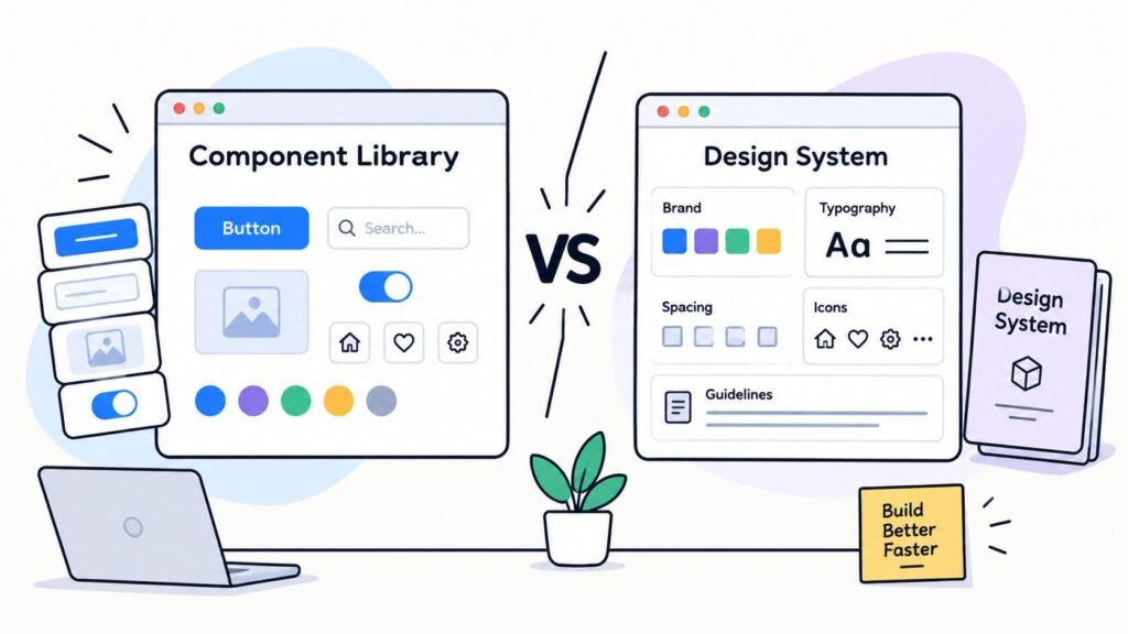
A component library provides reusable interface components; a design system adds the shared rules, ownership, and change process needed when reuse becomes a coordination problem.
In this article’s practical model, a startup should repair a shared kit when failures stay local, add governance when ownership or release problems recur, and use a full design system when decisions must align across teams, products, brands, or platforms.
Headcount and screen count are poor triggers. Recent product work provides better evidence: a component change that spawned another exception, a missing state discovered in QA, or a release whose downstream impact the team could not explain.
What Is a Component Library?
A component library is a maintained set of reusable interface components plus the contracts that explain their variants, states, behavior, and use. A design system is broader: it adds shared foundations, patterns, contribution rules, ownership, and change management across teams or products.
Decision rule: In this article’s decision model, a component library is enough when one team can reuse components without recurring exceptions, missing states, or unsafe changes. Add explicit governance when ownership and release problems repeat. Consider a full design system when the same decisions must stay aligned across teams, products, brands, or platforms.
The GOV.UK Design System offers one practical example: components come with guidance, examples, and conditions for use. The useful distinction is operational: a library collects reusable UI components, while a design system coordinates how people create, change, and retire them.
Before a Full Design System: A Governed Component Library
Governed component library is this article’s label for explicit ownership, contribution review, design-code parity, and release rules. It is not an industry standard. GOV.UK shows such rules in practice; startups can use a lighter process.
| Context | What the team has | Minimum operating rule | Decision boundary |
| Shared component kit | Reusable components inside one product or team | Basic naming, reuse, and visible states | Duplicates, undocumented variants, and missing production states begin to recur |
| Governed component library | Production components with explicit contracts | Owner, design/code parity, contribution review, version/deprecation path, and QA | Decisions and exceptions regularly cross teams, products, brands, or platforms |
| Design system | Shared product language and operating model | Principles, tokens, patterns, content/accessibility rules, governance, and adoption work | It must be managed as an ongoing internal product |
In this article’s practical decision model, these are operating contexts, not stages. Nielsen Norman Group likewise treats maturity as contextual and non-linear. A team can skip a context, move back, or keep a mature system lean. Governance can exist in any maintained library; the middle label marks explicit ownership and release rules.
A Practical Upgrade Test: Six Signals to Watch
Take one recent component change and follow it through design, implementation, QA, and release. Each signal identifies a different place where the contract can fail; the pattern of failures, rather than a total score, determines the next operating layer.
Exception Pressure
Trace the latest exception to a genuinely new product need or a shared component that no longer fits. If detached Figma instances, local forks, or one-off CSS keep recurring, those modifications can make later updates unsafe or reduce accessibility, as GOV.UK’s production guidance explains.
State Completeness
Missing states expose decisions that design, engineering, or QA still infer. Locate them across loading, empty, error, disabled, permission, responsive, content-stress, and relevant accessibility behavior. The list depends on the product; recurring omissions belong in the component contract.
In 4,714 public issue discussions from 41 open-source design systems, Lamine and Cheng classified 42.7% as component behavior and 10.2% as visual design. Those percentages describe the public issues in that dataset, not startup effort or total maintenance cost.
I know a UI kit has outgrown informal conventions when newcomers must infer how and where components should be used. Designers, developers, and product owners fill those gaps with different assumptions, so component use begins to drift. Component-level documentation and a clear owner help the team work from a shared reference. Weak spots include loading, empty, and specific error states, overlong or data-heavy content, and microinteractions such as how a side panel enters and exits.
Anastasiia Gunko, Design Lead at Merge Rocks
Design-Code Parity
Trace one component from Figma properties and variants into code props, states, and behavior. Different meanings across design, engineering, and QA create two competing contracts. Figma’s variant properties can expose the differences; people have to resolve them.
Change Safety
Follow one incompatible change to its consumers. Can teams identify the change, the deprecation path, and the migration or rollback expectation? GOV.UK lifecycle statuses and, for packages that adopt it, Semantic Versioning make those expectations visible; neither guarantees safety.
Ownership and Contribution
Name the person who can accept a variant, reject a duplicate, record the decision, and update guidance. If the answer changes by contributor or meeting, ownership remains implicit. Carbon’s contribution process shows one inspectable maintainer-review path, not a startup template.
Adoption
Compare the documented path with what contributors use. One stale component may need repair; recurring workarounds across contributors point to a contract or governance problem. Keep adoption qualitative, with no universal threshold.
Route local exceptions, missing states, and parity gaps to kit repair. Repeated ownership or release failures call for explicit governance. Coordination across teams, products, brands, or platforms calls for a design-system decision.
The Minimum Component Contract
A governed component library needs a component contract that design, engineering, product, and QA can inspect. Keep it small enough to maintain, but make five things visible:
- List supported variants and states, including loading, empty, error, and disabled behavior where relevant.
- Describe responsive, interaction, keyboard, focus, and other accessibility behavior that acceptance checks must cover.
- Point to the current design component, code implementation, and usage guidance.
- Name the owner who approves a new variant or deliberate exception.
- Define the change path through review, testing, release notes, deprecation, and migration expectations.
Finished screens alone are not a substitute for a UI kit or component library. When reusable elements lack defined variants, such as a label’s colors, icons, and backgrounds, or a dropdown’s open state, developers must search across layouts, infer unspecified behavior, and sometimes reconstruct missing states. That creates extra questions and leaves room for avoidable inconsistencies in implementation.
Evgeniy Bryzhko, Senior Front-End Developer at Merge Rocks
A rendered-state tool such as Storybook can make examples easier to inspect. The contract still belongs to the team: tools display the choices people have defined and maintained.
Where React, Vue and Svelte Fit
React, Vue, and Svelte expose component inputs that engineers can use to implement a shared UI layer. Those APIs do not choose which variants the product supports, who owns them, how contributions are reviewed, or how incompatible changes reach other teams. The team still has to make those operating decisions.
Once the team knows what the shared UI layer must control, the next question is how it fits the stack. Merge Rocks’ comparison of React, Vue and Svelte for startups examines that implementation choice in more detail.
Test the Contract in Production
Move the contract through a representative product flow before treating it as ready. Render non-happy-path component states, stress long content, change viewport and input method, and check keyboard and focus behavior where relevant. Make handoff notes and acceptance criteria visible to implementation and QA. Then run the documented change path once, including the person who approves an exception.
A useful review follows one change from design decision through implementation, handoff, acceptance, and release. Another contributor should be able to recover both the rule and its rationale.
When the contract is clear, implementation still has to preserve its states, responsive behavior and acceptance criteria. Merge Rocks’ front-end development services describe the relevant implementation, handoff and QA scope.
W3C guidance says evaluation tools assist but cannot determine accessibility, and WCAG 2.2 conformance applies to complete web pages. A component story, automated scan, or isolated test can reveal defects, but it cannot establish conformance for the finished page. Production review has to cover the component in context.
Choose the Lightest Layer That Controls Drift
Start with the most recent component change that created an exception or exposed a missing decision. Keep the library lean when the team can repair its contract locally. Make ownership and release rules explicit when the same failure returns across contributors. Reserve a full design system for decisions that must remain aligned across teams, products, brands, or platforms. Inspect one recent component change against the six signals.