

In spite of the advent of smartphones and the internet, the popularity of business cards continues to explode each day. They are the tool of choice for connecting with new prospects at conferences, events, or even everyday usage.
All of these make the question of the perfect business card more pertinent. Any brand that wants the undivided attention of its fans will have to get all the elements of its business card design correctly. Yet, as challenging as this is, the possibility of coming up with a card that looks riveting is exhilarating.
A lot of elements come together to create a memorable business card. They are the font, images used, colors, shapes, and even the printing material. Today, we’d show you how to choose colors for your business card design.
When choosing colors for business cards, you’d want to consider your existing brand colors and the industry you are in. For example, is there a predominant industry color? Do specific colors depict some meaning? What is the cultural reaction to a particular color? And also, what emotions are you hoping to evoke?
Importance of a great business card
Around 60% of entrepreneurs believe it’s essential to have business cards. According to a similar business card survey, a firm’s sale increases by 25% every time a company distributes 2000 of its cards.
While we’d not attribute every sale a company makes to its business card, they are clearly effective marketing tools.
When done correctly, a business card will ensure your product or company gets the needed attention it deserves. And what follows attention is sales and patronage. The proceeding revenue will help you reach larger audiences with your business solutions.
Best colors for business cards
The best colors for a business card will depend on your industry and brand. To pick the best color for your business card, you’d at least need a basic understanding of color theory. Color theory refers to the basic rules and guidelines involving the use of colors that designers follow to communicate with their users.
This theory is based on human psychology, culture, and optical ability. It could help you make the right choice of colors to help your business card look professional and, in turn, turn prospects into customers.
Here is the psychology behind commonly used business card colors:
icon-angle-right White
White can denote positivity, purity, and innocence. It’s a standard color in minimalist designs due to its simplicity and neutrality. White business cards are a fit for finance and medical professionals.


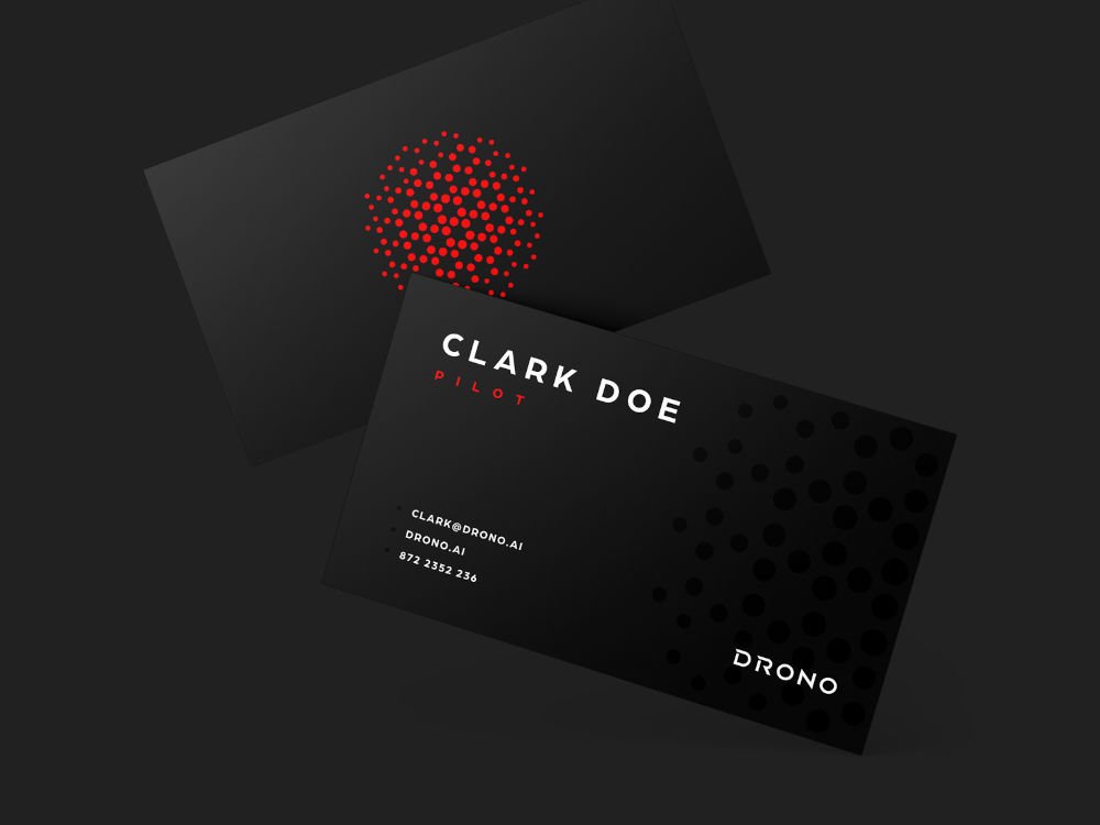
icon-angle-right Black
Black can imply sorrow and negativity. However, it can combine with other colors for a modern or traditional look. Like the color white, black is an adaptable color, as it borrows the characteristics of the colors it is used with.
The riveting nature of black business cards makes them a great pick to convey elegance and prestige. It can be ideal for a CEO or a top business consultant.
icon-angle-right Yellow
Yellow denotes warmth and optimism. It contrasts nicely with black text and is an instant attention grabber.

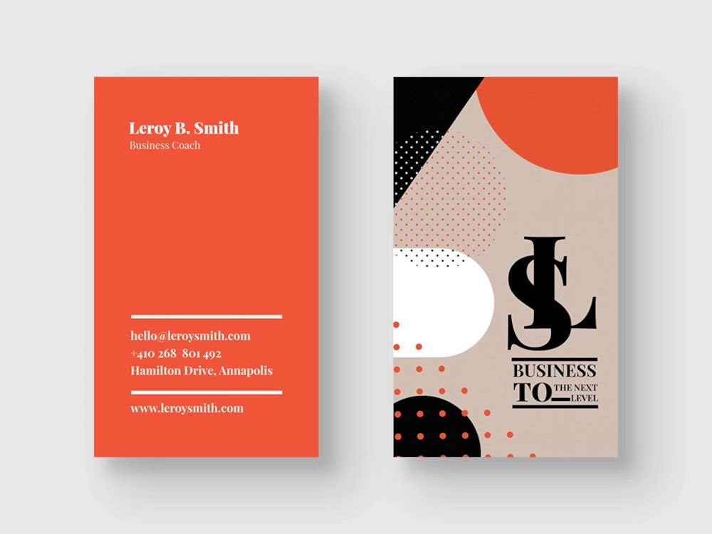
icon-angle-right Orange
The color orange can signify creativity and innovation. As a result, it’s naturally an excellent choice for professionals in startups.
icon-angle-right Blue
Blue is one of the most widely used colors on business cards. This is because it depicts honesty and trustworthiness. As a result, it’s a common choice in industries where privacy is a concern. Hence, medical and social media firms like Facebook and Twitter use shades of blue in their branding.

icon-angle-right Purple
The mysticism, imagination, and authority around the color purple make it a great choice for life coaches and well-being experts like yogis, masseurs, and nutritionists.

icon-angle-right Green
Finding the right shade of green for your business card is not the easiest task. Yet, businesses in the natural or organic products category have a compelling reason to use the color green.

More business card design tips
Although colors play an integral role, choosing colors for business cards is only one part of the puzzle. You should pay attention to other design elements.
1. Images & logos
Images such as the logo used should be of high quality, and sufficient attention should be given to the design. A dull image or logo will ruin any design.
2. Text and font
The text must be readable. Avoid overly fanciful fonts. Stick to a font size between 10 -16 pts. Ensure the text has adequate space to enhance readability.
3. Card material
This isn’t the most obvious detail, but it gets noticed. You want to pay special attention to the stock paper type and finishing used for your card printing. At 4over4 printing company, we make premium business card prints. We ensure you get quality prints that befit your brand and at a low cost.
Conclusion
Although ancient, business cards are still efficient for brand awareness and sales when done correctly. And choosing the right colors can give you an edge in networking and prospecting. So, do you have a business card, or do you plan to get one? Let’s hear what industry you’re in and the business card colors you’d print with.