


The Disconnect Between Design and Video
Brand managers, creative directors, and graphic designers invest massive amounts of capital and time into establishing a bulletproof visual identity.
They spend weeks obsessing over exact hex codes, typography kerning, and the psychological impact of white space to ensure every single corporate touchpoint feels distinctly “on-brand.”
Yet, when it comes time to produce motion picture content, these meticulously crafted brand guidelines are frequently ignored by outside production vendors, treating video as an entirely separate universe.
Video is not an isolated marketing silo; it is a living, breathing, high-impact extension of your brand’s visual identity.
If your company’s core aesthetic is minimalist, premium, and tech-forward, releasing a poorly lit, chaotic, or inconsistently branded video creates immediate cognitive dissonance.
The audience might not consciously know why the video feels wrong, but they will instinctively trust the brand less, assuming a lack of internal cohesion.
Here is a strategic, comprehensive guide to ensuring absolute alignment between your corporate video production and your core visual identity.
1. The Psychology of Cinematic Color Grading
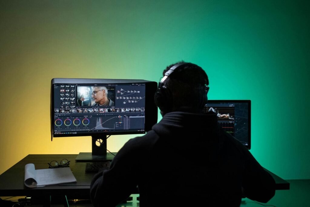
Color grading is the highly specialized post-production process of altering video luminance, contrast, and color balance.
It dictates the subconscious emotional response of the viewer before a single word of the script is spoken.
- Authoritative & Legacy Brands: If your brand palette relies on deep navy blues, slate grays, and crisp whites (the established standard in global finance, enterprise legal, and healthcare), raw footage should be deliberately graded to reflect cool, serious, and stable tones. Shadows should remain clean and cool, highlights should be crisp and clinical, and the overall image should feel grounded.
- Disruptive & Agile Brands: If you are an energetic SaaS startup utilizing vibrant oranges, electric teals, and stark blacks, the color grade should be highly saturated and punchy. Utilizing deep, crushed blacks and elevated mid-tones simulates speed, energy, and digital disruption.
Actionable Tip: Do not leave color grading up to the subjective, varying tastes of freelance editors. Brand managers must work closely with their production team to develop a proprietary “Brand LUT” (Look Up Table).
This foundational color file mathematically maps raw, flat cinema camera colors directly to your specific brand hues.
Distributing this LUT to all video vendors ensures flawless, global color consistency across all video campaigns, whether shot in New York, London, or Tokyo.
2. Typography as a Subconscious Trust Signal
Text on screen, whether animated lower-thirds identifying a speaker, full-screen title cards, or accessibility captions, must adhere strictly to your established corporate typography guidelines.
Brand managers must fiercely avoid letting video editors use generic motion graphic templates bought off stock websites, or default software fonts like Arial, Calibri, or Myriad Pro.
- Font Selection & Hierarchy: Always proactively provide your video agency with the exact OTF or TTF font files used on your website and pitch decks. Establish strict, non-negotiable rules on font weight (specifying exactly when to use Bold vs. Light) and tracking (letter spacing) to ensure legibility on both massive conference screens and tiny mobile devices.
- Animation Physics and Motion: The way text moves on screen speaks volumes about your corporate identity. A conservative, century-old wealth management firm should use elegant, slow cross-dissolves, subtle optical fades, or slow, linear reveals. Conversely, a modern tech company aiming for a younger B2B demographic might utilize fast, kinetic typography animations with aggressive easing curves (like spring, bounce, or digital glitch effects) to sub-communicate processing speed, agility, and a technological edge.
3. Rhythm, Pacing, and Sonic Branding
Visual identity operates on a timeline. The pacing of your video editing should perfectly match your brand’s established personality.
When producing business profile videos, consistency in pacing sets customer expectations and builds narrative familiarity.
- Heritage Brands: Require smooth, deliberate, unhurried pacing. Editors should hold on beautifully composed shots longer, utilize locked-off tripod angles instead of shaky handheld cameras, and employ sweeping, graceful transitions to convey immense market stability and long-term strategic vision.
- Agile Tech Brands: Benefit heavily from rapid-fire cuts, dynamic gimbal or handheld camera movement, and an upbeat tempo to convey constant innovation, rapid iteration, and market disruption. The edit should feel breathless and exciting.
- Sonic Branding & Sound Design: Audio cues must rigorously reinforce core values. An acoustic, folksy guitar track completely undermines a high-tech cybersecurity firm, making their multi-million dollar software seem quaint and localized. Just as an intense, bass-heavy synthesizer track induces unwanted anxiety for a compassionate healthcare provider. Brands should build a library of approved audio stems, sound effects, and musical genres for vendors to pull from.
4. Set Design, Wardrobe, and Environmental Branding
Brand integration begins long before the camera actually rolls; it starts deep in pre-production.
When scouting physical locations, look for environments that naturally echo your brand’s architecture (e.g., brutalist concrete and exposed steel for modern software architecture firms; warm, rich wood panels and leather for prestigious law firms).
Incorporate highly intentional brand elements into the set dressing: a strategically placed product, a softly blurred monitor displaying the company logo in the deep background, or an LED wash of your primary brand color on a background wall.
Furthermore, proactively guide your on-camera talent away from distracting wardrobe choices (like tight houndstooth patterns, which cause terrible camera moiré/strobing) and toward solid brand colors.
Advise them against wearing noisy jewelry that will ruin the audio recording. By treating video production with the exact same rigorous design standards as a flagship website redesign, brand managers create immersive visual experiences that build immediate, undeniable market trust.