
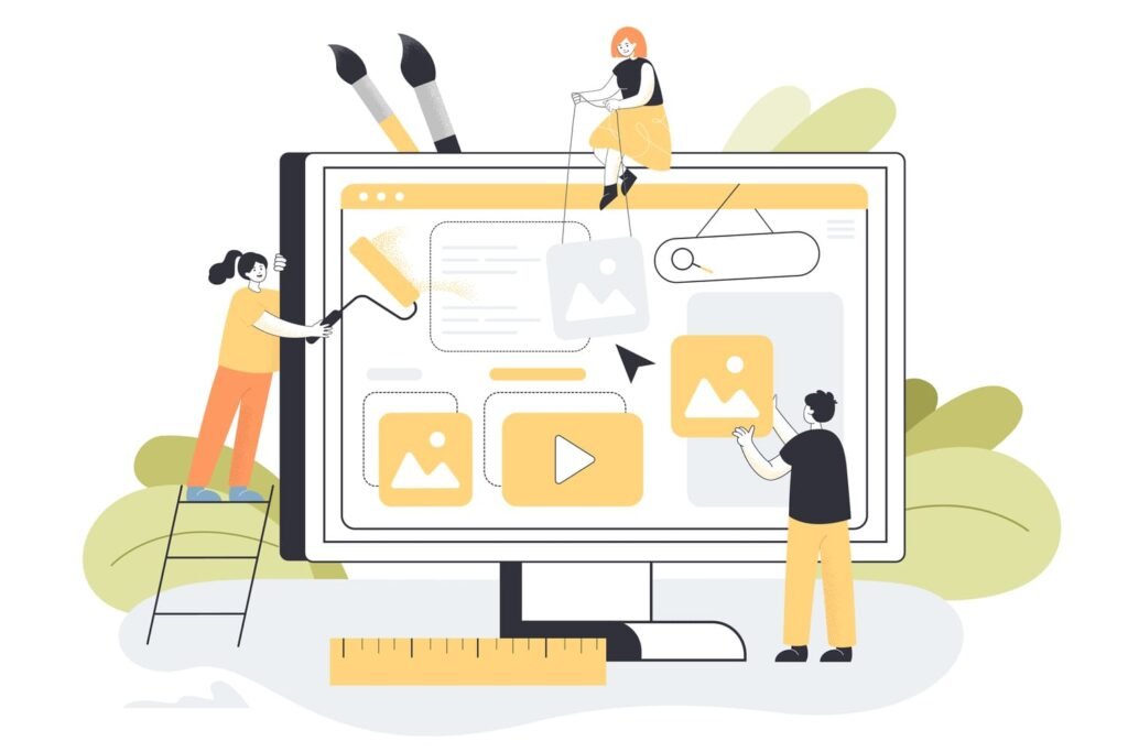
The gap between a good-looking site and a site that actually converts comes down to design decisions — usually small ones.
A friend of mine runs a two-chair barbershop. Last spring he texted me a link to his brand-new website, no message, just three exclamation points. And it looked sharp: big photos, a moody color palette, smooth little animations when you scrolled. I told him it looked great, because it did. Then I asked how bookings were going. Long pause. They weren’t. About the same as before the redesign, maybe a touch worse.
That gap is the thing nobody warns small-business owners about. A website can be genuinely beautiful and still be terrible at its one real job, which is turning a stranger into a customer. Looking good and selling are two different skills, and most templates are built for the first one.
Pretty is not the same as persuasive
Design that converts isn’t really about taste. It’s about removing friction and pointing attention. Every section on a page either nudges someone one step closer to acting or it gets in the way. There isn’t much neutral ground. The barbershop site had a gorgeous full-screen hero image, and you had to scroll past all of it to find out he was even open on weekends. The photo won. The customer lost.
So before anyone argues about fonts, ask a colder question: what do you want a visitor to do, and how fast can they do it?
Make the next move impossible to miss
Pick one primary action per page. Book now. Call. Get a quote. Just one. When everything is bold, nothing is, and a page with five equally loud buttons is really a page with zero. Give the main action a color nothing else on the page uses, put it where the eye lands first, and repeat it as people scroll. It feels repetitive to you because you’ve stared at the page a thousand times. A first-time visitor hasn’t.
A quick test
Squint at your homepage until it blurs. The thing that’s still visible should be the action you want someone to take. If it’s your logo or a stock photo of two people shaking hands, you’ve got a hierarchy problem.
Speed is a design decision
Here’s the unglamorous truth: the most elegant layout in the world won’t convert if it takes six seconds to show up. People bail. They don’t email to complain about load time, they just leave, and you never even know they were there. Those giant hero videos and uncompressed images that look so good in the mockup are often the exact thing quietly bleeding away visitors on a phone with two bars of signal.
This is usually where a DIY build hits its ceiling. It’s the point where it’s worth bringing in a custom web design in Charlotte firm that can balance the visual side against performance, because those two pull on each other constantly and getting the trade-off right takes a lot of reps.
Your homepage gets about five seconds
A visitor should be able to tell who you are, what you do, and why they should care before they scroll once. Sounds obvious. Most small-business homepages flunk it, opening with a vague tagline like “Excellence, delivered” instead of a plain sentence an actual human would say out loud. Clarity beats clever almost every time. Tell people what they get and what to do next, in the words your customers already use.
Mobile is the website now
More than half your traffic is on a phone, probably more than that. Yet so many sites are still designed on a big monitor and checked on mobile as an afterthought. Buttons come out too small to hit with a thumb. Text crowds the edges. A contact form asks for ten fields when three would do. Design for the phone first and the desktop version mostly takes care of itself. Going the other direction almost never works as cleanly.
Know when to stop doing it yourself
There’s no shame in a DIY site, especially early on. A template and a free weekend can get a new business online, and that beats nothing. But there’s a point where the site starts actively costing you work, where the gap between what it could earn and what it’s actually earning grows bigger than what a redesign would cost. That math sneaks up on people.
If you’re past that point, a Charlotte web design firm worth its fee won’t just hand you a prettier site. It’ll test the thing, watch how real visitors actually behave, and keep adjusting after launch instead of treating go-live as the finish line.
My friend’s still cutting hair. We reworked his homepage one evening over a couple of beers: clear headline, one obvious “Book a chair” button, the pretty photo demoted to a supporting role. Bookings ticked up within a few weeks. Same business, same haircuts, same prices. The only thing that changed was that the website finally got out of its own way.