
As a graphic designer, the colors you choose influence far more than your portfolio—they also shape your mindset, your workflow, and the energy of the space you create in.
Color psychology isn’t just a tool for client projects; it’s a powerful way to craft a workspace that supports the way you think, feel, and design.
The right palette can help you stay focused, spark new ideas, or bring a sense of calm to an otherwise chaotic schedule.
In this post, we explore how different colors impact creativity and how you can intentionally use them to transform your studio into a place that inspires your best work.
Also Read: Boost Your Creativity: 12 Unique Workspace Concepts for Designers
Why Color Psychology Matters in Your Workspace
Every shade carries emotional weight. Some colors energize; others relax. Some encourage concentration, while others help your imagination roam freely.
When you spend hours each day designing, even subtle changes in your environment can influence your productivity and mood.
Understanding how color affects the brain gives you a strategic advantage—allowing you to tailor your workspace to your creative goals.
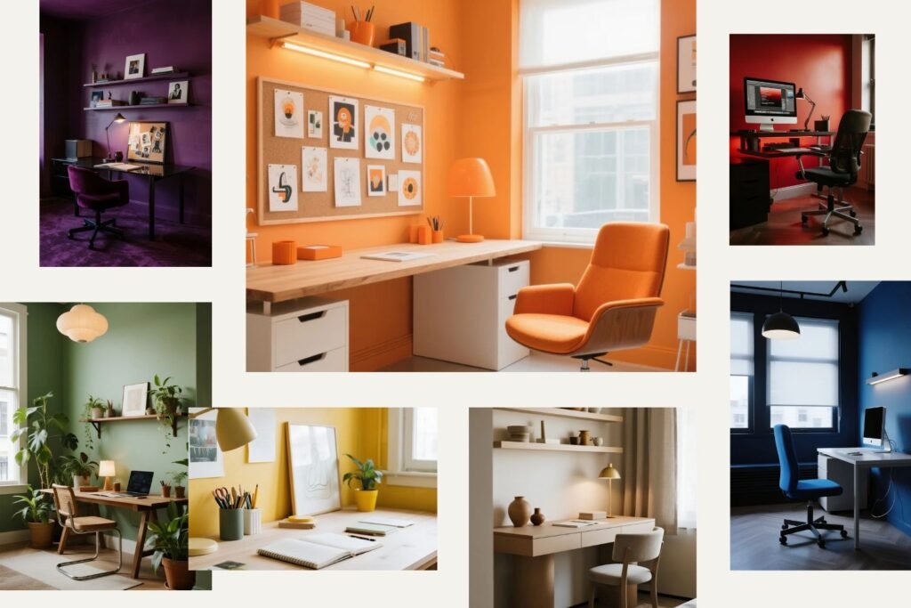
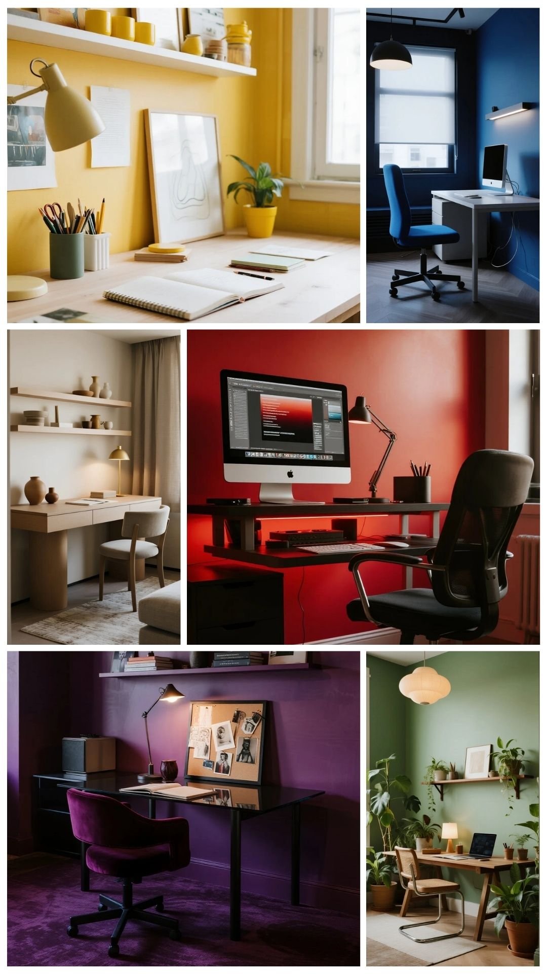
Warm Colors: Energy, Passion & Bold Thinking
🔴 Red — Motivation & Momentum

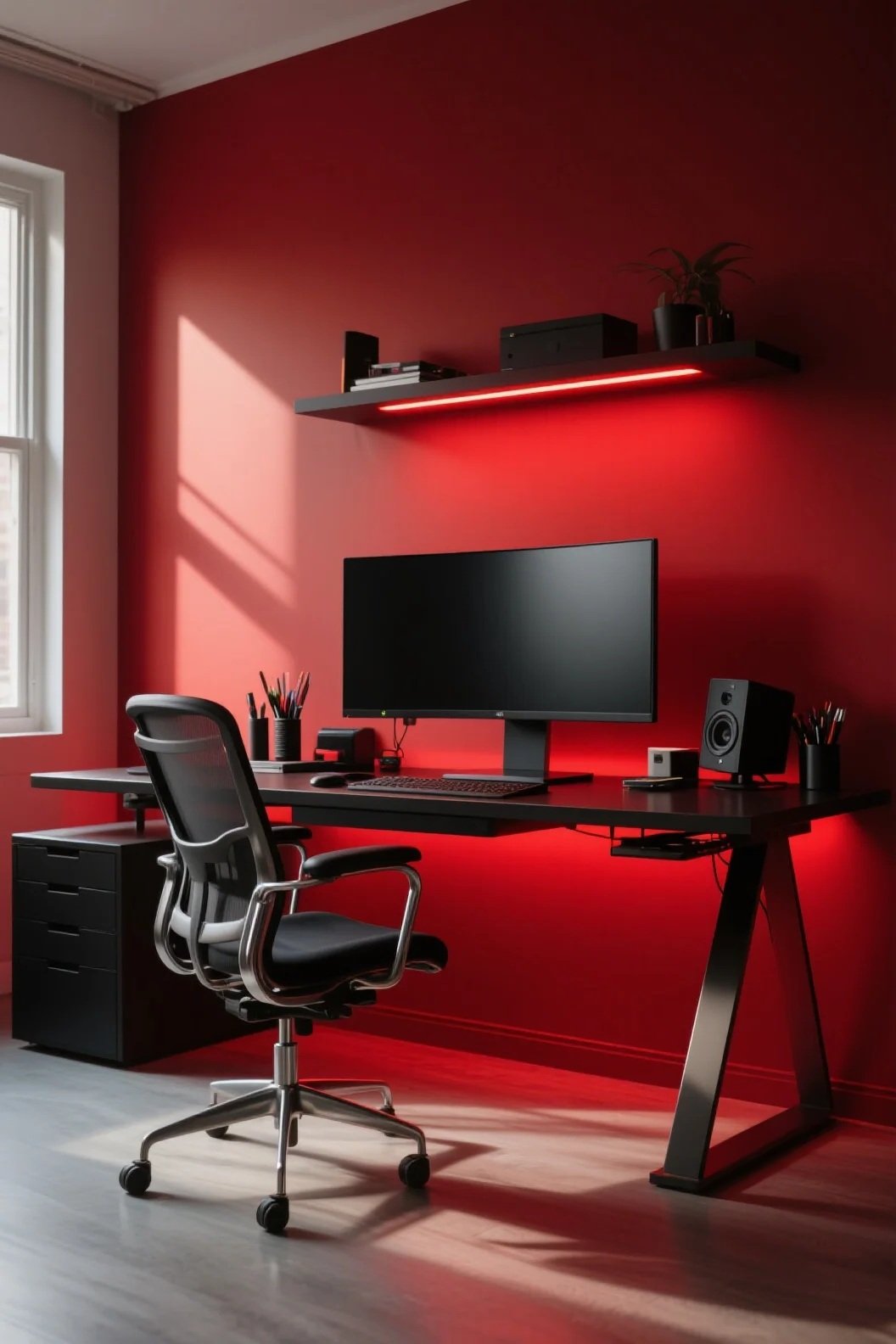
Red stimulates excitement, urgency, and physical energy.
It’s ideal for designers who want a workspace that wakes them up and pushes them into action—but use it sparingly, as too much red can feel overwhelming.
Best for: brainstorming zones, accent walls, and dynamic creative corners.
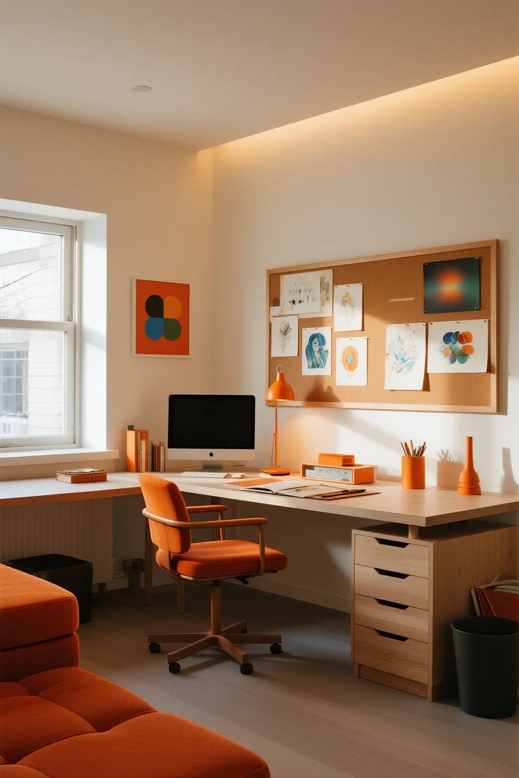
🟠 Orange — Creativity & Playfulness
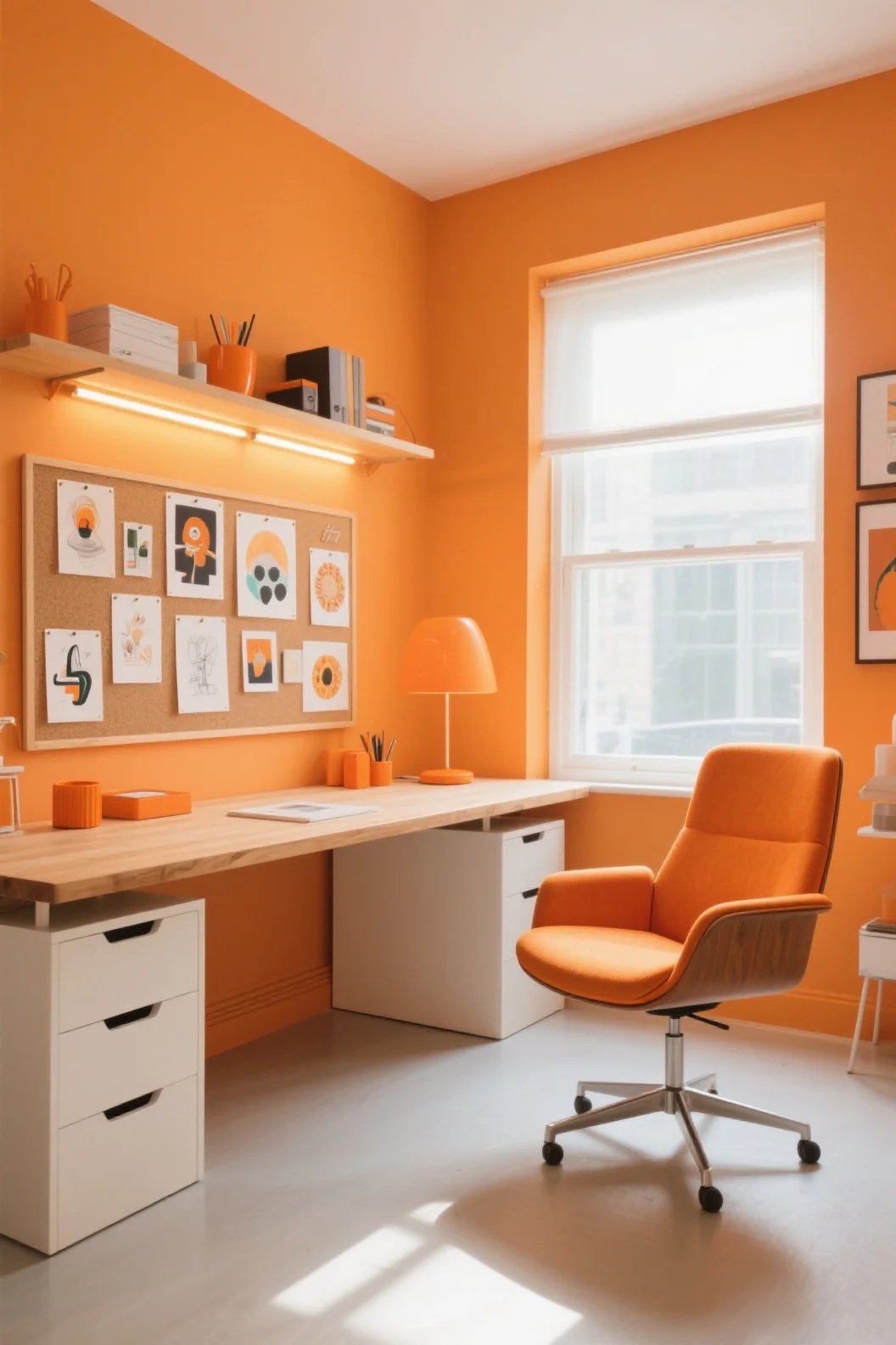
Orange blends red’s energy with yellow’s optimism. It sparks enthusiasm and is fantastic for designers who thrive in collaborative, high-energy environments.
Best for: mood boards, accessory décor, lively studio setups.
🟡 Yellow — Optimism & Idea Generation
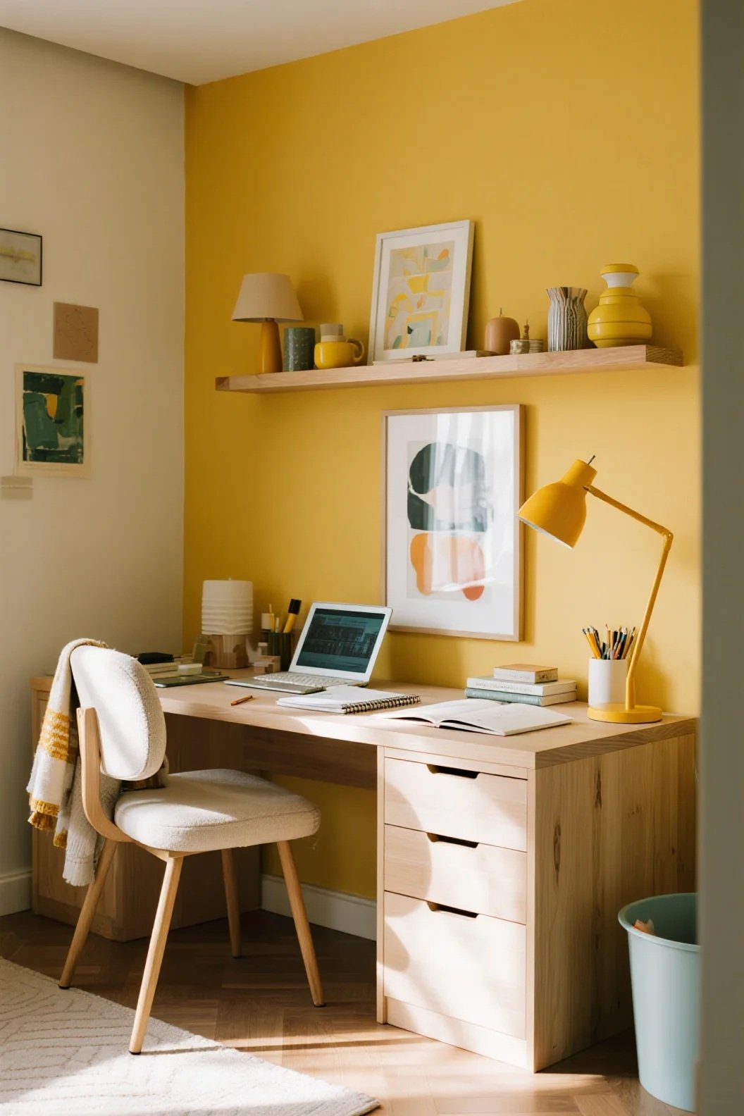
Yellow is the color of innovation. It boosts confidence, joy, and imagination—perfect for conceptual work.
Best for: artistic studios, ideation walls, places where sketches and concepts come to life.
Free Download: 11 Workspace Mockups to Show Off Your Creatives
Cool Colors: Focus, Calm & Deep Thinking
🔵 Blue — Focus & Mental Clarity
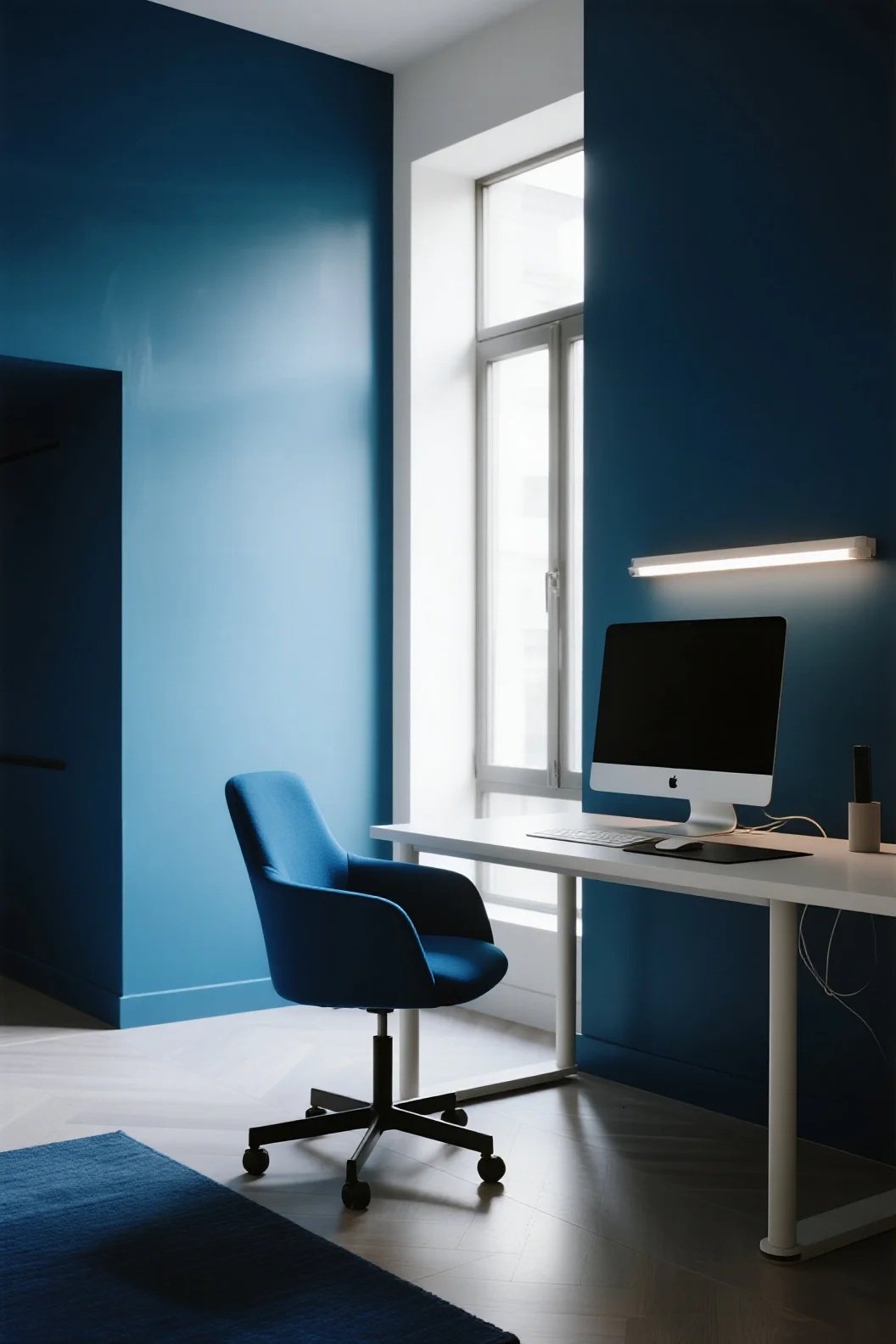
Blue helps steady the mind, enhancing concentration and problem-solving. It’s excellent for designers who do detail-heavy or technical work for long stretches.
Best for: desk areas, digital production zones, quiet creative environments.
🟢 Green — Balance & Long-Term Comfort
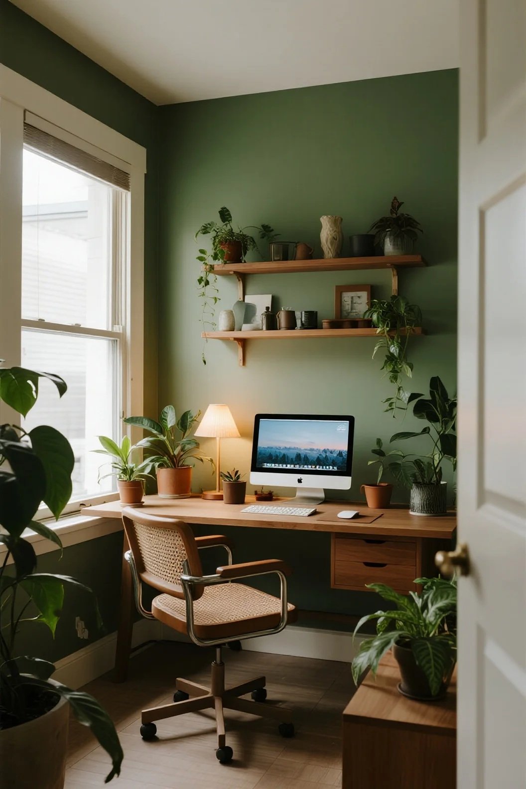
Green is incredibly soothing. It reduces eye strain, supports mental balance, and promotes sustained productivity.
It’s also the easiest color for the human eye to process.
Best for: all-day workspaces, biophilic-themed studios, areas with lots of screen time.
🟣 Purple — Imagination & Artistic Depth
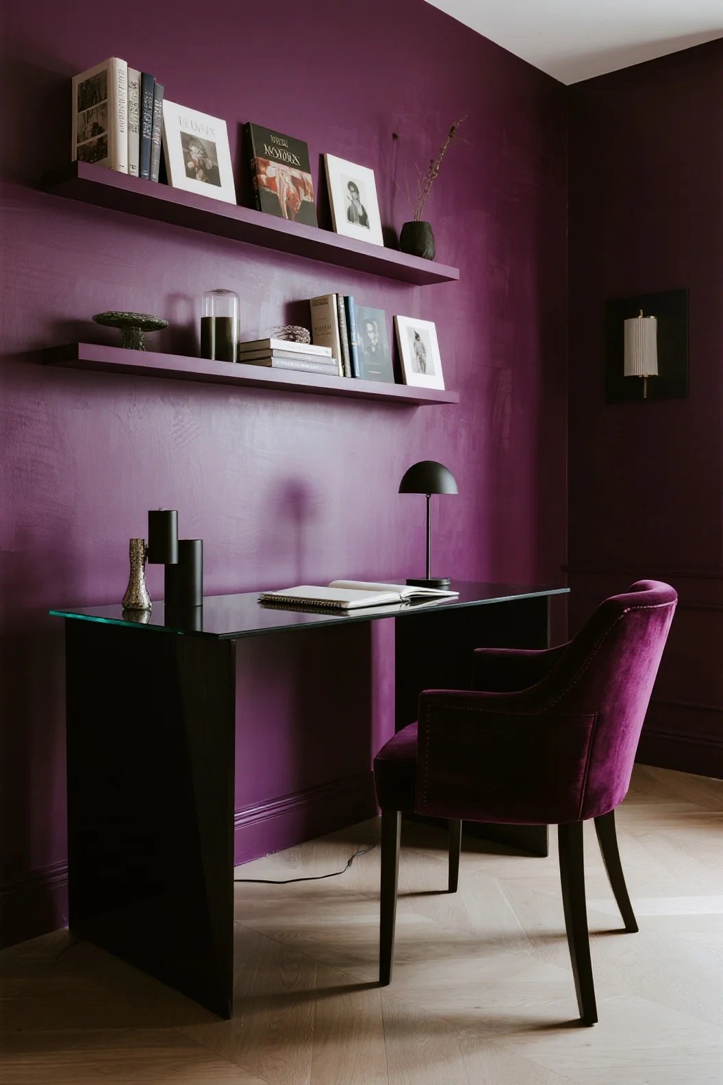
Purple evokes luxury, artistic expression, and spiritual creativity.
It’s great for designers who work in illustration, branding, or conceptual art.
Best for: inspiration corners, art displays, mood-setting décor.
Neutral Colors: Stability, Minimalism & Versatility
⚪ White — Clarity & Minimalism
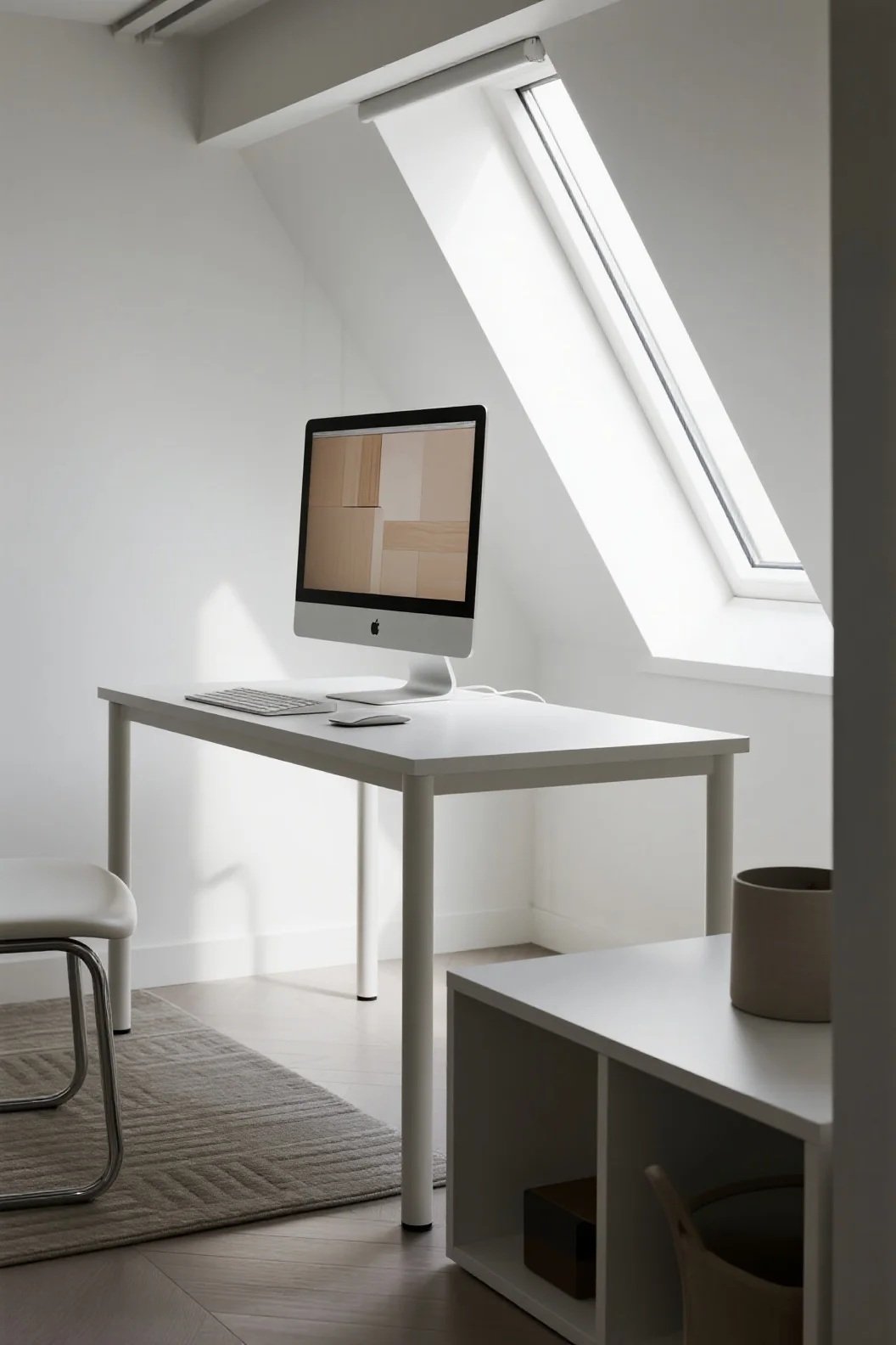
White provides a blank canvas that helps reduce mental noise.
It’s ideal for designers who want visual purity and a sense of order—but it must be balanced with texture to avoid feeling sterile.
⚫ Black — Sophistication & Focus
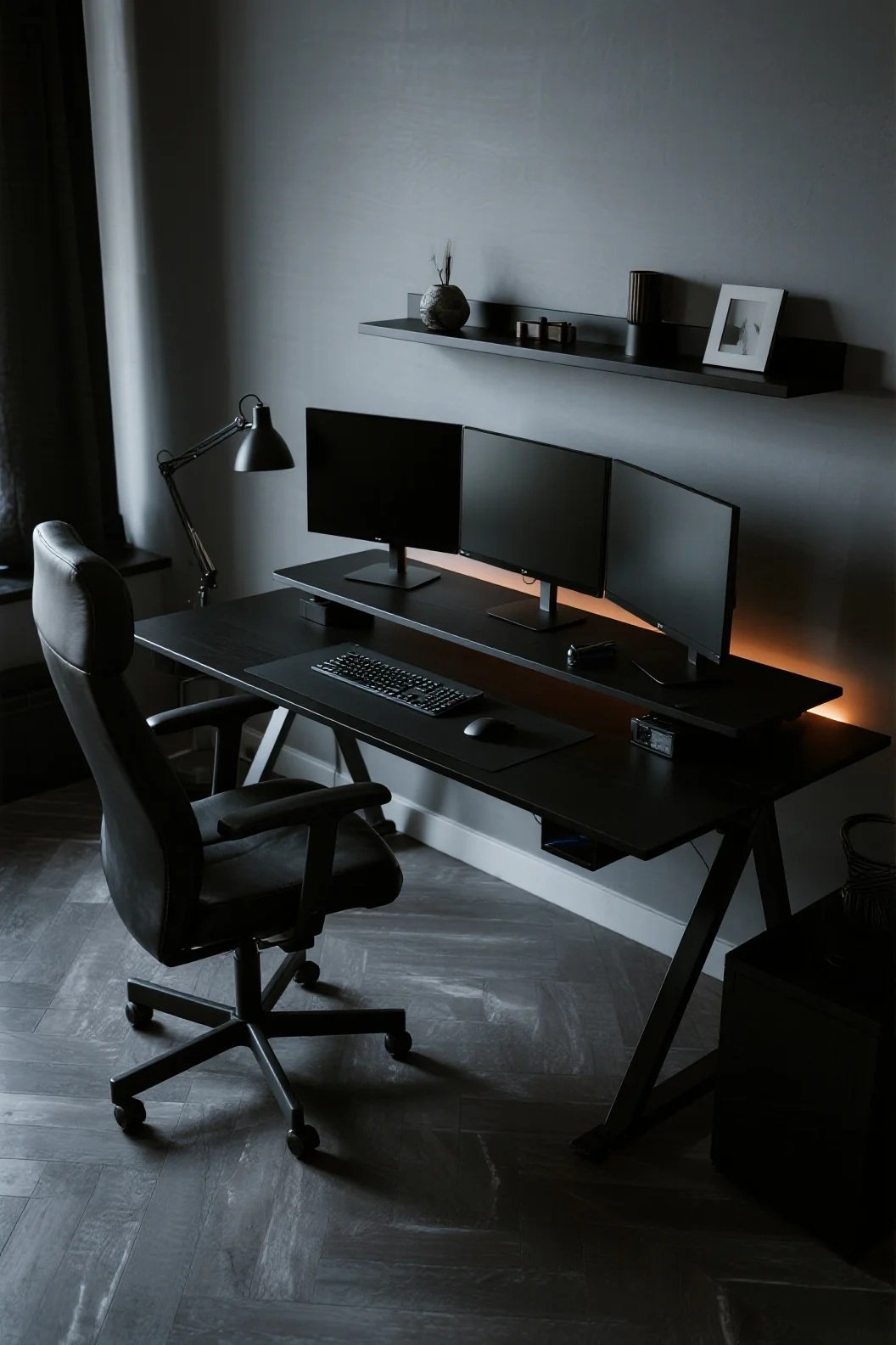
Black adds depth and mood, helping create a professional, grounded environment. Used well, it can elevate a workspace dramatically.
🪵 Beige, Gray, and Natural Tones — Comfort & Harmony
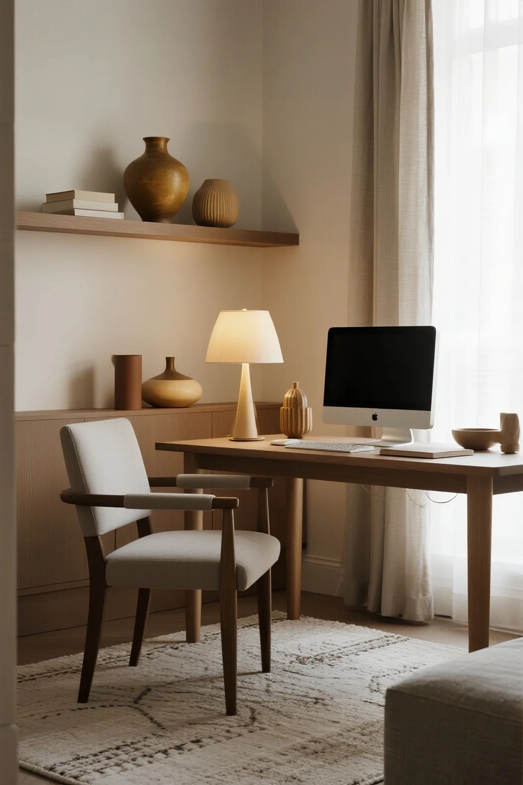
Earthy neutrals bring warmth without distraction, making them great for grounding your workspace and supporting a relaxed creative process.
Combining Colors for Maximum Creativity

You don’t need to commit to one color—designer workspaces often thrive on balanced palettes. Here are a few effective combinations:
- Blue + White: clarity, focus, clean minimalism
- Green + Wood Tones: natural calm, long-term comfort
- Yellow + Gray: energetic but controlled creativity
- Purple + Black: artistic depth with a dramatic edge
- Red Accents + Neutral Walls: energy without overwhelm
Use furniture, lighting, wall décor, and accessories to bring your palette together without a full remodel.
Also Read: Showcase of 15 Top Authors Envato Marketplace Workspaces
How to Choose the Right Color for Your Workflow
Ask yourself:
- Do you need more focus or more energy?
- Does your creativity flow best in calmness or vibrancy?
- Do you prefer a minimalist or expressive environment?
- Are you easily distracted by bold colors?
Your workspace color system should enhance—not compete with—your thought process.
Final Thoughts
Color psychology isn’t just about aesthetics; it’s about designing an environment that works with your creative brain instead of against it.
Whether you thrive in the calmness of cool tones, the inspiration of warm hues, or the balance of neutrals, intentional color choices can transform your workspace into a more productive, inspiring, and emotionally supportive studio.
Experiment, mix, explore—and let color help shape your most creative self.