

For graphic designers and branding enthusiasts, sports logos offer some of the most fascinating case studies in visual identity.
They’re bold, emotional, and built to stand the test of time. A great sports logo doesn’t just mark a team—it becomes its heartbeat. It shows up on billboards, streetwear, tattoos, and even in global pop culture.
Let’s explore 12 of the most famous sports team logos worldwide, why they resonate, and what designers can take away from each one.
See Also: Best 11 Famous Logos in the World – Why do They Work?
1. New York Yankees (MLB, USA)


You don’t have to follow baseball to recognize the Yankees’ interlocking “N-Y”. It’s arguably the world’s most worn sports logo—and not just by fans.
Why it works:
- Clean, elegant monogram design.
- Perfect symmetry that feels balanced and premium.
- Looks great in a single color on any background.
Design takeaway:
A well-crafted monogram can outlast trends and transcend its original purpose. Simplicity is often your strongest asset.
Recommended Reading: MLB Team Logo Designs: A Breakdown of All 30 Team Logos
2. FC Barcelona (La Liga, Spain)
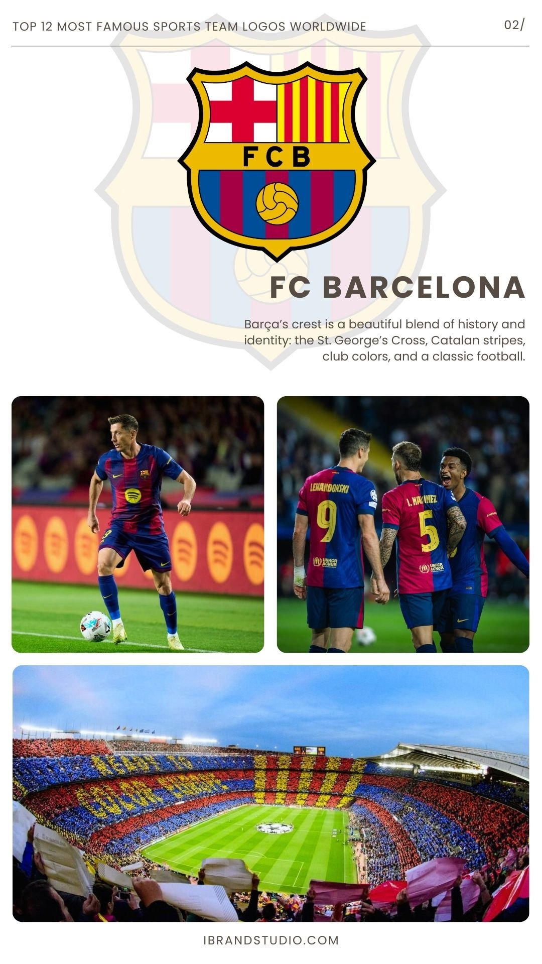
Barça’s crest is a beautiful blend of history and identity: the St. George’s Cross, Catalan stripes, club colors, and a classic football.
Why it works:
- Rich symbolism, but thoughtfully organized.
- Harmonious shield structure.
- Bold yet sophisticated color palette.
Design takeaway:
If you’re designing a multi-element emblem, clarity and structure matter. Every symbol needs a clear place to live.
3. Los Angeles Lakers (NBA, USA)
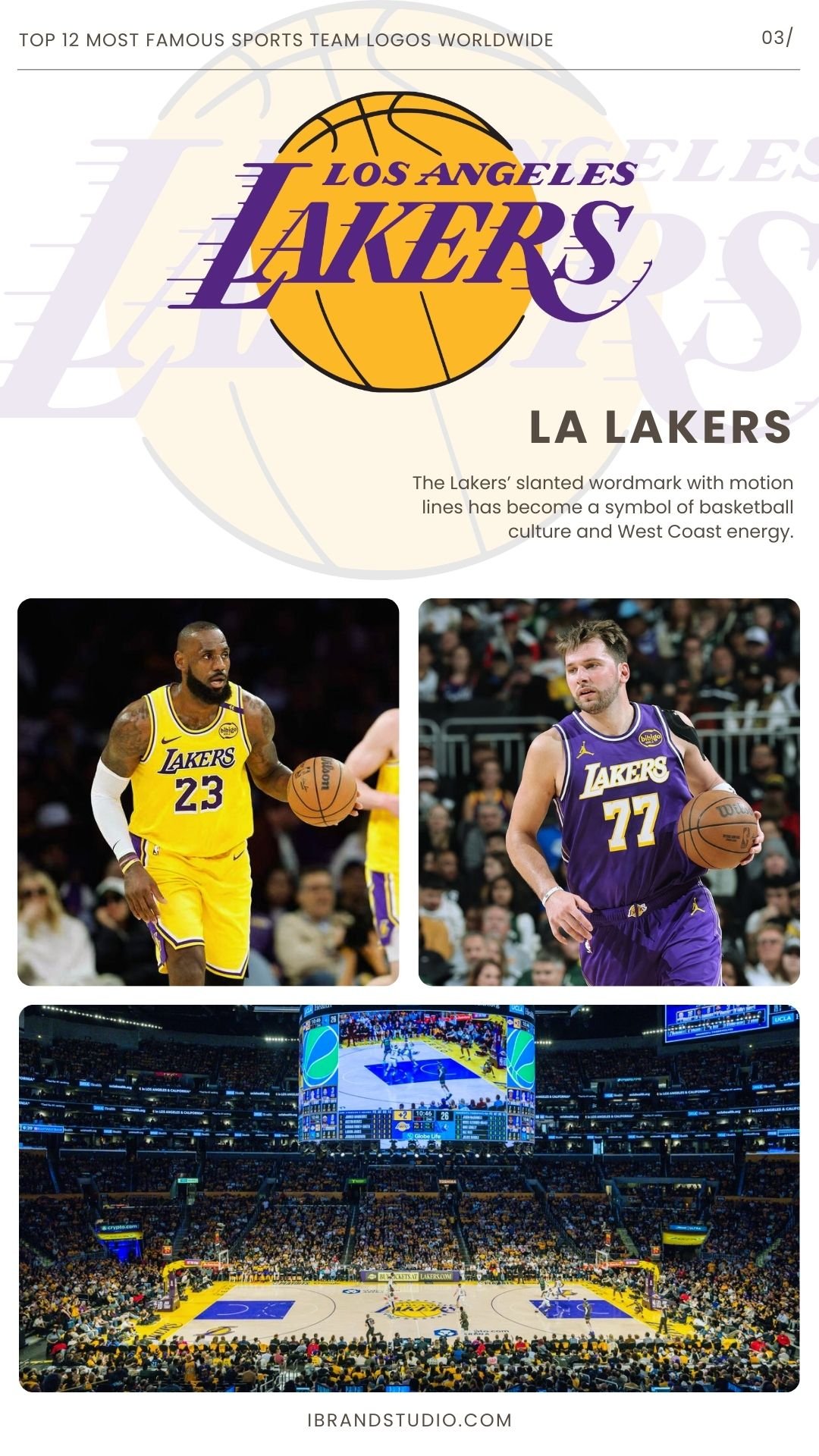
The Lakers’ slanted wordmark with motion lines has become a symbol of basketball culture and West Coast energy.
Why it works:
- Dynamic typography that immediately communicates movement.
- Purple-and-gold palette that feels luxurious and unmistakably “Lakers.”
Design takeaway:
Typography alone can create an iconic sports logo—especially when it captures a sense of motion or personality.
You Might Also Like: 30 NBA Team Logos That Inspire Great Design
4. Chicago Bulls (NBA, USA)
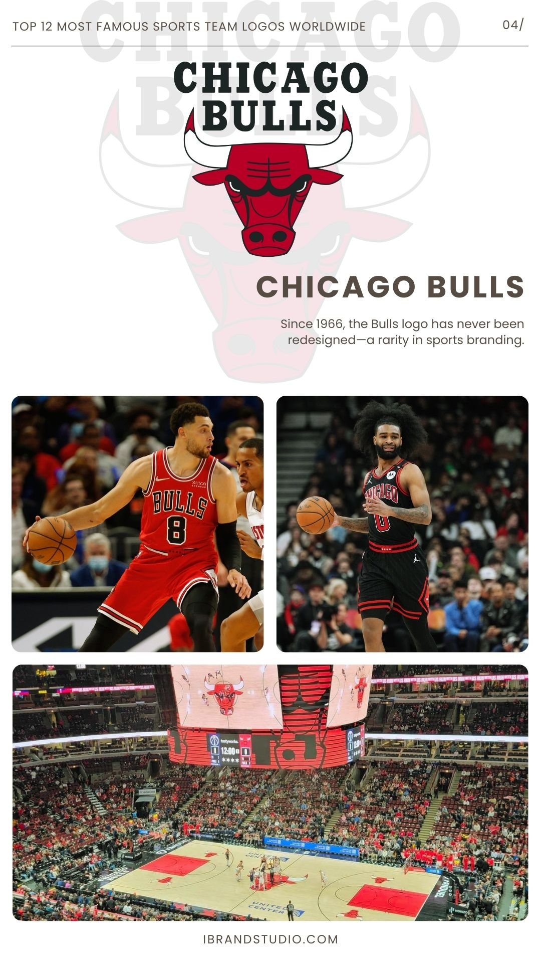
Since 1966, the Bulls logo has never been redesigned—a rarity in sports branding.
Why it works:
- Fierce, expressive illustration without overly complex details.
- Excellent symmetry and bold outlines.
- Scales beautifully from jerseys to small merchandise.
Design takeaway:
Emotion is powerful. When your logo evokes a strong feeling, it sticks.
5. Manchester United (Premier League, England)
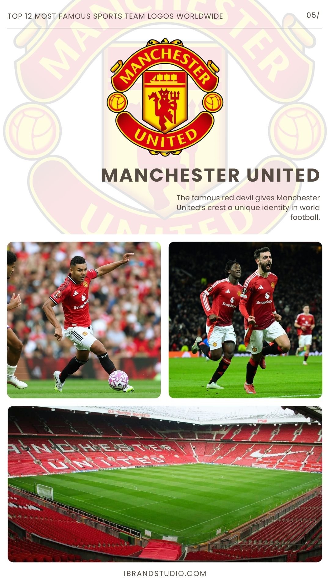
The famous red devil gives Manchester United’s crest a unique identity in world football.
Why it works:
- A single, memorable icon at the center of the shield.
- Thoughtful blend of tradition and modernity.
- Instantly recognizable on apparel.
Design takeaway:
A standout symbol—executed with confidence—can anchor an entire brand identity.
6. Dallas Cowboys (NFL, USA)
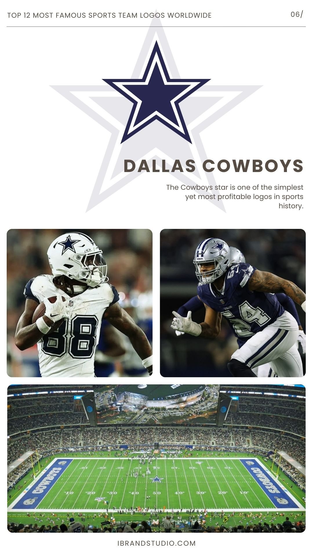
The Cowboys star is one of the simplest yet most profitable logos in sports history.
Why it works:
- Pure geometric minimalism.
- Universally recognizable across cultures.
- Works in nearly any context and size.
Design takeaway:
Never underestimate the impact of a single, well-drawn shape. Minimal logos often age the best.
See Also:
- The Art of the Game: How NFL Logos Define Each Team’s Identity
- 55 Amazing American Football Team Logos and Identity Designs
7. Real Madrid (La Liga, Spain)
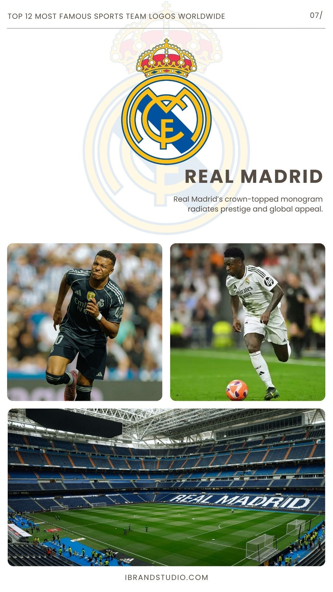
Real Madrid’s crown-topped monogram radiates prestige and global appeal.
Why it works:
- Royal symbolism adds emotional and cultural weight.
- Elegant lines and strong shape hierarchy.
- Gold accents elevate the overall look.
Design takeaway:
When your brand leans into a premium identity, ornate elements—executed with restraint—can reinforce that message.
8. New York Knicks (NBA, USA)
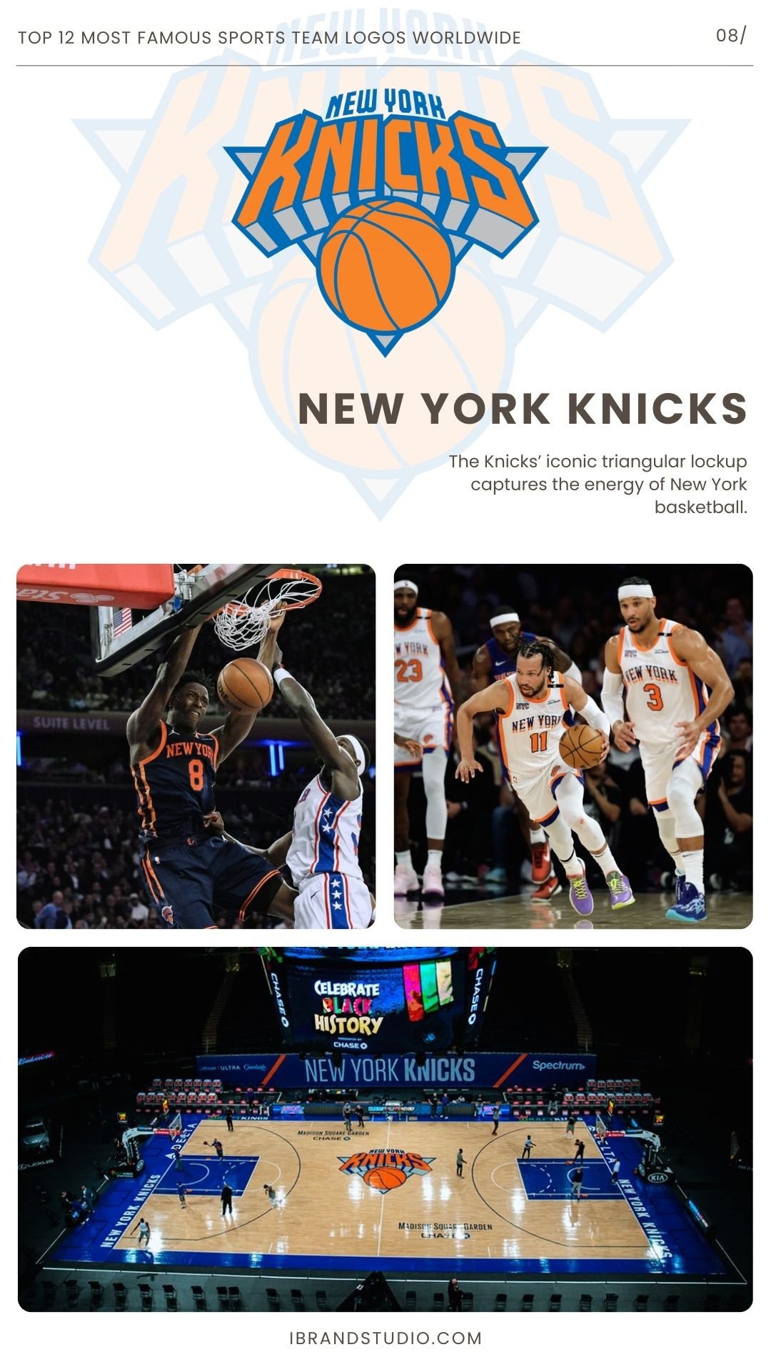
The Knicks’ iconic triangular lockup captures the energy of New York basketball.
Why it works:
- Bold, slightly futuristic typography.
- Urban, punchy feel that matches the city’s energy.
- Adaptable between detailed and simplified versions.
Design takeaway:
Combining geometry with typography can create a youthful, energetic identity that resonates with fans.
9. Juventus FC (Serie A, Italy)
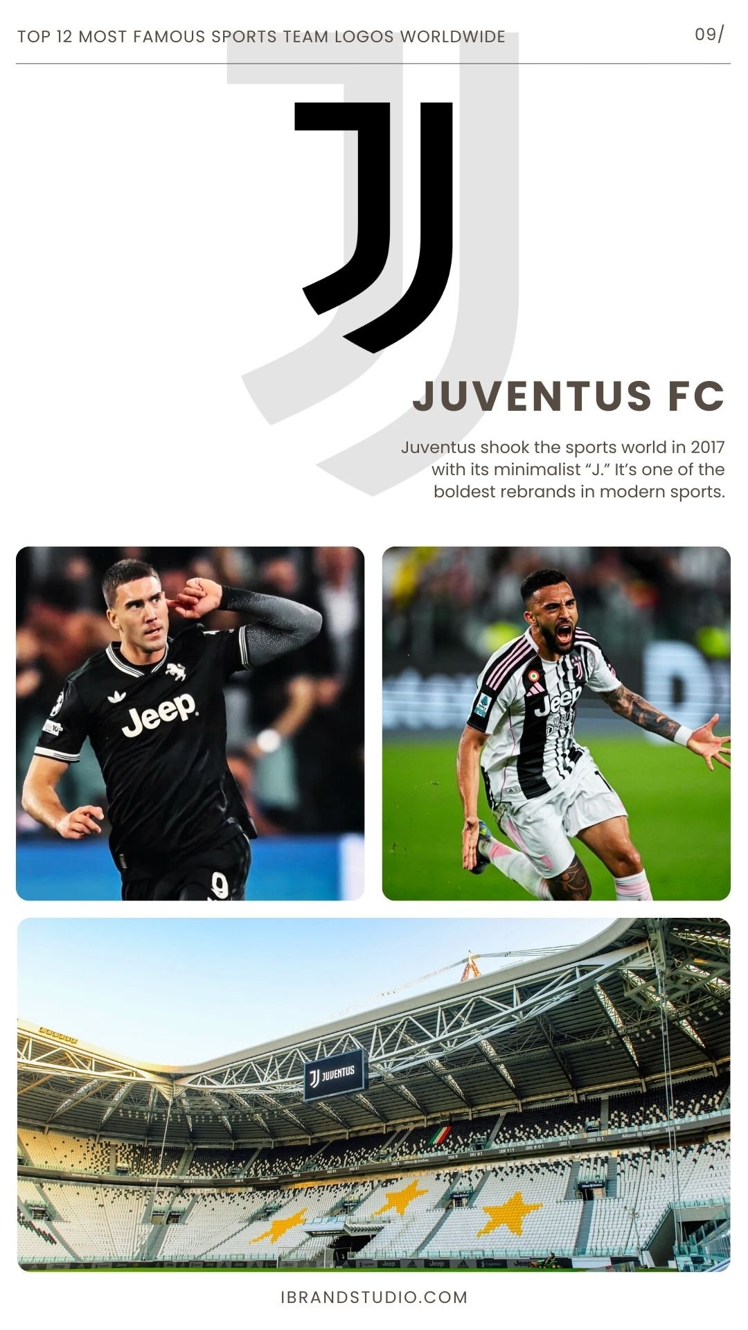
Juventus shook the sports world in 2017 with its minimalist “J.” It’s one of the boldest rebrands in modern sports.
Why it works:
- Ultra-clean, fashion-minded simplicity.
- Designed with digital, merchandising, and lifestyle branding in mind.
- Shows confidence through minimalism.
Design takeaway:
Sometimes the future calls for reducing, not adding. A brave redesign can reposition a team as a global brand.
10. Montreal Canadiens (NHL, Canada)
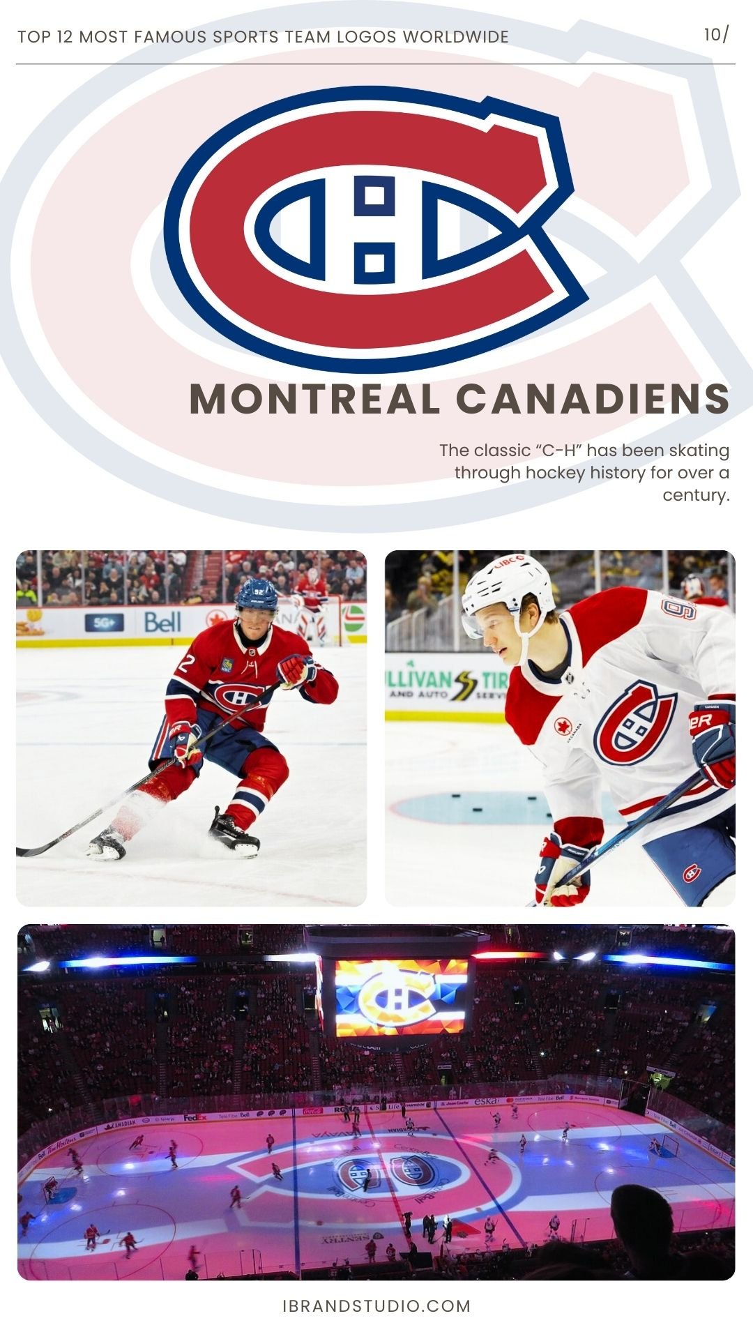
The classic “C-H” has been skating through hockey history for over a century.
Why it works:
- Clean typography with strong lines.
- Timeless red, white, and blue color scheme.
- Simple enough to endure changing design trends.
Design takeaway:
If the foundation is solid—line work, structure, proportions—a logo can remain relevant for generations.
11. Brazil National Football Team (CBF, Brazil)
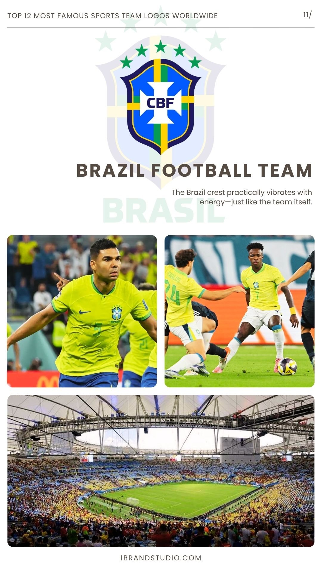
The Brazil crest practically vibrates with energy—just like the team itself.
Why it works:
- Bright national colors: yellow, green, and blue.
- Strong, clean shield layout.
- A design that feels joyful and unmistakably Brazilian.
Design takeaway:
Color psychology matters. An uplifting palette can become a core part of a brand’s global identity.
12. Ferrari (Formula 1, Italy)
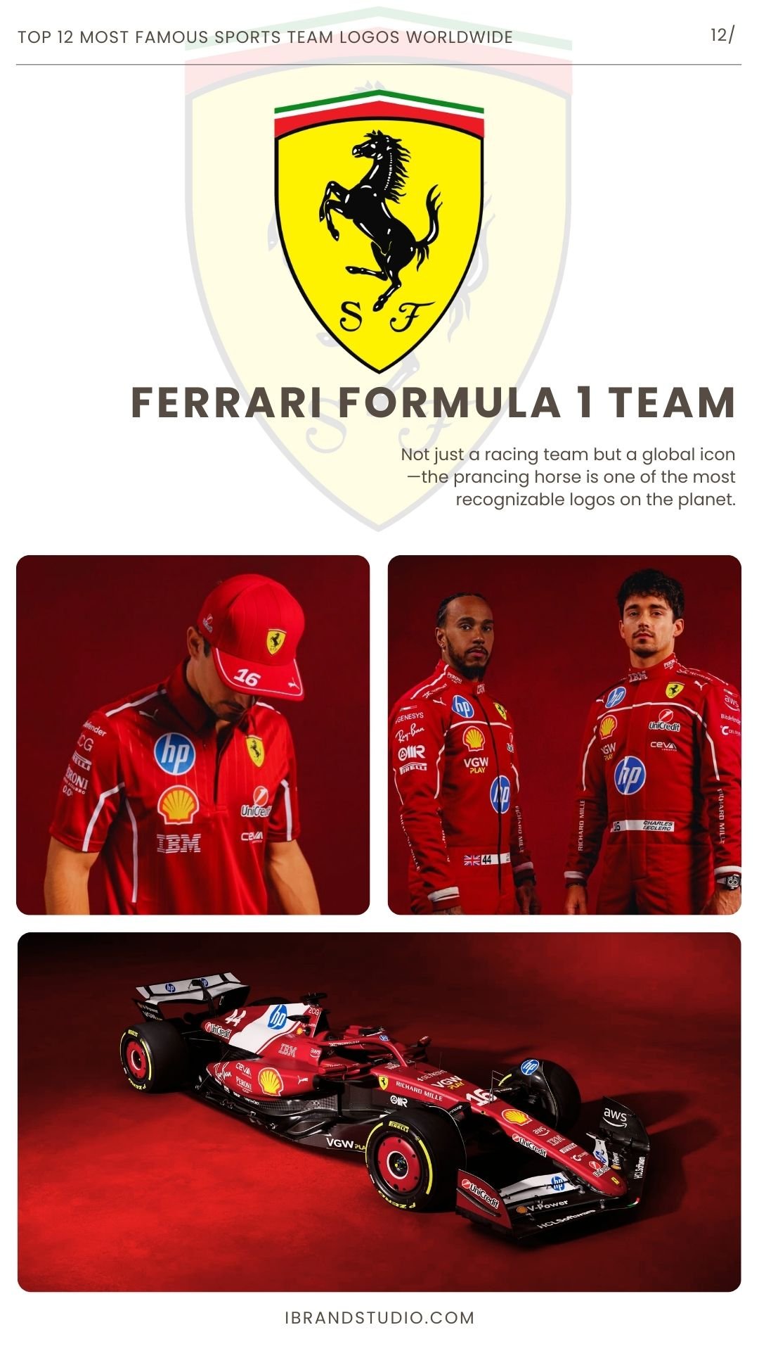
Not just a racing team but a global icon—the prancing horse is one of the most recognizable logos on the planet.
Why it works:
- Strong, elegant silhouette.
- Vibrant yellow shield adds impact and personality.
- Conveys speed, prestige, and heritage in one mark.
Design takeaway:
Silhouettes are incredibly powerful. If your logo works beautifully as a pure outline, you’re onto something timeless.
What These Logos Teach Us About Great Sports Branding
Looking across these globally recognized sports team logos, a few universal lessons stand out:
1. Memorability Matters More Than Detail
The simplest logos—the Cowboys star, Juventus “J”, Yankees monogram—are the ones that show up everywhere.
2. Storytelling Strengthens Identity
Barça, Real Madrid, and Brazil show how cultural symbols can turn a logo into a flag people rally around.
3. Emotion Helps a Logo Stick
Fierce, proud, bold—sports identities work best when they spark a feeling.
4. Versatility Is Non-Negotiable
A modern sports logo must live across digital platforms, merchandise, uniforms, and even luxury collaborations.
5. Typography Can Be a Superstar
Lakers, Yankees, Juventus prove that letters—when crafted intentionally—can be as iconic as any mascot.
Final Thoughts
Sports logos blend strategy, history, and artistry like few other design challenges.
They need to be instantly recognizable, emotionally charged, and versatile enough to live everywhere—from giant stadium screens to tiny app icons.
The logos above remain iconic not just because they look good, but because they embody what their teams stand for.
For designers and branding lovers, they’re a reminder that a powerful visual identity can shape culture for decades.