From Spine to Signage: 10 Bookstore Branding Concepts That Turn Pages Into Memorable Brands
Bookstores today are doing much more than selling books. They’re becoming destinations—places people seek out not just for what’s on the shelves, but for how the space feels.
For entrepreneurs and branding enthusiasts, this shift matters. A modern bookstore isn’t just retail; it’s a brand experience.
The strongest ones succeed because they know exactly who they’re for, what they stand for, and how to communicate that through design, tone, and atmosphere.
In this article, we’ll walk through 10 bookstore branding concepts, each with a distinct brand name, tagline, logo vibe, color palette, and interior feel.
Along the way, I’ll share practical branding insights you can use whether you’re launching a bookstore, refining a retail concept, or sharpening your brand strategy skills.
Let’s get into it.
Why Bookstore Branding Is No Longer Optional
Here’s the reality: people can buy books anywhere. Online retailers have convenience covered. What they can’t replicate is a sense of place.
Strong bookstore branding helps you:
- Attract the right audience instead of everyone
- Create emotional attachment, not just transactions
- Encourage people to linger, browse, and return
- Charge premium prices without resistance
Good branding isn’t decoration. It’s strategy made visible.
1. The Marginalia
Tagline: Where readers leave their mark
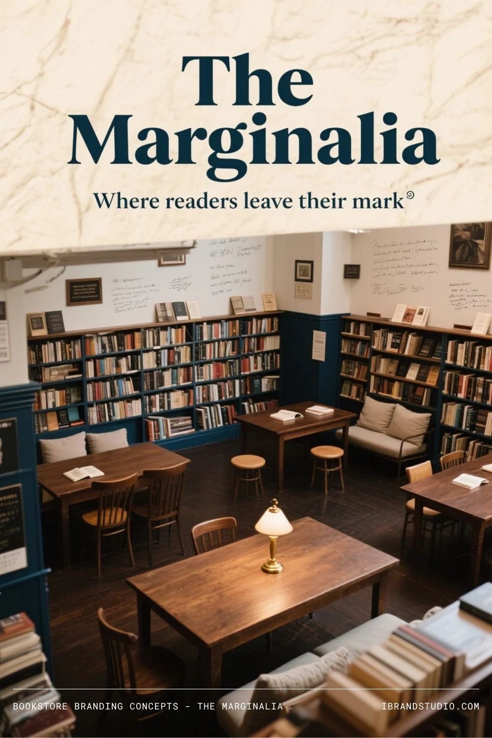
Concept
The Marginalia is built around the idea that reading is personal. This brand celebrates notes in the margins, underlined passages, and thoughtful engagement with text.
Logo Vibe
Refined serif typography with subtle handwritten or pencil-like details—something that feels academic but alive.
Color Palette
Parchment white, charcoal gray, muted ink blue, soft graphite.
Interior Feel
Warm wood tables, scholarly touches, and quiet prompts inviting readers to share thoughts or favorite quotes.
Branding Insight
When customers can participate in the brand—by leaving notes, recommendations, or reflections—they feel ownership. That builds loyalty fast.
2. Spine & Soul
Tagline: Books that stay with you
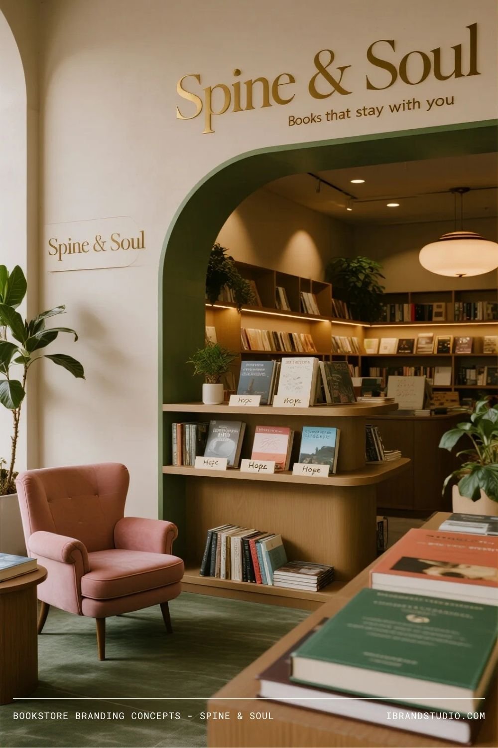
Concept
This bookstore organizes books by emotional experience rather than genre. It’s for readers who choose books based on how they want to feel.
Logo Vibe
Elegant serif typography paired with a gentle symbol—perhaps a heart subtly formed from book spines.
Color Palette
Warm beige, blush tones, forest green, soft gold accents.
Interior Feel
Comfortable seating, warm lighting, plants, and shelves labeled with feelings or life moments.
Branding Insight
Emotion is a powerful differentiator. When brands speak to inner states instead of categories, they feel more human and memorable.
3. Dog-Eared Press
Tagline: Well-read. Well-loved.
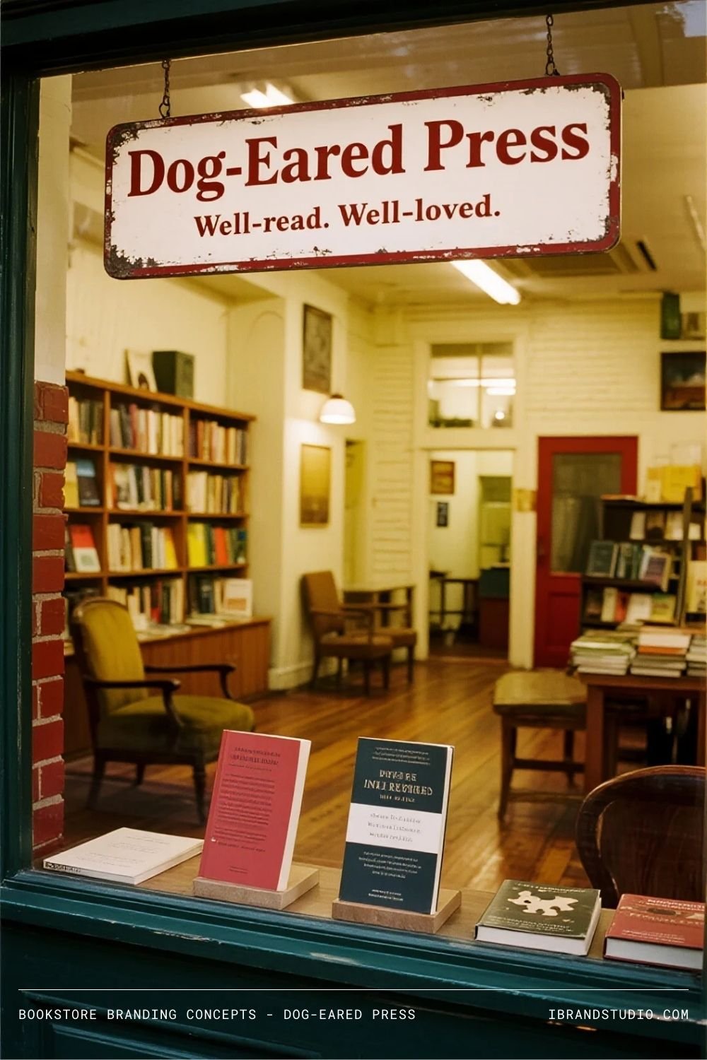
Concept
Dog-Eared Press leans into nostalgia and imperfection. It’s about rereads, classics, and the beauty of books that have lived full lives.
Logo Vibe
Vintage-inspired typography with a slightly worn texture. A folded page corner makes a perfect icon.
Color Palette
Mustard yellow, brick red, cream, dusty brown.
Interior Feel
Mismatched furniture, tightly packed shelves, and a cozy, slightly cluttered charm.
Branding Insight
Not every brand needs to look polished. When imperfection is intentional, it becomes part of the story.
4. The Quiet Chapter
Tagline: A pause, bound in pages
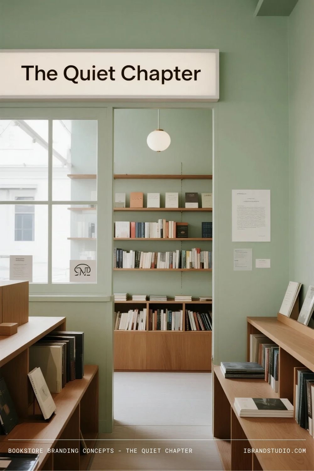
Concept
Minimalist and serene, The Quiet Chapter is designed for readers who crave focus and calm.
Logo Vibe
Clean, spacious sans-serif typography with no unnecessary embellishment.
Color Palette
Soft white, light gray, pale sage, natural wood tones.
Interior Feel
Open layouts, lots of natural light, sound-dampening materials, and minimal signage.
Branding Insight
Restraint can be bold. Removing visual and sensory noise is a strong positioning move in a loud world.
5. Ink & Lantern
Tagline: Stories worth staying up for
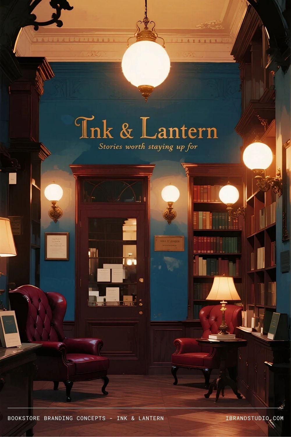
Concept
This brand feels timeless and slightly mysterious—perfect for fiction lovers and night readers.
Logo Vibe
Classic serif typography paired with a lantern or glowing ink illustration.
Color Palette
Midnight blue, warm amber, deep burgundy, antique gold.
Interior Feel
Low lighting, cozy nooks, leather chairs, and shelves that feel endless.
Branding Insight
Lighting isn’t just functional—it’s emotional. It quietly shapes how people experience your brand.
6. Plot Twist Books
Tagline: Expect the unexpected
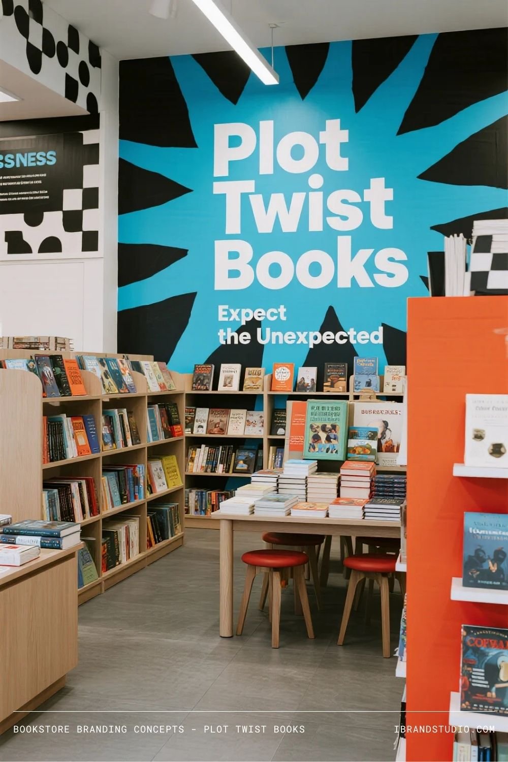
Concept
Modern, energetic, and playful, Plot Twist Books highlights surprising reads and fresh voices.
Logo Vibe
Bold sans-serif type with an intentional visual twist—unexpected cuts, flipped letters, or asymmetry.
Color Palette
Electric blue, coral, black, and white.
Interior Feel
Graphic wall art, witty signage, and creative displays like “blind date with a book.”
Branding Insight
If surprise is your promise, bake it into everything—from signage to layout to promotions.
7. The Open Book Co.
Tagline: Stories for every chapter of life
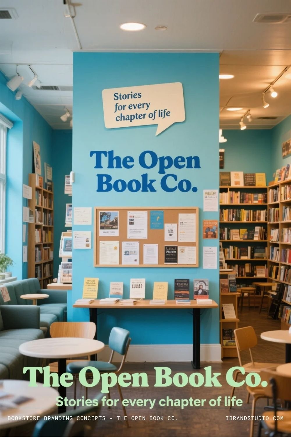
Concept
Community-focused and welcoming, this bookstore is built around connection.
Logo Vibe
Friendly, rounded typography with an open-book symbol.
Color Palette
Sky blue, soft green, warm gray, white.
Interior Feel
Flexible seating, event spaces, local author displays, and visible staff recommendations.
Branding Insight
Community brands work best when people are visible. Faces, voices, and shared stories matter.
8. Boundless
Tagline: No limits. Just stories.
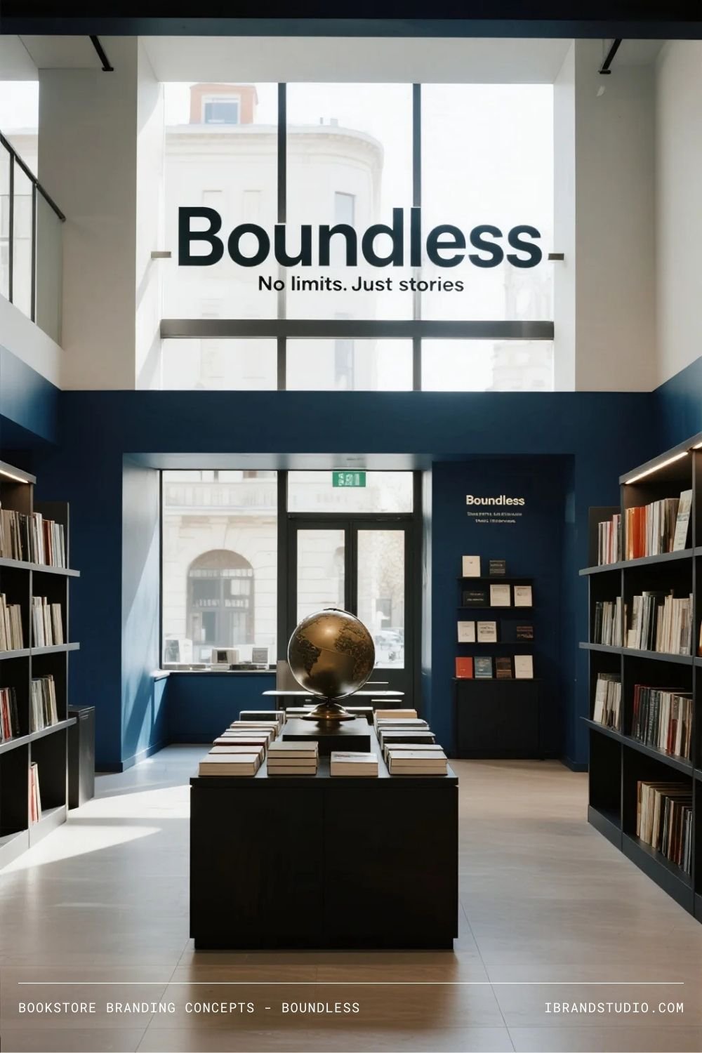
Concept
Boundless is modern, global, and idea-driven—appealing to curious, forward-thinking readers.
Logo Vibe
Clean modern typography with a subtle expanding or horizon-inspired mark.
Color Palette
Deep navy, crisp white, teal, silver accents.
Interior Feel
Open shelving, maps, multilingual sections, and contemporary furniture.
Branding Insight
Aspirational brands benefit from clarity. Clean design signals confidence and ambition.
9. The Last Line
Tagline: You’ll want one more page
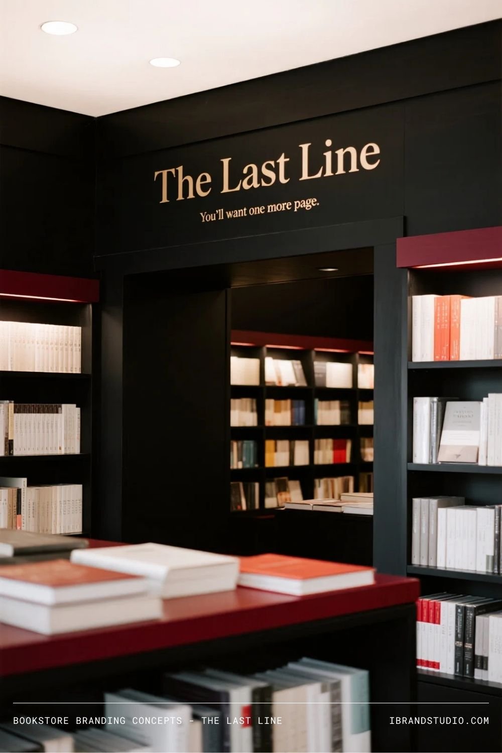
Concept
Moody and literary, this bookstore appeals to serious readers and writers.
Logo Vibe
High-contrast serif typography—simple, dramatic, and intentional.
Color Palette
Black, off-white, wine red.
Interior Feel
Dark walls, spotlighted shelves, quiet intensity.
Branding Insight
Serious doesn’t mean cold. Depth attracts loyalty when it’s authentic.
10. Paper Haven
Tagline: Your refuge in reading
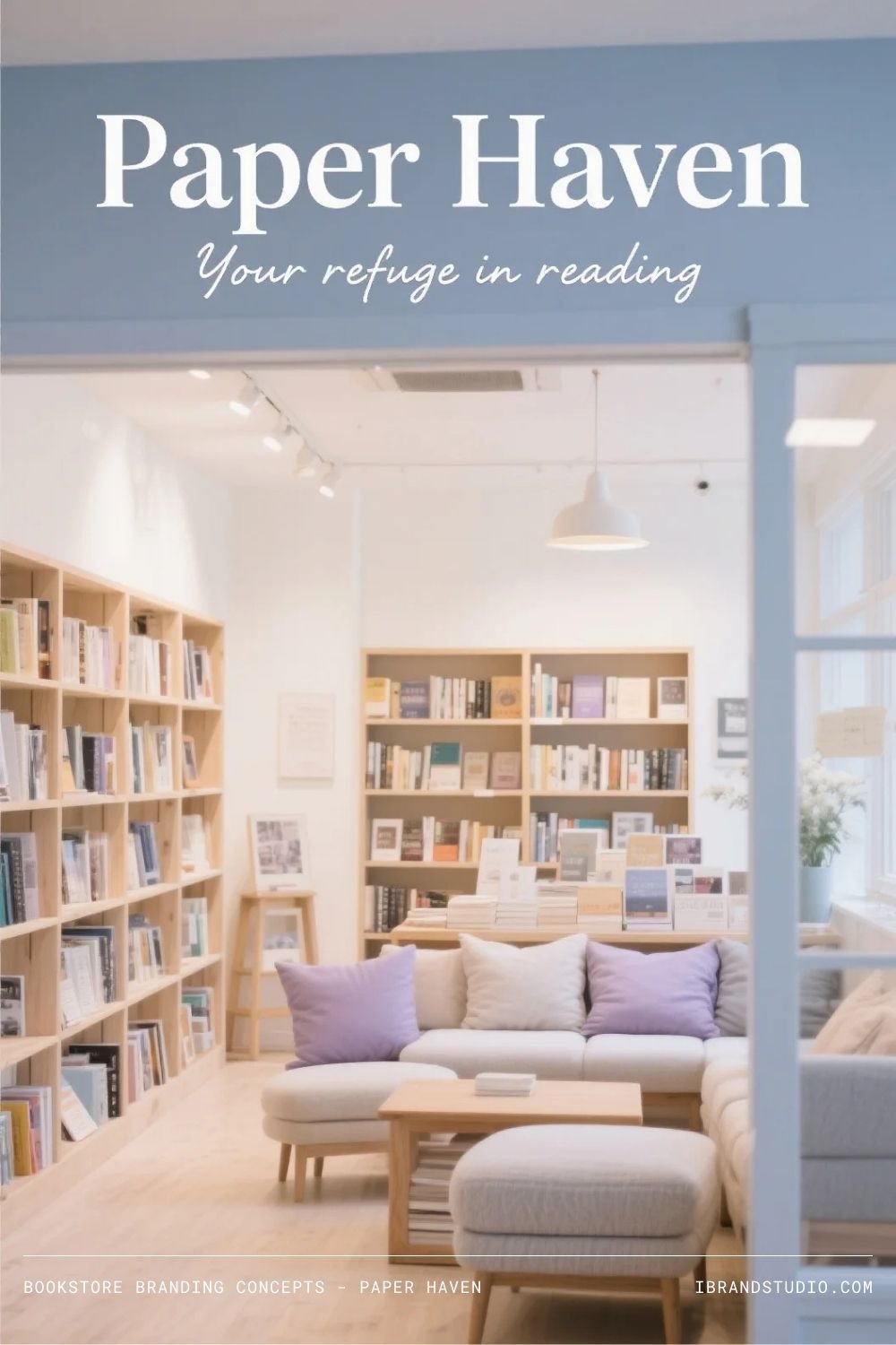
Concept
Paper Haven is all about comfort and restoration—a break from screens and speed.
Logo Vibe
Soft serif or handwritten-style typography.
Color Palette
Cream, lavender gray, soft blue, light oak.
Interior Feel
Cushions, warm textures, gentle music, and a strong sense of ease.
Branding Insight
Design for lingering. The longer people stay, the deeper their connection to the brand.
Final Takeaway: Branding Is the Story Beneath the Books
For entrepreneurs and brand builders, the lesson is simple:
Great bookstore branding isn’t about trends—it’s about intention.
Every successful concept here answers three questions clearly:
- Who is this for?
- How should it feel to be here?
- Why does this place matter?
When those answers align across name, visuals, and interior design, you’re not just opening a bookstore—you’re creating a brand people want to return to.