Celestial Identity: 12 Star Logo Concepts That Make Brands Truly Shine
Stars are one of the most timeless symbols in visual identity design. They represent excellence, ambition, guidance, and achievement—qualities that almost every brand wants to communicate.
Yet despite their popularity, star logos are often misused, becoming generic or visually forgettable.
At ibrandstudio.com, we believe great branding is never about decoration alone. It’s about strategy, clarity, and storytelling.
A star logo should feel intentional, aligned with brand values, and visually distinct—never like a stock icon pulled from a library.
In this article, we’ll explore 12 star logo concepts through a branding-focused lens.
Each concept breaks down the visual idea, strategic meaning, ideal use cases, and practical design tips—so graphic designers and branding enthusiasts can create star logos that feel refined, relevant, and memorable.
Why Star Logos Still Work in Modern Branding
Despite design trends shifting toward minimalism and abstraction, star logos remain powerful because they are:
- Universally understood – Stars symbolize success, leadership, and aspiration across cultures
- Highly versatile – They adapt easily to minimalist, luxury, retro, or futuristic styles
- Instantly recognizable – A star holds its form even at small sizes
- Emotionally charged – Stars suggest “top tier,” “award-worthy,” or “trusted quality”
The real challenge is execution. Without a strong concept, a star logo quickly feels generic. The following concepts will help you avoid that trap.
1. The Classic Five-Point Star
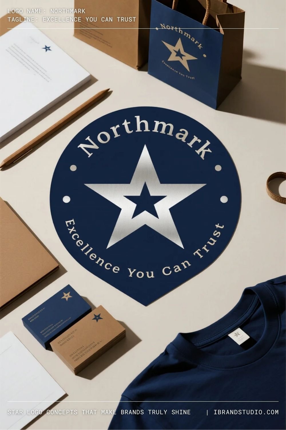
Concept overview:
A balanced, symmetrical five-point star with clean geometry.
Brand meaning:
This star represents reliability, trust, and achievement. It’s familiar, which makes it reassuring—when designed well.
Best suited for:
Corporate brands, institutions, sports teams, certifications, and educational organizations.
Branding tip:
Precision matters. Subtle adjustments in angle, spacing, and proportion can elevate a basic star into a professional mark.
2. Minimal Outline Star

Concept overview:
A star drawn using thin strokes or outlines, relying on negative space.
Brand meaning:
Outline stars feel modern, calm, and confident without being aggressive.
Best suited for:
Beauty brands, wellness businesses, creative studios, and personal brands.
Branding tip:
Test the logo at small sizes early. Outline stars must remain legible as social icons and favicons.
3. Geometric Star Construction
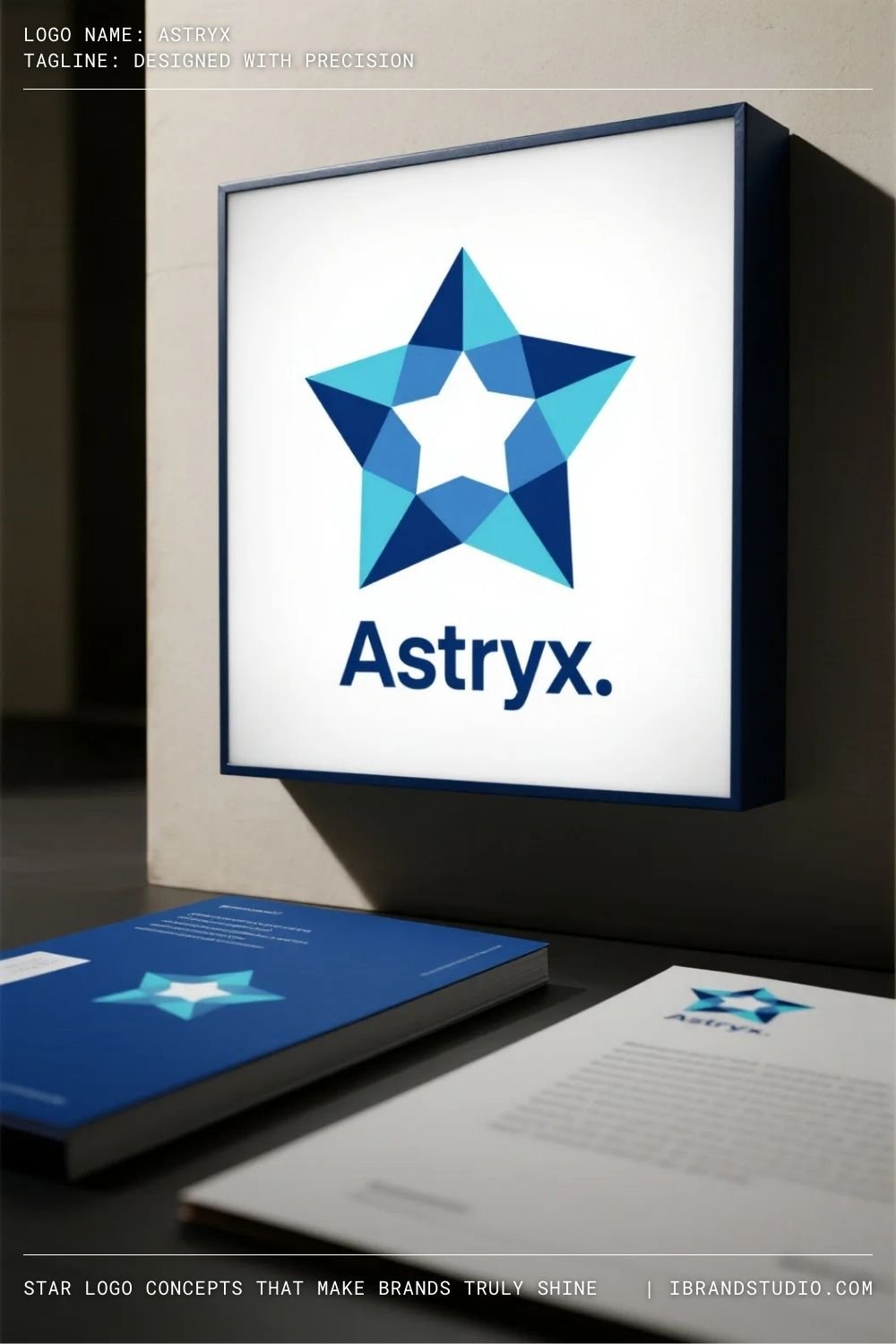
Concept overview:
A star built from precise geometric systems—circles, grids, or angular forms.
Brand meaning:
This approach communicates logic, structure, and innovation.
Best suited for:
Tech startups, architectural firms, digital agencies, and data-driven brands.
Branding tip:
Consistency is key. A geometric star should follow a clear construction logic that can be documented in brand guidelines.
4. Abstract Star Symbol
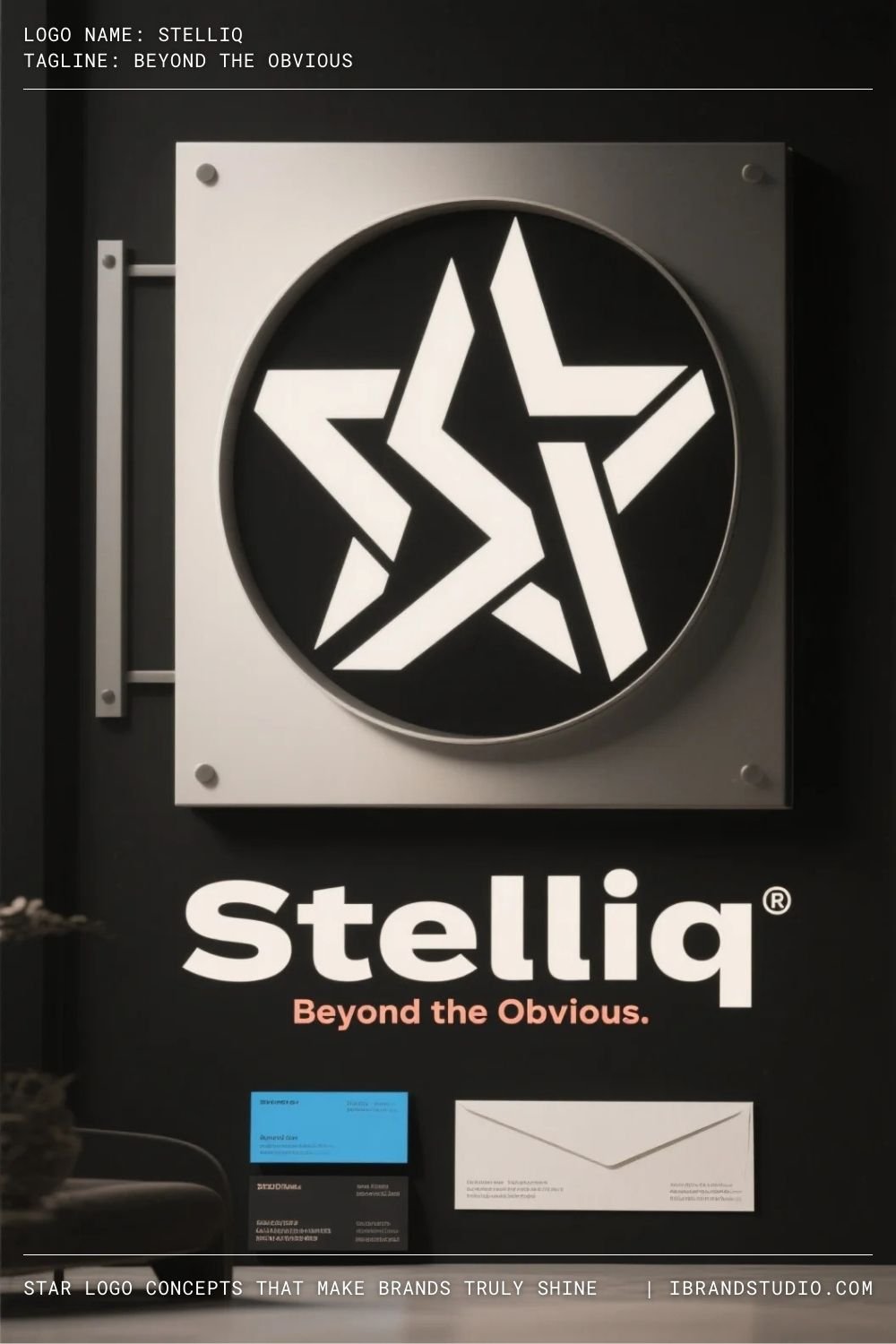
Concept overview:
A star suggested through intersecting shapes or abstract forms rather than a literal outline.
Brand meaning:
Abstract stars feel contemporary and distinctive, helping brands stand out in crowded markets.
Best suited for:
Creative agencies, modern startups, digital platforms.
Branding tip:
Abstraction should still communicate intention. If the star needs heavy explanation, the concept may be too complex.
5. Negative Space Star
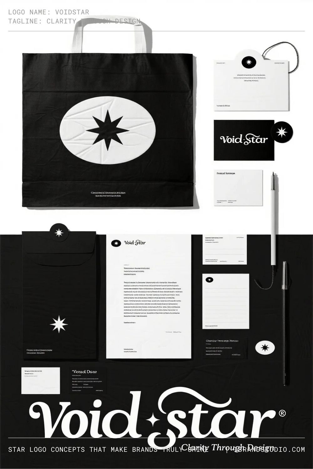
Concept overview:
A star revealed through empty space within another shape.
Brand meaning:
Negative space logos feel clever, premium, and thoughtfully designed.
Best suited for:
High-end brands, marketing firms, and conceptual identities.
Branding tip:
Balance contrast carefully. The star should appear naturally, not forced into the composition.
6. Star and Lettermark Integration
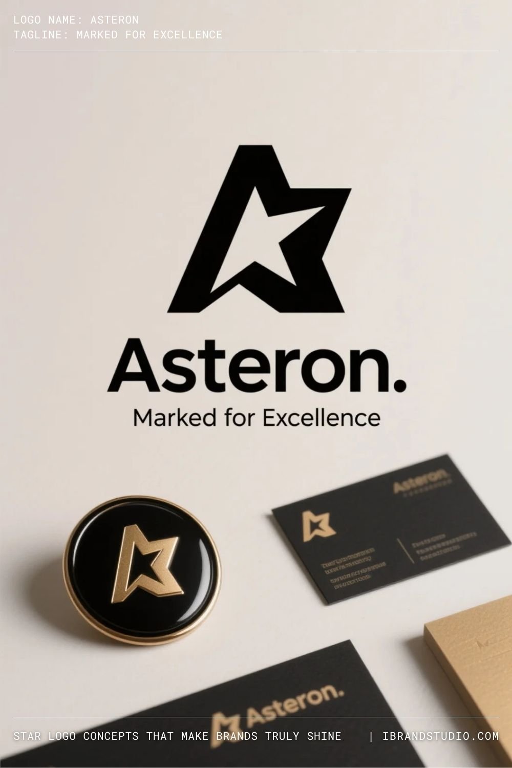
Concept overview:
A star merged into a letterform—often initials or monograms.
Brand meaning:
This creates a strong proprietary identity that feels custom-made.
Best suited for:
Personal brands, fashion labels, boutique studios, startups.
Branding tip:
Let typography lead. The star should enhance readability, not disrupt it.
7. Vintage Badge Star
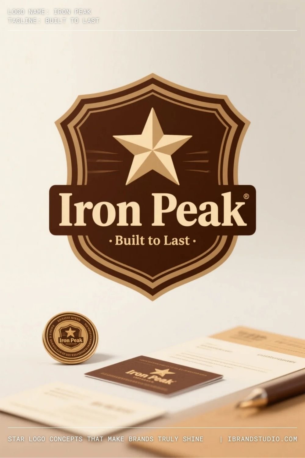
Concept overview:
A star enclosed within a badge, seal, or emblem inspired by heritage design.
Brand meaning:
Badge-style stars evoke craftsmanship, authenticity, and tradition.
Best suited for:
Coffee brands, barbershops, breweries, heritage businesses.
Branding tip:
Pair with classic serif or slab typography and muted color palettes for authenticity.
8. Dynamic or Shooting Star

Concept overview:
A star designed with motion—using angled lines, trails, or directional flow.
Brand meaning:
Motion suggests progress, speed, and ambition.
Best suited for:
Technology companies, logistics brands, media platforms, sports-related businesses.
Branding tip:
Keep movement subtle. Overly complex motion reduces scalability and clarity.
9. Multi-Star Luxury Composition
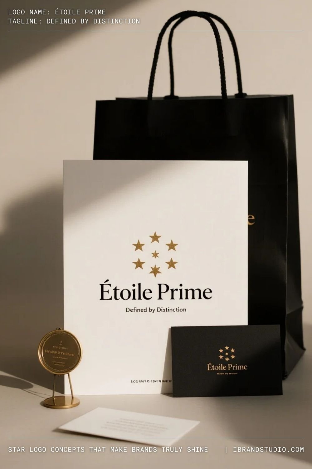
Concept overview:
Several stars arranged in a refined, symmetrical layout.
Brand meaning:
Multiple stars imply ranking, prestige, and premium quality.
Best suited for:
Hotels, real estate, luxury services, hospitality brands.
Branding tip:
Luxury is about restraint. Fewer elements, generous spacing, and refined typography make a stronger impact.
10. Hand-Drawn Star
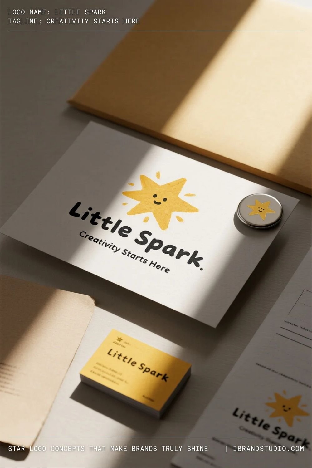
Concept overview:
An intentionally imperfect star with a sketch or hand-crafted feel.
Brand meaning:
Hand-drawn stars feel friendly, creative, and human.
Best suited for:
Children’s brands, creative workshops, lifestyle businesses, indie projects.
Branding tip:
Digitally refine hand-drawn elements to maintain consistency across print and digital media.
11. Cosmic or Celestial Star
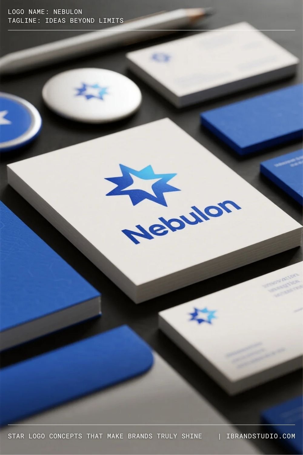
Concept overview:
A star inspired by astronomy—often using gradients, glow effects, or orbital references.
Brand meaning:
Celestial stars communicate imagination, innovation, and future-focused thinking.
Best suited for:
AI startups, entertainment brands, science-based businesses.
Branding tip:
Always create a flat version. A strong logo must work without effects.
12. Star as a Supporting Brand Element
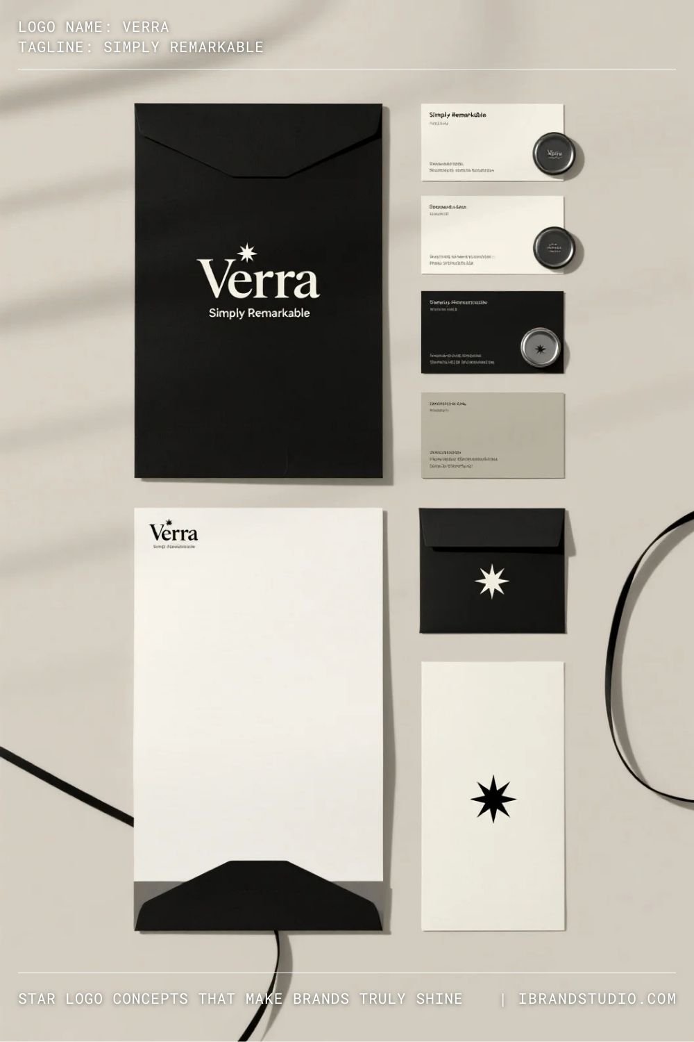
Concept overview:
A star used as an accent rather than the primary logo mark.
Brand meaning:
This adds flexibility while reinforcing symbolic meaning across the brand system.
Best suited for:
Lifestyle brands, fashion labels, personal brands.
Branding tip:
Define clear usage rules so the star remains consistent across touchpoints.
Common Star Logo Design Mistakes
Even experienced designers can fall into these traps:
- Using generic stock star icons
- Overcrowding the logo with multiple stars
- Ignoring scalability and contrast
- Relying too heavily on gradients
- Designing without a clear brand strategy
At ibrandstudio, we always emphasize this principle: concept first, style second.
How to Design a Star Logo That Feels Unique
To elevate your star logo design:
- Customize geometry and proportions
- Combine stars with typography intentionally
- Use negative space thoughtfully
- Test across real-world applications
- Build a clear brand story behind the symbol
A well-designed star logo doesn’t just look good—it communicates value.
Final Thoughts
Star logos endure because they tap into something universal: the desire to stand out, to lead, and to be remembered.
But strong branding isn’t about using popular symbols—it’s about reinterpreting them with purpose.
For graphic designers and branding enthusiasts, star logo design is an opportunity to transform a familiar shape into a distinctive identity.
With the right concept, structure, and restraint, a star can become a powerful brand asset rather than a visual cliché. Design intentionally, refine relentlessly, and let your branding shine—strategically.
