Building a Scalable Brand Identity System for Tech Startups: A Practical Framework
A logo is not a brand. This is something most designers understand intuitively, but many startup founders learn the hard way.
They invest in a beautiful mark, pick a color palette they like, choose a typeface that feels modern — and six months later, their marketing materials look like they were produced by five different companies.
The problem is not bad design. The problem is the absence of a system.
A brand identity system is a set of interconnected design decisions — visual, verbal, and structural — that work together to create a consistent, recognizable presence across every touchpoint.
For technology startups operating in competitive markets, this system is the difference between a brand that scales gracefully and one that fragments with every new hire, product launch, or marketing campaign.
This article breaks down the practical framework for building brand identity systems that work specifically for tech startups — companies that move fast, iterate constantly, and need their brand to keep pace with their product.
Why startups need systems, not just assets
When a startup has three people, brand consistency is easy. The founder approves every design. The same person writes the website copy and the investor deck.
Visual decisions happen informally, guided by shared taste.
At fifteen people, this breaks down. The marketing lead creates social media graphics with slightly different colors.
The product team uses a different type hierarchy in the app. The sales deck uses a logo variation that nobody approved. The careers page looks like it belongs to a different company.
This fragmentation is not a design failure — it is a systems failure. Without documented rules and reusable components, every new person who touches the brand makes independent decisions that gradually erode consistency.
The cost is cumulative. Each inconsistent touchpoint slightly weakens brand recognition.
Over twelve months, the compound effect is significant: customers perceive the company as less established, less professional, and less trustworthy than competitors with cohesive identities.
A brand identity system solves this by replacing individual judgment with shared infrastructure.
Instead of asking “what font should I use for this headline,” a team member opens the design system and finds the answer already defined.
The four layers of a startup brand system
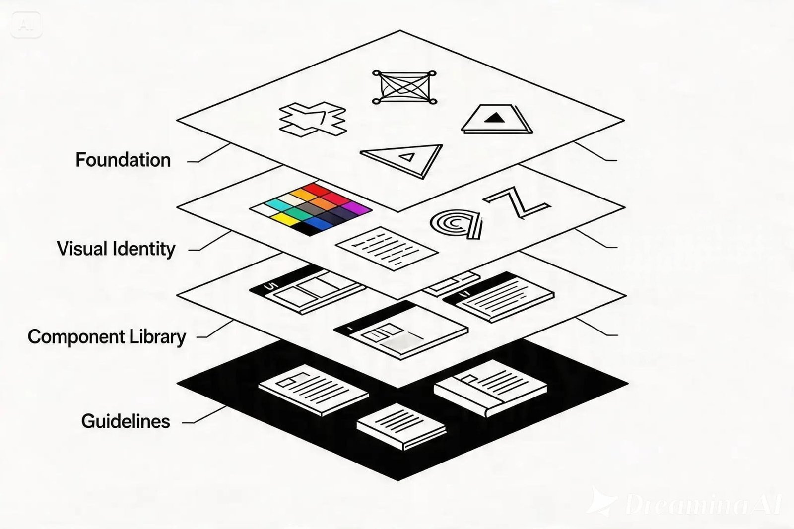
Effective brand identity systems for tech startups operate across four distinct layers, each building on the one below it.
Layer 1: Strategic foundation
Before any visual design begins, the strategic layer establishes the conceptual territory the brand occupies.
This includes positioning — where the company sits relative to competitors and what makes it meaningfully different.
It includes audience definition — not demographic abstractions, but specific characterizations of the people who evaluate and purchase the product.
And it includes brand attributes — the personality traits that should come through in every piece of communication.
For a B2B SaaS company, the strategic foundation might define the brand as “technically rigorous but approachable, confident without being aggressive, modern without being trendy.” These aren’t marketing platitudes — they’re decision-making filters.
When a designer is choosing between two illustration styles, or a copywriter is deciding on tone for an error message, the brand attributes provide clear guidance.
Layer 2: Visual identity core
The visual identity core comprises the foundational design elements: logo and its usage rules, color system, typography, and spatial principles.
For startups, the logo needs to function across a wider range of contexts than most founders anticipate.
It appears as a 16-pixel favicon, a social media avatar, a conference banner, a product loading screen, and an investor presentation title slide.
Designing for this range of applications from the beginning prevents the common problem of a logo that looks beautiful at large sizes but becomes unreadable at small ones.
The color system should include a primary palette for core brand applications and an extended palette for UI, data visualization, and status indicators.
Defining both upfront prevents the gradual accumulation of off-brand colors that happens when product and marketing teams independently solve color problems.
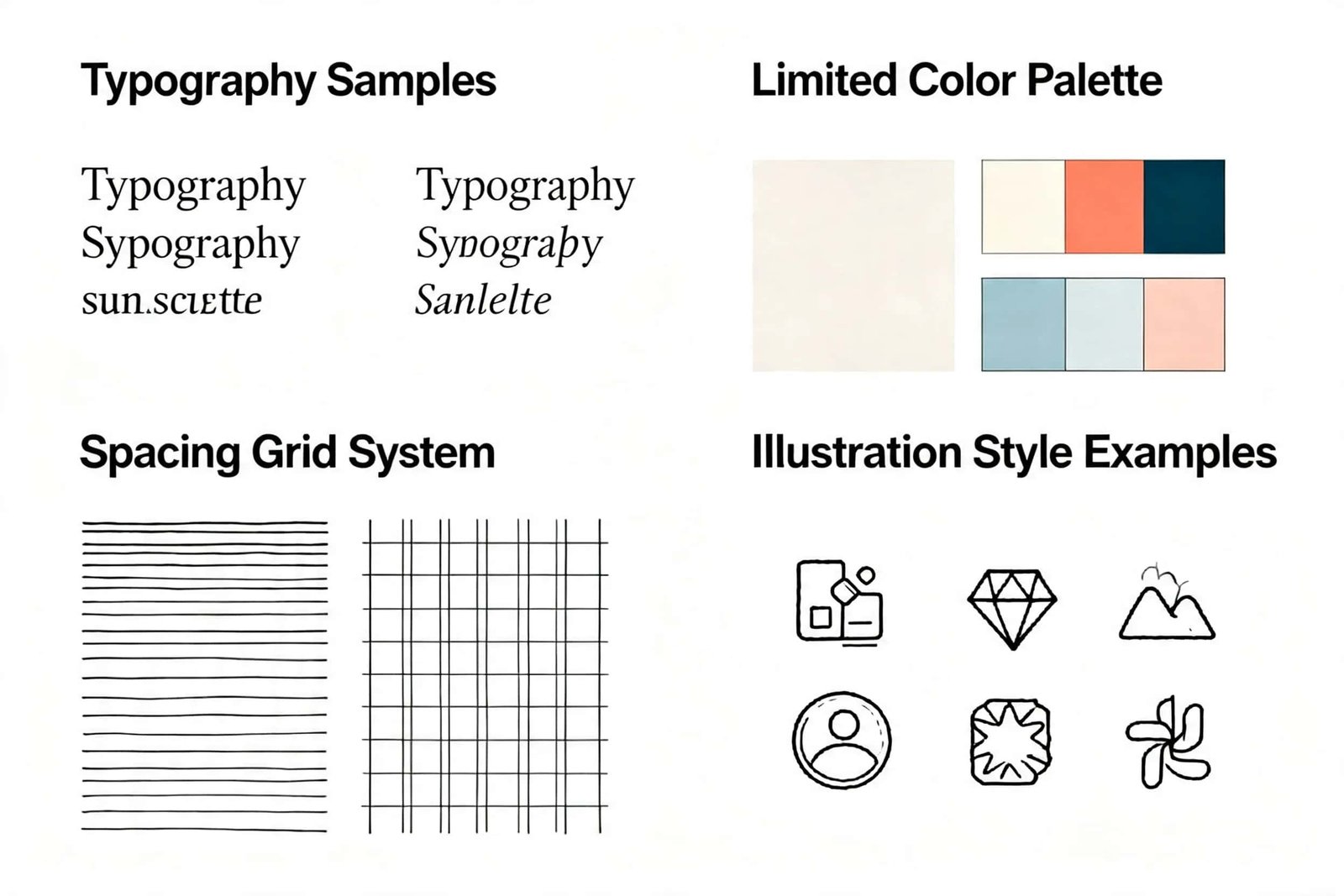
Typography should specify a primary typeface and a systematic hierarchy: heading levels, body text, captions, labels, and code.
Variable fonts are increasingly the standard for tech brands because they offer weight flexibility within a single font file, which improves both design range and web performance.
Layer 3: Component library
This is where the system becomes practically useful for teams. The component library translates visual identity principles into reusable elements: button styles, card layouts, icon sets, illustration guidelines, photography direction, social media templates, and presentation frameworks.
For tech startups, the most critical components are those used most frequently: the website header and navigation, the blog post template, the social media image format, the investor deck master slide, and the email signature. Getting these right eliminates the vast majority of day-to-day brand consistency problems.
The component library should live in Figma or a similar collaborative design tool, accessible to everyone on the team — not just designers.
When a founder needs to create a quick LinkedIn post graphic, they should be able to open a template, change the text, and export a perfectly on-brand image in under two minutes.
Layer 4: Guidelines and governance
The final layer documents how the system should be used, including rules, examples, and common mistakes. Good brand guidelines for startups are short, visual, and practical.
They show more than they tell. Each rule is accompanied by a “do” and “don’t” example that makes the principle immediately clear.
The most effective startup brand guidelines are living documents — hosted digitally, updated regularly, and integrated into the tools the team already uses.
A 200-page PDF that lives in a shared drive and nobody reads is worse than no guidelines at all, because it creates the illusion of governance without the reality.
Practical decisions that matter most
After working with dozens of early-stage companies, agencies that specialize in startup branding consistently identify a set of design decisions that have outsized impact on how a tech brand is perceived.
Typography choice is the single most influential visual decision. The typeface appears on every page of the website, every slide of every deck, every line of every email.
A distinctive, well-chosen typeface creates more brand recognition per dollar invested than almost any other design element.
The trend in 2026 leans toward custom or semi-custom variable fonts that give brands typographic flexibility while maintaining a unique voice.
Color restraint separates professional brands from amateur ones. The most effective tech brand color systems use one dominant color, one accent color, and a carefully defined neutral palette.
Startups that try to use five or six colors end up with visual noise. The constraint forces clarity.
Illustration and photography styles often get neglected but dramatically impact brand perception.
A consistent illustration style — whether geometric, organic, isometric, or abstract — creates visual unity across blog posts, feature pages, and social media.
The key is defining rules that are specific enough to maintain consistency but flexible enough that content creators don’t need custom illustrations for every new piece.
Spacing and layout principles are the invisible backbone of professional design.
Consistent spacing — between elements, around containers, in margins — creates a visual rhythm that audiences feel even if they can’t articulate it.
Define a spacing scale (typically based on multiples of 4 or 8 pixels) and apply it everywhere.
Building for Webflow, Framer, and modern platforms
A significant shift in startup branding over the past two years is the move from static design deliverables to integrated design-and-development systems.
Modern website platforms like Webflow and Framer allow brand identity decisions to be implemented directly in code-free environments, eliminating the traditional handoff gap between design and development.
This changes what a brand deliverable looks like. Instead of delivering a Figma file and hoping the developer interprets it faithfully, forward-thinking agencies deliver a live, editable website where every brand decision — typography, color, spacing, components — is already built and functioning.
For startups, this approach has a practical advantage: the marketing team can update content, launch new pages, and create campaigns without needing engineering resources.
The brand system is embedded in the platform itself, making consistency the default rather than the exception.
The evolution principle
The final principle is perhaps the most important for early-stage companies: your brand system should be designed to evolve.
A seed-stage startup does not need the same level of brand sophistication as a Series C company. But it does need a foundation that can grow without being replaced.
This means making strategic choices that are specific enough to be distinctive yet flexible enough to accommodate new products, markets, and audiences.
The practical way to achieve this is to over-invest in the strategic and typographic layers — these are the hardest to change later — and allow illustration style, photography direction, and campaign-specific elements to remain more fluid. Build the skeleton strong.
Let the muscles develop over time. And resist the temptation to lock in every visual detail at the earliest stage.
A brand system that can breathe will outlast one that is rigid, no matter how polished the rigid version looks on day one.