How To Improve A Logo with A Few Necessary Tweaks
 Image by Ramotion on Dribbble
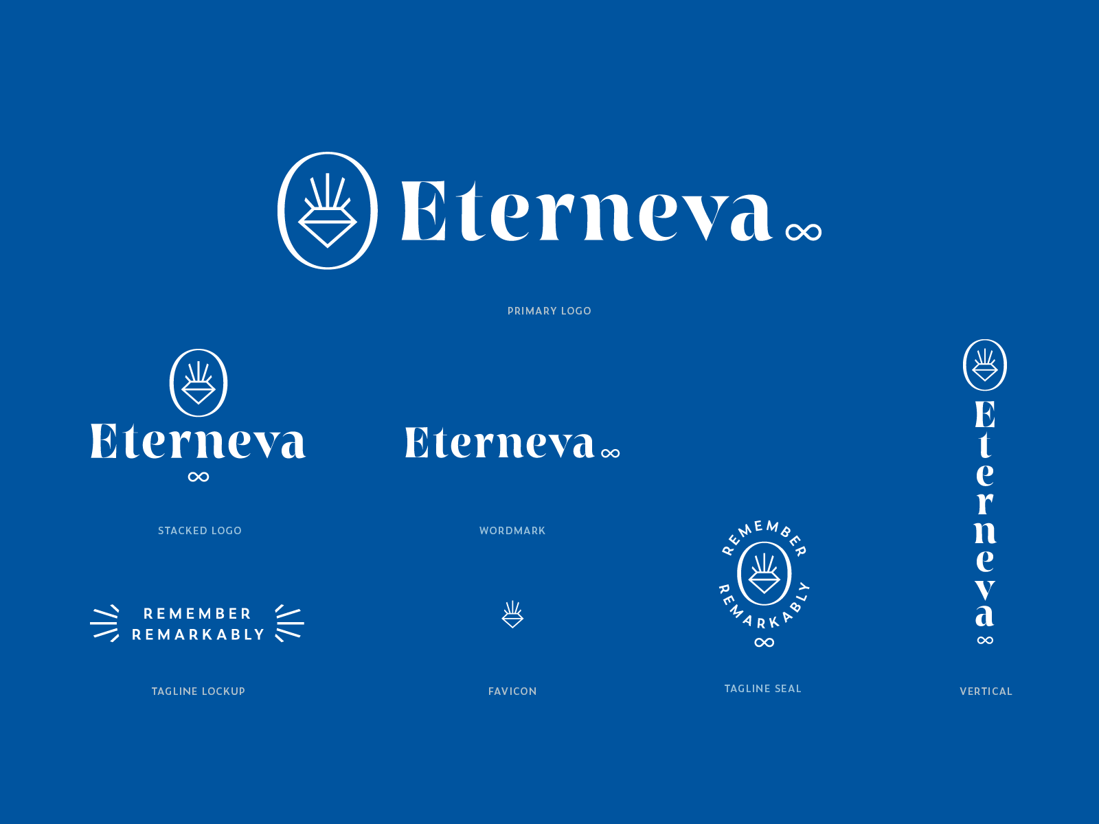
A logo is not just the symbol of a business that shows its products or services. It helps in creating a solid and clear brand identity. So there are quite a few purposes for a logo in the business world. First of all, it sends a message to your audience, and well-made ones can bring loyal customers.
But what do you do when you already have a logo but want to improve it. Updating one is not something that businesses usually do. There is a fear of losing the already existing clients or sending away potential ones. Still, changing your logo as the business grows is one of the most important aspects of a company. When the brand evolves in the right way with a company, it can bring awareness and pride to your one.
In this article, there are different ways of how to improve a logo explained.
What is a brand?
A logo is a perfect introduction to a brand. The logo needs to reach a certain audience, and when you design it, be aware of that. Writing how you want the brand to feel can be a great exercise to start with.
Diversity
Researching is also a good way of getting creative and generating some new ideas. Think about what your logo is missing.
A good exercise is to note the words that connect with your business and then search for image symbols that relate. You can’t go wrong with this, and you will also have fun.
For example, WooCommerce and Prestashopk, two competing companies, have done this quite well with their logos.
Use psychology
This is more than obvious, but many people don’t use psychology in their logo designs. First of all, if you want to make an impact, your logo needs to be friendly with the subconscious human instincts.
With an understanding of human psychology, you can create better designs that are going to connect at a subliminal level. So get ready to read some books and even take some courses if you want to go for this.
Strip down the logo
If you are stripping down your logo design, you are going to end up with a simple one. This is a plus because people can recognize it easier.
Check some campaign websites from the US and see the candidates’ logos. Are they complicated? Yes, maybe the bad ones. But except those, the logos are really simple.
If your logo is a bit complicated at the moment, search for the elements that are in excess.
As an example, you could have a simple typeface logo that has some extra design elements. What happens if you take those elements off and keep just the text?
You might get the logo that you were searching for.
Fashion
Minimalism is a big trend that applies to all kinds of designs. So it is quite obvious that it works for logo designs as well. Striping it down can make you sustain the attention of existing clients or potential customers.
Choose the right colors
Colors have an important role in clarifying the message of a brand. Red is a strong color that usually connects people with feelings of passion and energy. If you go blue, you will have a brand color that is more associated with trust and balance.
This is why it is important to know what kind of colors you use in your logo. You don’t want to get the mixture wrong because people will see it and not really enjoy the message.
Look at Calendly and Doodle, for example. They both chose blue as their color because they want their users to trust their brands. Same thing happens with fintech apps or financial companies, in general.
The Font
You can also play with the font that you are using. Maybe it’s time for a change or simply make some small adjustments to it. Just try out stuff and see if any new combination that you find is going to be of help.
If your budget is a bit tight, you can go for a free for commercial use font, like the ones from Font Squirrel. Otherwise, it’s best to either go for something custom or a premium font.
Company/Product
When we focus on logos that show too much, they can end up looking bad, like in the case of open source software companies who either don’t care about their logo or care too much and embelish it with strange graphics.
However, on the opposite side, it is easy to get caught in the idea that minimalism is always the best choice. You need to find a balance between both of them.
Keep it easy and flexible
It is known that a good logo feels simple and flexible. This is what you want your logo to feel like. In current times, logos appear on all screens, and there are more and more brands that have their own. Together with this comes the responsibility of designing other elements in a similar way as well. These are icons, avatars, and banners. Always consider other digital content designs besides your logo only, you need to create them all.
Space
Logos need space, and if yours has both a wordmark and an icon, pay attention to it. The space between them needs to look spacious and breathable.
Don’t overlap tet with other elements unless it is necessary. If you let your logo enough space, this means that it doesn’t look messy. Remember that sometimes you are going to scale down the size of it. If it doesn’t have enough room, it is going to look very bad when it gets printed out.
Give it meaning
Here are some other great tips that you need to consider when updating your logo:
- Consider what is different about your business and what makes it stand out
- Think about the core business values and define them
- Ask yourself who is your target audience, understand their view so you can get closer
- Have patience, building a brand like Nike or Audi takes a lot of time and hard work
Conclusion
In conclusion, there are many small changes that you can make to your existing logo. You can play around with its colors, font, or icon. However, the most important change that you make to it is how you feel about it.
Customers are going for sure to notice any change that you make, especially if they have been regulars. In the end, it is your process. Test stuff out and see what changes are going to get you closer to the end design.
About the Author!
Bogdan is a designer and editor at DesignYourWay. He’s reading design books the same way a hamster eats carrots, and talks all the time about trends, best practices and design principles.