
A logo no longer lives in just one place. It appears on a smartwatch the size of a postage stamp, in a car dashboard, on a 75-inch television, and inside a search-engine result, all on the same day.
If your logo fails to scale, your brand fades, or worse, looks broken, exactly where you need trust the most.
A responsive logo solves that problem by flexing to fit every screen without losing its voice.
Key Takeaways
- A responsive logo is a family, not a single file.
- If it reads on a smartwatch, it will shine anywhere.
- Choose one unmistakable visual core and defend it at every size.
- Test on real hardware under real lighting.
- Document versions, export formats, and alt text for SEO gains.
- Maintain the system, brands evolve, and your logo toolkit should too.
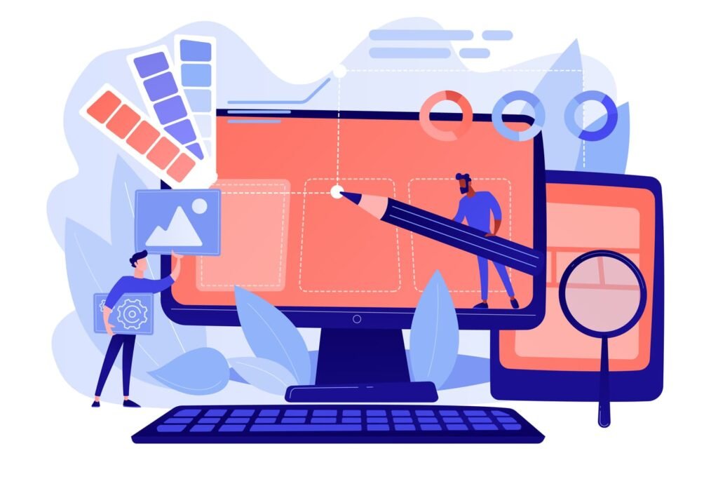
What Is a Responsive Logo?
A responsive logo is a system of logo variations built from one core idea. Each version is tuned for a different display size or context:
| Version | Where It Shows Up | Typical Details |
| Full logo | Desktop sites, print ads, packaging | Icon + full wordmark + tagline |
| Stacked logo | Tablet apps, slide decks | Icon + wordmark |
| Icon-only | Mobile menus, social avatars | Simplified symbol |
| Micro mark | Watch faces, favicons | One bold shape or letter |
By planning these levels ahead of time, you keep consistency while giving every viewer the best possible experience.
Why Old-School Logos Break on Modern Screens
Older marks were drawn when screens were rare and resolution was low. They often collapse under today’s demands:
- Tiny real estate. A watch face is only about 200 px wide; intricate lines disappear.
- High-resolution displays. 8K TVs blow up flaws, jagged edges and low-quality gradients look amateur.
- Variable lighting. In bright sun a muddy color scheme turns invisible; in dark mode a thin outline vanishes.
- Touch targets. On phones, logos often double as buttons. They must read well and invite taps.
- File-size strain. Heavy PNGs slow sites and hurt Core Web Vitals, leaving users frustrated and search engines unimpressed.
When companies try to bolt on fixes, they quickly run into edge cases.
Teaming with a seasoned Houston web design company often reveals that the cheapest solution is a fresh, purpose-built responsive logo system, not another round of tiny tweaks.
Core Principles of Responsive Logo Design
1. Scalability
Draw with vectors and rely on bold geometry. Fine strokes or busy drop shadows rarely survive reduction.
2. Simplicity
Strip away anything that does not express brand personality. Think of a logo as a headline, not a paragraph.
3. Flexibility
Design several breakpoints, just like responsive web layouts. Not every jump needs a full redesign; small tweaks count.
4. Context Awareness
Plan color and contrast for light and dark modes. Provide monochrome versions for engraving, embroidery, or newsprint.
Step-by-Step Guide to Crafting Your Responsive Logo
1. Research and sketch
List the smallest and largest places your mark will live. Sketch quick thumbnails at those extremes first.
2. Establish a visual core
Choose one unmistakable element, shape, initial, or motif. Whatever happens, that stays.
3. Build breakpoints
Decide at which pixel widths you will swap versions (e.g., 192 px, 64 px, 16 px).
4. Design in grayscale first
Value contrast beats color when space is tight.
5. Add color, texture, and motion
Gradients or animation can enrich larger sizes without burdening small ones.
6. Test in context
Export PNGs and drop them into mock-ups: phone home screens, smart-watch faces, and 8K hero banners.
7. Gather feedback
Ask folks who did not work on the project to identify the brand at each size. If they hesitate, simplify again.
8. Document everything
A brand style guide should outline usage rules, file names, and accessibility notes.
Testing Across Phones, Watches & 8K Screens
| Device | Pixel Density | Test Checklist |
| Smartwatch | ~300 ppi | Legible at arm’s length? Exportable to .SVG? |
| Smartphone | 450–550 ppi | Sharp in dark and light mode? Aligns with app-icon grid? |
| Laptop/Desktop | 120–220 ppi | Scales smoothly when the browser zooms? |
| 8K TV/Billboard | 30–100 ppi | Holds up when viewed from 10 ft? Edges crisp at 100 %? |
Use emulator tools or real hardware whenever possible. View from typical distances. A logo that shines at 15 inches might blur at 15 feet.
Common Mistakes and How to Dodge Them
- Stuffing in text. Taglines vanish on small screens, keep them out of micro marks.
- Over-relying on color. Brands need to work in black, white, and one-color print.
- Ignoring motion limits. A looping animation may work online but fail in email headers or PDFs.
- Saving only as PNG. Always export vector originals for future-proof scaling.
- One-size-fits-all mindset. Treat each breakpoint as a unique design problem, not a simple resize.
SEO and Brand Benefits
Search engines reward consistent branding. A responsive logo package helps in three ways:
- Faster page loads. Serving the smallest fitting logo cuts file size, improving Core Web Vitals.
- Clear alt text mapping. Each variant can have precise alt text (“Brand icon,” “Brand wordmark”) boosting image search relevance.
- Reduced bounce rates. A crisp, legible mark on every device builds trust instantly, keeping visitors on-site longer.
Bonus: Social platforms favor square or circular avatars. Having an icon-only version ready prevents awkward auto-crops and protects your click-through rate.
Maintaining Consistency Over Time
A responsive logo is not a single file but a living system that demands upkeep:
- Seasonal modes. Swap color palettes for holidays while retaining shape.
- Interactive states. On hover, large marks can animate subtly; micro marks stay still to save resources.
- Localization. Keep the symbol consistent, but adjust wordmarks for different scripts.
- Accessibility checks. Re-test contrast ratios whenever you tweak colors to stay WCAG compliant.
- Version control. Store files in a shared repository so designers, marketers, and printers always pull the latest assets.
Final Thoughts
Brands win hearts when they show up polished everywhere their audience looks. In a world of endless screen sizes, a responsive logo is your passport to clarity and credibility.
Invest the time now, and your mark will stand tall, whether it’s glowing on a tiny wrist screen or stretching across an 8K stadium display.