Typography Tips: How to Create an Impressive App Design

“Too small, too large, too clumsy, too isolated” – With user experience gravitating higher attention in the mobile industry, such comments related to typography has become a normal thing in the market.
Mobile app designers have started focusing on introducing the right typography into their app design process and develop a higher intriguing user experience. But still, there are many who are still confused about why and how to make the best use of this design element for boosting user interactions within their apps and make the users stay longer on their platform.
If you belong to this category, this article will be a good read for you.
Here, we will look into the benefits of considering typography and the best tips to choose the right typography elements and create an impressive design, starting with the definition of what is Typography.
Typography
Typography refers to the technique of representing the written words such that they seem legible, engaging, and readable. In other words, typography is the process of selecting the right typefaces, line lengths, styles, point sizes, and letter spacing (tracking) such that they altogether enhance the app appearance and provide you with the following benefits.
Key Benefits of Considering Typography in App Design Process:
1. Typography Encourages Visual Hierarchy
Typography influences the appearance of your mobile application. A right typography brews positive vibes and encourages the users to enjoy the pleasant experience of interacting with your platform. Whereas, a wrong typography impacts their interest in your application; compelling them to get an escape from your platform at the earliest.
2. It Improves Readability
Another reasons why using typography to create an impressive brand image is important is that the typography you choose also brings a major impact on the app content readability. If you pick the right typography, it eases the process of reading content added to the app. It helps to understand every single detail comfortably and proceed further, which eventually results in building better business relations. Whereas, the inappropriately used typography might look cool, but disrupts the user readability experience.
Let me explain this with an example:

Suppose, you add a typography like the one shown in the image above to your mobile app. Regardless of how innovative your app features and services are, the user won’t be able to understand anything and respond accordingly. This will irritate the users, which will ultimately affect the user engagement and retention rate.
Now see this:
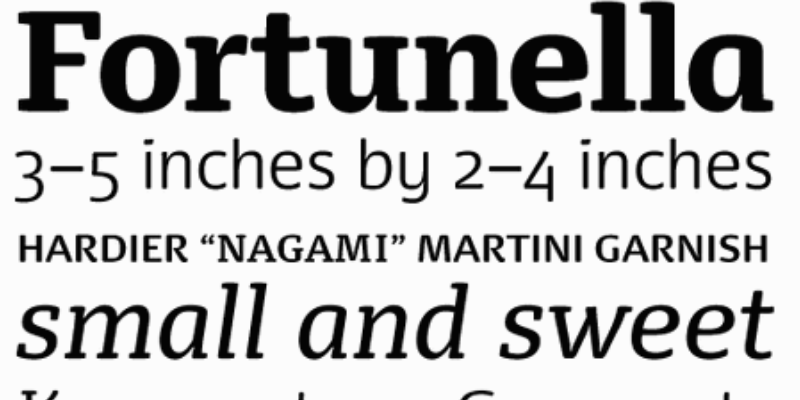
Whereas, if you pick a typography as shown in the image below, the users will enjoy staying on your platform, read the content and access your services. This will improve your app user retention rate and provide you with higher chances of converting views into customers.
3. It Shows Professionalism
The typography you choose also reflects your professionalism. If you pick a font that does not go with your market standards, brand vision, and customers taste, it will bring a bad impression on the audience. They will consider your brand as untrustworthy, unprofessional and incompetent – an outcome of which will be that you won’t be able to achieve your desired goals in stipulated time and funds.
Let’s take another example:
Suppose you have a real-estate business where you deal with sophisticated clients across the globe, if you add a fancy font to your mobile application, it will disturb them and they will leave your platform. On the flip side, if you add a traditional, business-centric font to your design brand, the users will find it too boring and tasteless to continue with, resulting in app failure.
So, ensure that the typography you select matches with the message you want to deliver to the market as well as your customer characteristics.
4. It Leads to Higher Sale Conversion
Another major reason why you should select typography for your mobile app precisely is that the typography affects conversion. It has been found in a survey that users completed reading 52% of the app content at an average speed of 6395ms when a good typography was used, whereas they hardly covered 48% of the app content at the speed of 6715ms when the typography was chosen was poor.
Now as you know the importance of considering typography for your mobile application design, let’s jump directly to the tested and proven tips to pick the right typography for creating an impressive app design.
Tips to Choose the Right Typography for Your Mobile App (& Enjoy Better Results).
Tip #1. Use Different Fonts to Give a Hierarchical Impression
When you pick different font types, styles and sizes for portraying different elements in a mobile application, it accelerates the screening process for the users. They will find it easier to connect different content elements and understand the message which you wish to convey.
For example, use regular weights of 11-19pt for content body, a medium weight of 20-34pt for headings and 30-50pt for the main headline (or the bold version of the headings style).
Tip #2. Keep The Line Length Short
Unlike desktops, mobile phones have limited screen size. If you go with the desktop style, the lines will appear either closely connected or overlapping on the mobile platform. This will ruin the readability of your mobile app, which will further result in lower ROI.
So, pay attention to the line length when designing an app. It is preferred to keep 30-40 characters in a line. But again, these numbers can also vary as per your app and the device it will run on.
Tip #3. Go for Mixed Alignment
The way your content is aligned also brings a major impact on the readability front and affect the outcome. For example, if you apply Justified alignment to your content such that it leaves unnecessary white spaces in the content, it will break the user flow and result in poor customer experience.
When talking about alignment, it is always better to go with mixed alignment. For example, left alignment seems fit to the app requirement if longer lines are involved. Whereas, centered alignment is recommended for short lines and titles.
Tip #4. Consider Apple and Google Design Guidelines
Apple and Google also have their own set of design guidelines that you must consider while selecting the app typography. For example, San Francisco typeface is the foremost choice for iOS applications by Apple, while Google recommends using Roboto. So, keep yourself updated with their design specifications to make your application welcomed by the platform.
Tip #5. Play with the Color Contrast Factor
While playing with different colors to add a contrasting effect to your mobile app UI is a nice option, it is necessary to position readability above creativity. The decided color-contrast combination should not be such that the user finds it hard to read the content and leave the platform.
To put this into practice, ensure that you have a high contrast for your fonts. For example, a darker font on a very light background, and vice versa.
Bonus Tips: Leave Adequate White Space
Apart from focusing on placing the content in the right typography, it is also wise to pay attention to the white spaces. A right proportion of white space in UI design can make your app page appear clean and engaging – helping the different elements breathe and impress the app users significantly rather than scratching their head with confusion and dissatisfaction. So, embrace the power of white space in UI design.
Takeaway
Typography, as shared in this article, plays a crucial role in enhancing the market presence of a mobile app. If considered smartly, the practice can give a boost to your mobile app and make it stand out from the crowd.
So, are you ready to look into this app design element? If so, don’t forget to consider the aforementioned tips while deciding the typography for your mobile application design.