Top 12 Most Famous Fast-Food Brand Logos Worldwide
Fast-food logos are everywhere—and that’s exactly the point. These brands operate in fast, crowded environments where decisions are made in seconds.
A logo isn’t just decoration; it’s a shortcut to recognition, trust, and appetite.
For brand designers and entrepreneurs, fast-food logos are some of the best branding case studies available.
They prove how simplicity, consistency, and emotion can outperform complexity every time.
In this article, we’ll explore 12 of the most famous fast-food logos worldwide, unpack why they work so well, and share practical branding tips you can actually use.
You Might Also Like:
- Top 15 Most Influential eCommerce Brands Shaping Online Shopping in 2025
- The Top 12 Electric Vehicle Brands Leading the Future of Transportation
Why Fast-Food Logos Are Branding Powerhouses
Fast-food brands don’t have the luxury of long explanations. Their logos need to work:
- From across the street
- On packaging, apps, and billboards
- Across cultures and languages
The strongest fast-food logos share a few traits:
- Simple, bold forms
- High memorability
- Emotional familiarity
- Long-term consistency
Let’s look at the brands that have mastered this balance.
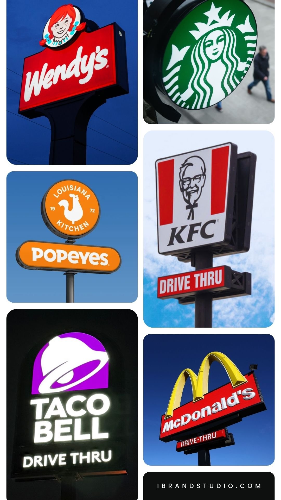
1. McDonald’s – The Golden Arches
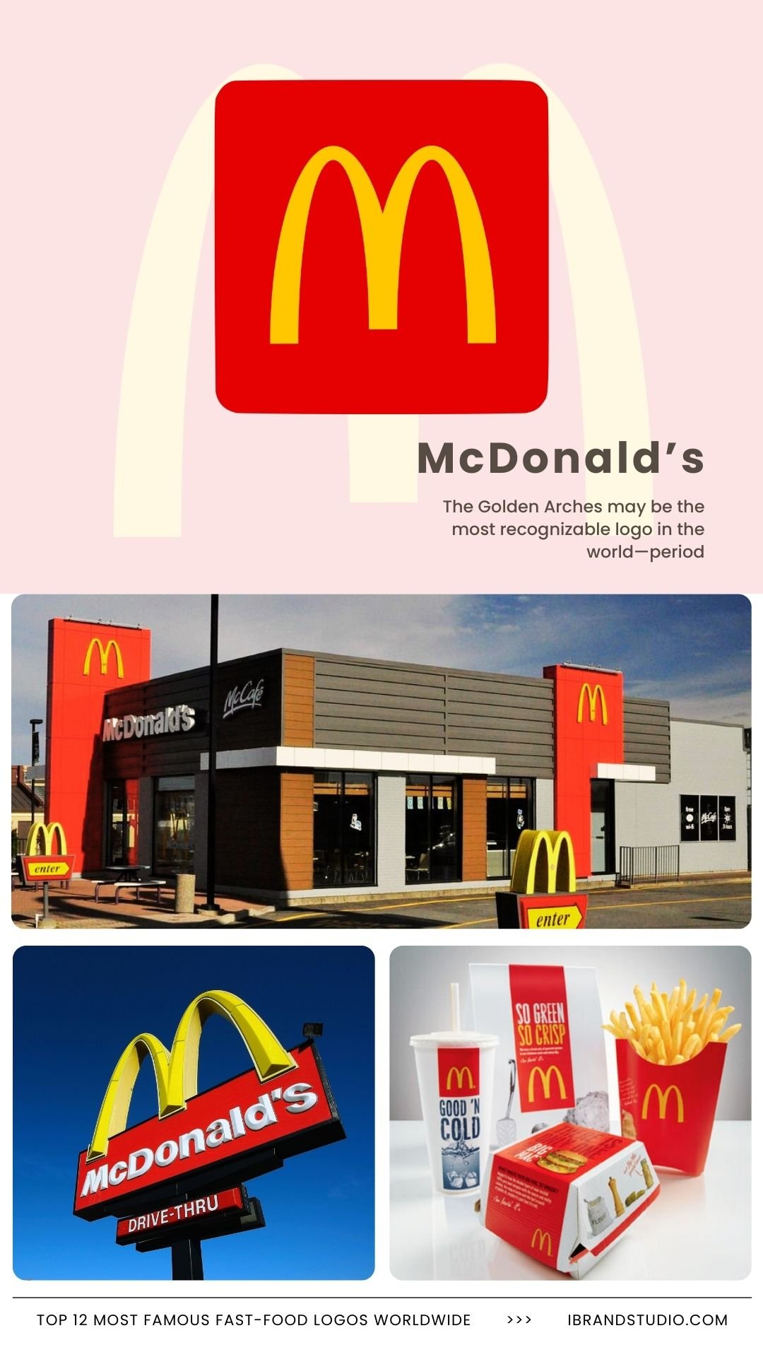
The Golden Arches may be the most recognizable logo in the world—period.
Why it works:
- Clean, geometric shape
- High-contrast yellow and red
- Instantly recognizable without words
Brand lesson:
A simple symbol, used consistently, can carry enormous brand equity.
Designer tip:
Ask yourself: Would my logo still work if the name disappeared?
2. KFC – Colonel Sanders
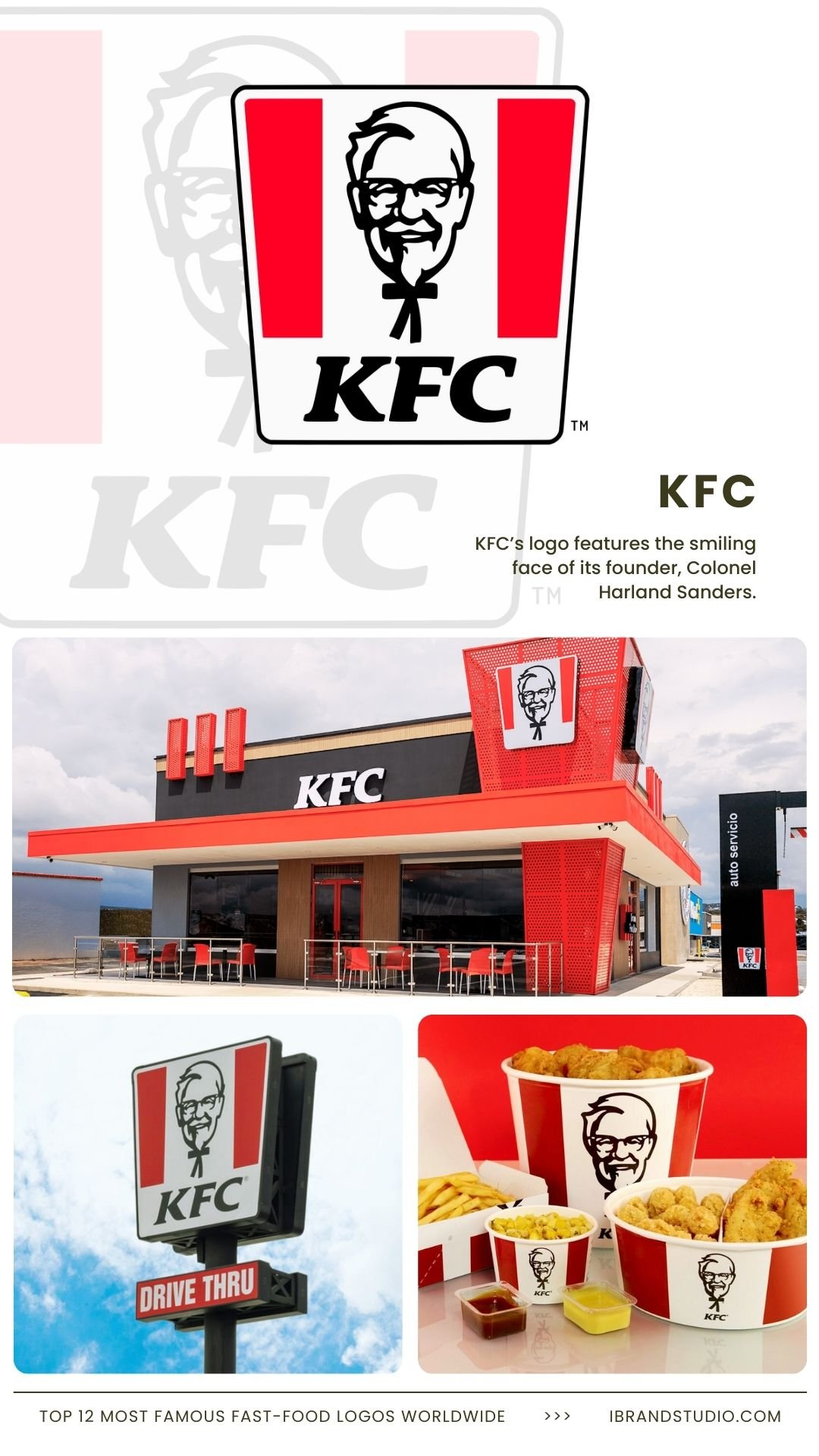
KFC’s logo features the smiling face of its founder, Colonel Harland Sanders.
Why it works:
- A human face builds trust
- Reinforces heritage and authenticity
- Limited color palette keeps it timeless
Brand lesson:
A founder or mascot can become a powerful emotional anchor.
Designer tip:
If you use a character, make sure it aligns with your brand values—not just nostalgia.
3. Starbucks – The Siren
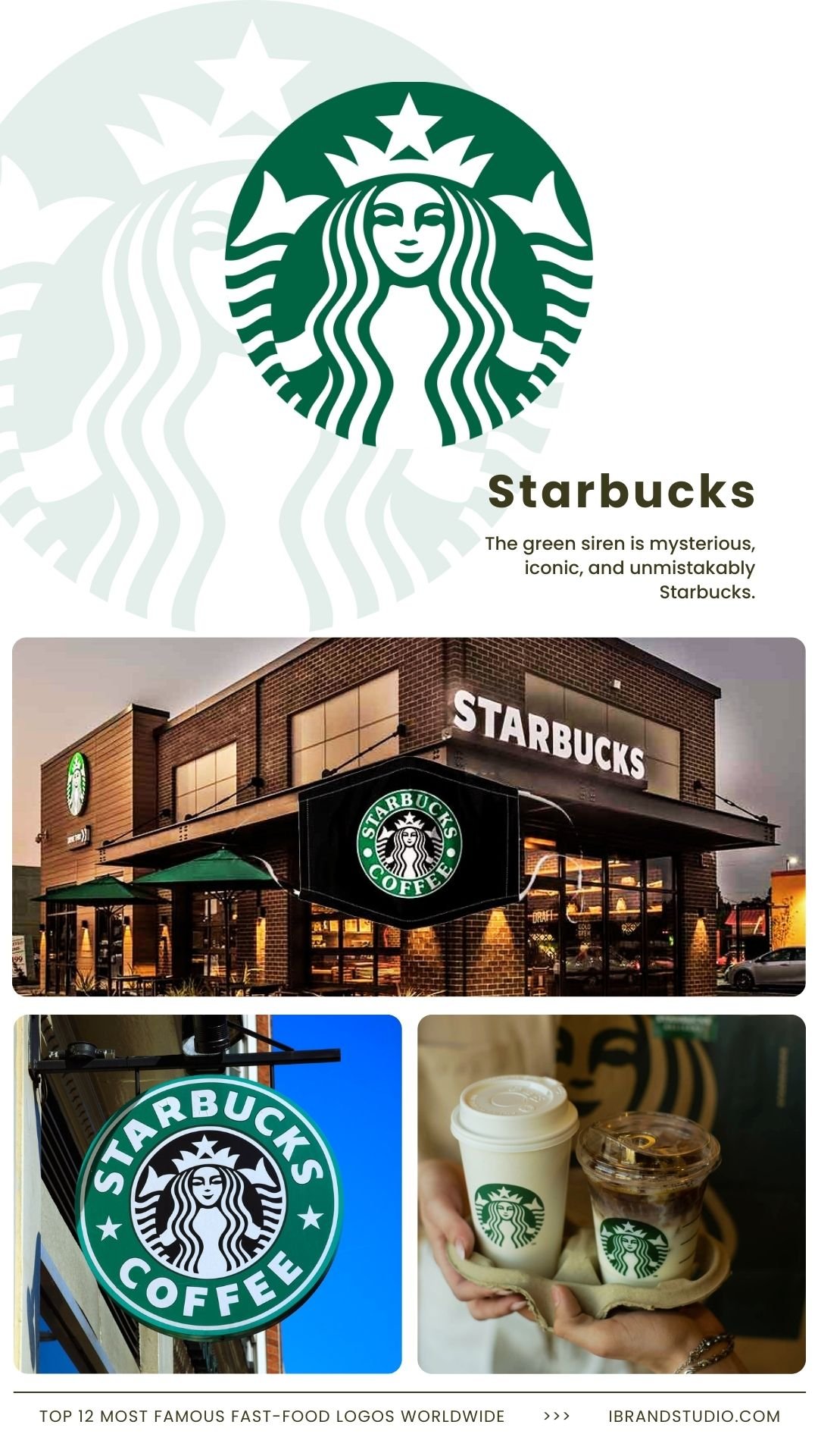
The green siren is mysterious, iconic, and unmistakably Starbucks.
Why it works:
- Unique, non-literal imagery
- Strong silhouette
- Scales beautifully across formats
Brand lesson:
Logos don’t have to explain the product to be effective.
Designer tip:
Symbolism often ages better than literal product imagery.
4. Subway – The Arrowed Wordmark
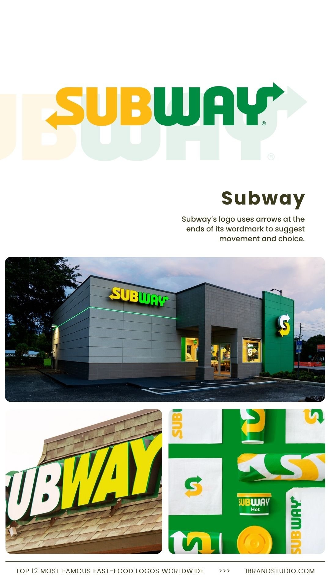
Subway’s logo uses arrows at the ends of its wordmark to suggest movement and choice.
Why it works:
- Subtle visual storytelling
- Fresh, energetic color scheme
- Clean typography
Brand lesson:
Typography can communicate meaning when designed with intention.
Designer tip:
Look for ways to embed ideas directly into letterforms.
5. Burger King – The Bun Logo
Burger King’s logo literally puts the brand name between two buns—and that’s the genius of it.
Why it works:
- Clear product association
- Warm, appetizing colors
- Balanced, circular shape
Brand lesson:
Obvious ideas often win when executed well.
Designer tip:
If your product is iconic, don’t hide it—celebrate it.
6. Domino’s – The Domino Tile
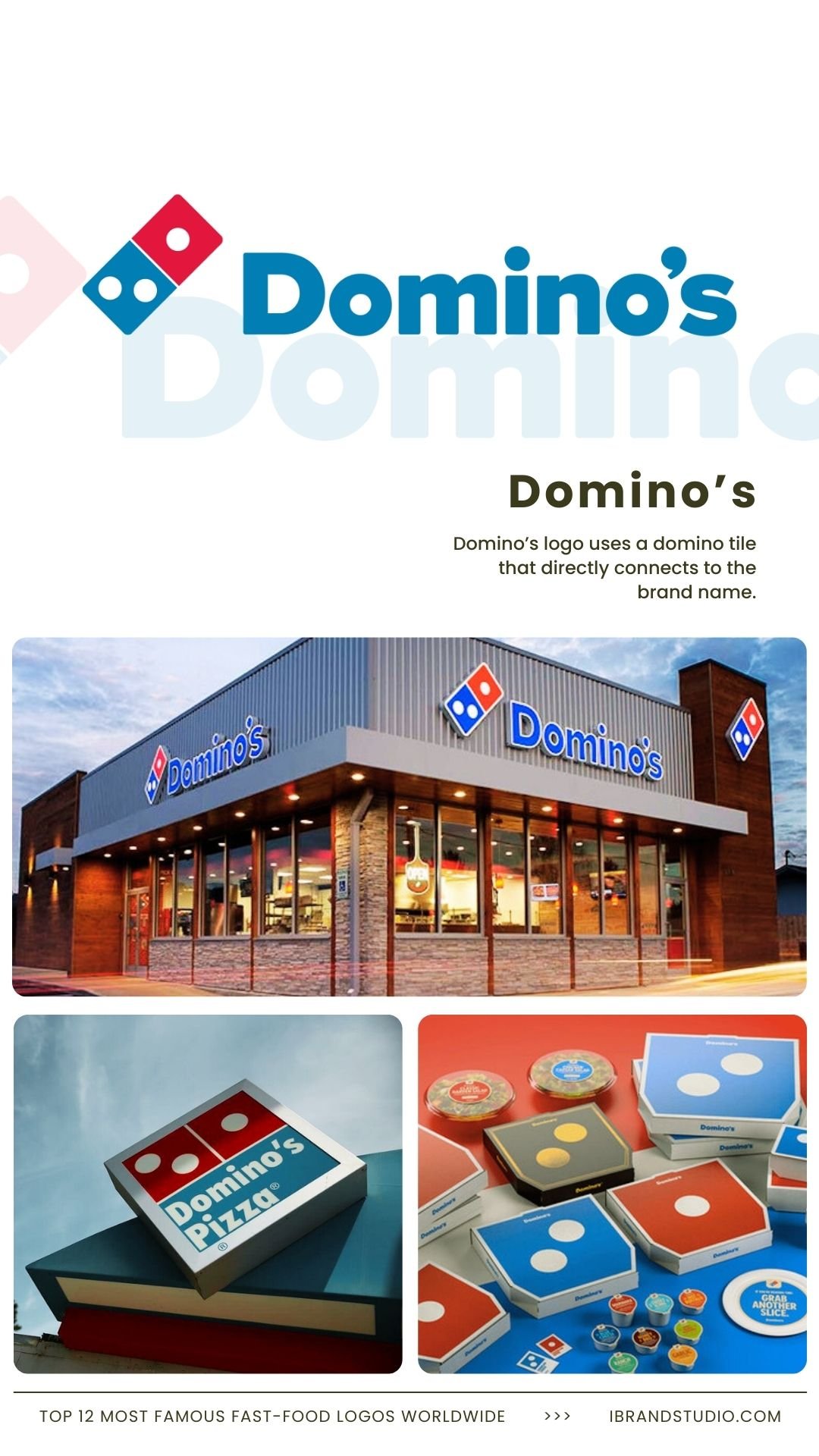
Domino’s logo uses a domino tile that directly connects to the brand name.
Why it works:
- Strong name-to-symbol alignment
- Simple geometry
- Highly adaptable for digital use
Brand lesson:
Logos that reinforce brand names are easier to remember.
Designer tip:
Direct associations reduce cognitive load for customers.
7. Pizza Hut – The Red Roof
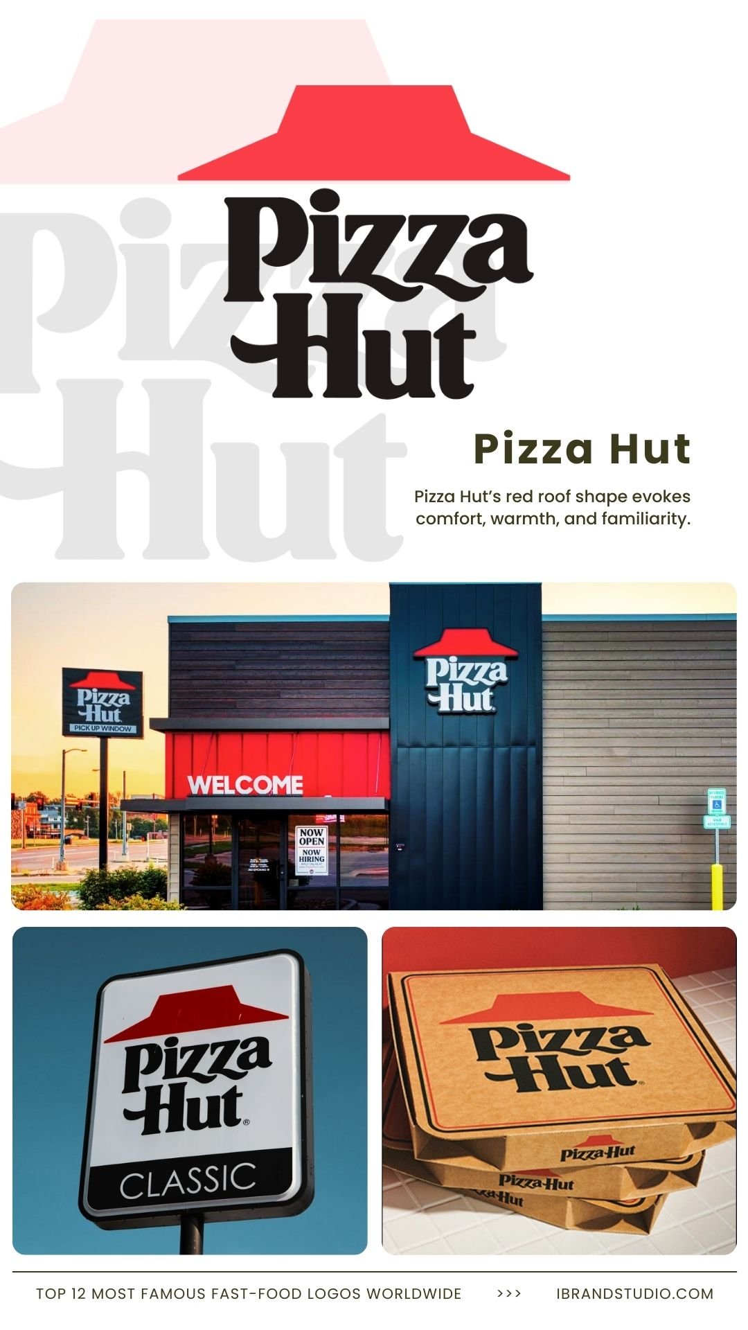
Pizza Hut’s red roof shape evokes comfort, warmth, and familiarity.
Why it works:
- Suggests a physical place, not just food
- Red stimulates appetite
- Nostalgic appeal
Brand lesson:
Logos can represent experiences, not just products.
Designer tip:
Think about the environment or emotion your brand delivers.
8. Taco Bell – The Bell Icon
Taco Bell’s bell icon is playful, modern, and highly flexible.
Why it works:
- Simple, recognizable shape
- Bold color experimentation
- Youthful brand energy
Brand lesson:
A strong logo can evolve without losing recognition.
Designer tip:
Design for flexibility—especially in digital-first brands.
9. Wendy’s – The Redheaded Girl
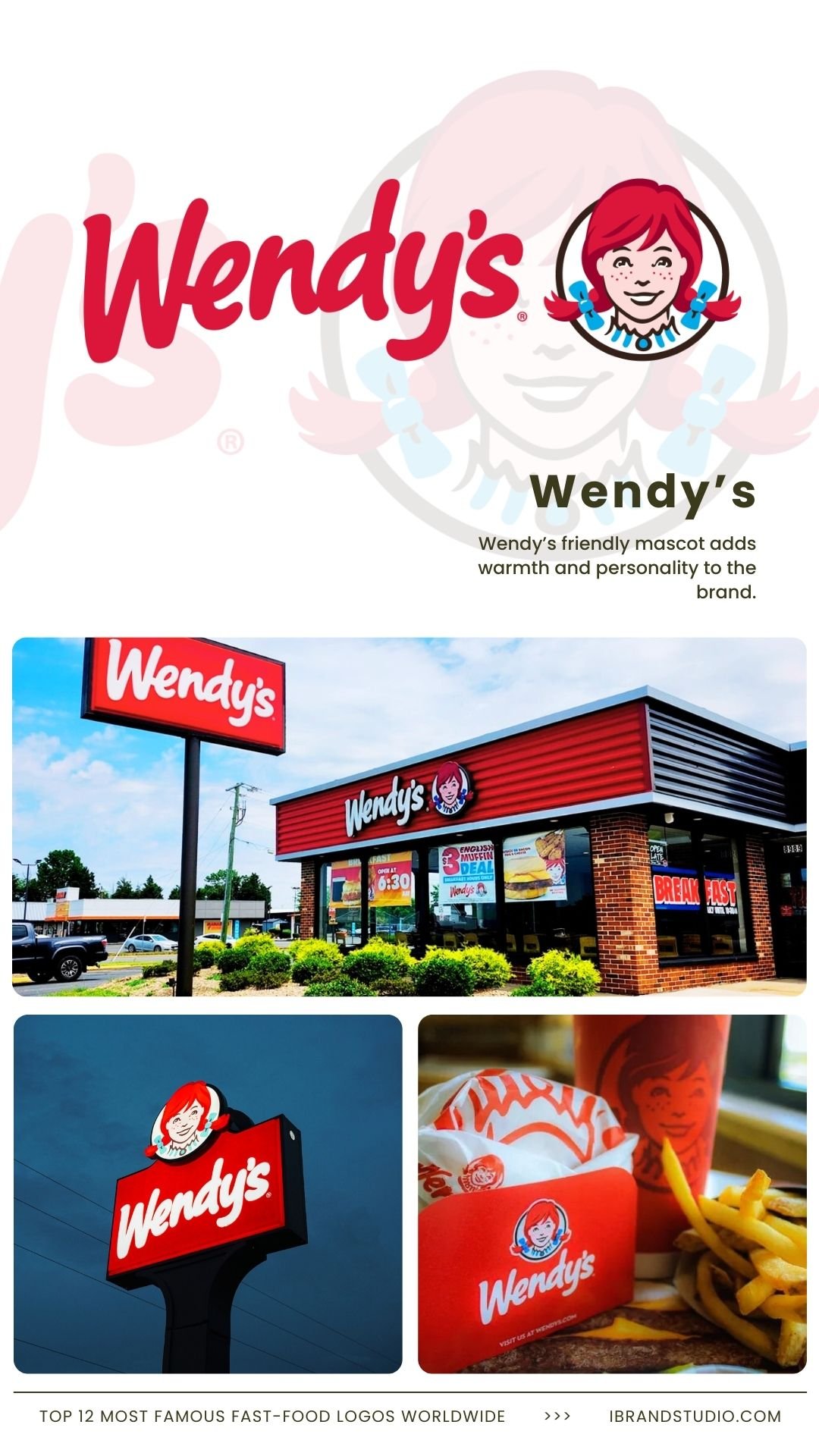
Wendy’s friendly mascot adds warmth and personality to the brand.
Why it works:
- Approachable and human
- Feels personal and trustworthy
- Strong mascot recall
Brand lesson:
People connect with brands that feel human.
Designer tip:
Soft lines and friendly expressions can lower brand resistance.
10. Dunkin’ – Bold Typography
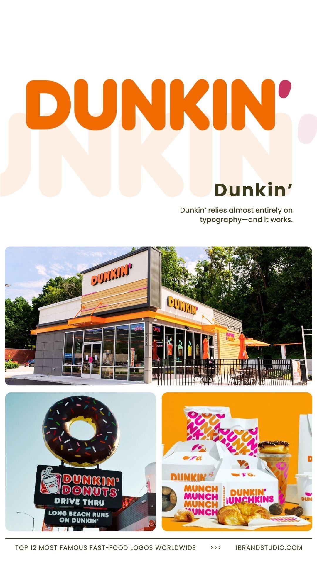
Dunkin’ relies almost entirely on typography—and it works.
Why it works:
- Thick, rounded letterforms
- High-visibility colors
- Excellent distance recognition
Brand lesson:
You don’t always need an icon if your type is distinctive.
Designer tip:
Custom typography can be your strongest brand asset.
11. Chick-fil-A – The Chicken Script
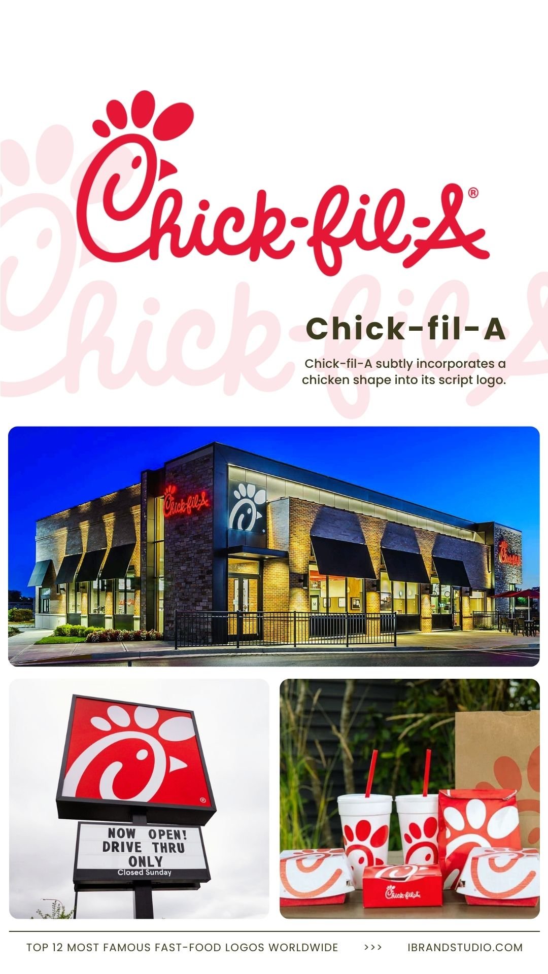
Chick-fil-A subtly incorporates a chicken shape into its script logo.
Why it works:
- Clever without being flashy
- Friendly, handwritten feel
- Clear product connection
Brand lesson:
Small creative touches can make a big impact.
Designer tip:
Hidden details increase memorability and brand charm.
12. Popeyes – The Circular Badge
Popeyes uses a bold badge-style logo with strong cultural roots.
Why it works:
- Retro-inspired confidence
- High-contrast orange palette
- Distinct personality
Brand lesson:
Authenticity stands out more than trends.
Designer tip:
Lean into your heritage—it’s often your biggest differentiator.
Also Read: 10 Coffee Shop Brand Identity Concepts That Go Beyond the Logo
What Brand Designers & Entrepreneurs Can Learn
Across these famous fast-food logos, a few patterns are impossible to ignore:
- Simplicity scales best
- Color psychology matters
- Consistency builds long-term trust
- Emotion beats explanation
- Flexibility protects the future of the brand
These logos didn’t become famous overnight. They earned recognition through clarity, repetition, and smart design decisions over time.
Final Thoughts
Fast-food logos are more than visual marks—they’re business tools refined through decades of real-world testing.
For designers, they’re lessons in restraint and intention. For entrepreneurs, they’re proof that great branding drives growth.
If you’re building or refining a brand, don’t copy these logos. Study why they work, then apply those principles to your own identity.