

Snack brands live or die by recognition. In a crowded aisle or a fast-moving digital feed, a logo has seconds—sometimes milliseconds—to spark familiarity, trust, and craving.
For branding enthusiasts and entrepreneurs, snack logos offer some of the best real-world lessons in visual identity: bold colors, simple shapes, and emotional consistency at global scale.
In this guide, we’ll break down 12 of the most recognizable snack brand logos ever created, explain why they work, and extract practical branding tips you can apply to your own business.
Along the way, we’ll keep things beginner-friendly and insight-packed—no fluff, just proven design strategy.
You Might Also Like: 43 Coolest Food Packaging Designs for Your Inspiration
Why Snack Brand Logos Are a Masterclass in Branding
Snack logos operate under intense pressure:
- They must stand out on cluttered shelves
- Appeal across ages and cultures
- Reproduce cleanly on packaging, ads, and social media
- Trigger appetite and nostalgia instantly
Because of this, snack branding tends to be extremely intentional—making it a goldmine for entrepreneurs studying brand recognition.
1. Lay’s

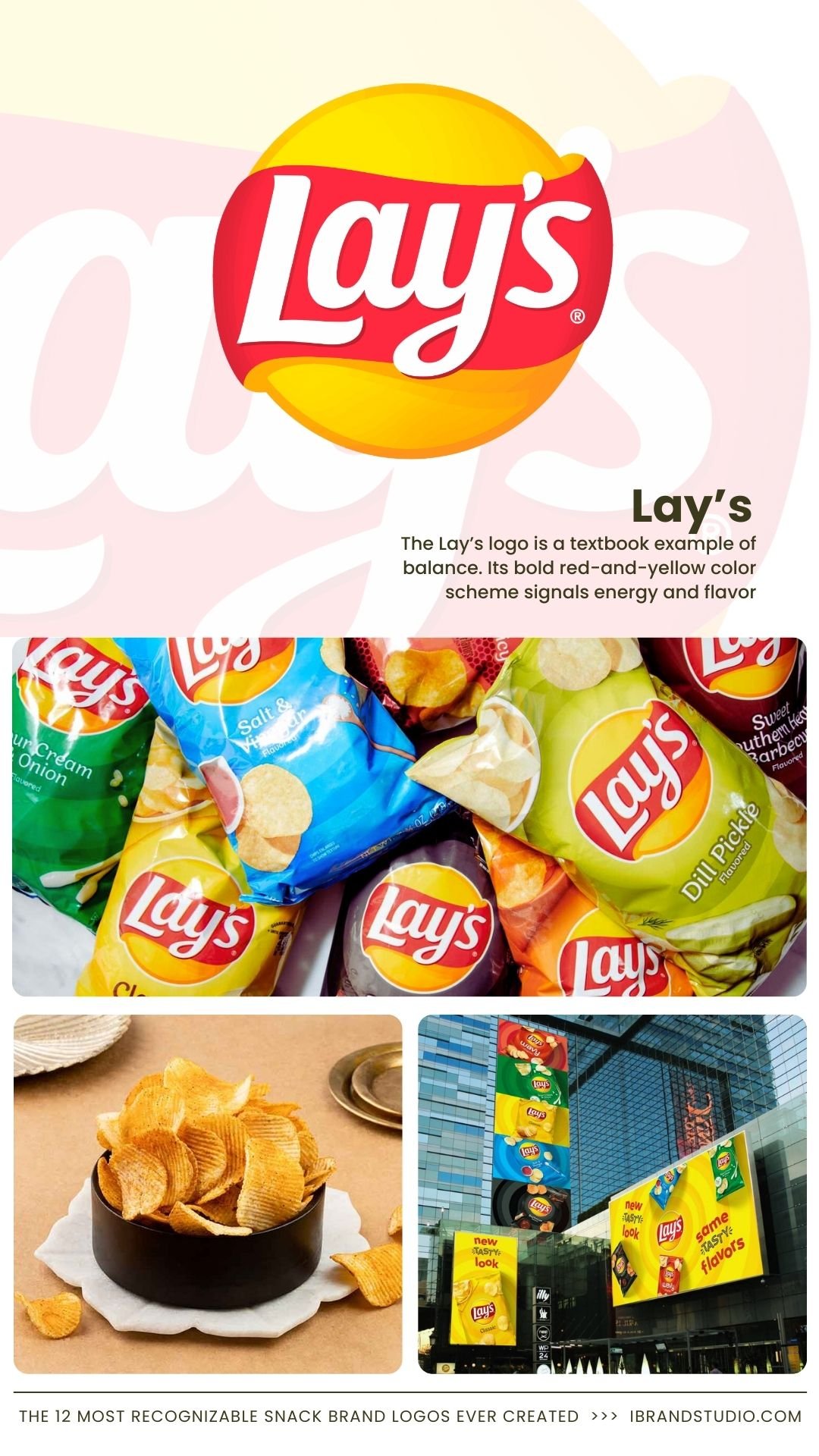
The Lay’s logo is a textbook example of balance. Its bold red-and-yellow color scheme signals energy and flavor, while the slightly curved typography feels friendly and approachable.
Why it works:
- High contrast improves shelf visibility
- Warm colors stimulate appetite
- Minimal complexity scales globally
Branding takeaway: Choose colors that match the emotional response you want—especially if food or lifestyle is involved.
Also Read: The 10 Most Recognizable Beverage Brand Logos Ever Created
2. Pringles
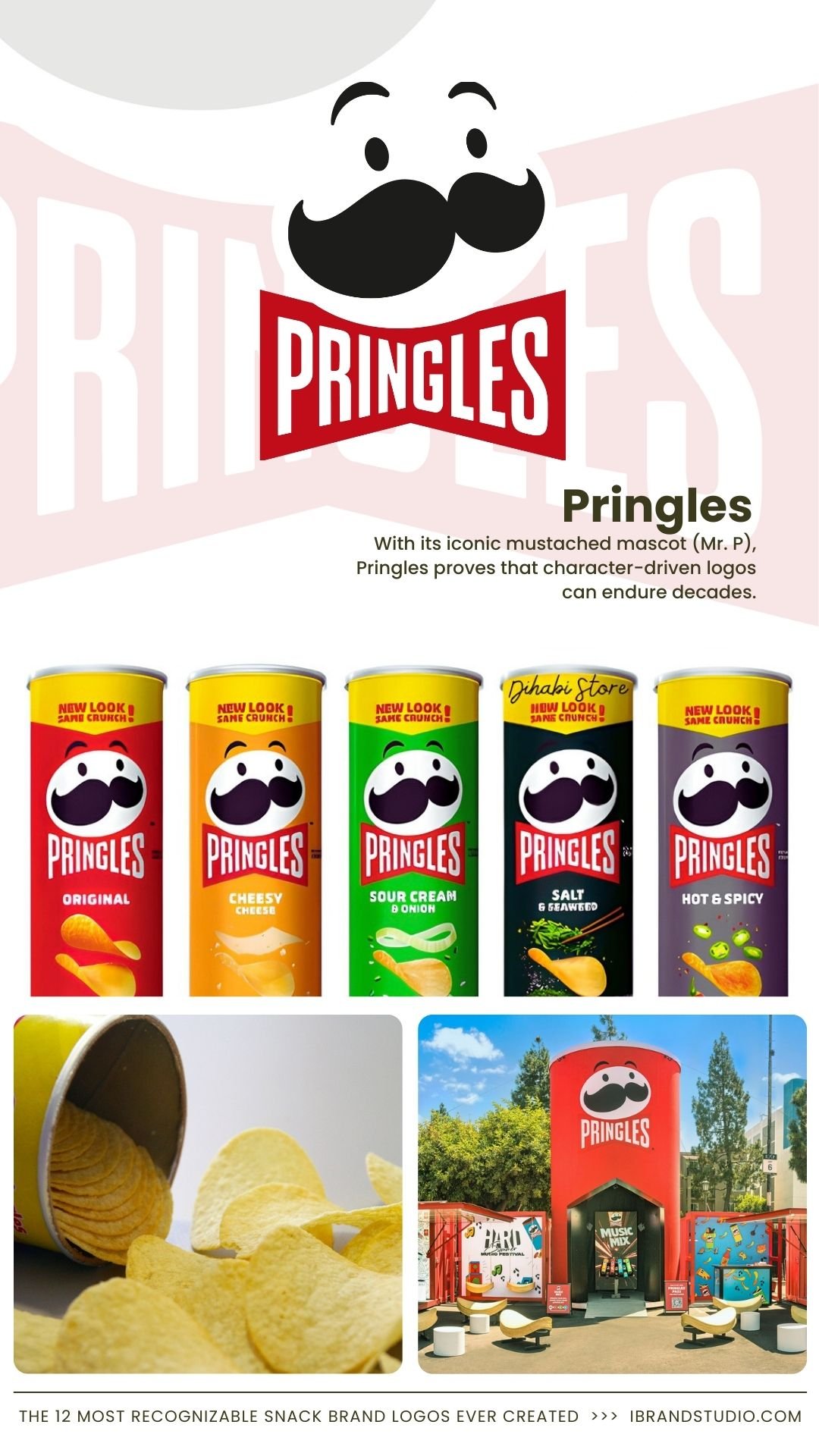
With its iconic mustached mascot (Mr. P), Pringles proves that character-driven logos can endure decades.
Why it works:
- Human-like face creates emotional connection
- Symmetry improves memorability
- Works even when simplified or animated
Branding takeaway: A distinctive character can humanize your brand—just make sure it’s simple enough to evolve.
3. Doritos

Few snack logos scream bold like Doritos. Sharp angles, intense reds, and triangular motifs reinforce the brand’s “extreme flavor” promise.
Why it works:
- Logo shape mirrors the product itself
- Strong geometry communicates intensity
- Appeals directly to younger audiences
Branding takeaway: Align your logo’s shapes with your product experience.
See Also: Top 12 Most Famous Fast-Food Brand Logos Worldwide
4. Oreo
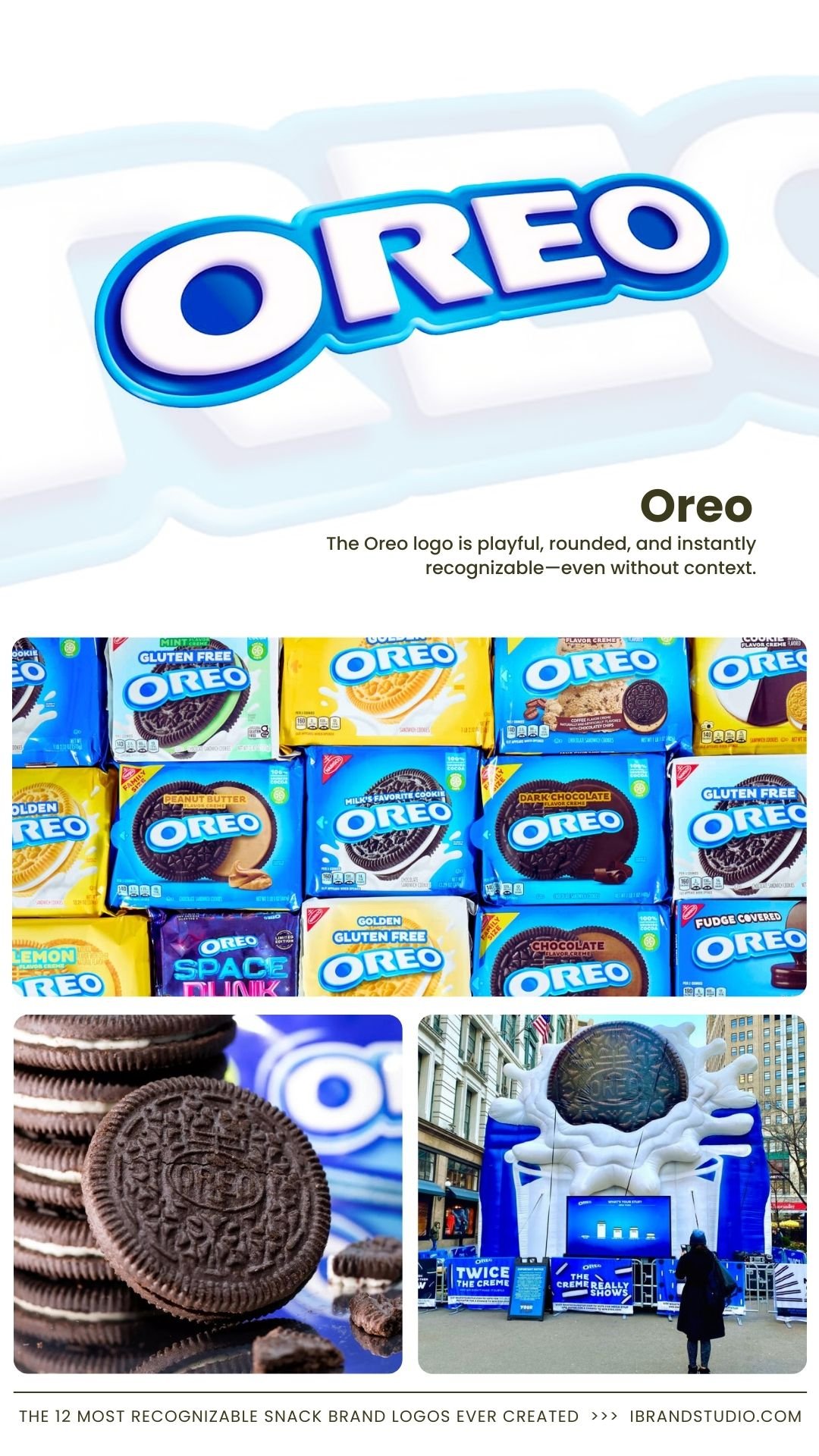
The Oreo logo is playful, rounded, and instantly recognizable—even without context.
Why it works:
- Rounded typography signals fun and comfort
- Strong contrast against blue packaging
- Easily adaptable for campaigns and collaborations
Branding takeaway: Soft edges and playful fonts work especially well for nostalgic or family-friendly brands.
5. KitKat
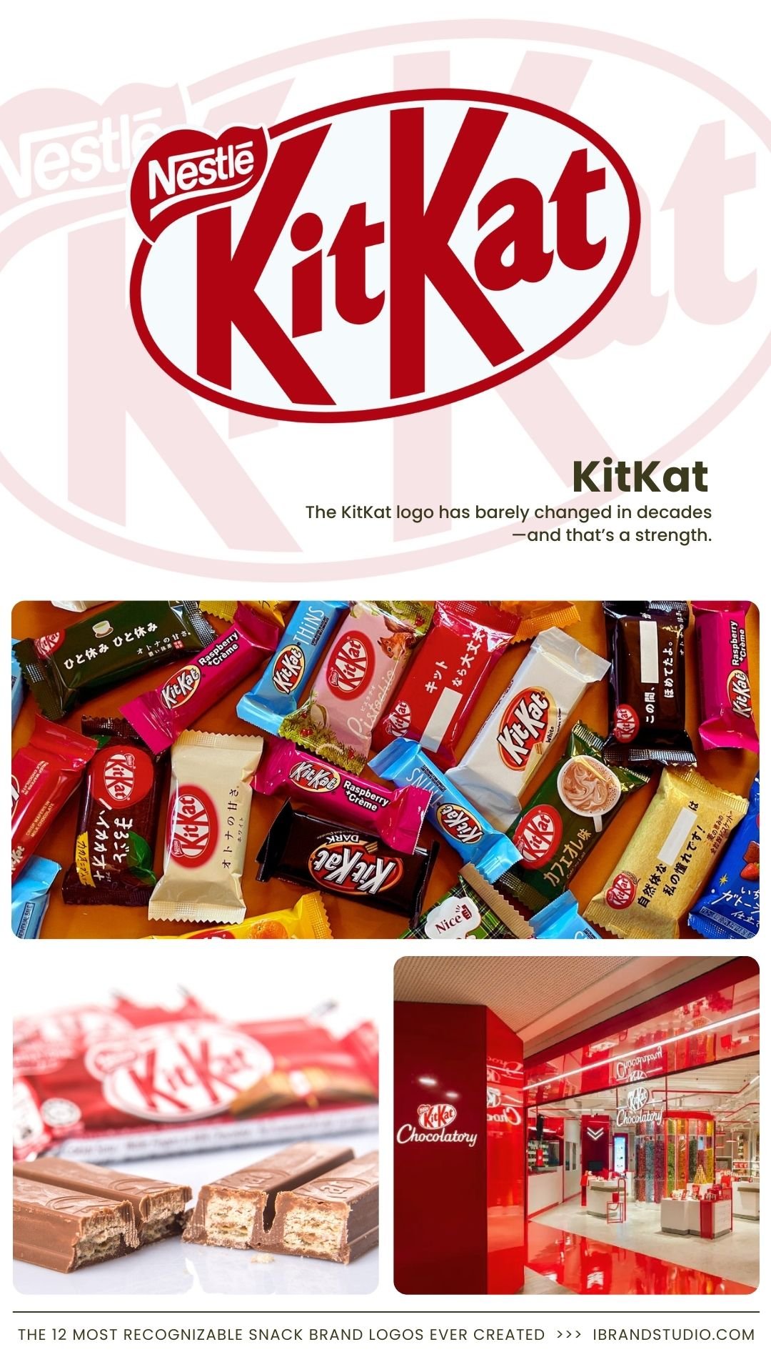
The KitKat logo has barely changed in decades—and that’s a strength.
Why it works:
- Oval badge feels classic and trustworthy
- Red color creates urgency and appetite
- Simple typography boosts recall
Branding takeaway: Consistency builds brand equity faster than constant reinvention.
6. Snickers
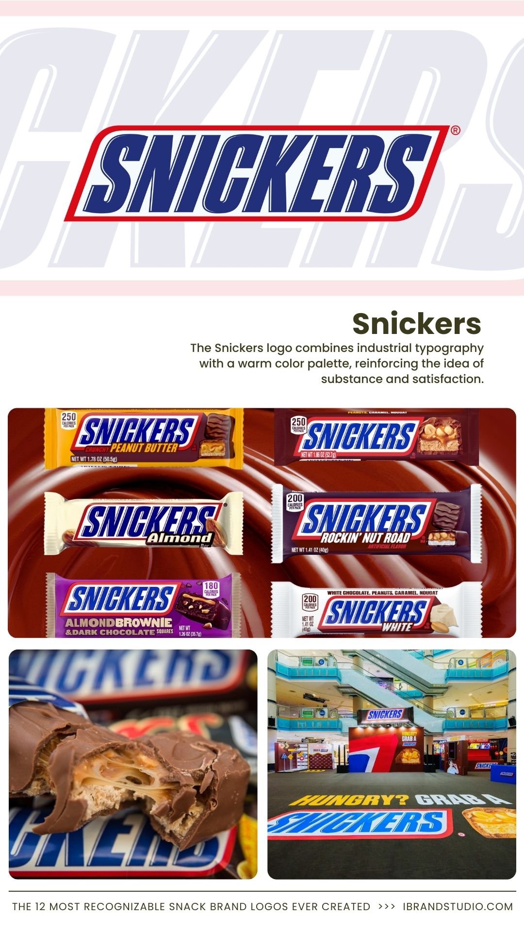
The Snickers logo combines industrial typography with a warm color palette, reinforcing the idea of substance and satisfaction.
Why it works:
- Strong wordmark communicates energy
- Blue outline adds contrast and structure
- Feels “solid,” just like the product
Branding takeaway: Typography alone can communicate personality if chosen intentionally.
7. M&M’s
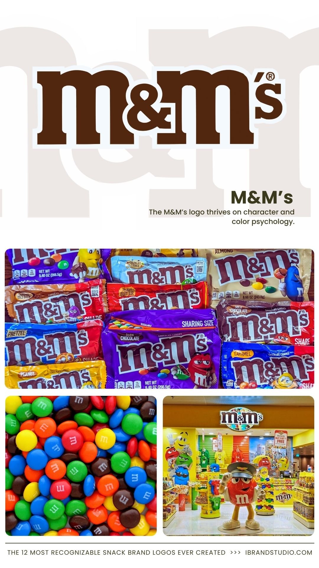
The M&M’s logo thrives on character and color psychology.
Why it works:
- Playful lowercase typography
- Color flexibility supports sub-brands
- Mascots reinforce memorability
Branding takeaway: A flexible logo system allows for expansion without dilution.
8. Cheetos
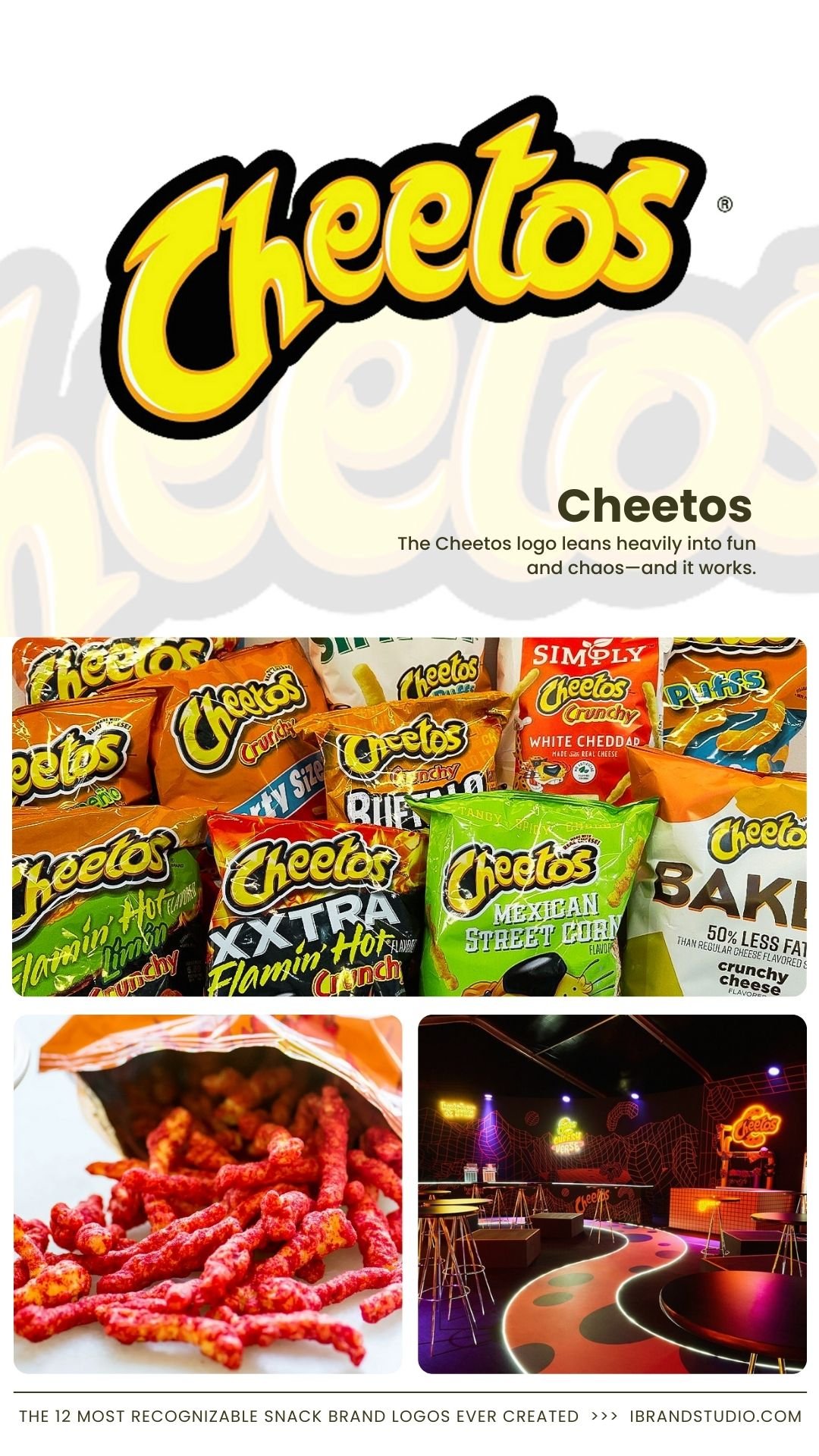
The Cheetos logo leans heavily into fun and chaos—and it works.
Why it works:
- Irregular typography signals playfulness
- Bright orange creates instant recognition
- Strong association with its mascot, Chester Cheetah
Branding takeaway: If your brand is fun, let the logo show it—don’t tone it down.
9. Ritz
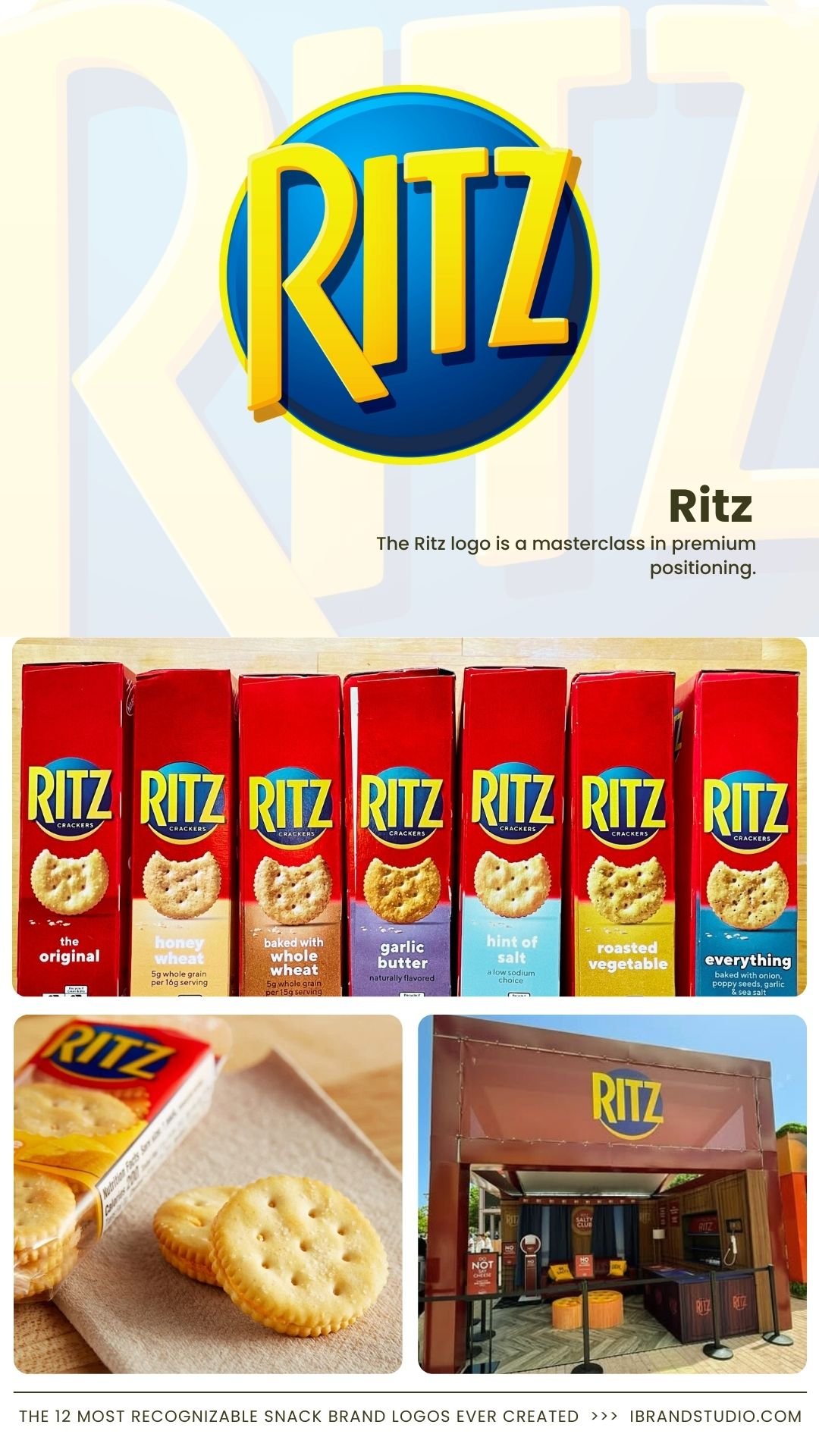
The Ritz logo is a masterclass in premium positioning.
Why it works:
- Serif typography implies heritage
- Blue-and-gold palette signals quality
- Circular seal feels established and trustworthy
Branding takeaway: Traditional design elements still work—when aligned with your brand promise.
10. Twix
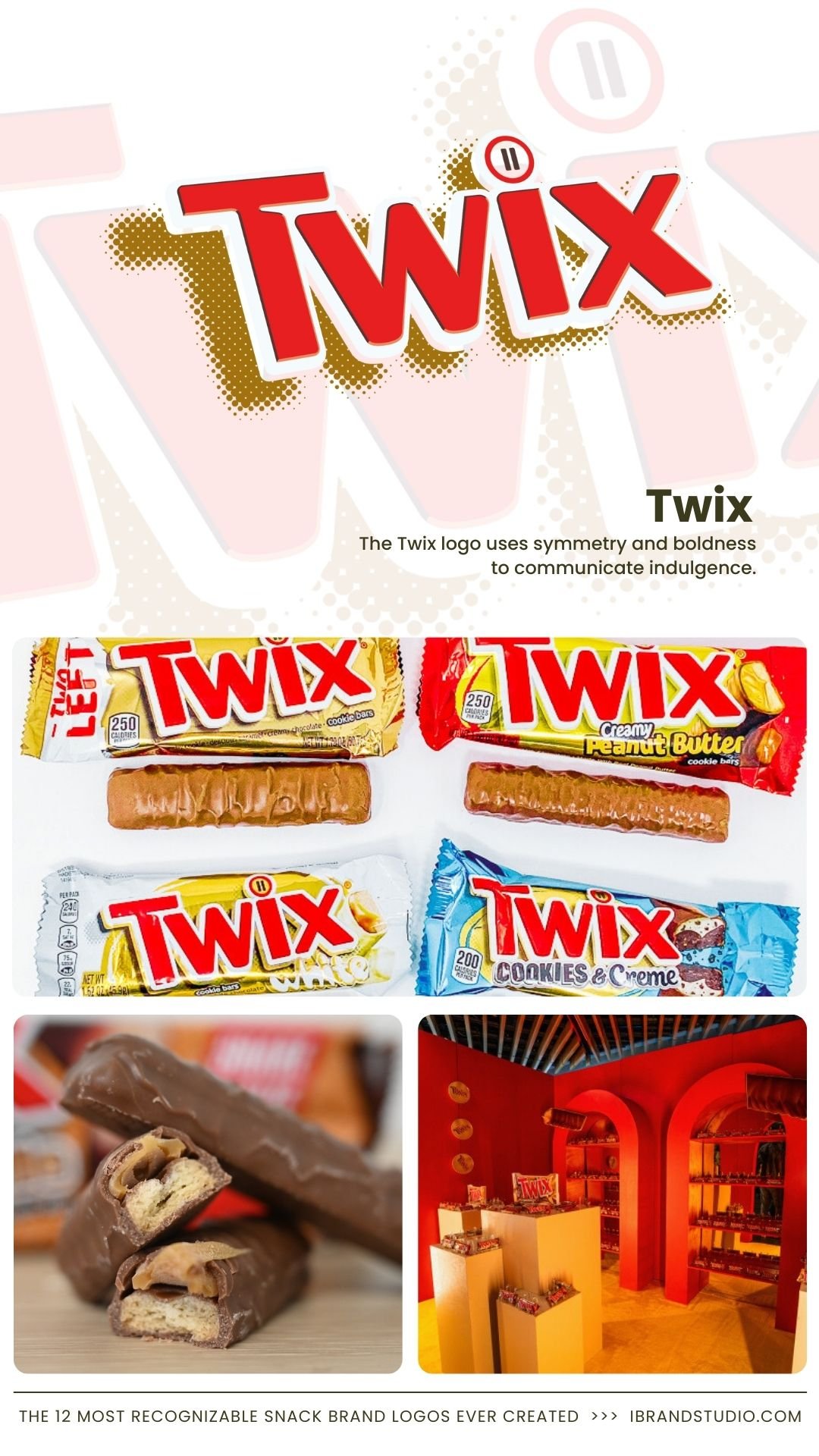
The Twix logo uses symmetry and boldness to communicate indulgence.
Why it works:
- Thick lettering conveys richness
- Red color creates appetite appeal
- Balanced layout supports dual-bar identity
Branding takeaway: Visual balance reinforces product storytelling.
11. Hershey’s

Simple. Clean. Timeless. The Hershey’s logo relies on strong typography rather than decoration.
Why it works:
- Brown color directly references chocolate
- No unnecessary visual noise
- Feels authentic and honest
Branding takeaway: Sometimes restraint is your strongest branding tool.
12. Goldfish
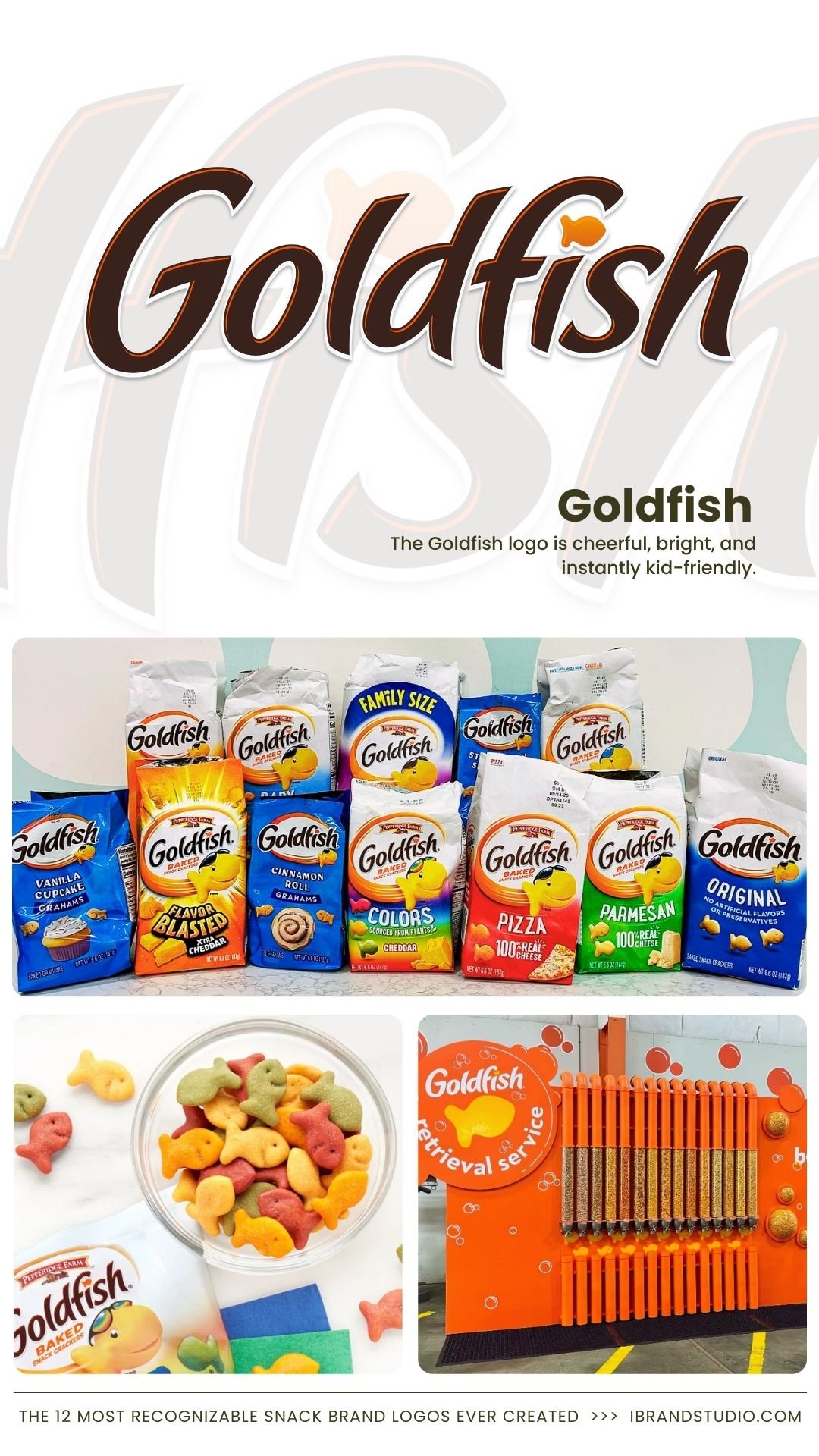
The Goldfish logo is cheerful, bright, and instantly kid-friendly.
Why it works:
- Smiling mascot builds trust with parents
- Bold colors attract children
- Simple shapes improve memorability
Branding takeaway: Know your primary audience—and design unapologetically for them.
Branding Lessons from Iconic Snack Logos
If you’re building or refining a brand, here are actionable logo design tips inspired by the most recognizable snack brands:
1. Prioritize Simplicity
Logos should be identifiable at a glance—even when scaled down.
2. Use Color Strategically
Colors influence appetite, emotion, and recall. Choose deliberately.
3. Design for Adaptability
Your logo should work on packaging, social media, ads, and merchandise.
4. Stay Consistent Over Time
Small refinements beat full redesigns when building long-term trust.
5. Align Logo Personality With Product Experience
Bold snacks need bold logos. Premium snacks need refined ones.
Recommended: 12 Creative Ice Cream Brand Identity Ideas (And the Design Lessons Behind Them)
Final Thoughts: What Entrepreneurs Can Learn from Snack Logos
The most recognizable snack brand logos weren’t accidents. They’re the result of clear positioning, emotional awareness, and relentless consistency.
Whether you’re launching a startup or refreshing an existing brand, studying these logos can save you years of trial and error.
If there’s one core lesson to remember: A great logo doesn’t just look good—it makes people feel something instantly.
That’s the real secret behind the world’s most iconic snack brands.