How To Get The Most Out of A Minimalist Website Design
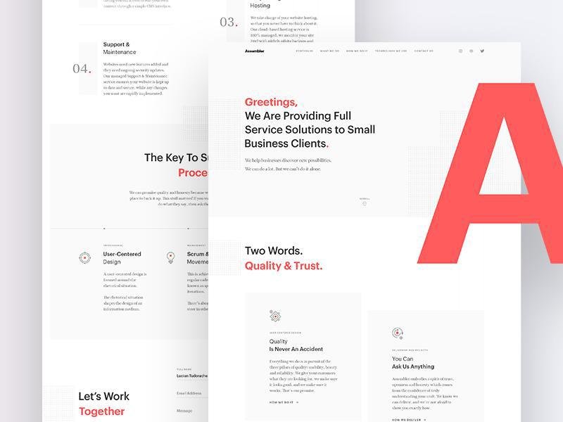
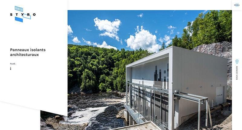
Modern web design is simplistic and clear, without confusing clutter.
This doesn’t mean a site is without stylistic touches and doesn’t mean it hides away (or doesn’t mention at all) important info. Instead, minimalist web design is very focused and pragmatic. Every element counts. Every detail is weighed and considered.
The end result is that every aspect of the final simplistic web design means something. This takes up extra time and can be a challenge, especially on website designs that need to have a lot of info on their many pages.
However, minimalist web design consists of a few core principles and concepts, no matter how intimidatingly complex the project seems.
What is the Website’s Purpose?
If you can clearly define the website’s purpose from the very beginning of your design process, everything about your project becomes that much easier.
Before you even touch the graphics, the code, or your mouse, you should know what your design’s ultimate goal is. This will eliminate confusion and provide unifying direction to the design.
It will allow you to have a metric to determine the usefulness of elements. You’ll be able to decide if they complement the purpose or distract from it.
What is meant by purpose? A few examples:
- The site is used to display previous work to potential clients
- The site educates people on some particular subject
- The site sells products or services
Once you know what the goals of the site are, you can get started. You’ll know what’s actually needed. You can decide if what you or the client want on the site is actually worthwhile.
Details Matter
Every element of the site matters, regardless of how big or small it is. Fundamentals are fundamental. Design principles shouldn’t be glossed over as so basic that you don’t need to think about them.
This means that choosing a font, for example, might make or break your website.
Minimalist web design means that mistakes will be spotlighted, as there’s little to distract from them. You must consider your design fundamentals. Planning and a sense of purpose are key.
Don’t be afraid to look things up to refresh yourself on a basic design principle. In many ways, using minimalist web design is a test of your skill as a web designer, as your knowledge of the basics are all on display.
Unify the Design
Make sure all the elements of your webpage design fit together. If any element stands out, it should be a calculated choice that you need to stand out to achieve the goals of the site design.
Any item that stands out because it simply doesn’t fit with the rest of design should be modified or removed altogether.
Make Sure There’s Whitespace
You need to make sure the elements of the site design (as well as your users) have room to breathe. Sometimes you’ll receive pushback on this from clients.
They might ask you to add something to fill in the space or be bothered by gaps and what seems to be extra room.
You need to remember that whitespace is key to making sure a website does not become cramped. A lack of whitespace causes elements to run together. Viewers’ eyes need a break to define separate areas.
Alignment is Important
With cleaner, minimalist web even minor errors in alignment of elements are strikingly obvious and jarring. Even misalignments the size of a pixel can stand out.
Use a grid. Even if you are completely confident in your aesthetic sense, use a grid. With a grid, you can be sure that everything is on track throughout your design process. There are a lot of different frameworks to choose from.
Visual Hierarchy
On the web, you have bare handfuls of seconds to catch a user’s attention and communicate your message, so you can draw them in. Your visual hierarchy is how you do this.
Use the sizes and weight of different elements to create a trail to lead users through the page. Normally this trail ends with the call-to-action. If users feel that they know where they are going and what it’s leading to, they are more comfortable with continuing on. Confusions turn them away in frustration.
Minimize Clutter While Maximizing Focus
Avoid including too many elements. You should figure out what you really need to achieve the site’s purpose. Identify what visitors really are looking for and focus the site on that.
Unnecessary information distracts from your message and can make it harder for a user to navigate the site. Clutter can become visually jarring and drive people away just from how unpleasant it looks. Focus down on what will get a user to follow along with your call-to-action.
Reduce the Page Count
While it can be tempting to offer a user as much information as possible, especially on an informative website, it’s not a good idea to have a ton of pages.
You want to avoid confusion. Even a site designed around being the one stop shop for something needs to focus on its message. Too many pages can be misleading. It can annoy visitors who are looking for something specific.
Remember, paragraphs don’t; have to be massive walls of text. Five or six lines are perfectly legitimate as paragraphs and are very easy to read fast.
Keep the Color Palette Simple
Color catches attention, but avoid using too many in a website design. It is easy to distract or even repel people with an overwhelming number of colors.
Stick to two main colors that fit everywhere on your site. You can vary the shades of these colors for a more unified, but still minimalist website design. This also makes it easier to draw attention to a certain item by using a third color that stands out.
Conclusion
Minimalism is not boring and doesn’t have to reduce your creative touches. In fact, it emphasizes them.
Rely on your fundamentals and you’ll find that removing clutter brings out the best of your website design, the things that you worked hardest on or were most inspired to create. Minimalist web design is a true test of skill and understanding.
About the Author!
Bogdan is a designer and editor at DesignYourWay. He’s reading design books the same way a hamster eats carrots, and talks all the time about trends, best practices and design principles.


