Logo Design Trends WooCommerce Store Owners Should Watch in 2025
If you are a WooCommerce store owner, and you have this nice brand and its particular standing, logos are like the face of it, right? People have a knack for remembering brands by their logos.
Attracting the right audience is crucial; you need your logo to have a lasting impact. When someone takes a look at that they should instantly think, Oh yeah, that’s them!
That’s why having a cool, and trendy logo is a must in 2024 and onwards. I mean, who wants their brand to look old and boring? Not me, for sure!
An impactful logo has the ability to tell your brand’s story, vibe with your style, and stand out among the rest. It just isn’t about being pretty, it’s about painting the whole picture.
Trends keep changing with time so this whole ordeal of logo designing, keeping it timeless, or keeping it updated is very important.
Being a WooCommerce store owner, you gotta keep up! Let’s talk about some of the top logo design trends for WooCommerce in 2024.
1. Minimalist Logos
Okay, so minimalism is super important and really in trend right now. It’s like, the less you have, the better.
No fancy stuff, no crazy details. Just clean, simple lines. Studies say brands with simple logos make 22% more money because their logos are memorable and easy to leave an impact. That’s huge, right?
Take Apple, for example. Their bitten apple logo is iconic. So easy to remember. Or Netflix – it’s just a red “N,” but it works everywhere – on apps, TV, merch, you name it.
Minimal logos are very adaptable, which is exactly what you need for your WooCommerce store.
2. Bold Colors and Gradients
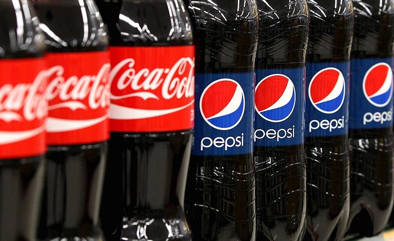
Color theory is crazy. Colors are like the mood of your logo. Have you ever noticed how Coca-Cola’s red makes you feel excited? That’s color psychology at work.
Logos with bold colors grab attention fast. The most popular colors in logos are blue (cool and calm), red (energy and passion), and yellow (happiness).
Pepsi’s logo is a great example. It’s got red, white, and blue, which make it look fresh and friendly.
Bright colors or gradients (where one color blends into another) are trending big time for 2024. If you want your WooCommerce store to pop, try these.
3. Retro and Vintage Looks
Old-school vibes are back! Retro logos remind people of the good old days. It’s all about making your brand look trustworthy and warm.
Plus, retro works for everyone – old people feel nostalgic, and young people think it’s cool.
Big brands use this trick to rebrand. They blend old designs with new ideas. For example, think about Burger King’s rebrand.
Their new logo feels vintage but still modern. If you want your WooCommerce store to connect with a wider audience, go retro.
4. Geometric Shapes
Geometry isn’t just for math class anymore. Genius designers use shapes like circles, squares, and triangles to make logos look balanced and sharp. Shapes are simple but super recognizable.
Not to mention that they look extremely intellectual at first glance because lets be honest we are all a little intimidated by geometric shapes. Circles mean unity and togetherness.
Geometric shapes can make your logo look strong and smart, which is perfect for online stores.
And if you’re looking to expand your design skills, consider learning how to create your own custom T-shirt design in Adobe Photoshop.
It’s a great way to apply some of these principles to other elements of your brand, like custom merchandise or apparel.
Squares show stability and professionalism. And triangles? They’re all about growth and strength.
Using shapes can make your logo look strong and smart, which is perfect for online stores. Just don’t go overboard, or it’ll look messy.
5. Custom Fonts (Typography)
Fonts are like, the personality of your logo. Some fonts feel modern, like sans-serif ones. Others feel old-school and classy, like serif fonts. The font you choose can tell people what your brand is about.
For example, luxury brands like Chanel use classic fonts. But tech brands might go for sleek, futuristic ones.
![]()
And here’s a cool fact: Sometimes, the font is the logo. Think of Coca-Cola or Google. If your WooCommerce store has a unique vibe, pick a font that matches it.
6. 3D and Layered Logos
3D logos are like wow! They look real and have depth. They’re not just flat; they stand out, especially on digital screens. If you run an online store, you should think about this trend.
Netflix’s logo sometimes uses a 3D style, and it’s super eye-catching. You can add shadows and layers to make your logo look interactive.
This is great for WooCommerce stores because most of your customers are online.
7. Hand-drawn and Organic Logos
Hand-drawn logos feel personal and warm. They look like the brand really cares! They’re perfect for small businesses or stores that sell handmade stuff.
They’re not super polished, but that’s the point. People like them because they feel real.
Brands that help people or work with kids often use this style. It’s not for every WooCommerce store, but if you’re selling something personal or unique, try it.
Hand-drawn logos stand out because they’re not all perfect and digital-looking.
8. Animated Logos
Gone are the days of static logos, well not really but here’s the point, static logos are okay, but animated ones? They’re fire!
Animated logos move or change, and that’s what makes them memorable. People love interactive stuff, and animation makes your logo more fun.
Google’s logo is the perfect example. The colorful dots that bounce around? Yep, that’s an animated logo. If your WooCommerce store is super techy or digital, think about adding some animation to your logo.
9. Negative Space
Negative space refers to the area around and between the main design elements. Skilled logo designers can strategically manipulate this space to create hidden images, dual visuals, and subtle surprises within a logo.
Using negative space allows symbols to convey multilayered meanings and enables brands to communicate complex ideas in a visually striking way.
In layman’s language, negative space is like the blank part of your logo, but it’s not wasted. Designers use this space to create hidden shapes or meanings.
![]()
It makes the logo clever and unique. Like Baskin Robbins which hides its 31 flavors in its logo or Amazon where the arrow is pointing from A to Z giving the idea that they have everything, GENIUS!
Pepsi’s logo uses white space to separate the red and blue parts. It looks simple, but there’s a lot of thought behind it.
For WooCommerce stores, negative space can make your logo look classy without being complicated.
10. Responsive and Adaptive Logos
Your logo has to work everywhere, and by everywhere I mean every screen that it’s gonna appear at, on your website, mobile, social media, and even packaging.
That’s why responsive logos are trending. They change size and shape but still look awesome and just the same.
Big brands like Chanel and Coca-Cola have logos that look the same whether they’re on a billboard or a pen. Your WooCommerce store needs a logo that’s flexible, too. It keeps your branding consistent and professional and moreover authentic.
Why Logos Matter for WooCommerce Stores and Why Follow the Trend?
The real question arises why you being a WooCommerce store owner should get into this ordeal?. Why does all this even matter for your WooCommerce store? Because a logo is everything.
Stats show that 70% of people recognize brands by their logos. And if your logo is trendy and cool, more people will remember it, recognize and probably click open the store because they recall lingering their long enough when they first saw it!
Plus, having a logo that matches 2025 trends can give your store a modern edge. It makes your brand look fresh and in touch with what’s happening.
Customers are more likely to trust and shop from brands that look professional, have more authentic and seriousness to it!
Tips for Choosing the Right Logo Design for Your WooCommerce Store
- Know Your Brand: What’s your vibe? Fun, serious, luxury? Your logo should match.
- Pick the Right Colors: Remember, colors have meaning and intuition. Blue for calm, red for energy, yellow for happiness, like Mcdonalds, choose the one that resonates with your store.
- Keep It Simple: Don’t overdo it. Minimal designs are in, and they’re easier to remember.
- Work with Pros: If you’re not good at designing, hire someone. It’s worth it. Additionally, learning how to incorporate user feedback into your design process is crucial. Understanding what your audience likes can make a significant impact on how effective and well-received your logo will be.
Conclusion
So, let’s recap what we learned so far. Logos are the first impression of your brand and determines whether the user likes it or not at the first glance.
WooCommerce store owners have a huge opportunity to grab the market from its neck if they step up their logo game. Be it minimal, retro, geometric or gradient, you decide what exactly vibes with your store.
There you have it now, the top logo design trends for 2024. Whether it’s bold colors, retro styles, or animated logos, there’s something for every WooCommerce store owner.
A good logo can help your brand stand out and make a lasting impression.
Now don’t wait too long to update your logo because trends come and go, but a trendy logo can help your store grow like never before.
So, what are you waiting for? Go get designing and make your WooCommerce store unforgettable and impressionistic. The world is your oyster!
About the Author!
Alan Joe is a professional digital marketer with over five years of experience in the industry. Currently working for Extendons, he specializes in creating engaging content for eCommerce solutions. Alan highly recommends custom product boxes WooCommerce to enhance product offerings and increase customer satisfaction on WooCommerce stores.