12 Bird Logo Concepts That Help Brands Fly Higher
Bird logos have been everywhere for decades—and they’re not going away anytime soon.
From iconic global brands to small creative studios, birds continue to play a powerful role in logo design and brand identity.
Why? Because birds are instantly recognizable, emotionally charged, and incredibly flexible from a design standpoint.
For graphic designers and branding enthusiasts, bird logos offer a perfect balance of symbolism, aesthetics, and storytelling.
But the difference between a generic bird logo and a great one lies in concept, execution, and intention.
In this article, we’ll explore 12 bird logo concepts, break down what each bird communicates, and share practical design tips to help you create logos that feel intentional, modern, and memorable.
Grab this: Free Blue Falcon Emblem: AI, EPS, SVG & PNG Files Included
Why Bird Logos Are So Effective in Branding
Birds work in branding because they communicate ideas quickly—often without words.
Across cultures, birds symbolize freedom, vision, ambition, transformation, and movement. From a visual perspective, they also offer:
- Strong silhouettes
- Natural symmetry and motion
- Scalability for digital and print
- Emotional resonance with audiences
A well-designed bird logo doesn’t just look good—it reinforces the brand’s message every time someone sees it.
Keep Explore: The 7 Most Popular Logo Symbols Today (And Why They Still Work)
1. Eagle Logo Concept – Strength, Leadership, Authority
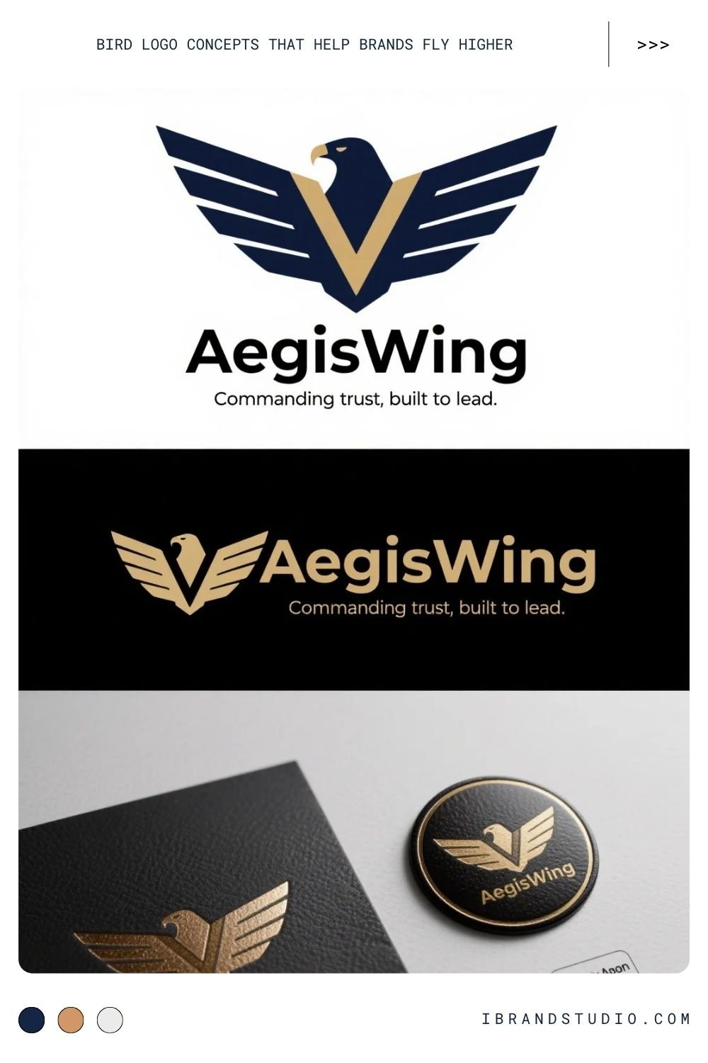
The eagle is one of the most recognizable birds in branding. It immediately conveys power, confidence, and control.
Best suited for:
Corporate brands, financial institutions, security firms, sports teams, government-related organizations
Design approach:
Eagle logos work best when they feel bold and intentional. Designers often use sharp edges, wide wingspans, and strong symmetry to enhance the sense of authority.
Tip:
Modern eagle logos are usually simplified. Overly detailed feathers can make the logo feel dated or hard to scale.
2. Dove Logo Concept – Peace, Care, and Trust
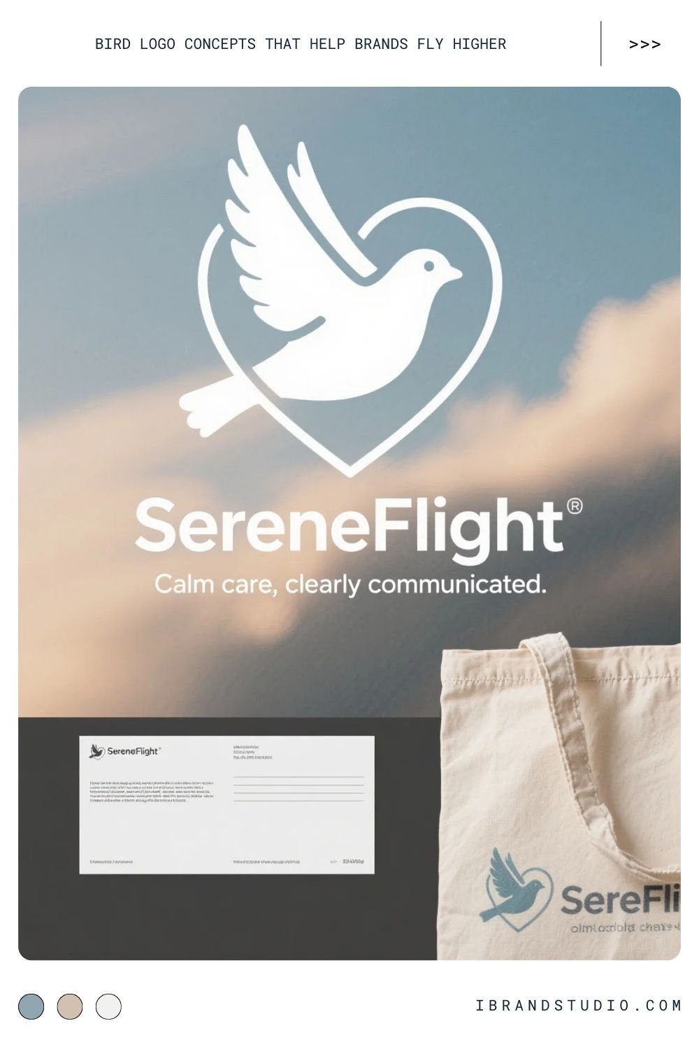
Doves communicate calmness and sincerity. They feel human, emotional, and reassuring.
Best suited for:
Nonprofits, wellness brands, healthcare, spiritual organizations
Design approach:
Soft curves, gentle wing positions, and light color palettes help reinforce the message of peace and care.
Tip:
Line-based dove logos often feel more contemporary than fully illustrated ones.
3. Owl Logo Concept – Intelligence and Insight
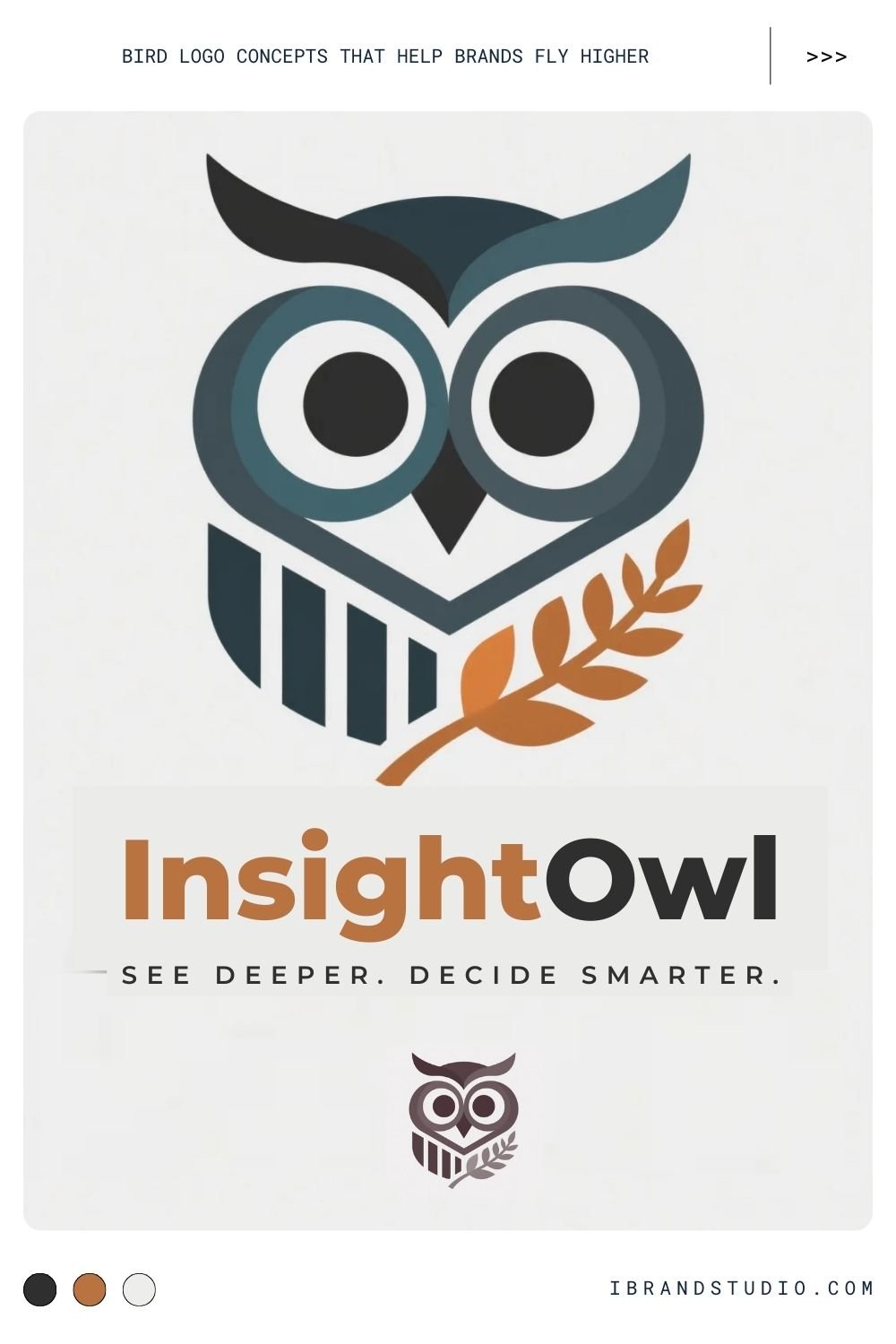
Owls are strongly associated with wisdom, learning, and thoughtful decision-making.
Best suited for:
Education platforms, consulting firms, analytics companies, fintech brands
Design approach:
Many owl logos focus on symmetry and eye shapes to emphasize intelligence. Even abstract owls work well if the “watchful” quality is clear.
Tip:
Avoid cartoonish expressions unless the brand is intentionally playful.
4. Falcon Logo Concept – Speed, Focus, Performance
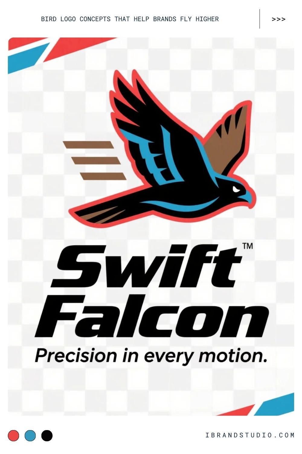
Falcons represent precision, speed, and elite execution.
Best suited for:
Tech startups, esports teams, logistics companies, performance brands
Design approach:
Use sharp angles, forward-leaning shapes, and motion lines to imply velocity and direction.
Tip:
A falcon in mid-dive or streamlined profile instantly communicates action.
5. Sparrow Logo Concept – Simplicity and Community
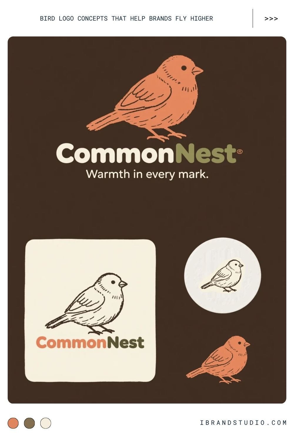
Sparrows are small, familiar, and approachable. They feel human and grounded.
Best suited for:
Local businesses, cafés, lifestyle brands, social platforms
Design approach:
Hand-drawn or minimalist sparrow logos feel authentic and friendly.
Tip:
Imperfect lines can actually strengthen the charm of this concept.
6. Peacock Logo Concept – Beauty, Confidence, Luxury
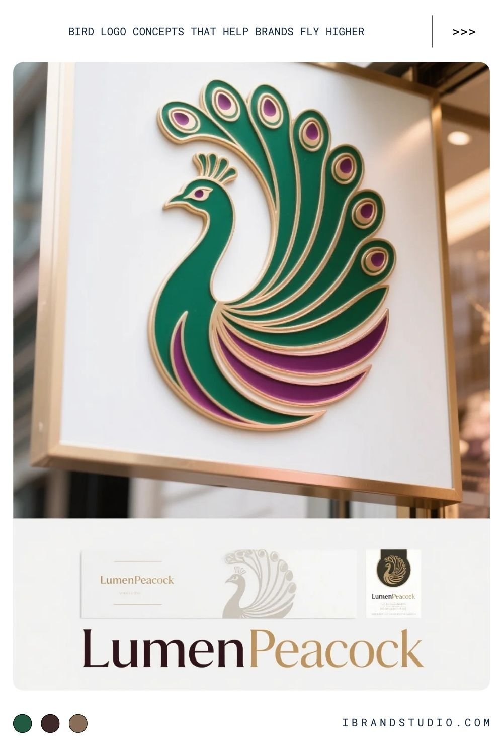
Peacocks are bold, expressive, and impossible to ignore.
Best suited for:
Fashion brands, beauty products, luxury services, creative studios
Design approach:
Stylized feathers, elegant curves, and rich colors help convey premium quality.
Tip:
Focus on suggestion rather than detail—implied feathers often look more refined.
7. Hummingbird Logo Concept – Energy and Creativity
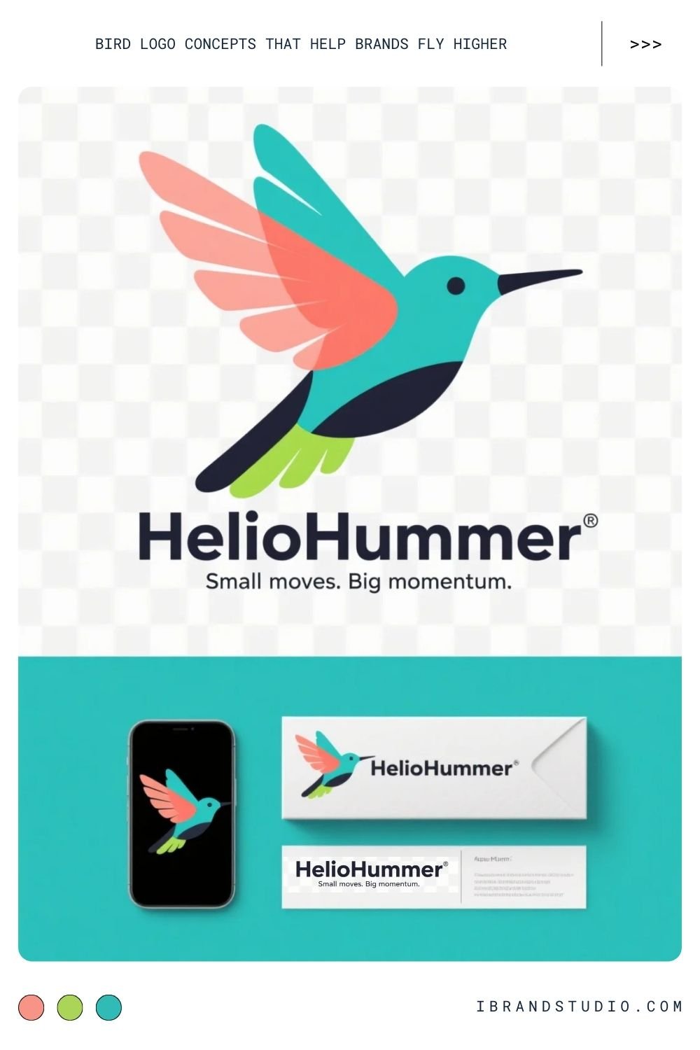
Hummingbirds are small but powerful, symbolizing agility and innovation.
Best suited for:
Creative agencies, startups, eco-friendly brands, wellness products
Design approach:
Wing motion, vibrant accents, and lightweight shapes bring energy to the design.
Tip:
Keep the body simple so the logo doesn’t feel chaotic.
8. Raven Logo Concept – Mystery and Intelligence
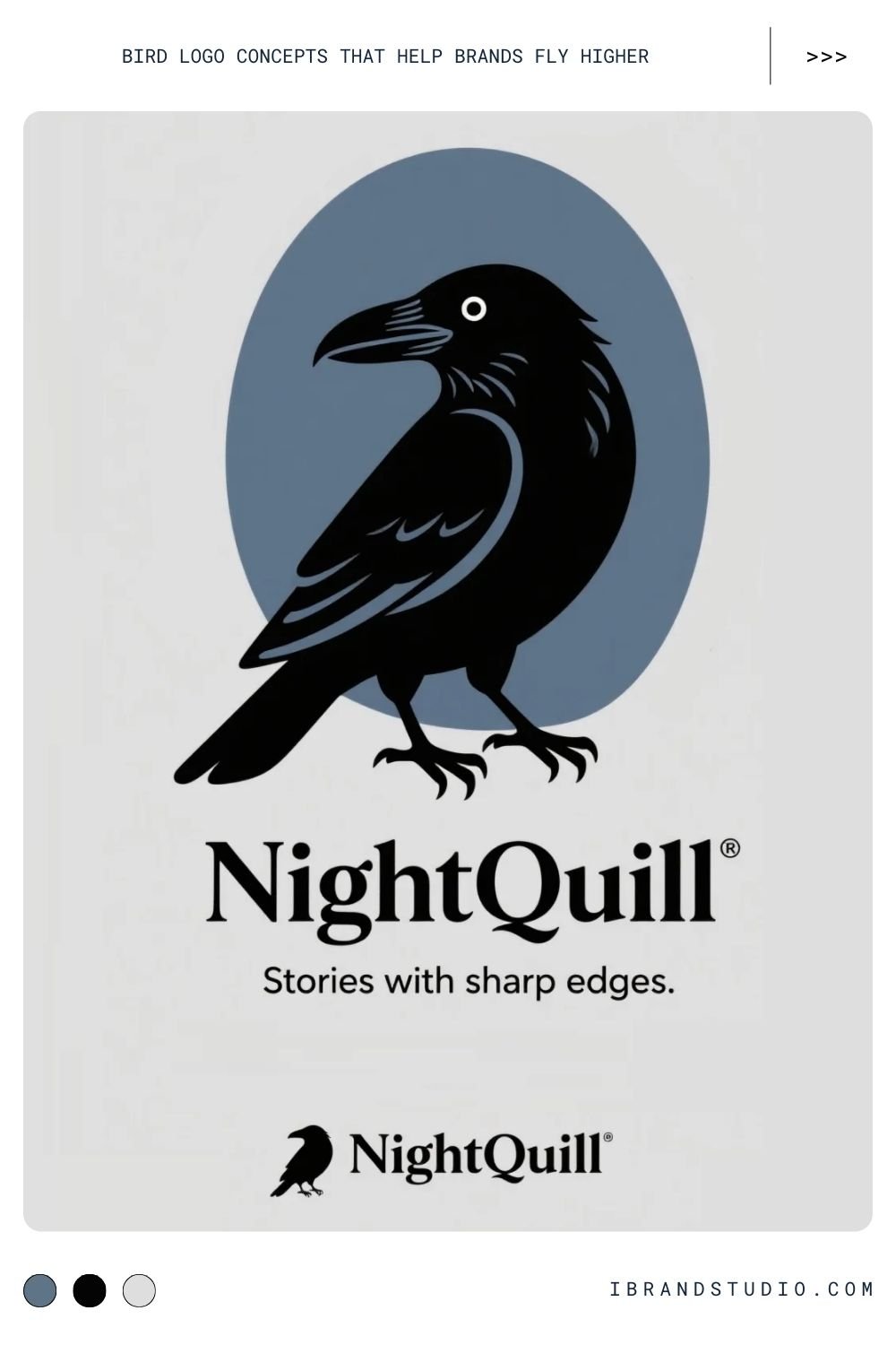
Ravens are clever, symbolic, and slightly dark—perfect for storytelling brands.
Best suited for:
Gaming, publishing, media brands, alternative aesthetics
Design approach:
Strong silhouettes and dark palettes enhance the sense of mystery.
Tip:
Negative space works especially well with raven logos.
9. Swallow Logo Concept – Travel and Freedom
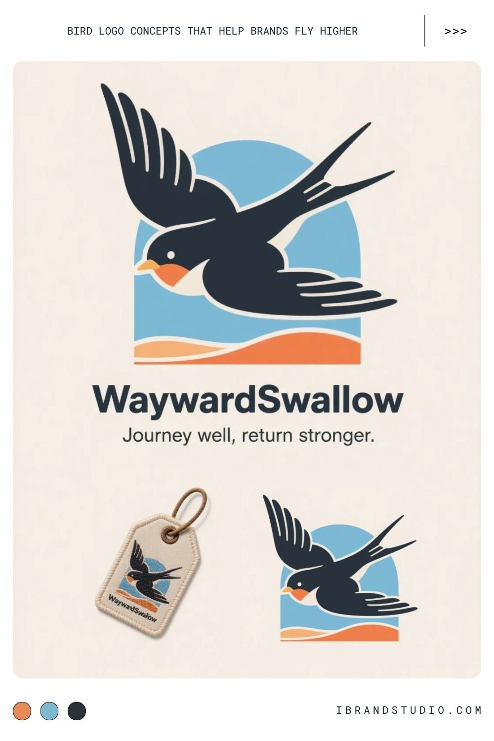
Swallows symbolize movement, loyalty, and safe return.
Best suited for:
Travel brands, logistics, lifestyle and apparel companies
Design approach:
Flying poses and clean lines reinforce the sense of freedom.
Tip:
Swallows are excellent for badge-style or emblem logos.
10. Phoenix Logo Concept – Transformation and Strength
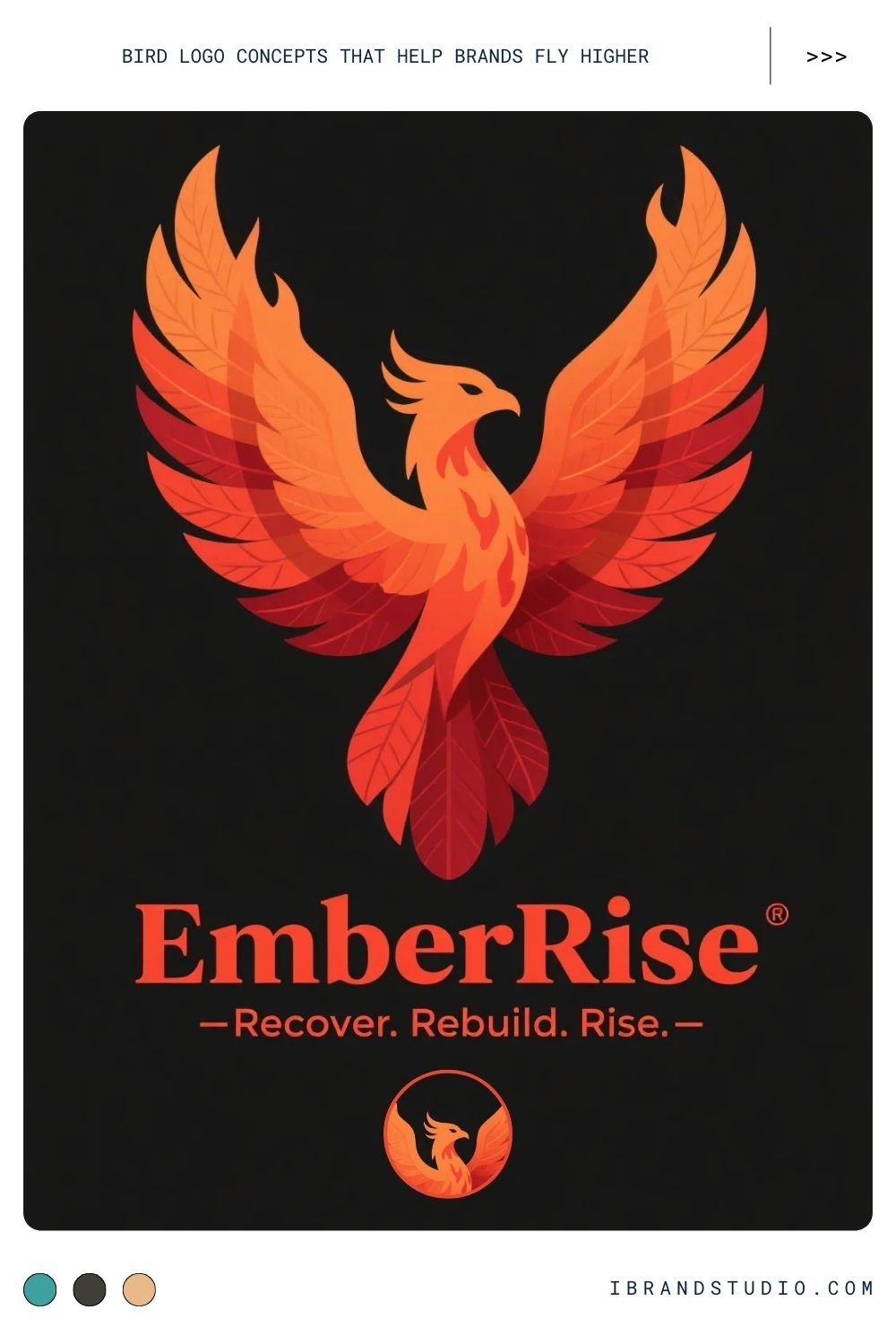
The phoenix represents rebirth and resilience—one of the strongest symbolic birds.
Best suited for:
Rebranding projects, fitness brands, coaching businesses, recovery services
Design approach:
Upward motion, flame-inspired shapes, and dynamic composition are key.
Tip:
Subtle gradients can work well if they don’t overpower the mark.
11. Pelican Logo Concept – Care and Protection
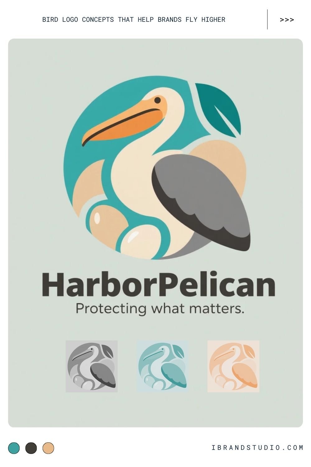
Pelicans symbolize generosity and nurturing.
Best suited for:
Charities, healthcare services, family-focused brands
Design approach:
Rounded forms and calm expressions make the logo feel safe and caring.
Tip:
Avoid overly stiff geometry—softness is the strength here.
12. Crane Logo Concept – Balance and Elegance
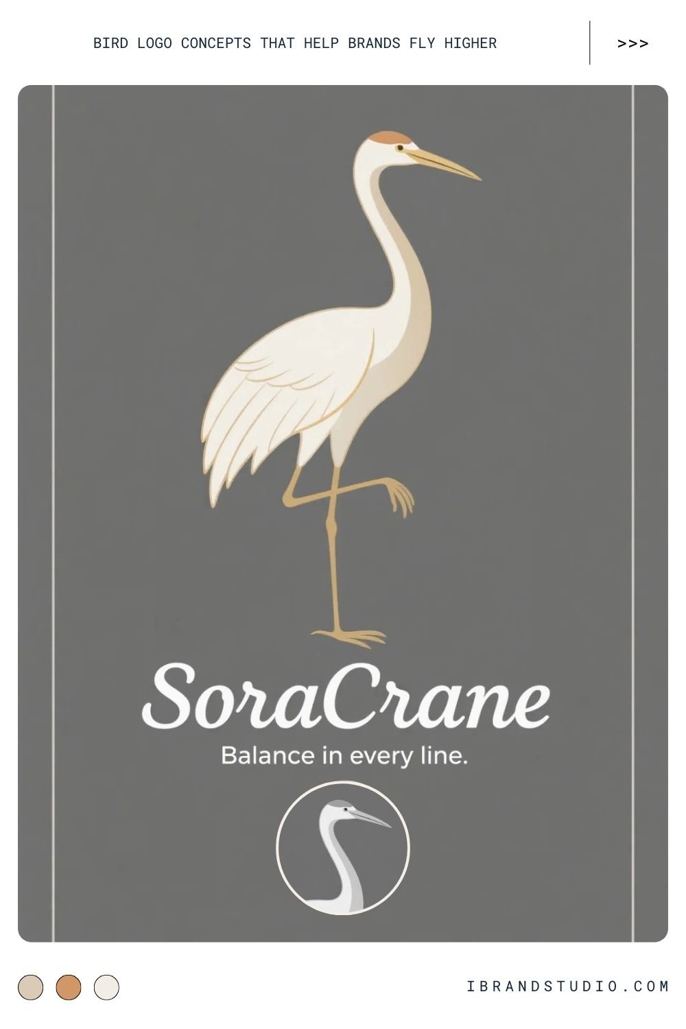
Cranes feel refined, graceful, and timeless.
Best suited for:
Wellness brands, architecture firms, cultural or Japanese-inspired identities
Design approach:
Minimal forms, thin strokes, and vertical balance emphasize elegance.
Tip:
White space is essential—don’t crowd a crane logo.
How to Choose the Right Bird for a Brand
Before designing, step back and ask:
- What emotion should the brand evoke?
- Is the brand bold, calm, playful, or premium?
- Who is the audience?
- Where will the logo live most often?
A bird logo works best when the symbol, style, and strategy align.
Final Advice for Designers
- Start with meaning, not visuals
- Sketch freely before refining
- Test in black and white early
- Avoid clichés unless you reinterpret them
- Design for longevity, not trends
Conclusion: Designing Bird Logos That Truly Fly
Bird logos aren’t just decorative—they’re storytelling tools. When chosen thoughtfully and designed with intention, they help brands communicate values instantly and memorably.
As a designer, your goal isn’t just to draw a bird. It’s to translate identity, emotion, and purpose into a symbol that feels effortless and timeless. Do that well, and your logo won’t just sit there—it will take flight.
Are you interested in this design approach? Our team can customize it specifically for your needs. Please contact us for more details.
