The 7 Most Popular Logo Symbols Today (And Why They Still Work)
Logos do a lot of heavy lifting in a very small space. In a glance — sometimes less than a second — they’re expected to communicate trust, personality, and meaning.
That’s why, across industries and cultures, we keep seeing the same kinds of symbols show up in logo design.
This isn’t a coincidence. Certain logo forms work because humans are wired to recognize and emotionally respond to them.
Designers don’t keep using birds, leaves, or circles because they’ve run out of ideas — they use them because these symbols have proven psychological power.
If you’re a graphic designer, brand strategist, or just someone who loves branding, understanding why these logo symbols are so popular will help you make better design decisions — and avoid using them accidentally or lazily.
Let’s break down the 7 most commonly used logo symbols across industries, what they communicate, and why brands keep coming back to them.
Why the Same Logo Symbols Appear Everywhere
Before we jump into the list, it helps to zoom out for a moment.
Most popular logo symbols share three things:
- They’re instantly recognizable
- They carry clear emotional meaning
- They work across cultures and languages
Good logos don’t need explanation. They rely on shared visual understanding — often rooted in nature, geometry, or long-standing cultural symbolism.
When a symbol already has meaning built in, a brand can communicate faster and more effectively.
That’s the real reason these symbols last.
1. Birds: Freedom, Movement, and Vision
Birds are everywhere in logo design, especially when a brand wants to feel aspirational or forward-looking.
They naturally suggest freedom, speed, and perspective. A bird in flight feels optimistic and dynamic, while a perched bird can feel calm and observant.
Wings add an extra layer of momentum and growth.
Grab it: Free Blue Falcon Emblem: AI, EPS, SVG & PNG Files Included
Common industries
- Airlines and travel
- Media and communication
- Fashion and lifestyle brands
Why birds work so well
Birds aren’t aggressive, but they’re powerful. They suggest progress without intimidation — which is why they’re especially popular with global brands.
Also See: 12 Bird Logo Concepts That Help Brands Fly Higher
Well-known examples:
Barclays, American Eagle, Twitter (formerly), NBC, Nestle
2. Animals: Personality and Emotional Connection
Animals (beyond birds) are some of the strongest storytelling tools in branding.
Different animals instantly communicate different traits:
- Lions feel authoritative
- Horses feel fast and elegant
- Bulls feel strong and resilient
- Big cats feel confident and agile
This makes animals incredibly useful when a brand wants a clear personality without using words.
Also See: 15 Animal Logo Concepts for Powerful & Memorable Brands
Common industries
- Automotive
- Sports teams
- Fashion and apparel
- Entertainment
Why designers choose animals
Animals humanize brands. They make companies feel more relatable while still allowing for bold, iconic visuals.
Related: Low Polygon Logo Designs: 45 Amazing Animal Logos
Examples:
Animal Planet, Ferrari, Puma, Lacoste, WWF, Porsche

Also Read: 30 Awesome Animal Logo Marks by Ivan Bobrov
3. Leaves and Plants: Nature, Health, and Growth
If you’ve ever designed for a wellness, organic, or sustainability-focused brand, you’ve probably reached for a leaf at some point — and you’re not alone.
Leaves and plant imagery signal growth, renewal, and environmental responsibility. In modern branding, they’ve become shorthand for “natural” or “eco-conscious.”
Common industries
- Organic food and beverage
- Environmental organizations
- Beauty and wellness
- Agriculture
Why plant symbols are so popular
They’re emotionally positive and immediately understood. Even when a brand’s sustainability claims are modest, plant imagery creates a perception of care and responsibility.
Examples:
Air Canada, Whole Foods, Adidas, Huawei, Nestea
4. Fruit: Freshness and Approachability
Fruit logos might seem niche, but they show up more often than you’d expect — even outside food branding.
Fruit represents freshness, simplicity, and human-scale design. A single piece of fruit is easy to recognize, easy to remember, and rarely intimidating.
Recommended: Logo Design Inspiration: 45 Creative Fruit and Vegetable Logos
Common industries
- Food and beverage
- Grocery and health brands
- Apparel and consumer goods
- Technology (in rare but notable cases)
Why fruit works
Fruit feels friendly. It softens brands and makes them feel more accessible — which is exactly why Apple’s logo works so well despite being simple.
Also Read: Branding Sweet Success: How Fruit-Based Companies are Redefining Healthy Lifestyles
Examples:
Apple, Sprite, Fruit of the Loom, Applebee’s, Woolworths
5. Circles: Unity and Trust
Circles are one of the most commonly used shapes in logo design — and arguably the safest.
They represent wholeness, community, and inclusion. There are no sharp edges, no hierarchy, and no obvious beginning or end.
Keep Explore: Awesome Circle Animal Logos With Tom Anders Watkins
Common industries
- Tech and apps
- Healthcare
- Social platforms
- Global organizations
Why designers rely on circles
Circles feel modern and approachable. They scale beautifully in digital environments and work especially well for app icons and social avatars.
Examples:
LG, Target, Pepsi, MasterCard, Olympic Rings, abc
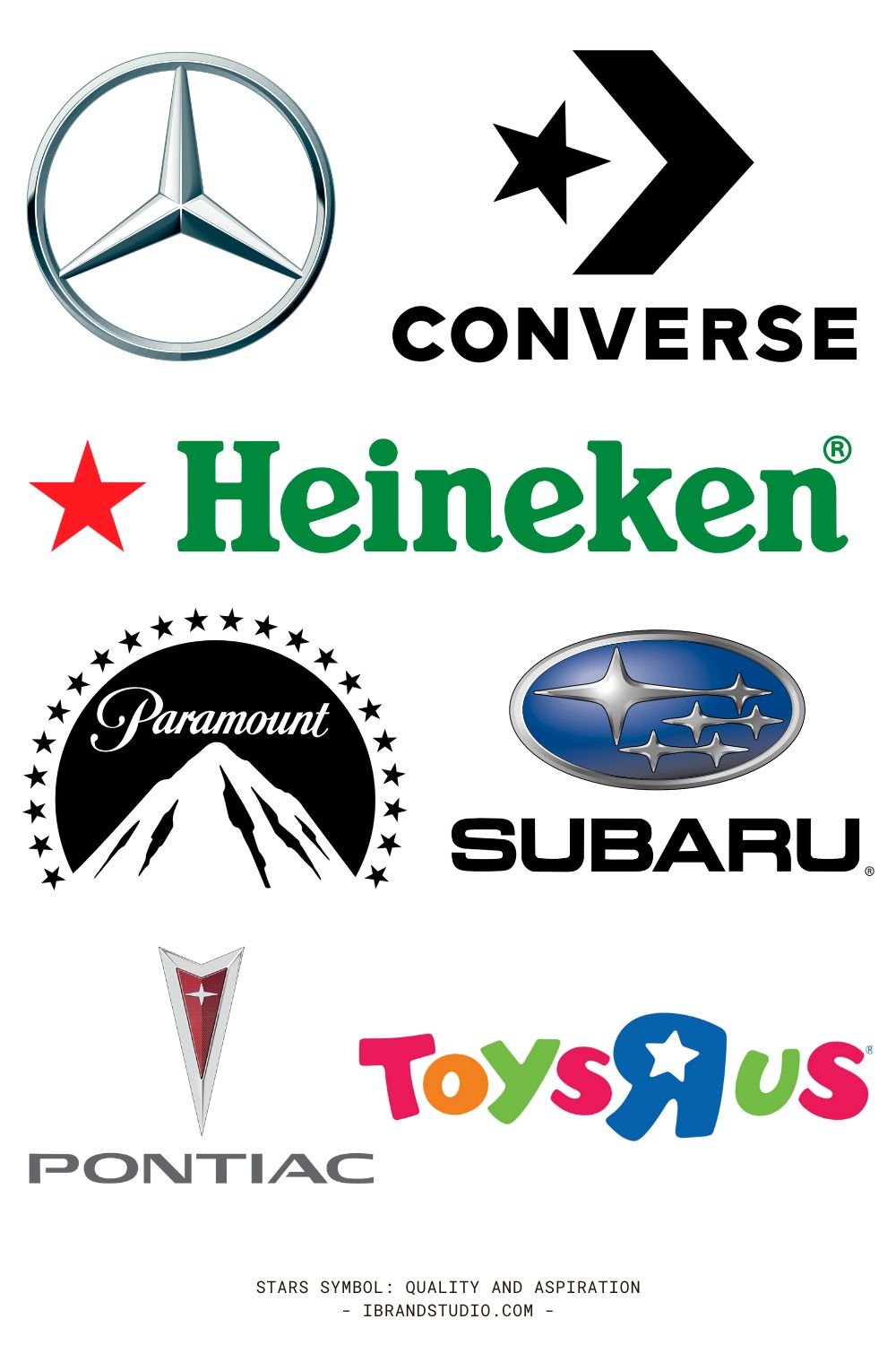
6. Stars: Quality and Aspiration
Stars are visual shortcuts for excellence.
They communicate achievement, recognition, and high standards. In some cases, they also carry patriotic or cultural meaning, depending on context.
Common industries
- Entertainment and media
- Automotive
- Retail and food
Why stars endure
A star instantly elevates perception. It suggests leadership or premium quality without saying it outright.
Keep Explore: The 10 Most Famous Supercar Brands and Their Logos
Examples:
Mercedes-Benz, Paramount Pictures, Heineken, Converse
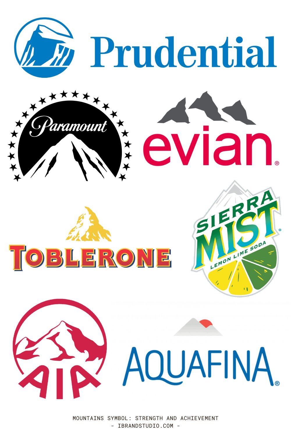
7. Mountains: Strength and Achievement
Mountain imagery taps into a deep metaphor: effort, endurance, and reaching the top.
Mountains symbolize stability, ambition, and long-term strength — which is why they’re so popular with outdoor and adventure brands.
Also See: A Collection of 35 Creative Mountain Logo Designs for Inspiration
Common industries
- Outdoor and lifestyle brands
- Travel and tourism
- Beverage (especially water)
Why mountains resonate
They feel timeless and dependable. Even abstract mountain shapes carry a sense of resilience and trust.
Grab This: Freebie: 8 Adventure Logos and Badges (AI, EPS)
Examples:
Prudential, AIA, Evian, Toblerone, Paramount
Final Thoughts: Popular Doesn’t Mean Generic
Here’s the takeaway for designers and branding enthusiasts:
Using common logo symbols isn’t the problem. Using them without intention is.
These symbols work because they’re deeply embedded in human perception. The key is not avoiding them — it’s how you use them.
Ways to stand out with familiar symbols
- Simplify more than competitors
- Abstract instead of illustrating literally
- Pair the symbol with distinctive typography
- Build a unique color system around it
Strong logo design isn’t about reinventing meaning. It’s about choosing the right symbol — and executing it better than anyone else.
