It is always relaxing to have some quiet time at home as you watch a movie or follow a TV show. But some people want to catch that blockbuster movie at the theaters so that they can enjoy it in the best quality. One of the things that make a good movie/TV show is its ability to grab the attention of the audience before they can watch it. A logo of the movie/TV show, in this case, can be an excellent example of an element that draws the audience attention.
If you are a movie/TV show fan, you most definitely know some of the famous logos. And we are not talking about the movie studio logos like 20th Century or Warner Bros. Rather, we are talking about the movie/TV shows movie logos, along with the meaning behind them.
Let’s have a look at them, shall we?
#1. Friends

We choose to start with this TV show because it is one of the best sitcoms of all times. The logo of this TV show is just as the name is; FRIENDS. It is a 90s comedy about a group of friends going through the usual ups and downs of life. Some fall in love with each other, while others become enemies along the way. But at the end of the day, they are still great friends that have each other’s back to the end.
This show doesn’t only revolve around a family home and workplace like most sitcoms. Instead, it has a lot of incredible scenes and fascinating stories.
The opening title starts with the characters goofing around a fountain with vibrant colored umbrellas. They are dancing to the theme song; I’ll be there for you by The Rembrants. The logo ‘FRIENDS’ is presented in unique handwriting, which reflects the sense of fun and abandonment of the show. Also, six colored dots separate the letters. Some believe that the dots represent the six main characters in the show, but that’s not the case. The reality is that these dots are only a representation of the six colorful umbrellas that the characters are carrying.
#2. Jurassic Park

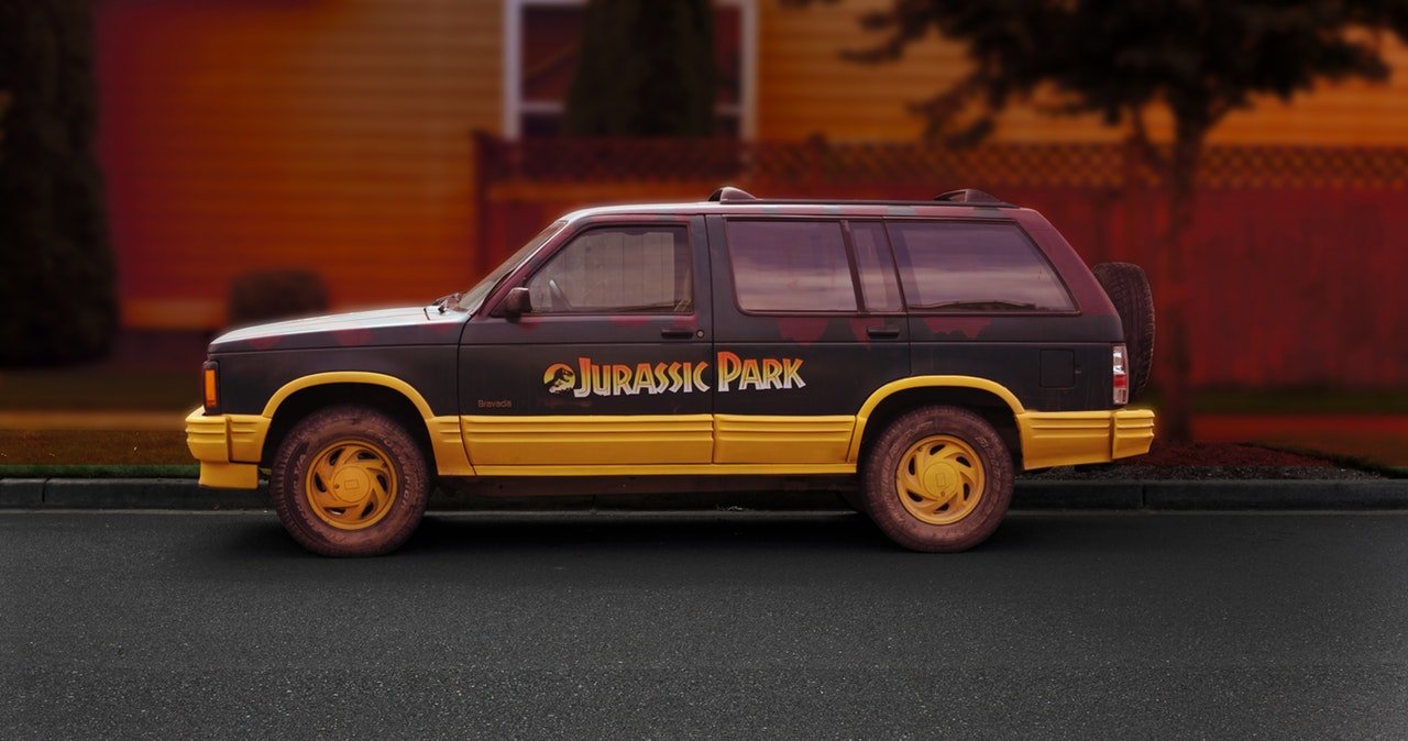
This movie was start released in 1993, and the logo has never changed since then. Even in the most recent Jurassic World movie of 2018, the logo remains the same. The Jurassic Park franchise logo features a T. Rex skeleton that is frozen in time as it is stalking its prey.
It was created by Chip Kidd, a book cover designer. Initially, Chip Kidd designed the first logo for the franchise in 1990. It was placed against a red backdrop that was used to promote the movie that would then be released in 1993.
According to Kidd, he claims that he found a book in the gift shop at the Museum of Natural History. The book featured a Tyrannosaurus Rex skeleton diagram, which he worked on it to make it more accurate than the previous design.
The poster designer of the film, Tom Martin, later used the design of Chip Kidd and added a typeface and a tiny jungle landscape at the bottom. This helped to give the dinosaur scale and give the whole design completion.
#3. Breaking Bad

Any lover of TV shows can easily tell you what Breaking Bad is all about. This is not a new term in the entertainment world. It is actually voted as one of the best TV show of all times. The show is about Walter White, the high school chemistry teacher that had a boring life with nothing to be proud of. He lived a regular life until he was diagnosed with cancer. That is where the gears of the show shift and you are introduced to a whole new Walter White that is not cooking and selling methamphetamine.
But we’re not here to talk about how the show goes down. Instead, we are discussing the logos, and the logo on this one is a very easy book to read. It is all about the periodic table elements that are set in an indifferent font that signify Walter White’s boring former life. But it could also depict the stability and purity of science and how Walter cooks unmatched meth.
The second font is somewhat broken to symbolize the mess that Walter’s life turn into when he gets deeper into the life of crime. It also could symbolize how meth leaves someone ‘broken’ and vulnerable.
This logo is very popular today that Bryan Cranston, who plays Walter White, got it tattooed on his ring finger in the final episode of the season finale. If you haven’t watched this series, be sure to catch it on the MSN watch online guide. You can also find more other TV shows and movies to watch.
#4. Batman

Who is not aware of the Batman movie franchise? This superhero movie series has been a hit for the past three decades. The first Batman movie was released in 1989, and it has proven to be a blockbuster ever since.
If you have been following the Batman movies since the 90s, you will notice that the logo changed somewhere on the way. Earlier on, director Tim Burton and Warner Bros wanted to bring something different and turn up the juice in the franchise. This was when they released the Dark Knight, which was the first ever Batman movie with a mega success.
But they also wanted a change in the logo. That is when they wanted to make some alteration in the logo just to help them capitalize on the recognition of the Batman movies. The first logo was not as ‘energetic’ as producer Jon Peters wanted. As a result, he wanted a makeover. The designers replaced the bright yellow background with a stark gold theme with clean, sharp lines. These sharp lines were meant to be both different and familiar with the previous design. They didn’t want the audience to think it was something new.
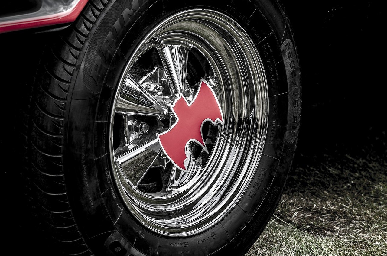
The Batwing vehicle in the movie franchise takes the shape of the logo too.
Another popular logo is the James Bond Series that has been running from 1969 to date. It comes with the 007 Logo, where the number 7 depicts a gun. The 00 are just like cover-ups for the 7.
It can be annoying to start watching a TV series without knowing if it will be good in the next episodes or not, but there are ways to tell if the TV show is a hit or not.
