A Brief Guide of How To Combine Colors in Your Advantage
Many times we are not aware that any entity around us is communicating or suggesting a specific message. The human brain is based on two levels, the conscious and the subconscious one. At the conscious level the messages are usually directly communicated while at the subconscious level everything is more subtle, the suggestion being the way of conveying a message. Influencing the subconscious of people is mostly an art whereas not the doctors didn’t have too many information about the supreme computer, the brain.
The logo designers are merely trying to influence the logos viewers and many times are used methods that seem to stimulate the subconscious. A very effective way to influence the subconscious of people is to use the power of colors. Yeah, the colors are everywhere and these may be used in our advantage! This is not only my opinion or the common appreciation of the logo design community, it is scientifically proved.
In conclusion, every designer should know how to handle the colors in his/her advantage. Fortunately or not, becoming friend with the colors isn’t rocket science, there are a few tips to follow but to turn into a very good manipulator of color power a lot of experience is required. Here are some ideas that will help very much in determining the best color/color combination for your next project. Apply them and let us know what you achieved, maybe your work will be highlighted in our logo collections.
#Pay attention to the meaning of colors
Each color has its specific meaning and every designer should anticipate how the viewers will be influenced by colors. Depending on the region of the planet, a color may have various meanings and a bad choice may offend some people. All these potential issues may be avoided by studying very carefully the potential audience. It’s weird and in the same time alluring, but a color may have totally opposed meanings in different countries.
#The message of the logo should match to the colors
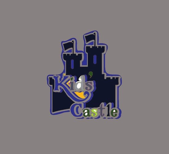
A logo isn’t only about color; there are other elements that should be taken into account. A very good logo transmits a single message from all the perspectives, therefore the shapes, typography and any other element should match to the colors used. Imagine a logo for a kindergarten, using a childish approach but using black …by sure it will be a big fail! The example bellow is more than enough, isn’t it?

#A powerful contrast is different from visual tension
Contrast is mandatory in almost any project but achieving it isn’t quite necessarily a simple task and many designers commit many mistakes regarding this matter. A too strong contrast doesn’t mean that it will be noticed and appreciated by viewers; in the most cases it will fatigue the viewers’ eyes and nothing more. A very good method of checking the contrast power is to convert it in black and white the digital files; unless the design is hardly to distinguish then your contrast is OK. The example below is self-explaining the difference between contrast and visual tension.


#Don’t use too many colors-three is enough
A quality logo is easily recognizable and in consequence, a part of logo designers uses multiple colors in their projects. Well, this is not a negative aspect but it has enough downsides to make you think twice when using multiple colors. A multitude of colors doesn’t mean that it will be wide appreciated and in addition of that, a very colorful logo supposes a lot of problems when using it in print version. Usually, more than three colors isn’t quite recommended to use.
#Two or three nice colors don’t have necessarily a nice result
The color theory seems to be based on the laws of Murphy; there are an immense number of nice colors but in spite of that the number of cool color combination is very limited. Definitely, two nice colors doesn’t mean that their combination is amazing.
It’s very difficult to make a good color combination but there are some online tools that simplify the process of selecting a color and any logo designer should have bookmarked at least two or three. Bellow it’s just a short selection of online apps that help the designers to select the best color combination. I strongly recommend playing for some minutes with them and finally select some for your next projects.
- Kuler
It is the application released by Adobe, therefore you shouldn’t have doubts about its quality. It’s simple to use and you may get inspiration from other people color combinations. - COLOURlovers
Colour Lovers is a great application and it is very useful in getting inspiration and creating a good color palette. The navigational menu is very rich and at the same time it helps very much in finding the perfect colors for your project. - Color Scheme Designer
It’s another useful application that makes easier to select a color. I appreciate the fact that is fully focused in providing to the user everything he/she needs to create the perfect color combination.
#The most important tip: be a valiant friend of colors
The above tips are very important and truly useful but they are based on a basic entity that should have no secret for any designer: color theory. Yep, everything is based on the science of color. You can’t make good color combination or use them in your advantage as long as you don’t have a solid background about. My advice is to fathom your color theory acknowledge because colors are everywhere and there is no design project where isn’t required to play with colors. I really hope that you will find this post useful and don’t forget to share it with your friends!
– Written by Daniel –