Coca-Cola’s Timeless Brand Identity
Coca-Cola is not only the largest beverage company in the world but also one of the most influential brands. It is easily recognizable. According to Business Insider, as much as 94% of the world’s population is able to explain what the Coca-Cola logo stands for. The brand itself wants and tries to be associated with joy and happiness.
Did you know… In Mandarin, Coca-Cola translates to ‘Tasty Fun’ or ‘Delicious Happiness’.
A little bit of history
Coca-Cola started in 1886 and in Atlanta, Georgia. It was created and founded by Dr. John Stith Pemberton who was a pharmacist and a chemist.
After unsuccessful trials of introducing new medicines to the market, he decided to move into the beverage industry.
The first Coca-Cola was sold in a pharmacy. The first-year sales weren’t very promising. Dr. Pemberton sold on average 9 bottles per day.
Nowadays sales are estimated to equal around 1.9 billion. The classic Coca-Cola soda drink is sold in over 200 countries and territories.
That includes pretty much all countries except Cuba and North Korea due to the United States embargo against the countries.
For around 60 years, Coca-Cola wasn’t sold in Burma either. Also due to US trade sanctions. When the company finally entered the country in 2012, people saw it as a symbol of positive political changes in the future.
Tom Standage, the author of A History of The World in Six Glasses, said: ’Coca-Cola is the nearest thing to capitalism in a bottle’.
During the World War II Coca-Cola was supplied to the American troops abroad. This allowed the company to become a symbol of American patriotism.
When the Berlin Wall fell in 1989, Coca-Cola employees handed out free cans. ‘Drinking Coca-Cola became a symbol of freedom’, says Tom Standage.
Did you know… There were multiple blind tests done during which participants were given Coca-Cola and Pepsi (the biggest competitor of Coca-Cola).
Most participants, taste-wise, chose Pepsi as their preferred drink. However, when asked whether they generally prefer Coca-Cola or Pepsi, most of them chose Coca-Cola due to higher familiarity and connection to the brand.
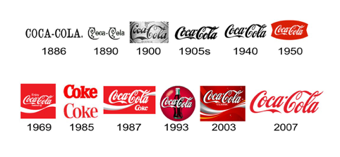
Logo Design
The logo was designed by Frank M. Robinson. He was a partner and a bookkeeper of Dr. Pemberton. Robinson chose to use Spencerian Script for Coca-Cola’s font.
The reason for his decision isn’t exactly known. However, it is safe to assume that Robinson simply followed the trends.
The script was considered a standard writing style for business correspondence in America before the introduction of typewriters.
As for the color, the red color was there since the beginning. It is meant to represent energy, excitement, power and passion.
Moreover, the red color is associated with increased heart rate and appetite. According to various studies, red color can trigger impulsive buying behavior.
The logo design kept being a little twisted throughout the years. However, it has never significantly changed. The use of the script and the colors remained constant throughout the decades.

Currently, there are two Coca-Cola logo versions in use. The 2007 version of Coca-Cola name with a white ribbon underneath it, both in a red circle.
And the 2009 version with Coca-Cola name alone, on a white background. Let’s see what the future holds. It’s been 9 years now since the company adjusted its logo.
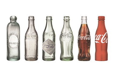
Brand Identity and Packaging Design
Naturally, at first, there was only a logo. Sometime in the 1880s, Asa Griggs Candler, a man who took over Coca-Cola after the death of Dr. Pemberton, decided to decorate datebooks, artworks, notebooks and bookmarks with the Coca-Cola logo.
This is how the company started its first brand identity design process on a national scale.
The Coca-Cola logo is the heart of the brand’s identity but there is more to it than just the logo design, script and colors.
Packaging design, specifically the shape of the bottle, played a huge role in the success of the brand. The shape of the bottle, without any writings on it, started to be as recognizable on the global stage as the logo.
No matter how successful the current results of the Coca-Cola’s brand identity are, the company faced multiple obstacles in its 130 years.
For example, in the 1980s, when cherry and diet coke were launched, the company suddenly struggled with brand recognition.
The reason was an inconsistent usage of the brand’s colors and logo on the packaging of the new products. Customers found it difficult to recognize the cherry and diet coke as part of the Coca-Cola product family.
Coca-Cola is one of the brands which believe that big changes bring trouble. The company executives believe it because they learned it from their past experience.
In 1985 Coca-Cola released New Coke and stopped the production of the classic coke at the same time.
The results of this decision were far from successful, so the company decided to return to the sales of the classic drink soon after. Coca-Cola then had to focus on rebuilding it’s briefly lost brand identity.
Share Happiness Campaigns
The company has been sharing the feeling of ‘happiness’ from the very beginning of its advertising campaigns.
The logo and the Coca-Cola slogan ‘delicious and refreshing’ were consistently used across all promotion: from a newspaper advertisement, through posters to branded items like t-shirts.

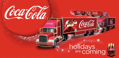
Coca-Cola is very much associated with the Christmas season. For some, the Christmas season doesn’t begin until they see the red Coca-Cola truck with Santa Claus imagine on their TV screen. ‘Christmas starts when Coca-Cola says so’.
Thanks to the whole Christmas campaign, the company associates itself with the ‘most wonderful time of the year’ which integrates perfectly with the branding strategy of sharing happiness.
Coca-Cola can definitely be called an emotional brand. Its objective is to sell experience rather than a product.
The attempt to include happiness in its overall brand image, and therefore, create the emotional brand, put the company ahead of its competitors as emotional marketing wasn’t a thing back in the days.
About the Author!
Natalia Raben is International Business student taking care of marketing @ DesignBro. Lover of design, photography and the arts.