Does Font Choice Make A Difference to A Business Logo
Telling a story using creative fonts in a business logo is always tricky. No business owner can overlook the right typeface for the sake of the company’s reputation.
A foxy designer cleverly selects a modern and appealing typeface to tell a great story… just like identifying a purring cat among multiple pigeons in a cluttered world.
Yep. The ‘right’ fonts empower a leading business. Are you interested in standing out from the clutter of sheepish or lame logos?
Here is a powerful template and a wealth of information to develop your unique story. It will affect your target audience positively with the brand being respected.
The Legend
- Fonts undoubtedly affect your business
- Considering the best typefaces for official logos and branding
- Are you aware of web-safe fonts?
- Glaring examples to stay clear
- Fonts that add weight to the design and business
- The best fonts benefit small business
BIG BONUS: A classic logo story at the end
How do fonts affect your business?
To comprehend why fonts could affect a business let us start with a few examples.
The use of creative designing of fonts began with the print media and is currently dominant in digital media. With better tools, resources, and technology designers use them freely.
However, with a multitude of fonts available, some are ‘rockstars’, infamous, ‘ugly’, ‘beautiful’, ‘impactful’, creative, or ‘highly attractive.’
Logos give the initial impression when you hand out company documents and allow visitors to browse your website.
The visuals, colors, and fonts have a psychological impact on potential customers, investors, and collaborators. They evoke good or bad feelings towards the brand or company.
A bunch of fonts cannot be slapped together with an automatic tool builder. Hire a designer or creative company that specializes in designing successful logos that tell a story or earn a badge of respect.
To build trust here are a few fonts, which are taken seriously as they also, are legible and speak about a company’s strength.
Serif & Sans Serif

Serif fonts like Times New Roman, Garamond, Bodini and Palatino are timeless and classic to use. They are the most reliable fonts designers use for their clients.
Directness is the keyword for Sans Serif fonts like Helvetica, Verdana, and Futura. New companies could take advantage of these typefaces.
Script
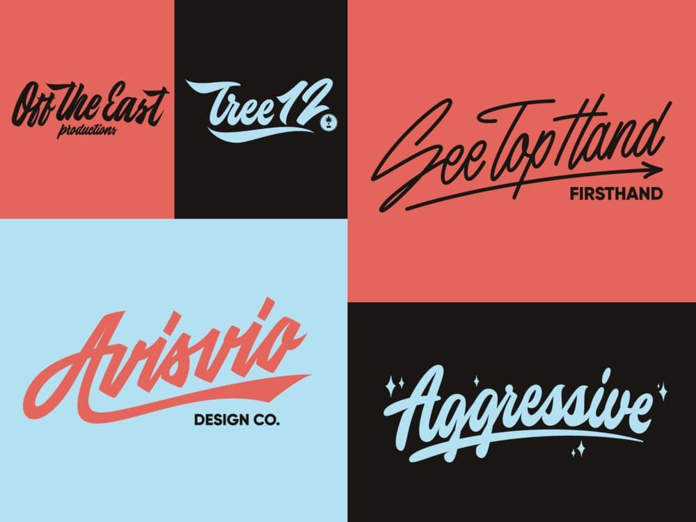
As you can see from the images, most Script fonts are stylish and very distinctive to add a special touch. They are ideal for making elegant invitation cards. If you are in the entertainment business, such fonts are effective for branding purposes.
Decorative

Decorative fonts create magic to personalize a brand and its content. They are apparent and distinctively noted in luxury brands or haute fashion house labels.
When you select fonts for a new enterprise, imagine a scribbled doctor’s prescription vs. a neat calligraphy-based creative. It will help to decide the choice and ultimately add genuine importance to the corporate logo.
Considering the finest fonts for logos and branding
Fonts that do not appeal to the modern viewer are responsible for inadequate emotional responses. Thus, the choice should add to the engaging personality of the brand.
Looking visually strong and legible to read on digital channels and print media is a necessity as well. Furthermore, being recognizable and memorable creates the brand more attractive.
A prime example: the moonscape fonts display a ‘technological’ feel along with the color scheme. If the font is nice but in small or not readable it produces negative vibes about the brand.
A good quality brand font will typically exhibit four attributes:
- Uniqueness in the display.
- Will be clear to read.
- It is compatible for use on multiple platforms.
- Instantly communicate the brand’s message effectively.
Are you aware of web-safe fonts?
As digital presence is critical for all companies, the need to include web-safe fonts will add to the list of ease of doing business.
While the ones noted above are timeless, each enterprise has to be unique and recognized. While browsing the internet, every user may not be able to see the fonts clearly and the experience will mess up with the reading ability.
Most web-safe fonts do not send garbled messages and appears clearly on any kind of screen i.e. computer or mobile device.
Are you aware that some fonts come with the operating system? When a digital logo is made, they appear legible and do not make a company website look like a scam.
When considering the right typefaces for a business, give a thought to the website design as well. It will save a lot of trouble of redoing it later.
To know more about it refer to: https://www.indeed.com/career-advice/career-development/web-safe-fonts
Glaring examples to stay clear
A professional designer with experience creating regular logo designing knows how bad examples ruin the image of a company.
How does one know a particular font choice or color scheme is wrong? It is very evident when marketing or promotional campaigns are run on various channels. People ignore the message, campaign, and product as they do not appeal.
Example 1:
The use of comic sans can make the text appear childish. An approachable font but is unprofessional in the corporate world.
Example 2:
Curls is yet another font that can break an image. It is not recommended for festive greetings!
Example 3:
Papyrus is too outdated for a modern logo design. It no longer looks appealing on print or digital media.
Example 4:
Bush Script is yet another font that anyone should stay clear from. It is bad for the brand or the business.
Fonts that add weight to design and business
The fundamental reason a specific font is selected represents its weight for the company or industry.
The color, shapes, and size of letters deliver the essence of a company to the public domain with the right message.
Example 1:
A Label comes under the serif kind that can definitely add the desired appeal. It is the choice of many luxury labels.
Example 2:
Rockwell makes it to a decent grade for many business logos. It looks professional and designed well, it is also eye-catching. It is quite readable even in the small.
Example 3:
Fruiter is very tidy and can be read online and in print. It is a great choice for a tagline accompanying the logo design.
Example 4:
Didot is highly recommended for digital usage. It appears clean on the computer screen. With the right colors, it could be enhanced for universal acceptance.
The best fonts benefit small business
If you are an independent owner of a local business or have a whether you own a corporation or own a small enterprise, to be on the online platform is essential.
As a part of being professional, you will need to have a strong logo design that signifies the business or services to give a good impression.
The benefits include:
- Conveying a professional impression on customers.
- Brand/service can stand out amongst local competitors.
- Colors and designs will capture genuine attention.
- Instead of being generic, be unique in styling and positioning.
- Secure a strong foundation for the business.
- People will start linking the brand and you positively.
Most small businesses do not have the luxury or budget to spend money. But a smartly designed logo can create an iconic brand name. Hence, choose the colors and fonts wisely or allow the designer take over.
To know more please browse: https://www.manypixels.co/blog/post/logo-font
A classic logo story
A 1920s Ferrari folklore gave quite well recognized horsepower car logos today in the world. It has a symbol of a ‘The Prancing Stallion’ on a yellow contextual, with the letters SF. SF stands for Scuderia Ferrari.
According to a legend, Enzo Ferrari met Count Paolina, mother of the renowned Count Francesco Baracca, after winning a race at the Savio track in 1923. The Count was an ace fighter pilot of the Italian Air Force at the time of World War I.
He used the Prancing stallion symbol at the sides of his Italian plane. She asked him to use this symbol, as it would bring good luck; Enzo was more than happy to use this motherly advice. His luck also shone and is still on the radar of car enthusiasts.
The rest of it is history of this power brand is best seen on the four-wheel drive! Speed, desire, and wild energy are strongly communicated with the prancing horse. The yellow color reflects clarity, focus, rapid reflexes, and actions without hesitation.
Voila, the perfect logo for Ferrari, the king of sports cars was created. It remains to attract new generations of customers.
Conclusion
Each industry or sector represents a certain appeal. Choosing the right colors and fonts brings a new element to doing business. Look at what your competitors are doing to attract customers.
Do they have a memorable icon? What kind of message does their website release? Do viewers get a fair idea of the business? Are they able to integrate the design into print and digital media? Each graphic has a story to tell and sell.
It’s now over to you. Check out the fonts and color schemes make business sense for success.
PS: Hire a pro, as a mother’s advice does not work always!
About the Author!
Ethan Millar is a technical writer at Aegis Softtech especially for computer programming like Asp.net, Big Data, Hadoop, dynamics AX, and CRM for more than 8 years. Also, have basic knowledge of Computer Programming.
Reference links:
- https://www.brandography.com/what-your-logos-font-says-about-your-brand/
- https://www.designrush.com/agency/logo-branding/trends/brand-typography
- https://www.frontsigns.com/blog/font-importance-for-the-logo-design/
- https://freethoughtblogs.com/pharyngula/2010/05/07/fonts-make-a-difference/
- https://stellapop.com/the-best-and-worst-fonts-for-branding/
- https://www.companyfolders.com/blog/worst-fonts-ever-11-examples-of-bad-typography-in-print
- https://logo.com/blog/best-fonts-for-a-logo
- https://www.indeed.com/career-advice/career-development/web-safe-fonts
- https://www.manypixels.co/blog/post/logo-font
- https://mediamonkeymarketing.com/logo-fonts-and-how-it-affects-your-business/
- https://alltimedesign.com/best-fonts-for-logos/