Simplicity does not mean primitiveness. These are two distinct concepts. And a lot of blank space in minimalist design is not the same as emptiness.
This is what Joshua Becker says in The More of Less:
[bs-quote quote=”You don’t need more space, you need fewer things.” style=”style-19″ align=”center” author_name=”Joshua Becker”][/bs-quote]
Today, we often discuss minimalism in regards to different contexts both at home and the office, and design is most closely related to it. For minimalism, we should be familiar with its advantages and disadvantages and key facts.
On Minimalism
In fact, the term minimalism is used in basically every field and industry. The dictionary explains it as “a style or technique famous for its balance and conciseness in the fields of music, literature, and design”. Minimalism is being accepted in a growing number of fields, and its core features are simplicity and meaningfulness.
When it comes to different fields of visual art, minimalism’s core principles are essentially the elegant preservation of critical parts that attract the viewer’s attention. Lines, shapes, colors, openness, compositions, and other elements are well organized. Today we can see minimalism in all areas of life: architecture, art, photography, literature, music, UI design, and even food.
Designers should pursue minimalist designs that are concise but not empty, fashionable but not over-adorned. They should utilize negative space, bold combinations of color and font, and integrate elegance into functional details. However, there is often a line between minimalist design and rude original design, which is why many designers do not like to take this risk. Some designers feel that this style is too cold, while more designers do not understand how to correctly handle minimalist design with fewer elements.
Characteristics of Minimalist Design
A minimalist design usually contains the following characteristics:
- Simplicity
- Clarity
- Visual hierarchy
- High Contrast Components and Proportions
- Each element has a function
- A lot of space and openness
- High attention to core details
- Typesetting is an important design element
- Non-functional decorative elements removed
Minimalist UI design highlights the core elements, making it more intuitive for the user ad their behavior more purposeful. In addition, minimalist UI design seems less complex. Satisfactory aesthetic trends also allow minimalist UI designs to have a good user experience.
Best practices in minimalist design
Today minimalist designs have become a mainstream design trend for web pages and UI design, and the main features of minimalist design can be reflected by the following best practices.
#1. Flat Design
The trends of flat design and minimalism complement each other, and they both maintain a high degree of consistency in technical details and spirit. As we all know, flat design removes the highlights, shadows, gradients, and textures that widely exist in quasi-physical design, while flat design 2.0 only adds some shadows and subtle gradients. Flat design makes buttons, icons, and illustrations more uniform in different screens and resolutions. The usability of the interface and visual coordination are easier to achieve in this design style.
However, flattening and minimalism are still two completely different concepts, and they are not mutually substitutable. Flattening is more a technical and stylistic existence, and minimalism has a broader significance. It contains a set of layout, composition, color matching, contrast and even overall design spirit strategies. Therefore, flat design should be regarded as a kind of technology and design skills to create minimalist design.
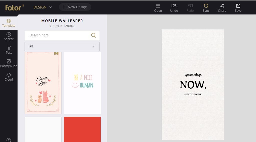
BTW, I might recommend a simple flat design tool for novices – Fotor. It’s free and easy-to-use. You may use it to design your phone’s wallpaper like I do below:
#2. Monochrome and Finite Color Matching Scheme

Color is an important link to build the emotional relationship between users and products. Designers usually adopt monochrome or fewer color matching schemes in minimalist design, which can allow the selected colors to be more cohesive and maximize the power of colors. This design keeps users from being easily distracted, which makes it easier for users to be guided to specific areas and focus on specific content.
Such an interface is both effective and efficient. In addition, from a psychological point of view, specific colors relate to specific emotions, while cohesive color matching can amplify emotions.
#3. Limited options
The power of minimalist design is to focus user attention more on functions and goals. Usually, in minimalist UI design, there are few decorative elements with no shadows, textures, or even redundant interactions and colors to distract user attention. They need users to concentrate and perform critical tasks. The navigation of the entire website or app is also based on helping users solving problems.
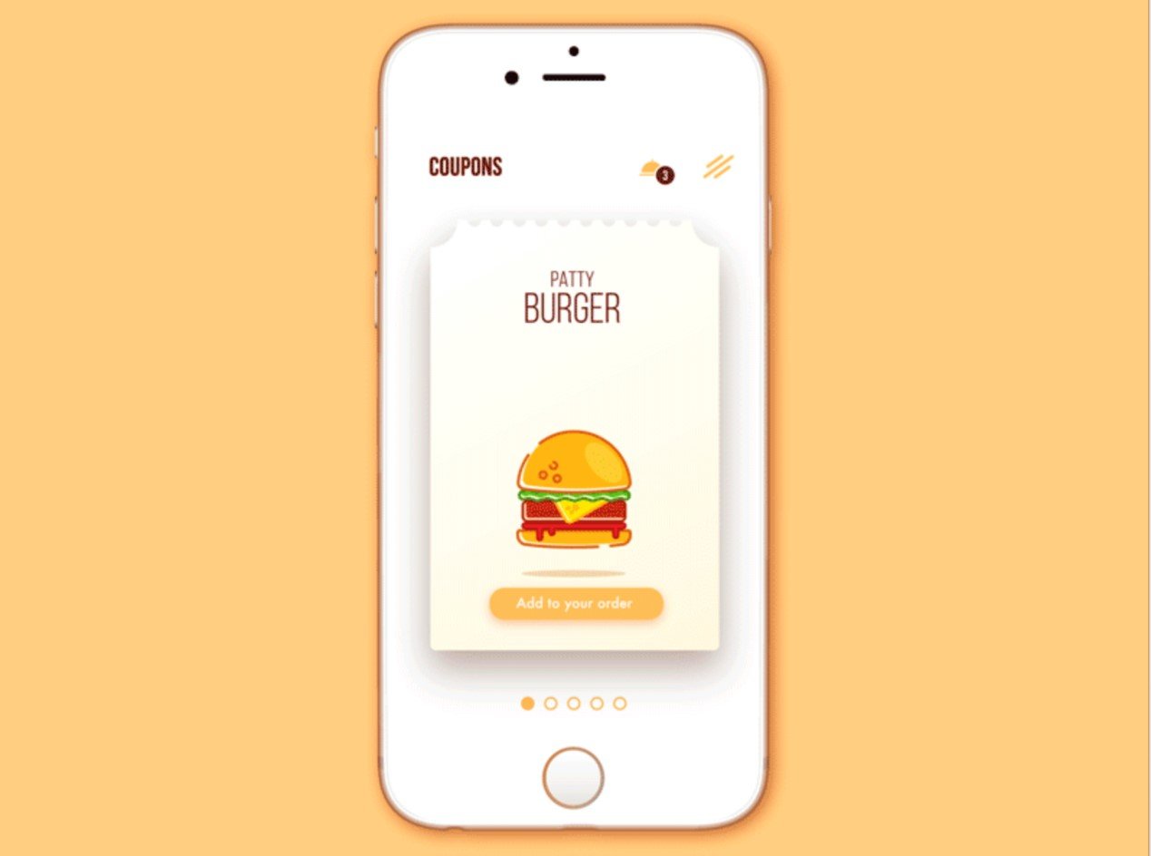
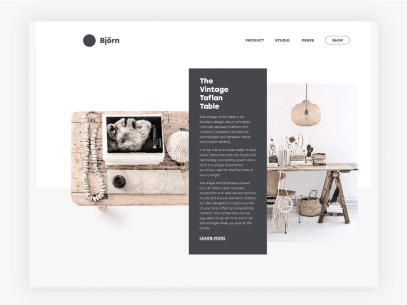
#4. Highlighted themes and visual elements
In a minimalist UI, designers do not incorporate too many pictures, but choose a single picture that expresses vividly and a prominent overall vision that attracts user attention. Such a design allows users to pay even more attention to the right picture, and no longer need to filter through a large amount of information, and the information and emotions conveyed by a single picture will not be usurped. Pictures or illustrations will follow a minimalist design style, otherwise they will destroy the overall style’s consistency.
#5. Concise and intuitive navigation

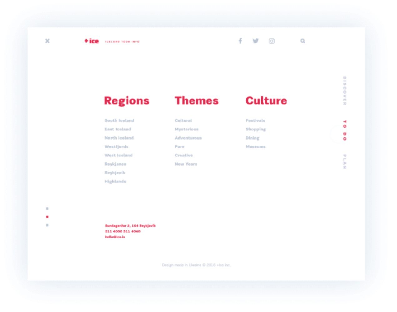
Minimalism puts forward strict requirements for navigation design: designers must follow the principle of minimalism to display the most important content and hide non-critical navigation content, but in doing so, they must ensure that users can easily find all the information they want, whether critical or non-critical. This inherent conflict has been criticized by minimalist designers: without sufficient research and testing, solutions such as the Hamburg menu to hide navigation and information may make users unable to find the content they want correctly and quickly, or even lost in the website. This is not a positive and effective user experience design.
#6. Make Good Use of Negative Space
Blank space, or negative space, is an integral part of minimalist design. It does not necessarily have to be white. It has nothing to do with color. In minimalist design, negative space is an effective way to enhance drawing attention to core elements and allow the entire design to be even more elegant. Negative space plays an irreplaceable role in creating contrast and clarity.
#7. Contrast
According to the concept of minimalist design, good contrast plays an important role throughout every aspect of visual design. Contrast mainly involves contrasting colors, shapes, and positions, which are all key elements of contrast.
Conclusion
Minimalist designs have many advantages. There are many effective ways to create web pages and UI interfaces, but it is not the silver bullet. In other words, its application scenarios are actually limited, but one thing is certain: the simpler the interface, the more obvious the design goals and objectives, and the more time and effort designers have to devote to it.
About the Author!
Ringo is a writing enthusiast who appreciates and talks about art, design, pop culture and music. In his daily life, he is also a cat lover and coffee addict. Accompanied by cats and music, he can always write a lot of passionate feelings about art or ordinary life. Whenever and wherever he is, he is willing to share his own experience and skills on the Internet in a timely manner. But occasionally, he becomes frustrated and irritable when he lacks caffeine.