A high bounce rate is not a good sign for a website and an indicator that its content and advertisement needs to have a serious overhaul. Although there are numerous tools you can use to analyze your website’s traffic, the complexity of this can often be confusing, with numbers and letters all over the place. However, bounce rate is one of the key measures of a website’s success and is something which any website designer and owner cannot afford to ignore.
Fundamentally, the bounce rate is the percentage of people who leave a website after entering one page. Therefore, a high bounce rate is not a good thing. Perhaps the content of your site is not relevant to your visitors or maybe it is hard to access information via your page. Whatever the reason, bounce rate is a variable which can be reduced, if not totally eliminated.
Having a clear target market makes it easier to have a low bounce rate. This ensures that you are writing appropriate content for your visitors, which leaves them more inclined to stay on your site, hence reducing the bounce rate. Perhaps this could be done by identifying a niche in the market or by writing about information which a large number of people need to hear about. The more relevant your content is to your audience, the more your bounce rate decreases.
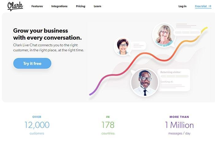
Another way of keeping your users engaged is through a clear, streamlined layout. Use extravagant colors only where they are necessary (call to action buttons) and make sure that your website is easy to browse. This may mean that your audience will stay longer, hence bounce rate decreases and your subscribers number increases. We can all agree that there is nothing worse than navigating through a website which is cumbersome and not user-friendly.
Ways to reduce bounce rate
#1. Make sure you have a good design and proper for your audience
As mentioned before, make sure that the site is easy to use and the user can get the desired information easily. This process starts off with the homepage. Have a clear list of contents and a series of accessible tasks which show exactly where a user needs to go. A clearly visible site map is a must as well. This allows a visitor to scroll your site at ease without any distractions.

Then, make sure that all the conventional features of your website, such as search boxes, social media buttons, and contact information are prominent in the design of your website. If a user doesn’t see these at first sight, they are more likely to ‘bounce’.
Gaze critically over your website’s design. Would you want to visit it? One of the most important things you need to do is make sure that your design fits in with your personal style or brand you are trying to portray. This way, users will get a feel of your website as a whole.
A color scheme is one of the ways to do this and it must be adapted to fit in with the style and content of your website. If a website has a more serious tone, dark hues may be appropriate whereas colors with bright connotations may suit a more light-hearted or ‘feel good’ website. Get this right, and your website’s bounce rate is sure to decrease.

Doing some market research may be a way to get ahead in this field. Look at similar sites to your own and see what they are offering. What design do they have? How are they attracting their clients? It is not a case of copying their designs, just more adapting and amalgamating things that you have observed in your research. The more sites you visit, the better, as the greater variety of perspectives, and therefore ideas, you will take into account.
#2. Avoid using annoying page elements

If visitors are inundated with annoying ads, pop-ups or distractions, they might not be inclined to stick around. Personally, I really dislike these sorts of things as they distract from the main content of a website and decreases a visitor’s patience. If you entered a website and the first thing you saw was a plethora of adverts that pop in your face you would probably leave the website as well. Sometimes you have to put yourself in the visitor’s shoes.
If you are going to advertise on your page (which most likely will happen) do it subtly, don’t plaster them all over the homepage. Give your user a chance to view the content of your website before letting them scroll any adverts. Adverts placed strategically can have the duality of attracting income and reducing bounce rate.
If you have a video or music on your site, do not play it automatically. This can be distracting and also annoying. Let the user have the choice of whether to play it or not. By doing this, you are empowering them and building a rapport with your audience, which may reduce the bounce rate.
#3. Have good typography
No matter how exciting your website is a great wodge of text is not going to attract visitors. Moreover, it will have the opposite effect, as people can’t be bothered to read an essay.

Segmenting your text into paragraphs (maybe one key point per 3 or 4 sentences) and interspersing it with images and pictures can keep your audience engaged whilst still getting across key information.
It may be tempting to use extravagant font colors and sizes, and, while it may look fancy, the reader may not view it that way. If something is not easy to read and if the text is all over the place and not in a clear structure, a reader can become disinterested. In some ways, your website is like a book, which should excite and inspire people. Would you want to scroll through a website with inconsistent layout and font?
Formatting is key in website readability. Make sure that all your spacing is correct and that paragraphs are marked clearly. In each chunk of text, all your fonts should be the same size and style. Nice and clean, that’s what the reader wants.
#4. Speed up page loading time
There’s nothing worse than a page taking a long time to load. This puts the user off and can make them irritated and impatient. While load time is partially down to internet connection of the user, if your page is chocked full of media and scripts, then this may increase how long it takes your page to load. There is definitely a positive correlation between bounce rate and web page load time.
If the images are a problem lazy load them gradually. If the scripts are a problem, trim them down or simply minify them.
Interestingly, if a page has a short loading time, this can make it more accessible through search engines, thus increasing your traffic and SEO. For example, Google, arguably the best in the search engine business, ranks pages according to their load time. So if your website doesn’t take long to load, then you are heading towards the top of the list of search results, which can only be a good thing.
As mentioned before, keep things simple. Parallax scrolling may be interesting, but if it’s bundled with a lot of other scripts, it will increase your page’s loading time.
#5. Have a responsive and usable site at the same time
If your website can easily be accessed from an array of devices including tablets and smartphones, then you are onto a winner.

Mobiles, in particular, are key in boosting traffic. With more and more people accessing the internet from their phones, if your webpage is easy to use from a mobile, this will definitely decrease your bounce rate.
A useful way to assess this is to access the site yourself using your own phone. Is it easy to navigate? Does it compare to accessing the site through a computer or iPad? What would you improve? It is easy to gloss over imperfections, but you have to adopt a critical eye when you are doing this. It is the only way to improve your site.
#6. Make custom 404 pages

The last thing that a user wants to see is a 404 page. They have long been a blight to internet users everywhere. To soften the blow of this, why not create a custom 404 page, with hyperlinks to other areas of your site. Instead of this being a turn-off, use it as an opportunity to market your site and decrease bounce rate.
#7. Offer Related Content
Not including related content on your pages is a big mistake. This can often be used to ‘hook’ the user and encourage them to carry on navigating through the site. Being savvy about this could seriously increase your traffic.

Be logical about it. Related content is interesting if it connects things that are of high relevance to each other, which have a high intersection of tags. They could relate to a theme or a key message you are trying to get across. They certainly increase the usability of the site and also show that you have taken care of your website’s design.
This is a trick often used by bloggers, who often link together articles. How many times have you seen the message; ‘If you read this, you may be interested in…’ and a series of related articles pop up. This is your chance to really advertise your website and show what it has to offer. Often little titbits of information can be key to keeping the reader engaged.
Conclusion
Considering how much it costs to build a website, it would be a shame to let all the money to waste because of a bad bounce rate.
If the bounce rate is decreasing, that means the visitors are spending a longer period of time browsing your website. Subsequently, this means they will see more of your content and ads, which could increase your revenue, particularly if you get a stream of organic traffic.
Networking is one of the key methods of reducing bounce rate. If a user really takes the time to absorb and digest the content of your website, then they are more likely to promote it to their friends and family through social networking sites. Having the ‘share’ buttons clearly visible on your page is conducive to increasing the effectiveness of this.
It might seem like a difficult process tacking the issue of decreasing bounce rate, but like tackling an essay, it is something that needs to be done bit by bit. It is worth taking the time to do it, so you can feel the full effects of it. Those who keep going get their reward.
About the Author!
Bogdan is a designer and editor at DesignYourWay. He’s reading design books the same way a hamster eats carrots, and talks all the time about trends, best practices and design principles.
