10 Coffee Shop Brand Identity Concepts That Go Beyond the Logo
Designing a coffee shop brand is one of the most exciting (and challenging) projects for a graphic designer.
Coffee brands sit at the intersection of lifestyle, emotion, community, and ritual—which makes them perfect playgrounds for strong visual identity, storytelling, and positioning.
In this article, we’ll explore 10 complete coffee shop brand identities, each with a clear name, concept, and tagline.
More importantly, we’ll break down why each concept works and how you—as a designer, business owner or branding enthusiast—can turn these ideas into real, scalable brands.
Whether you’re building a portfolio project, pitching a client, or planning a real café, this guide will give you practical inspiration and branding tips.
Free Download: 20 Coffee Shop Logo Templates and Badges (AI, EPS)
1. Ember Roast
Tagline: Where Coffee Meets Fire
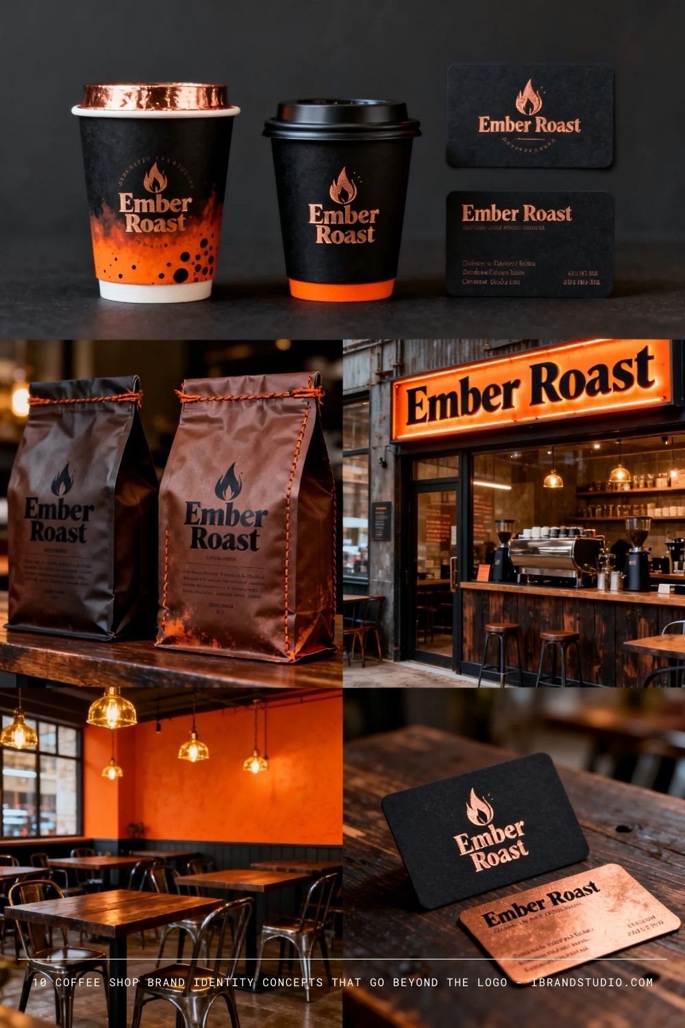
Brand Concept:
Ember Roast is built around intensity, craftsmanship, and heat.
The brand leans into the roasting process as a core storytelling element—fire, embers, and transformation.
Visual Direction:
- Dark wood textures, charcoal black, deep copper accents
- Bold serif or industrial sans-serif typography
- Minimal but powerful logo marks (flame, ember, roast drum)
Why it works:
This concept appeals to customers who want coffee to feel serious and premium. It’s ideal for urban locations and works especially well for small-batch roasters.
Designer tip:
Use texture sparingly—foil stamping, embossing, or grain overlays can elevate the brand without cluttering it.
Also Read: 12 Inspiring Restaurant Branding Designs for Your Next Project
2. Sunrise Society
Tagline: Start Better Every Morning
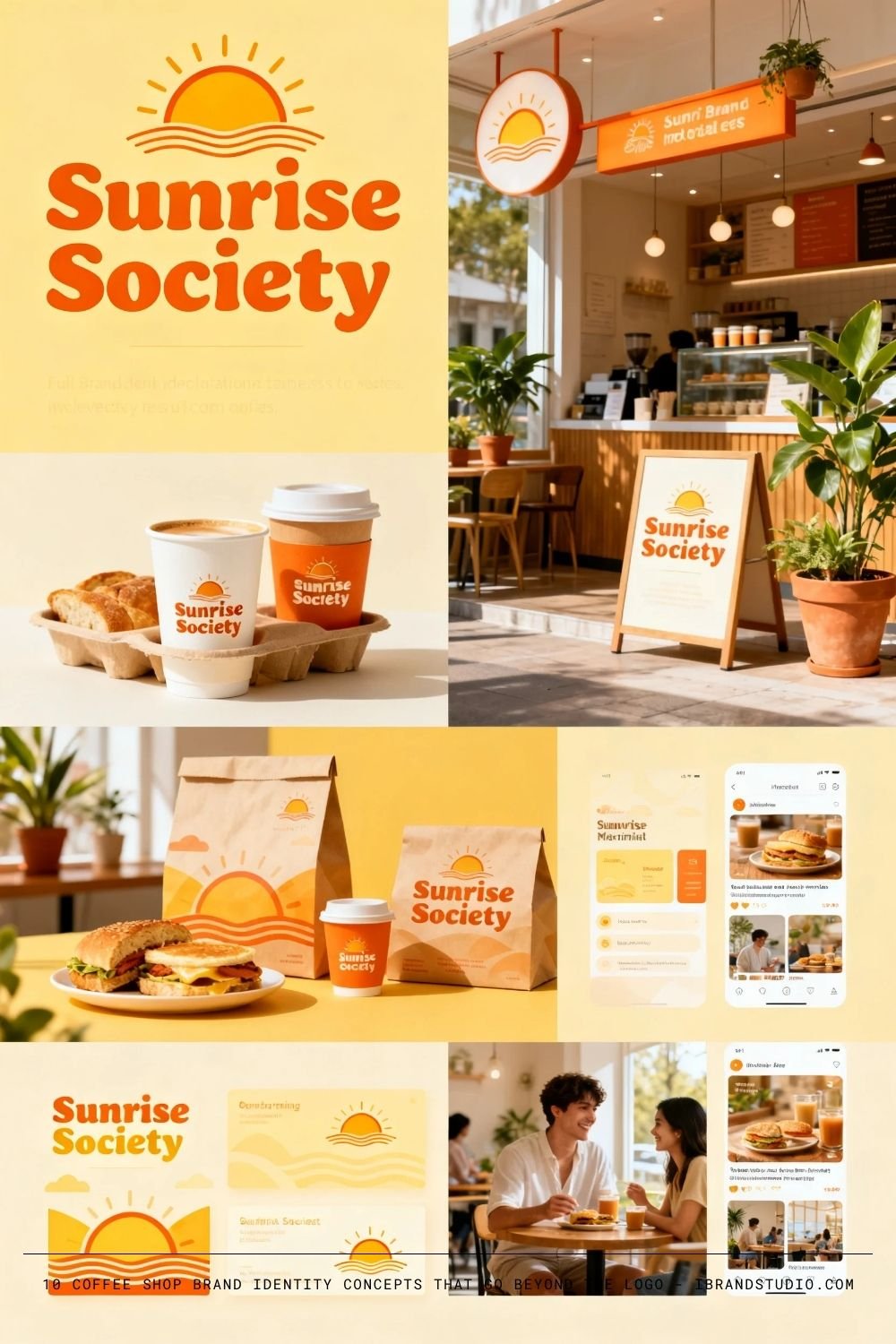
Brand Concept:
A bright, community-driven café celebrating morning rituals and optimism. Sunrise Society isn’t just about coffee—it’s about starting the day right.
Visual Direction:
- Warm yellows, soft oranges, light neutrals
- Friendly rounded typography
- Sun, horizon, or circle-based logo systems
Why it works:
Morning-focused brands are highly repeatable. This concept naturally supports breakfast menus, loyalty programs, and lifestyle content.
Designer tip:
Consistency matters more than complexity. Keep the logo simple so it scales well across cups, signage, and social media.
3. Bean & Tale
Tagline: Every Cup Has a Story
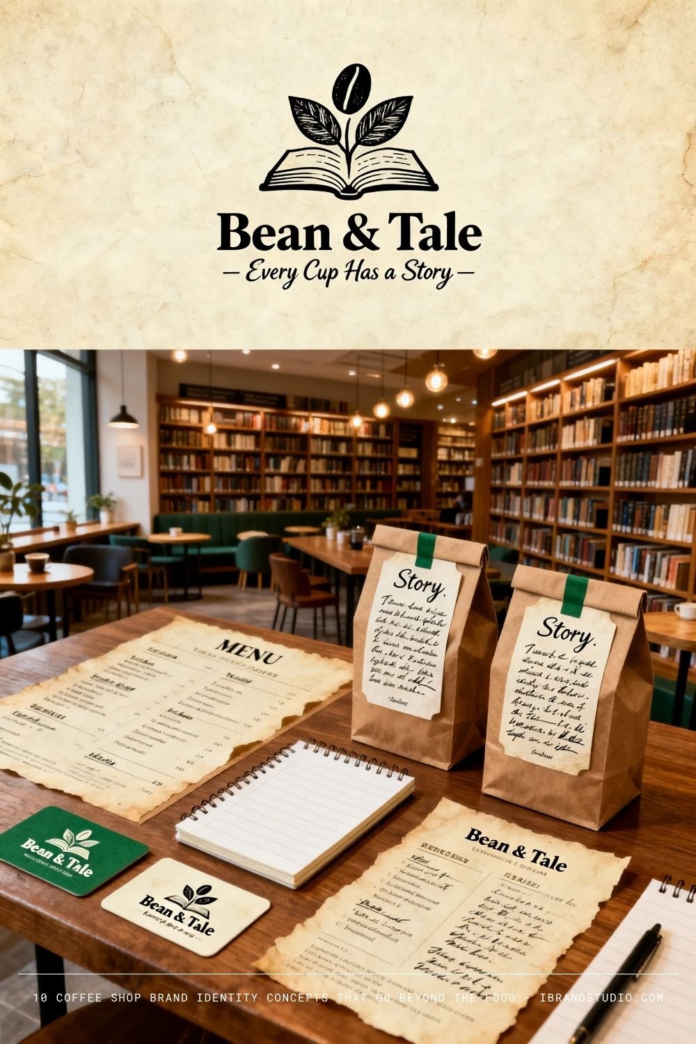
Brand Concept:
Bean & Tale positions coffee as narrative. Each blend tells a story—from the farmer to the cup—making it ideal for origin-driven branding.
Visual Direction:
- Book-inspired layouts, editorial typography
- Hand-drawn illustrations or engraved-style icons
- Warm, muted color palettes
Why it works:
Storytelling increases emotional connection and perceived value. Customers remember stories more than flavor notes.
Designer tip:
Create a flexible system where new “stories” can be added without redesigning the entire brand.
4. Drift Coffee Co.
Tagline: Brewed for the Journey
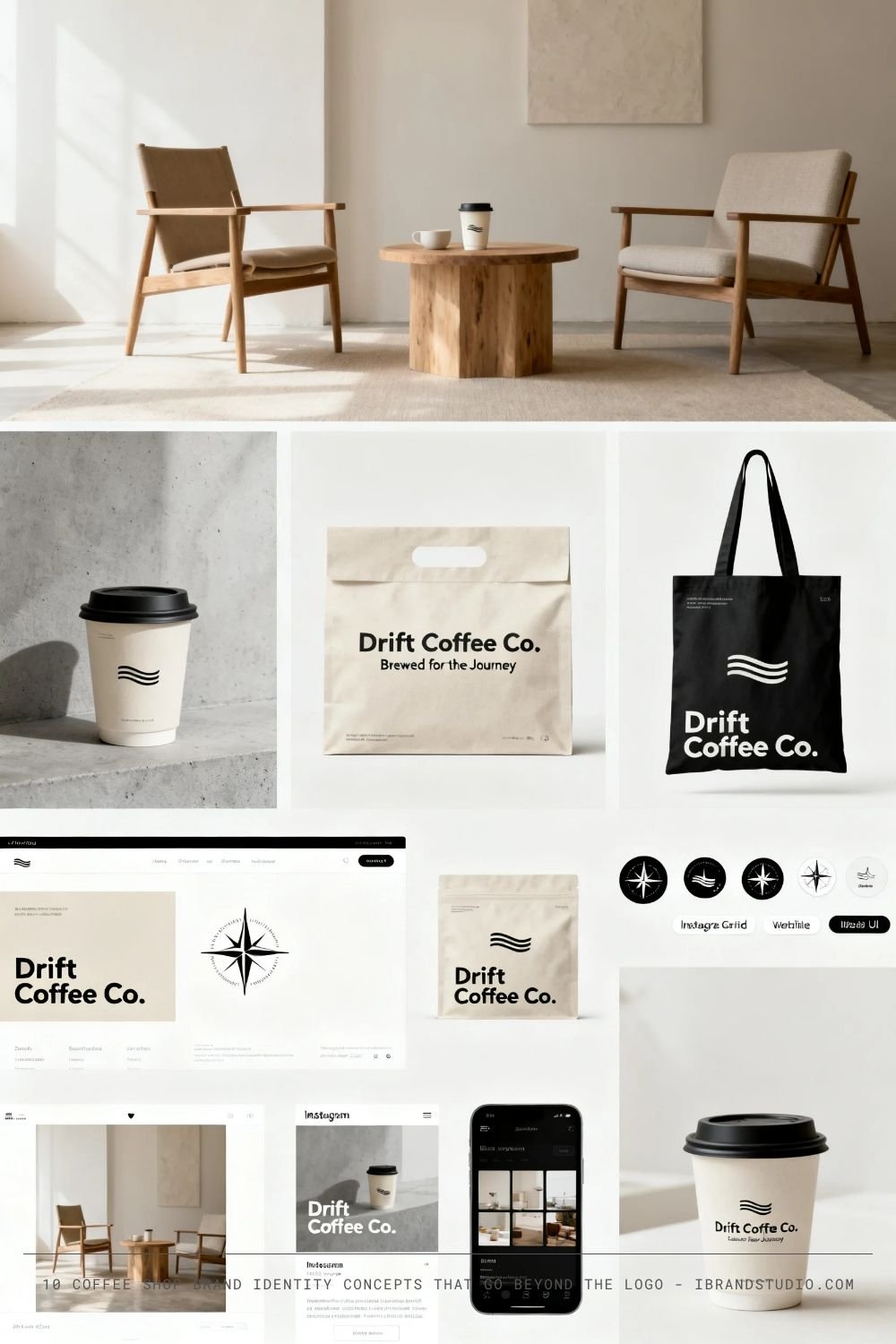
Brand Concept:
Drift Coffee Co. is about movement, freedom, and modern life. It’s minimal, travel-inspired, and highly Instagrammable.
Visual Direction:
- Neutral palettes (sand, stone, off-white)
- Clean sans-serif typography
- Photography-led branding
Why it works:
This brand fits perfectly with digital nomads and younger audiences who value aesthetics and flexibility.
Designer tip:
Let white space do the heavy lifting. Avoid over-decorating—this brand wins through restraint.
You Might Also Like: Top 15 Most Influential eCommerce Brands Shaping Online Shopping in 2025
5. Kopi Rakyat
Tagline: Kopi untuk Semua
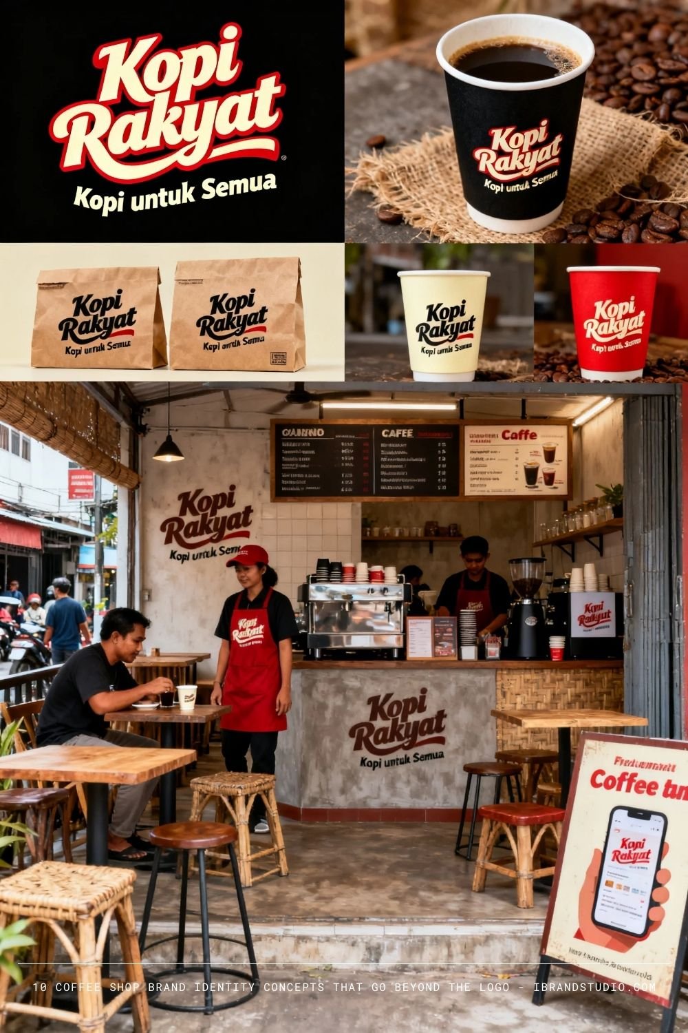
Brand Concept:
A proudly local brand celebrating accessibility and Indonesian coffee culture. Honest, bold, and community-first.
Visual Direction:
- Strong typography, high contrast colors
- Local language, cultural references
- Street-style graphics
Why it works:
Affordable brands still need strong identities. This concept proves that good branding isn’t only for premium markets.
Designer tip:
Authenticity beats polish. Don’t over-design—embrace imperfections.
6. Black Canvas
Tagline: Brew Your Creativity
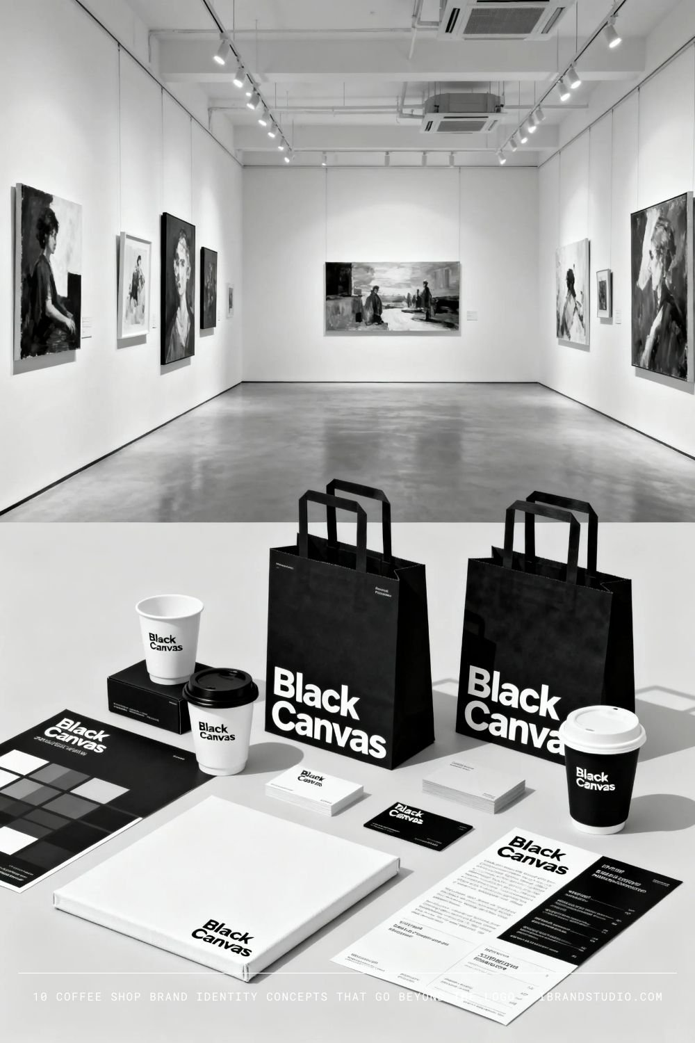
Brand Concept:
Black Canvas treats coffee as a medium for creativity. The café doubles as a gallery and creative hub.
Visual Direction:
- Black and white base palette
- Modular grid systems
- Rotating visuals
Why it works:
It gives designers and artists a sense of ownership and identity.
Designer tip:
Design the brand as a system, not a single logo.
7. Second Pour
Tagline: Slow Down. Pour Again.
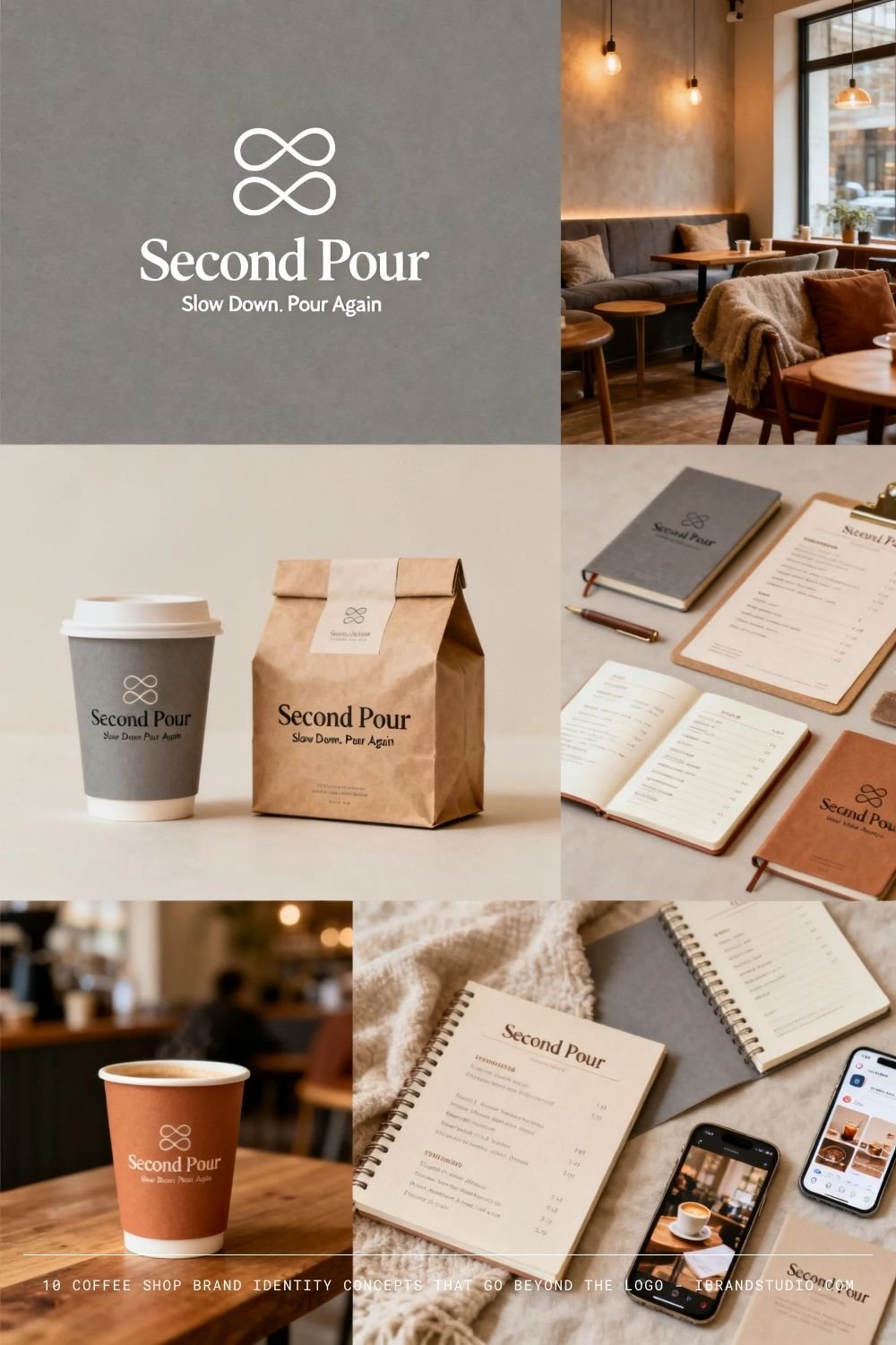
Brand Concept:
A reflective, slow-living café focused on mindfulness and comfort.
Visual Direction:
- Soft earth tones
- Gentle typography
- Calm photography
Why it works:
It stands out in a fast-paced, noisy coffee market.
Designer tip:
Design for emotion first, visuals second.
8. Peak & Pour
Tagline: Fuel for Higher Ground
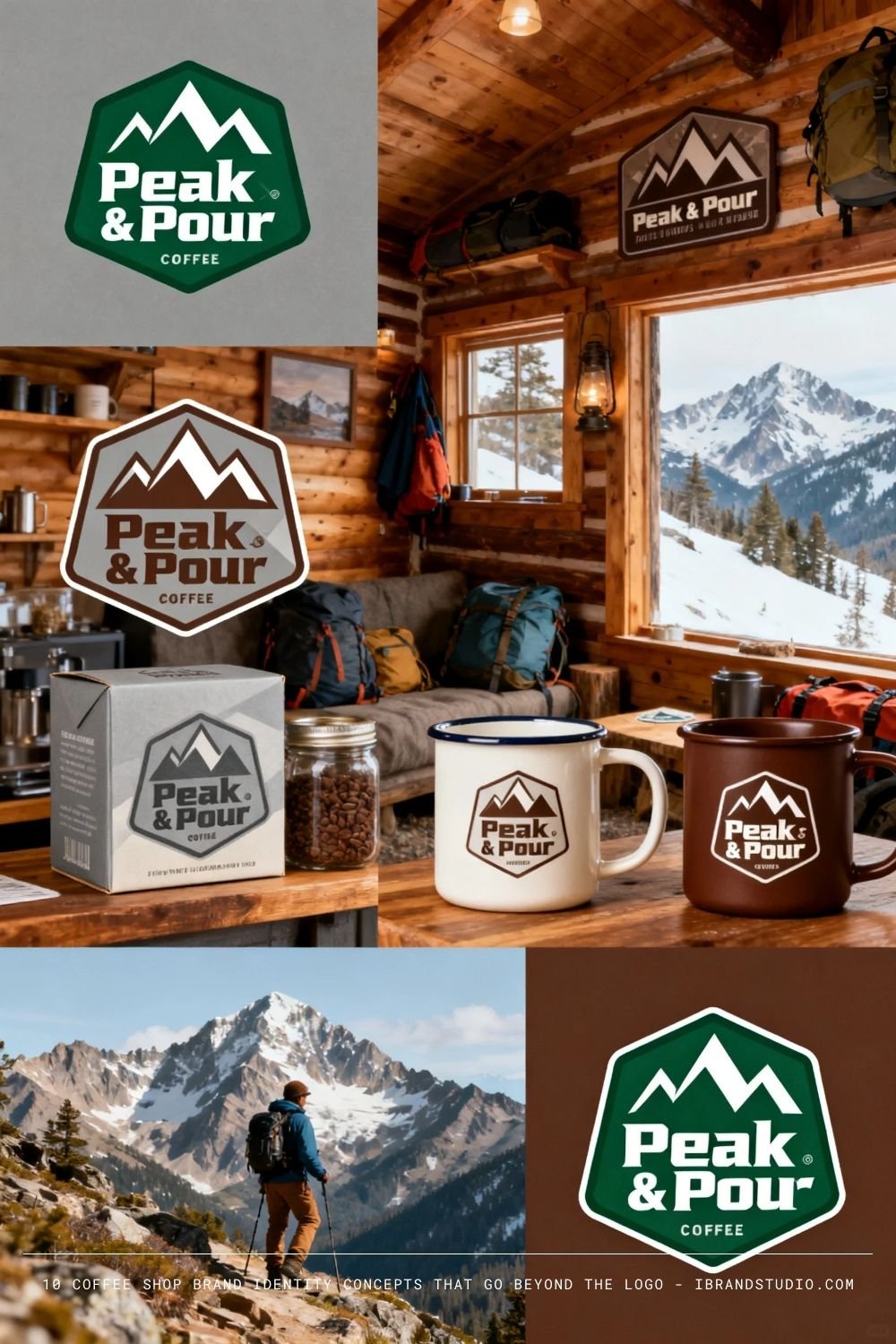
Brand Concept:
Mountain-inspired, performance-driven coffee brand.
Visual Direction:
- Earthy greens and browns
- Strong geometric icons
- Badge-style logos
Why it works:
Lifestyle alignment makes branding more memorable.
Designer tip:
Build a logo that works well on merchandise.
Free Download: 8 Adventure Logos and Badges (AI, EPS)
9. Night Owl Brew
Tagline: Awake After Dark
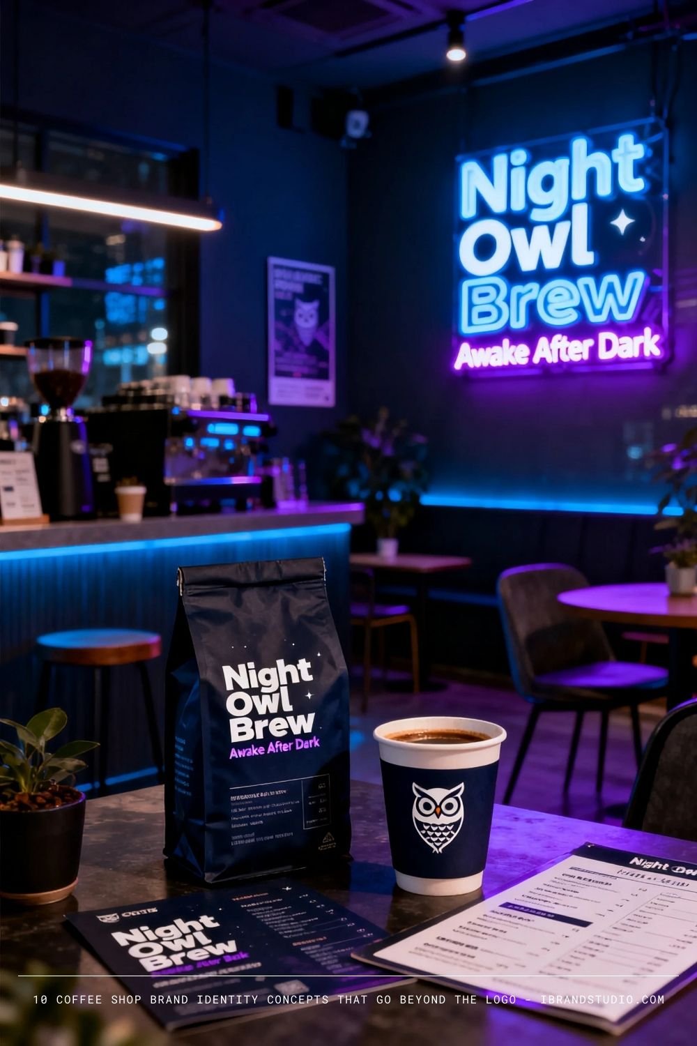
Brand Concept:
Late-night productivity café for night workers.
Visual Direction:
- Dark backgrounds, neon accents
- High-contrast typography
Why it works:
Clear niche = loyal audience.
Designer tip:
Test legibility in low-light scenarios.
10. Rooted Roasters
Tagline: Grounded in Good Coffee
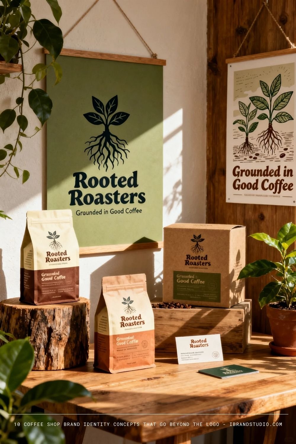
Brand Concept:
Sustainability-focused, ethical sourcing, and environmental responsibility.
Visual Direction:
- Organic shapes
- Earth tones
- Natural textures
Why it works:
Purpose-driven brands create long-term loyalty.
Designer tip:
Avoid greenwashing—clarity and honesty matter.
Recommended Reading: 60 Creative Coffee Branding And Packaging Designs
Final Thoughts
Great coffee shop branding isn’t about trends—it’s about clarity, consistency, and connection.
Choose a concept that aligns with the business reality, then design a system that can grow.
If you’re building a branding portfolio, coffee shops are excellent case studies.
They allow you to showcase logo design, packaging, interiors, social media, and storytelling—all in one project.
Design with intention, not decoration—and your brand will last.
Are you interested in this design approach? Our team can customize it specifically for your needs. Please contact us for more details.