
Ice cream branding is one of the most creatively rewarding spaces in brand design—not because it’s easy, but because it demands clarity, emotion, and strategy all at once.
Behind every successful ice cream brand is a well-crafted identity system that does far more than look good.
It communicates a point of view, attracts the right audience, and turns a simple product into a memorable experience.
In this article, we’ll explore 12 creative ice cream brand identity ideas, each built around a clear concept, name, and positioning.
More importantly, we’ll unpack the design lessons behind each idea—from typography and color psychology to brand voice and visual systems—so you can apply these insights to your own branding projects.

Whether you’re a graphic designer building a portfolio, a brand strategist looking for inspiration, or simply a branding enthusiast who enjoys breaking down great identity work, this guide goes beyond surface-level aesthetics.
These concepts are designed to show how thoughtful branding decisions shape perception, build trust, and ultimately drive success—one scoop at a time.
You Might Also Like: Creative Ice Cream Branding and Packaging Designs
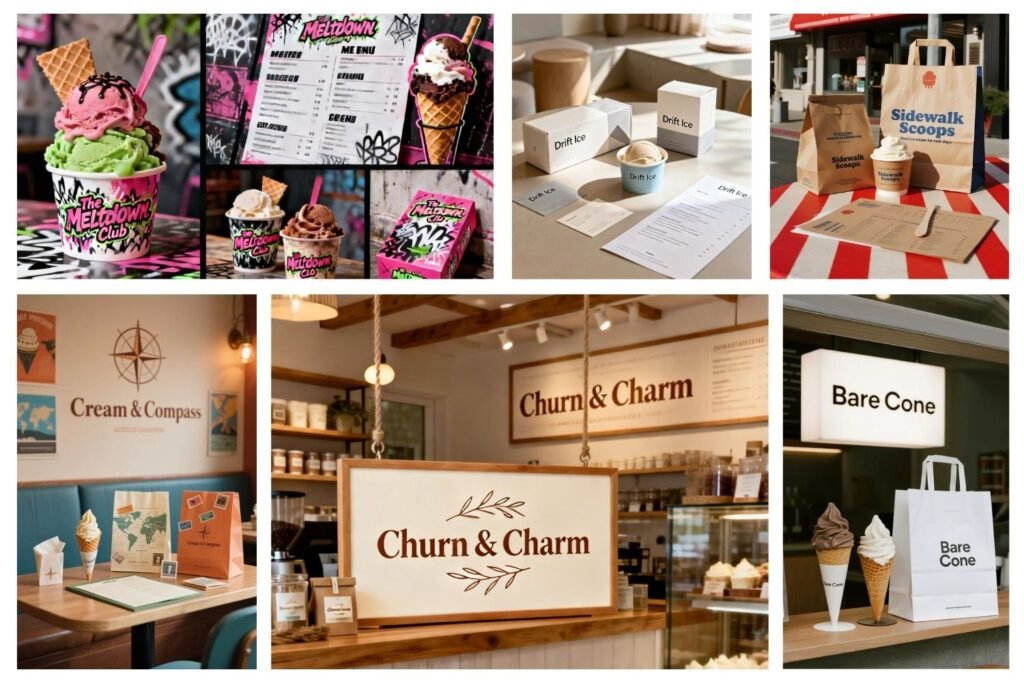
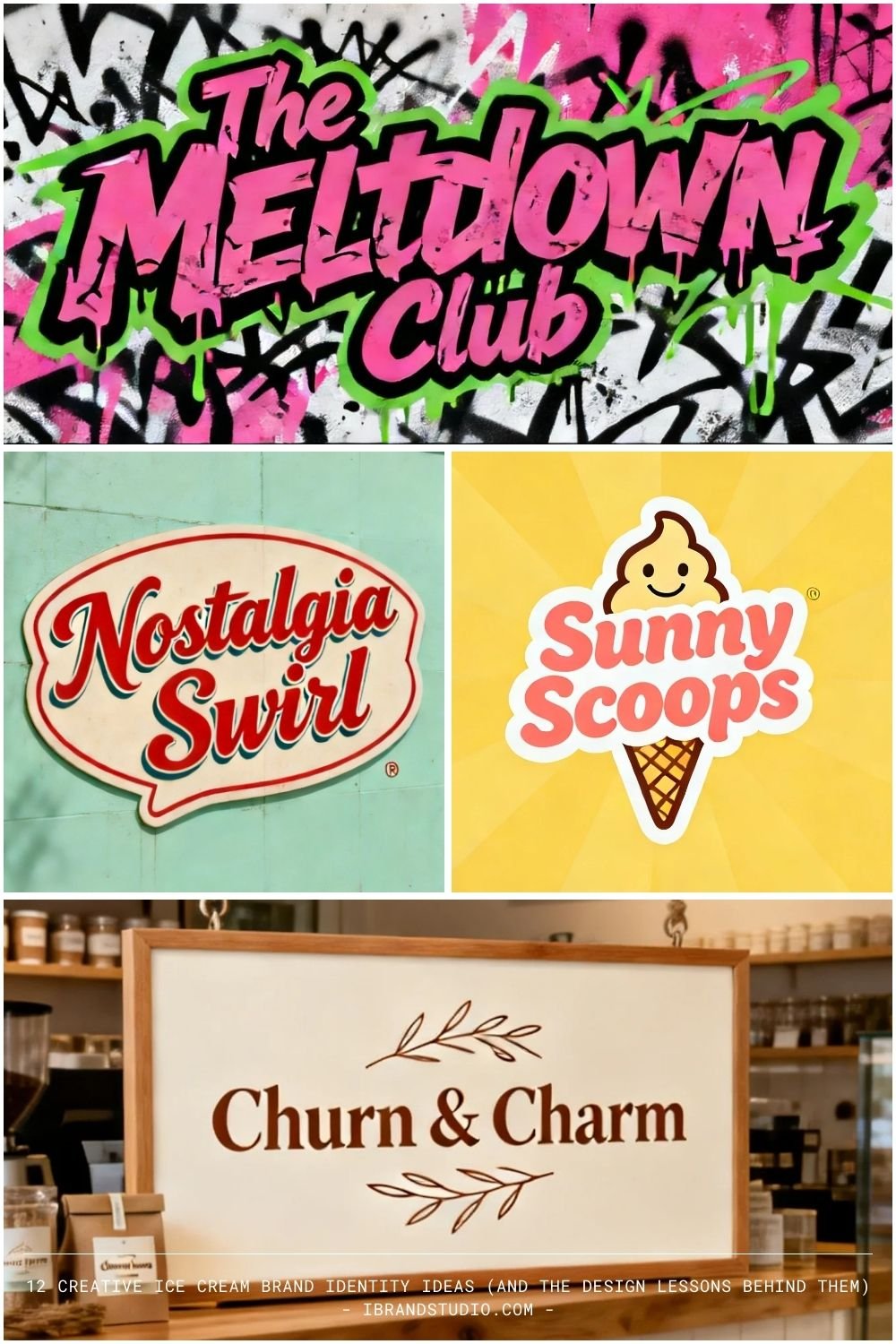
1. Churn & Charm
Tagline: Sweetness, done slowly.
Concept: A small-batch artisan ice cream brand rooted in craftsmanship, patience, and warmth. Seasonal ingredients and comforting flavors define the experience.
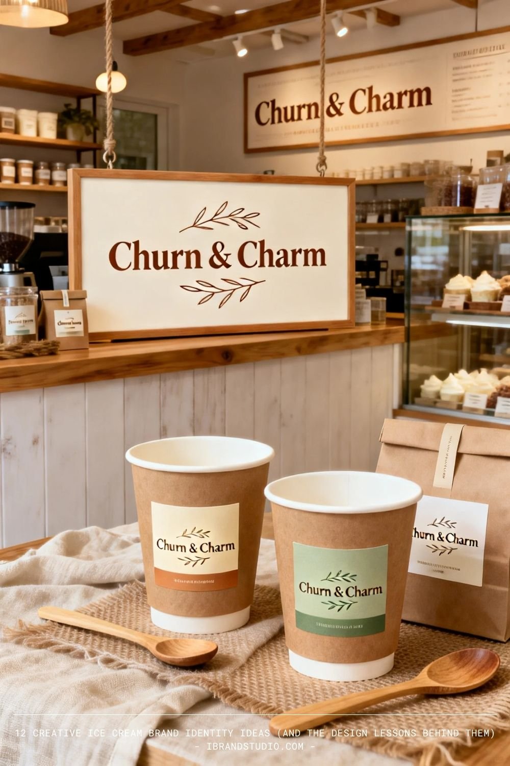
Why it works: It aligns with the slow-food and handmade movement, which signals authenticity and quality.
Design tip: Use hand-drawn elements, warm neutrals, and subtle texture to communicate “crafted” without over-decorating.
2. FROST LAB
Tagline: Experiment with flavor.
Concept: A futuristic, experimental ice cream shop that treats flavor like science—unexpected combinations, nitrogen freezing, and limited runs.
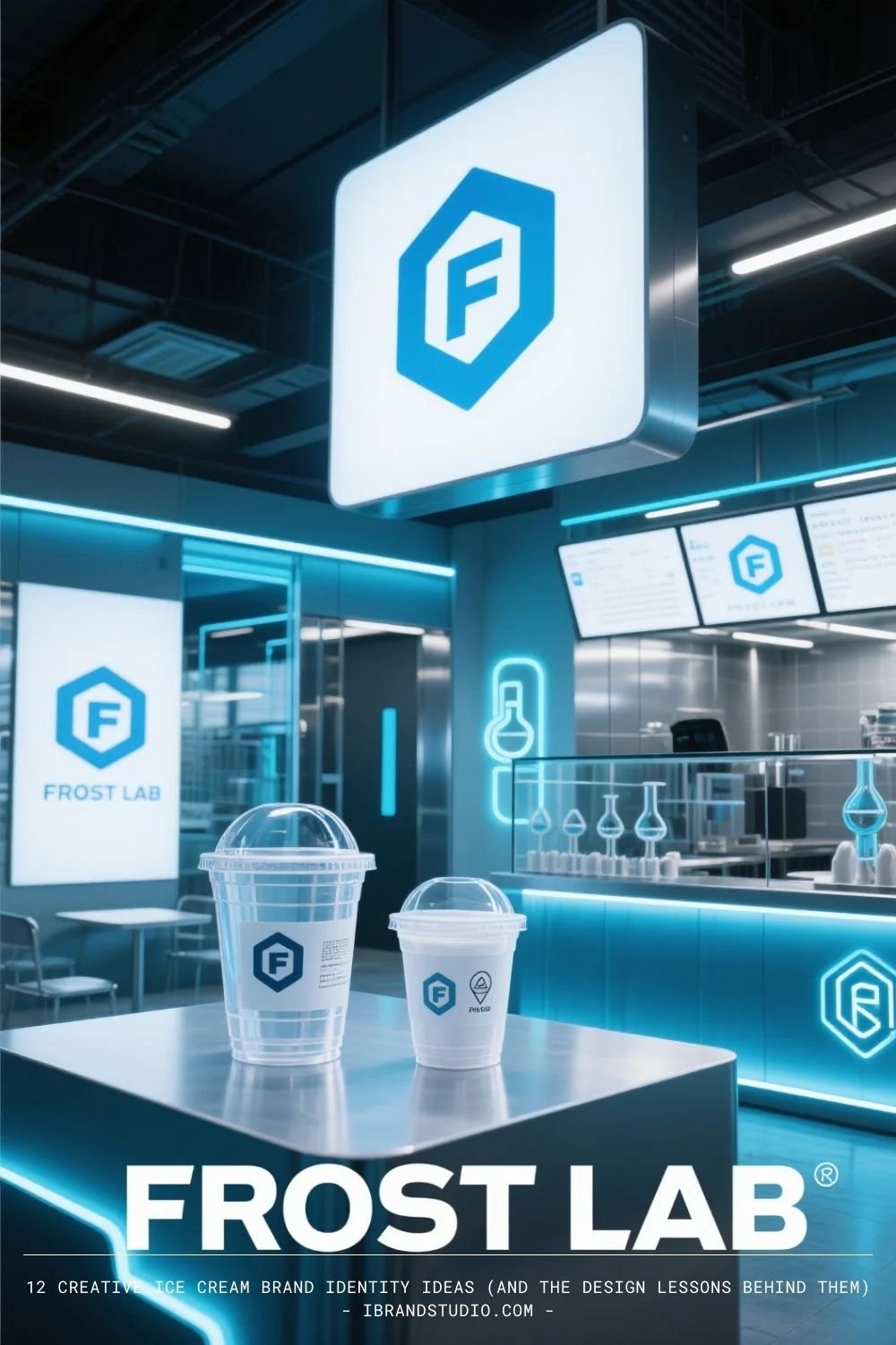
Why it works: It turns ice cream into an event, encouraging repeat visits and social sharing.
Design tip: Strong experimental brands need rigid design systems—grids, modular layouts, and consistent typography prevent visual chaos.
3. Sunny Scoops
Tagline: Happiness in every scoop.
Concept: A bright, cheerful, family-friendly brand built on classic flavors and joyful visuals.
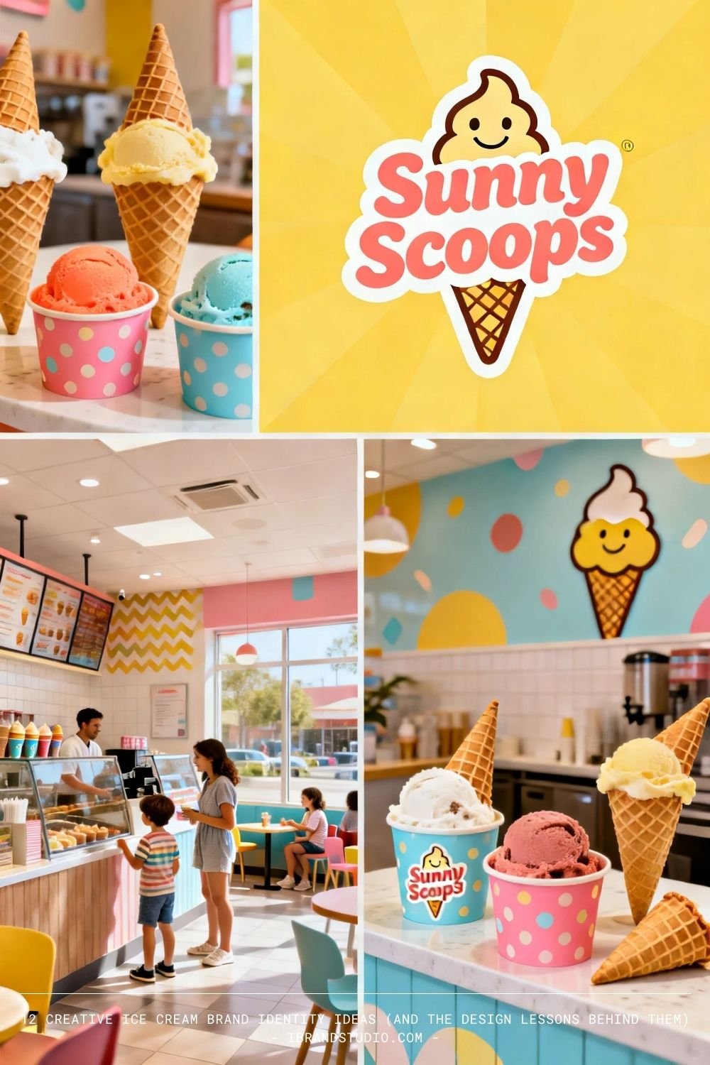
Why it works: It’s instantly legible. Customers understand it in seconds.
Design tip: Clarity beats cleverness in mass-appeal brands. Bold color blocking and friendly typography go a long way.
Also See: 55 Brand Identity Design Examples for Restaurant
4. Midnight Creamery
Tagline: Ice cream after dark.
Concept: A late-night ice cream destination offering rich, adult flavors like espresso caramel and dark chocolate truffle.
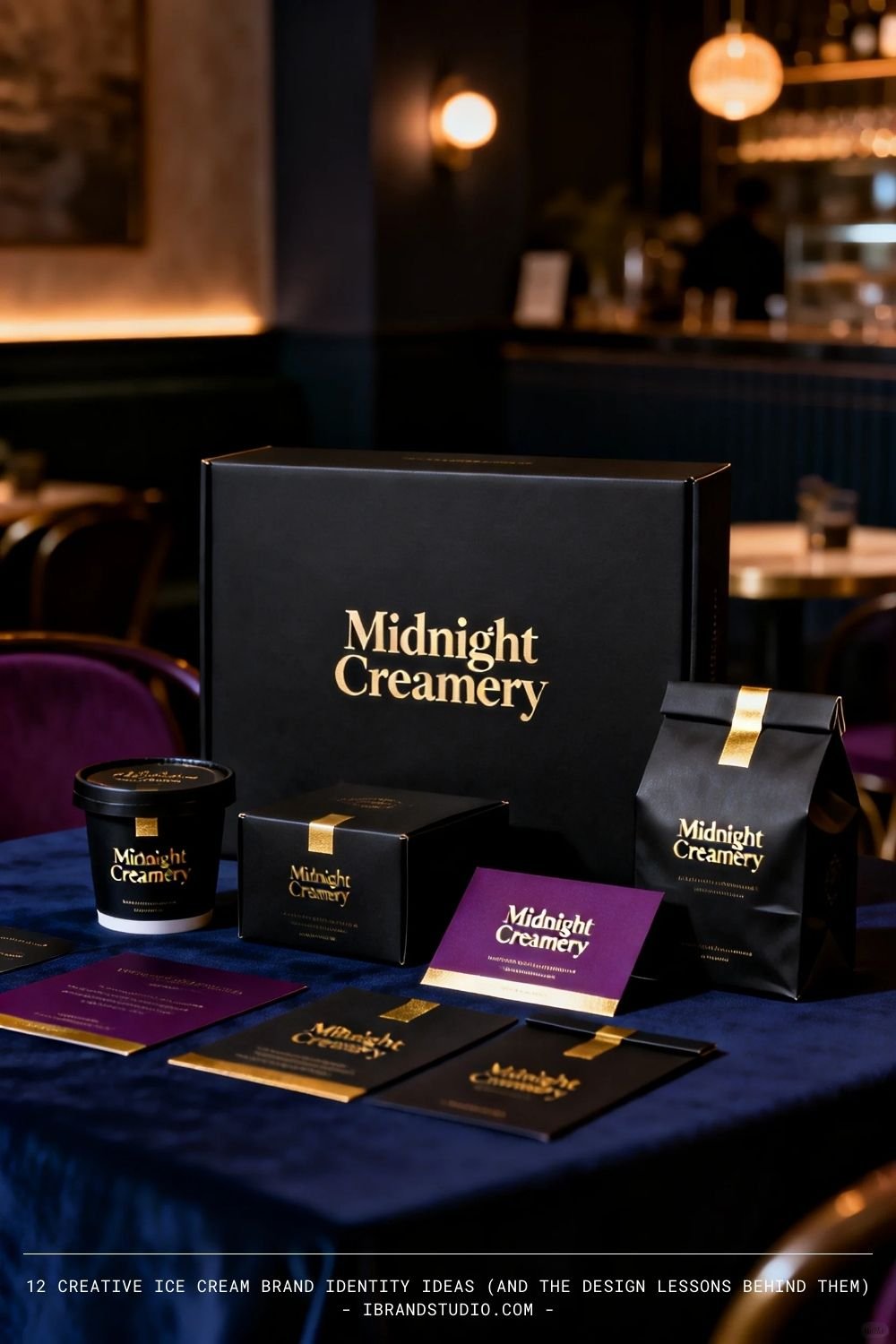
Why it works: Time-based positioning creates a strong niche most competitors ignore.
Design tip: Dark palettes and controlled contrast can feel premium when paired with restraint and clean layouts.
5. Nostalgia Swirl
Tagline: Taste the good old days.
Concept: A retro-inspired brand focused on childhood flavors, classic sundaes, and vintage aesthetics.
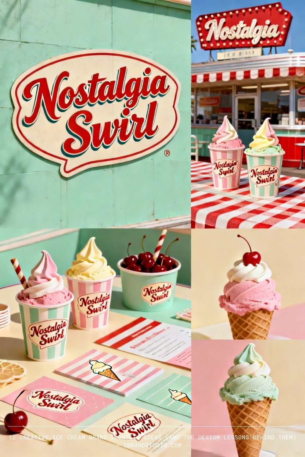
Why it works: Nostalgia is an emotional shortcut—it builds trust instantly.
Design tip: Retro branding requires commitment. Study period-accurate typography and color limitations to avoid “fake vintage.”
6. Drift Ice
Tagline: Cool flavors, calm moments.
Concept: A minimalist, wellness-oriented ice cream brand with subtle flavors and low-sugar options.
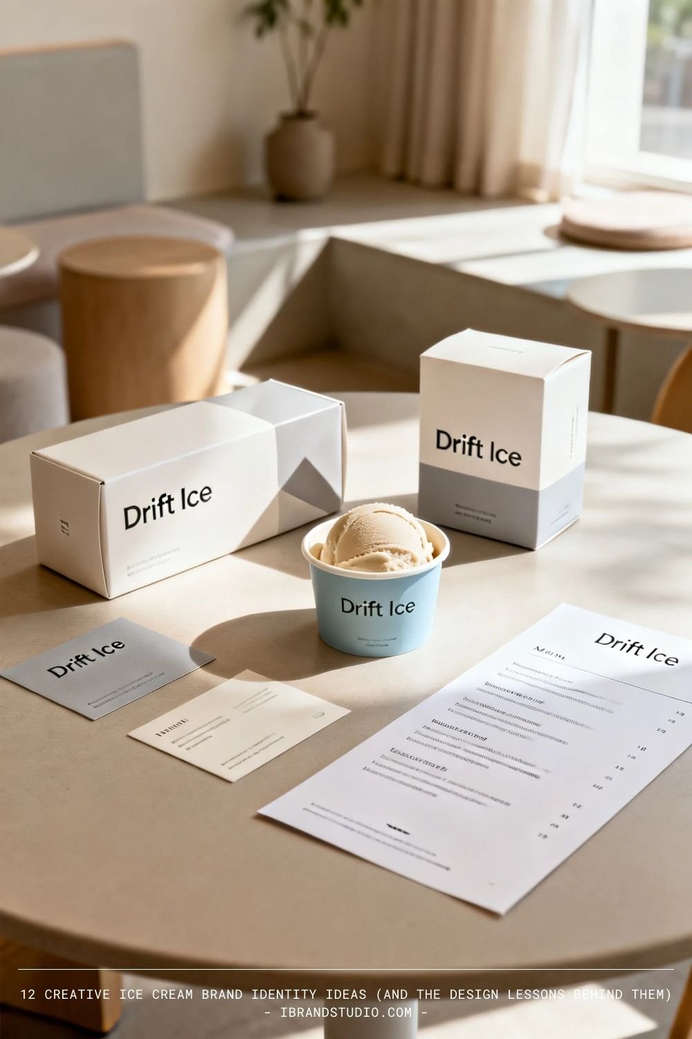
Why it works: It fits seamlessly into modern lifestyle branding and wellness culture.
Design tip: White space is a design tool. Let quiet typography and gentle contrast do the talking.
Also Read: The 10 Most Recognizable Beverage Brand Logos Ever Created
7. The Meltdown Club
Tagline: Lose control. It’s ice cream.
Concept: A loud, rebellious brand celebrating indulgence, humor, and excess.
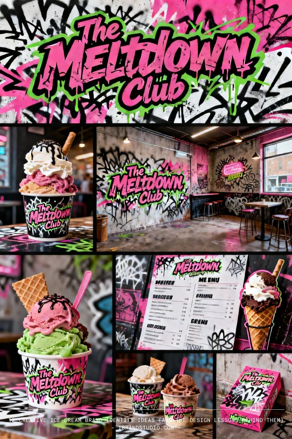
Why it works: It speaks directly to Gen Z’s preference for authenticity over polish.
Design tip: Typography and copywriting are as important as visuals. Let the brand sound as bold as it looks.
8. Cream & Compass
Tagline: Explore the world, one scoop at a time.
Concept: A travel-inspired ice cream brand where each flavor represents a destination.
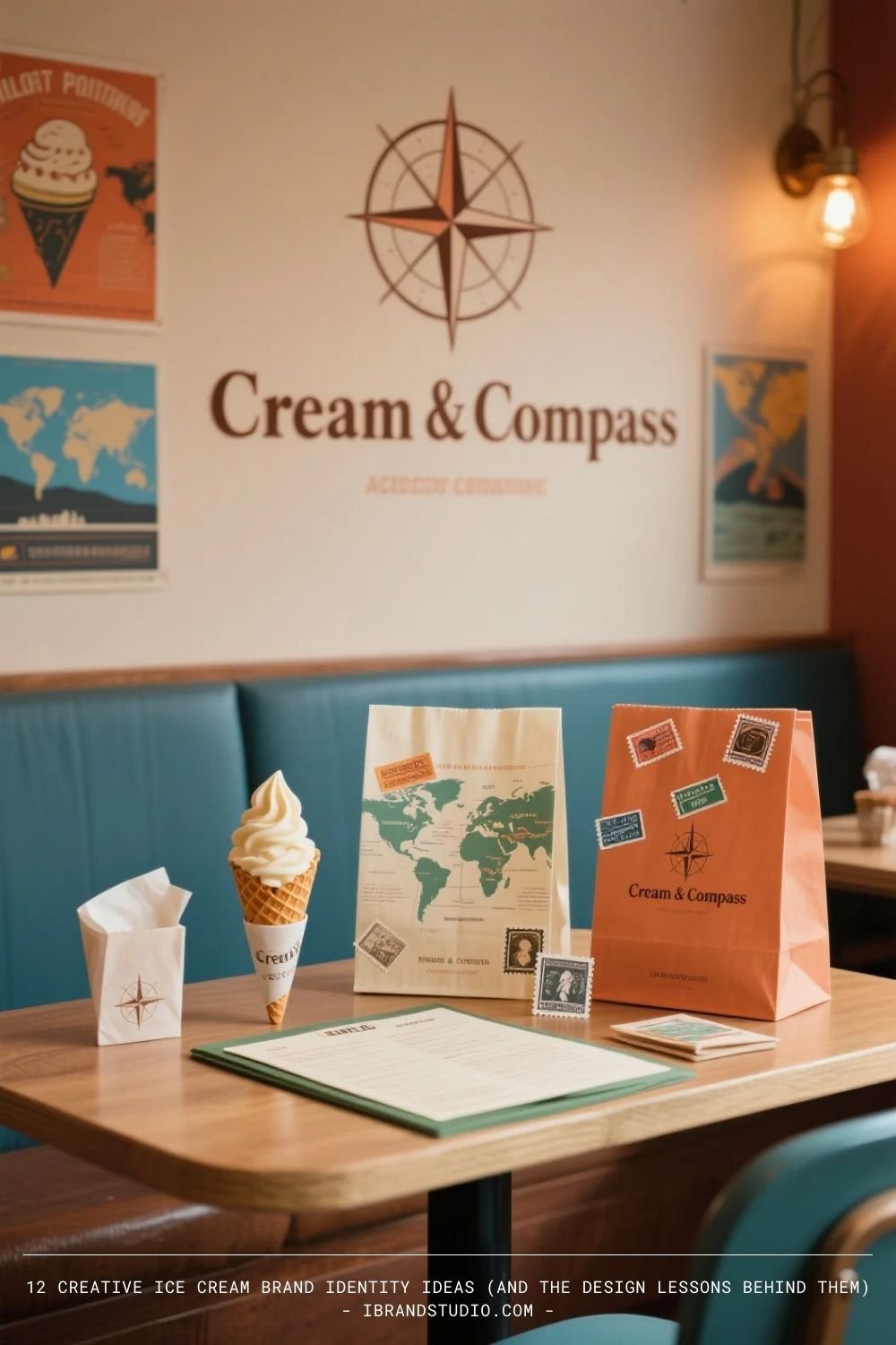
Why it works: It adds narrative depth to the menu, turning flavors into stories.
Design tip: Use visual metaphors—maps, stamps, coordinates—to reinforce storytelling without overwhelming the layout.
9. Bare Cone
Tagline: Nothing extra. Just great ice cream.
Concept: An ingredient-first brand focused on transparency, simplicity, and trust.
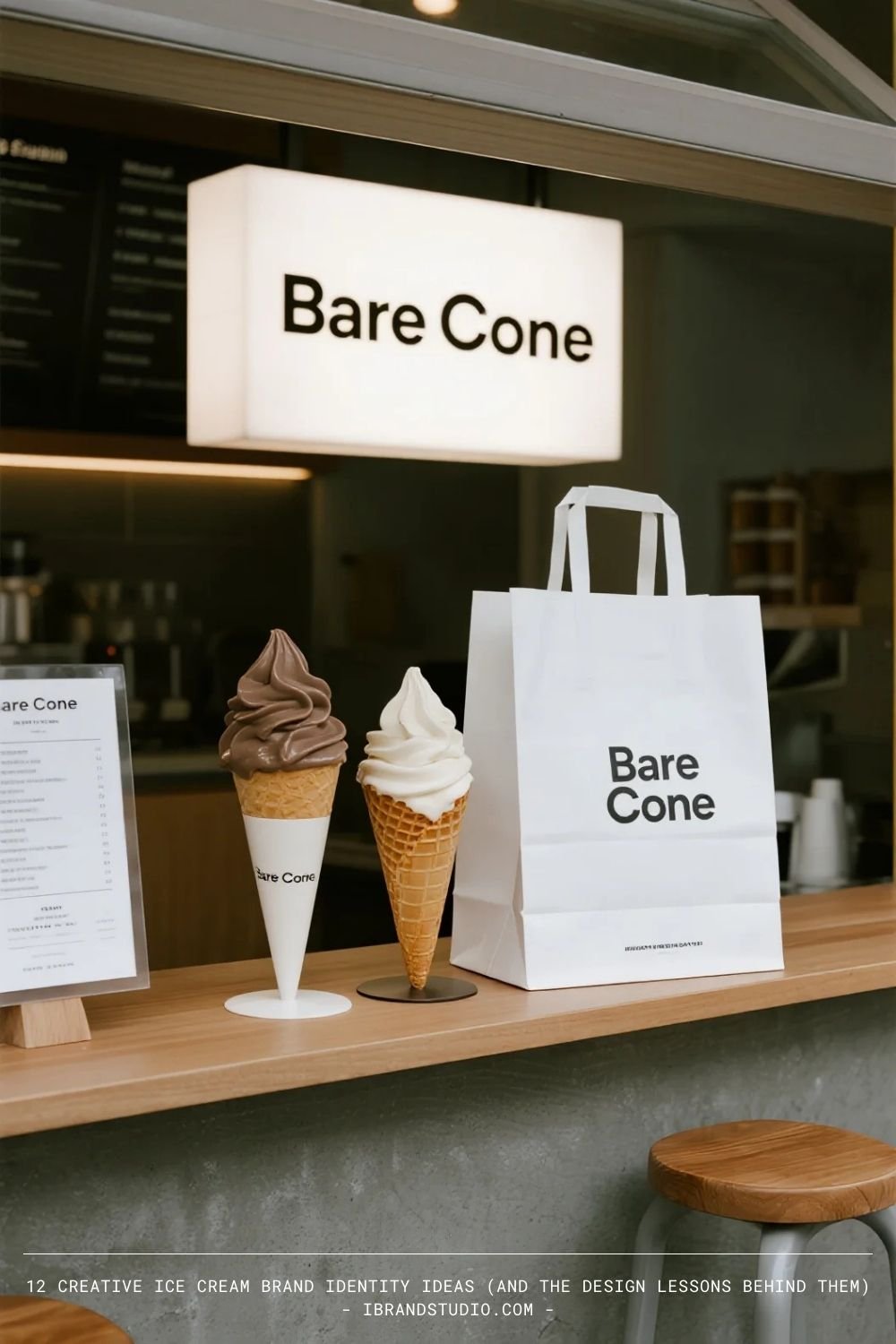
Why it works: Consumers are increasingly skeptical of over-marketing. Honesty stands out.
Design tip: Minimal brands demand precision. Typography, spacing, and material choice matter more than ever.
10. Velvet Freeze
Tagline: Indulgence, perfected.
Concept: A luxury ice cream brand positioned alongside fine desserts and patisserie.
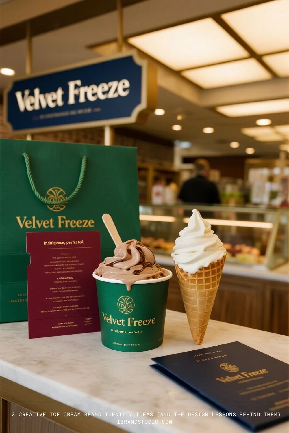
Why it works: It elevates ice cream into a premium category through restraint and presentation.
Design tip: Luxury branding isn’t about adding elements—it’s about removing anything unnecessary.
11. Cloud Nine Creamery
Tagline: Light, dreamy, unforgettable.
Concept: An airy, whimsical ice cream brand inspired by softness and fantasy. Flavors are light, mousse-like, and visually ethereal.
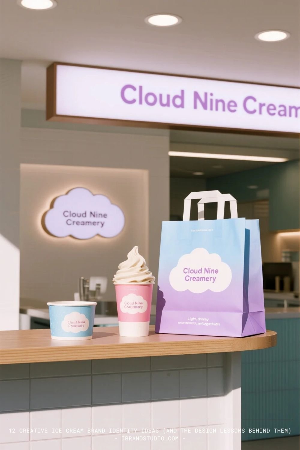
Why it works: It appeals to emotion and escapism, making the brand feel aspirational and shareable.
Design tip: Soft gradients, rounded typography, and motion design can reinforce a dreamlike identity when used sparingly.
12. Sidewalk Scoops
Tagline: Real ice cream for real days.
Concept: A street-level, neighborhood ice cream shop rooted in community, affordability, and everyday joy.
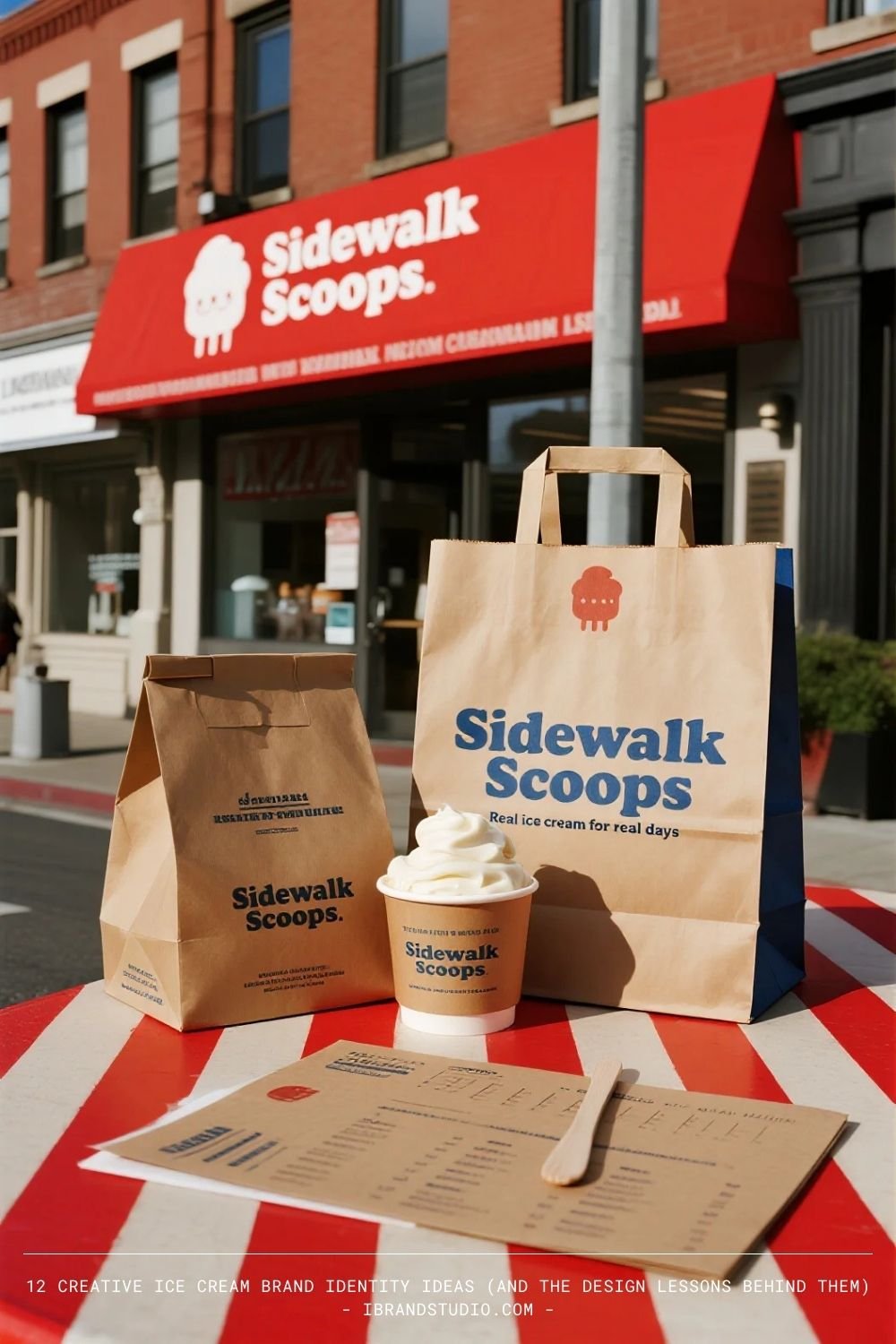
Why it works: It feels honest and approachable—no pretension, just consistency.
Design tip: Community brands benefit from familiarity. Repetition, bold signage, and simple layouts build recognition over time.
What Designers Can Learn From These Ice Cream Brands
Across all 12 concepts, several universal branding principles stand out:
- Positioning comes before visuals
Every strong identity starts with a clear audience and point of view. - Emotion is the real product
Ice cream sells happiness, nostalgia, calm, rebellion, or indulgence—design should amplify that emotion. - Consistency builds trust
A cohesive system beats isolated design moments every time. - Less can be more—if executed well
Minimal brands are harder, not easier. Precision is key.
Final Thoughts
Ice cream branding is more than fun aesthetics—it’s a masterclass in emotional branding, strategic positioning, and experience design.
For graphic designers and branding enthusiasts, studying categories like this sharpens your ability to translate abstract ideas into tangible systems.
Like these Ice Cream Brand Design concepts? We can make a custom design just for you. Send us a message!