Fresh, Juicy & Brand-Ready: 12 Fruit Logo Design Concepts Every Designer Should Explore
Fruit logo design never goes out of style. From organic skincare and beverage brands to playful startups and modern lifestyle labels, fruit symbols continue to dominate branding—and for good reason.
Fruits are universally recognizable, emotionally positive, and visually flexible.
Here at ibrandstudio.com, we love exploring logo ideas that are not just beautiful, but strategic.
A strong fruit logo isn’t about drawing something cute—it’s about transforming a familiar shape into a meaningful brand asset.
In this post, we’ll break down 12 fruit logo design concepts that graphic designers and branding enthusiasts can use as inspiration for real-world projects, complete with visual direction and practical design tips.
Why Fruit Logos Work So Well in Branding Design
Fruit logos instantly communicate values without needing explanation. When done right, they help brands feel:
- Fresh and natural
- Friendly and approachable
- Healthy and trustworthy
- Energetic and modern
From a design perspective, fruits are also ideal because they have clear silhouettes, bold color associations, and strong symbolic meaning.
That makes them perfect for logos that need to work across packaging, social media, websites, and mobile apps.
The key challenge? Making them distinctive, not generic.
1. Minimal Apple Logo – Clean & Modern Branding
Concept: A simplified apple icon built with clean shapes and strong balance.
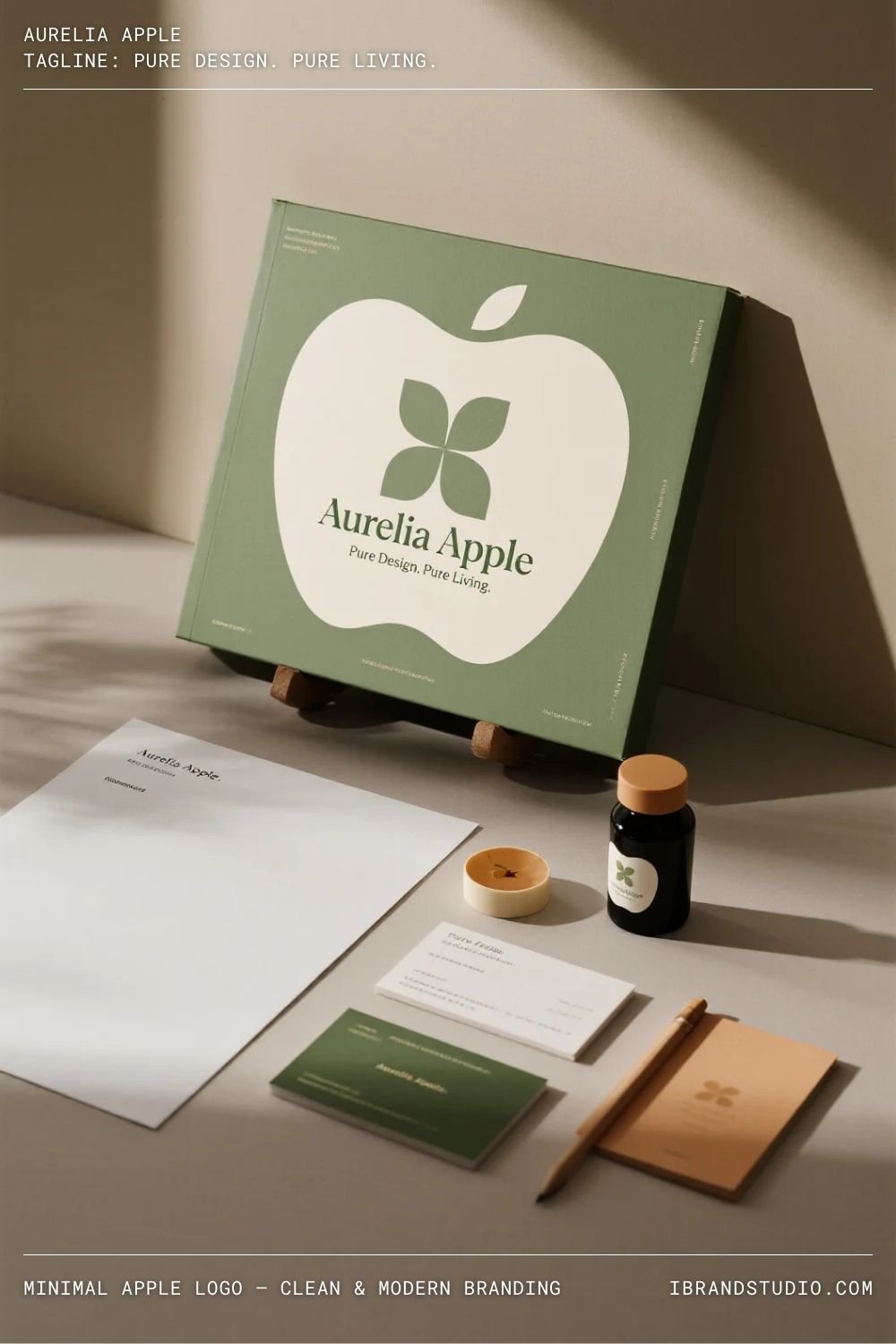
Minimal apple logos feel timeless and versatile. By removing unnecessary details, the apple becomes a flexible symbol that works across digital and print branding.
Design Tip:
Start in black and white. If the logo works without color, it will scale beautifully everywhere.
Best for: Tech-inspired brands, wellness startups, modern food labels
2. Abstract Citrus Slice – Fresh & Energetic Identity
Concept: Lemon, orange, or lime slices simplified into geometric segments.
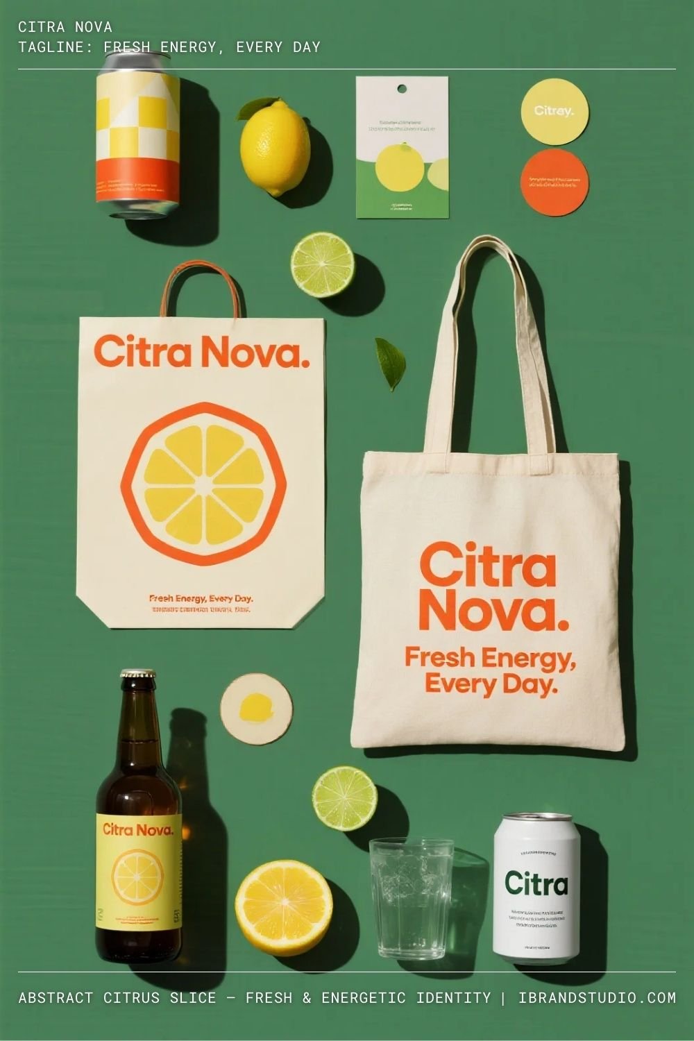
Citrus logos naturally communicate freshness and movement. Abstracting the slices gives the logo a modern edge while keeping the concept instantly recognizable.
Design Tip:
Use symmetry or radial balance to keep the design clean and visually satisfying.
Best for: Beverage brands, fitness studios, creative startups
3. Hand-Drawn Berry Logo – Organic & Artisanal Feel
Concept: A loosely illustrated berry with natural linework.
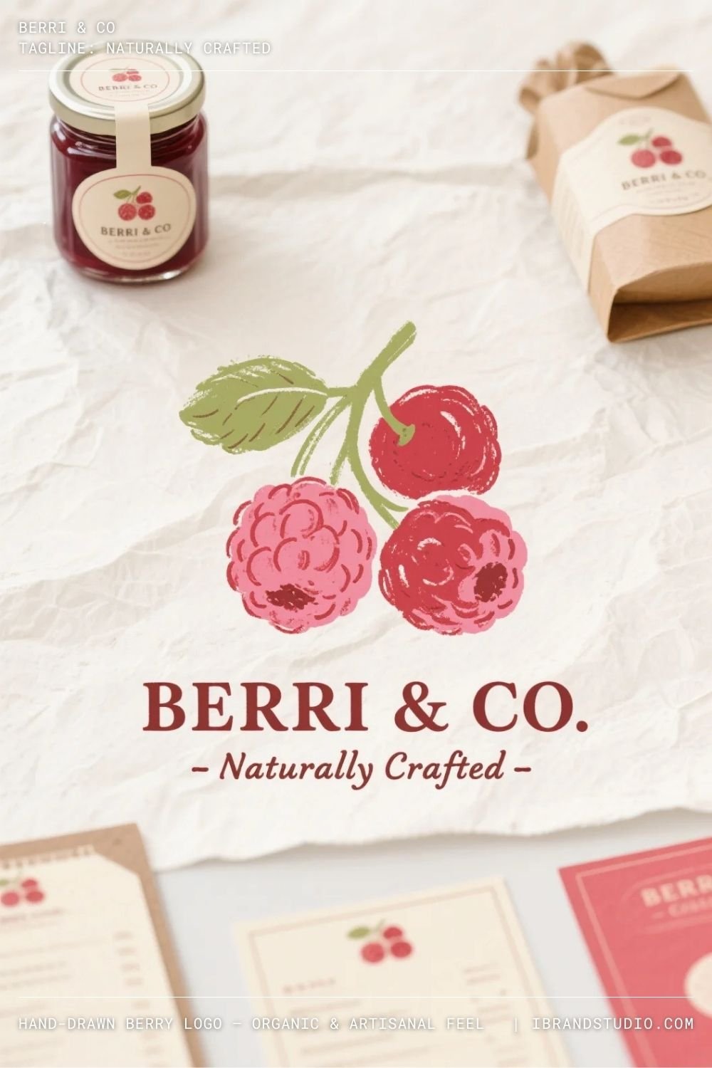
Hand-drawn fruit logos feel warm, authentic, and personal. They’re especially effective for brands that want to highlight craftsmanship or small-batch production.
Design Tip:
Keep imperfections intentional—avoid over-polishing the illustration.
Best for: Cafés, organic food brands, local businesses
4. Monoline Fruit Icon – Elegant & Flexible Logo Design
Concept: A fruit drawn using a single, continuous line.
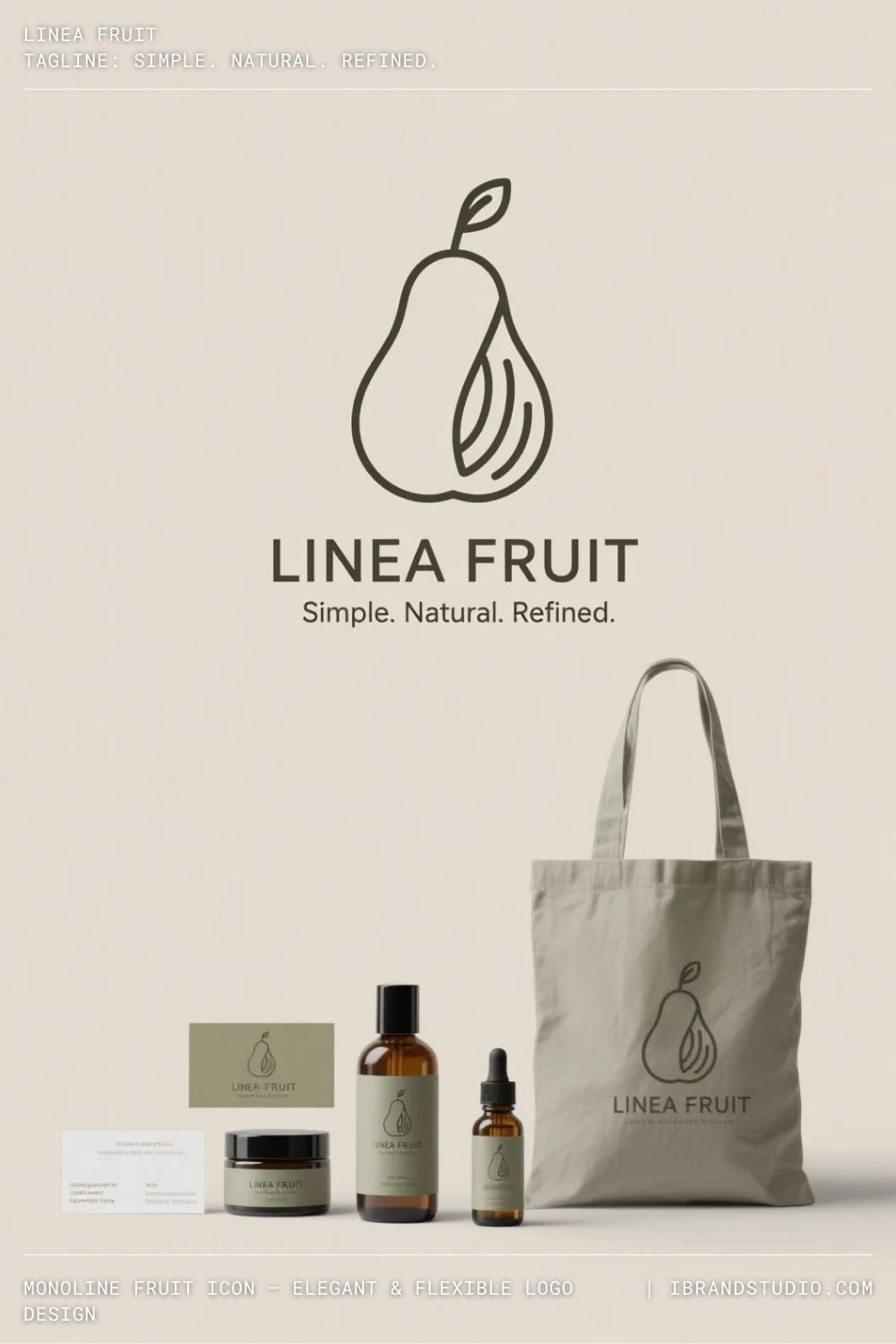
Monoline logos feel modern and refined. They adapt well to social media icons, packaging stamps, and minimal brand systems.
Design Tip:
Maintain consistent stroke weight and test visibility at small sizes.
Best for: Skincare brands, wellness products, boutique labels
5. Geometric Pineapple Logo – Bold & Structured
Concept: A pineapple built from triangles, grids, or repeating shapes.
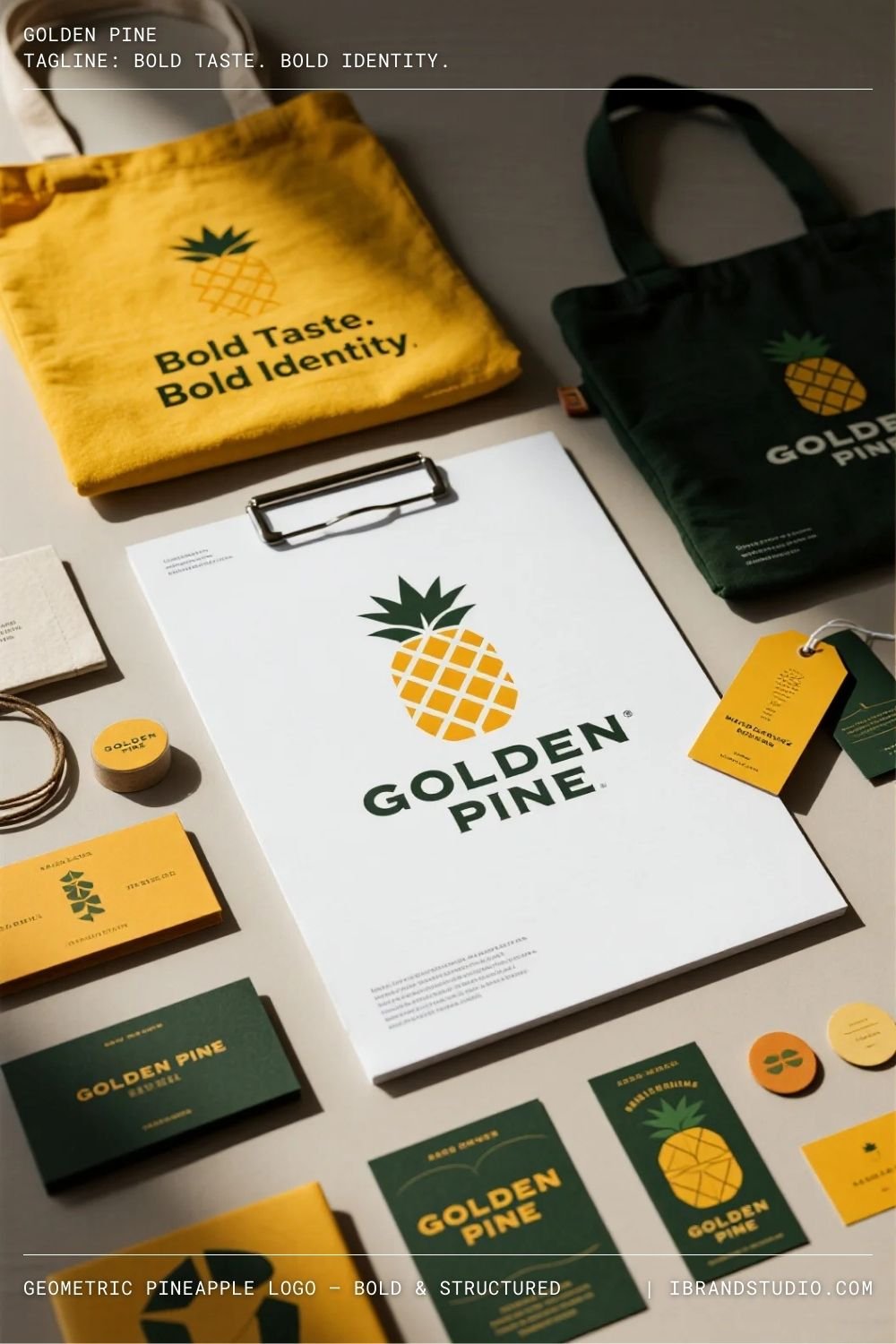
Geometric fruit logos communicate confidence and structure. Pineapples, in particular, symbolize creativity and hospitality.
Design Tip:
Limit your color palette to avoid visual overload.
Best for: Creative studios, lifestyle brands, co-working spaces
6. Fruit Mascot Logo – Playful & Memorable Branding
Concept: A fruit transformed into a character with personality.
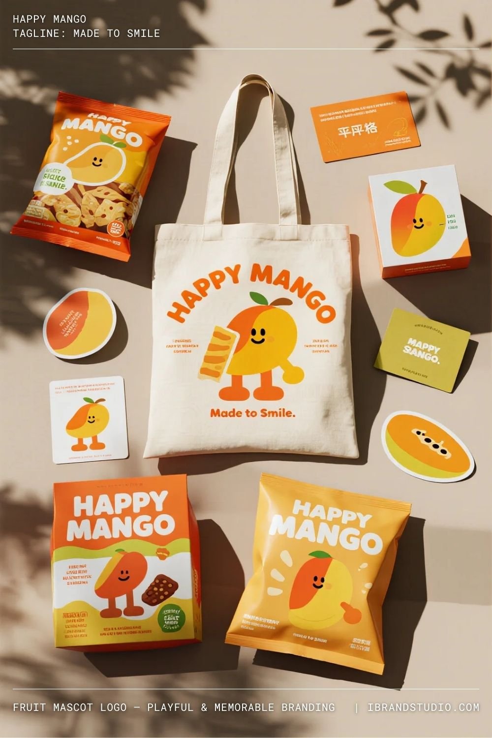
Mascot-style fruit logos create strong emotional connections and high brand recall, especially for younger audiences.
Design Tip:
Design the mascot to work both with and without facial expressions.
Best for: Kids brands, snack products, educational platforms
7. Negative Space Fruit Logo – Smart & Premium
Concept: A fruit shape revealed through negative space.
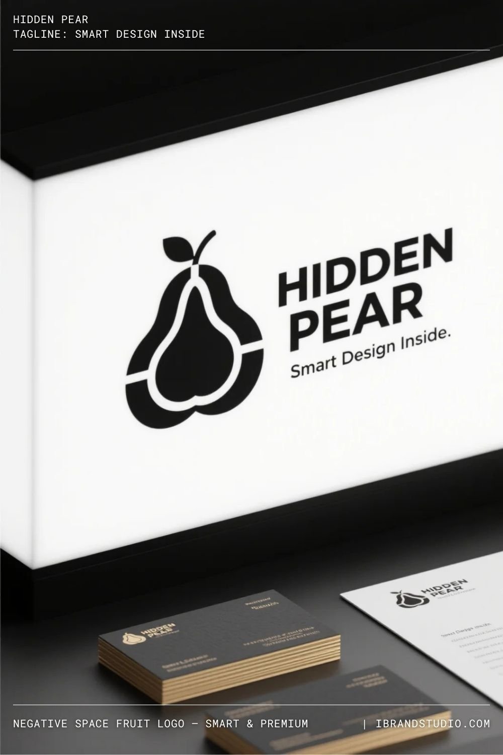
Negative space logos feel clever and premium when executed well. They encourage viewers to pause and engage with the design.
Design Tip:
Clarity always beats cleverness. If it’s confusing, simplify.
Best for: Boutique brands, premium packaging, creative agencies
8. Vintage Fruit Badge – Classic & Trust-Building
Concept: A fruit illustration placed inside a vintage emblem or seal.
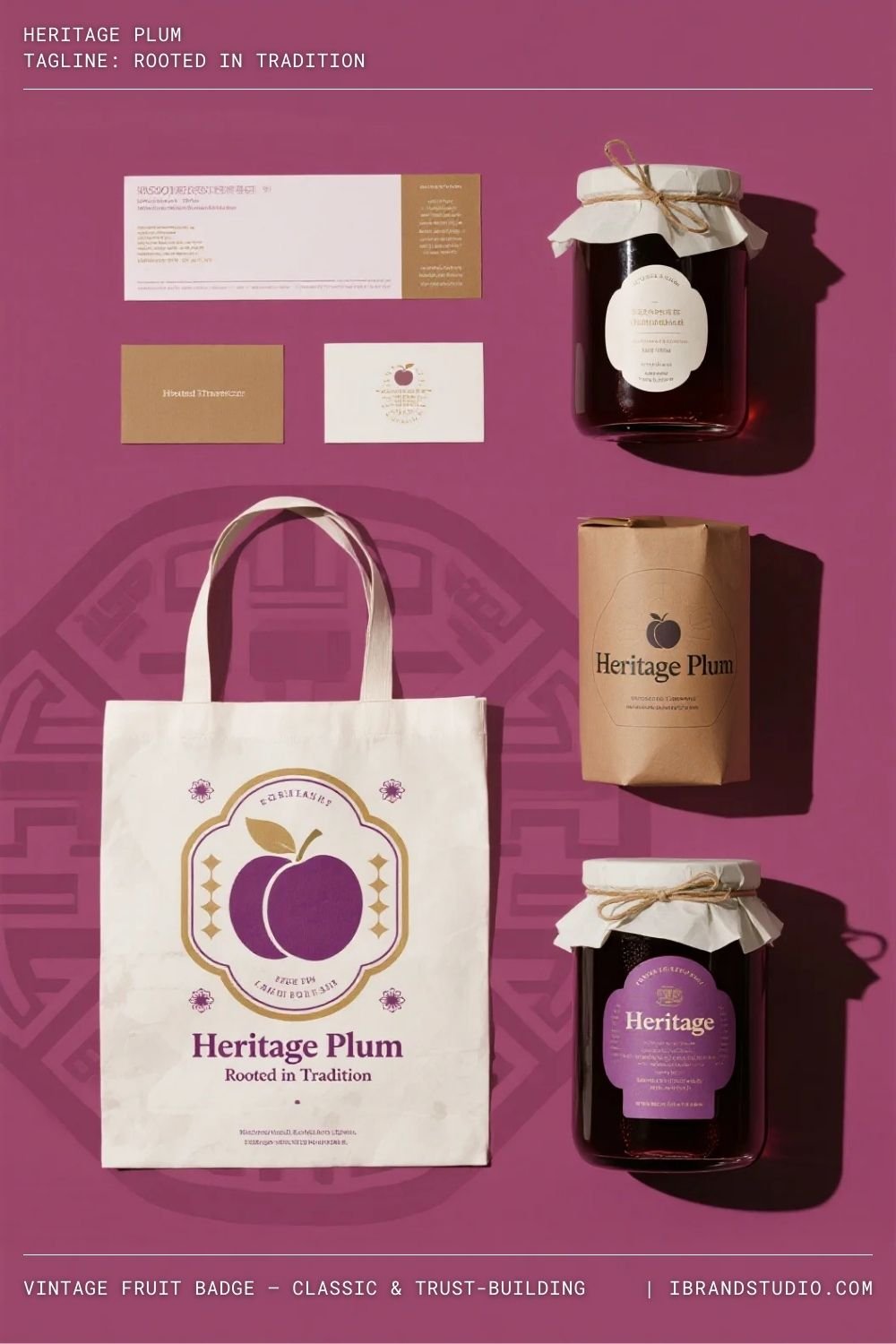
Vintage fruit logos evoke heritage, tradition, and trust. They work especially well for brands with strong storytelling.
Design Tip:
Use muted tones and textured typography for authenticity.
Best for: Coffee brands, jam labels, heritage food products
9. Fruit + Lettermark Logo – Clever & Compact
Concept: Integrating a fruit shape into a letterform.
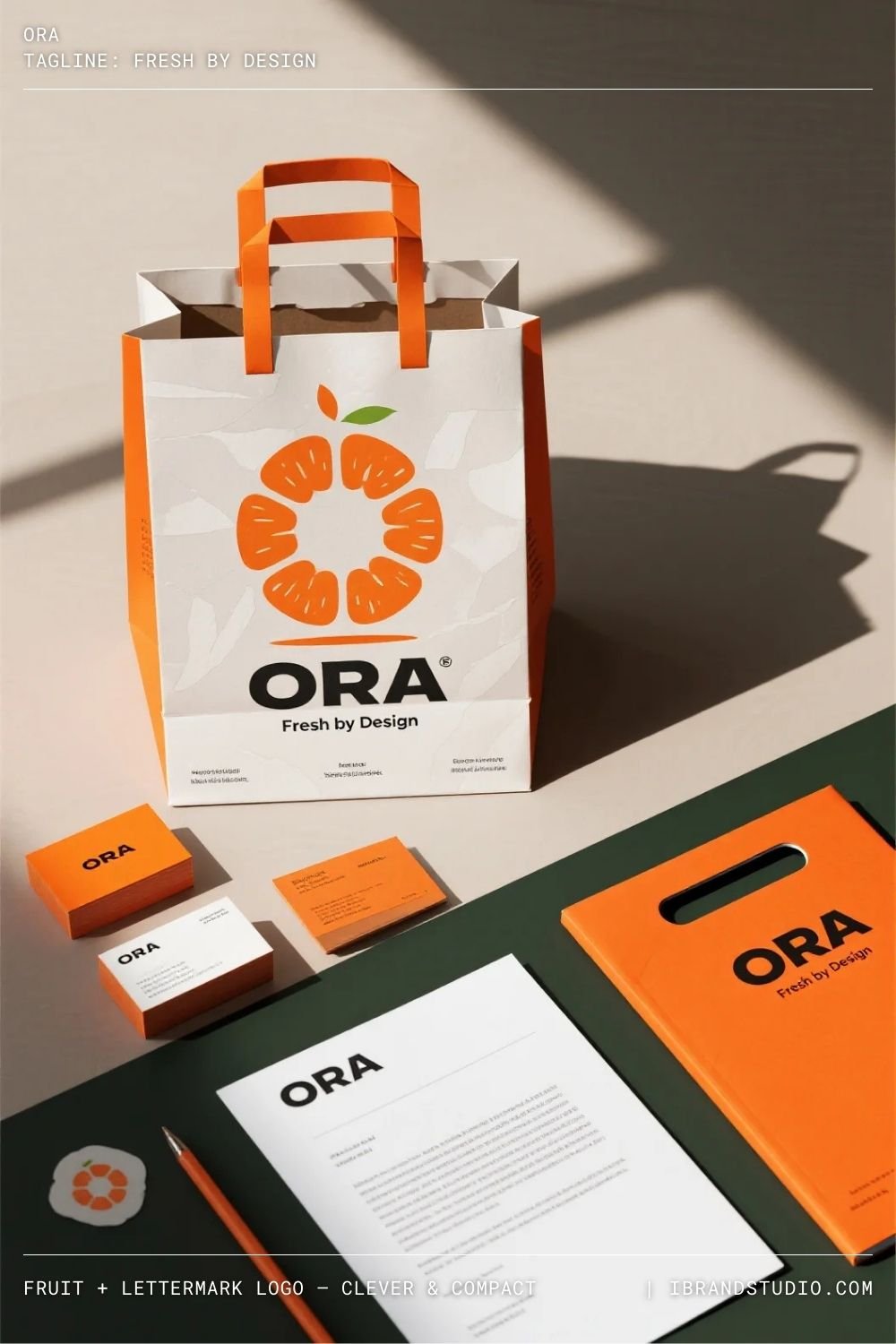
This approach keeps the logo compact and distinctive while reinforcing brand initials.
Design Tip:
Never sacrifice letter readability for decoration.
Best for: Startups, modern food brands, digital platforms
10. Flat Tropical Fruit Logo – Bright & Optimistic
Concept: Bold, flat illustrations of tropical fruits like mango or banana.
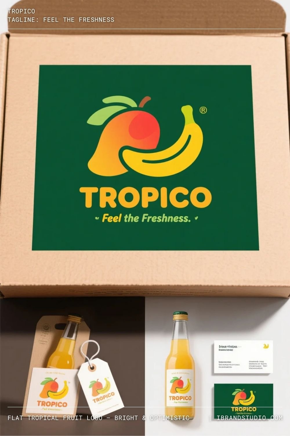
Flat tropical logos feel fun, approachable, and perfect for digital-first brands.
Design Tip:
High contrast colors help the logo stand out in feeds and thumbnails.
Best for: Smoothie brands, travel startups, lifestyle products
11. Luxury Fruit Logo – Minimal & Aspirational
Concept: A refined fruit symbol using metallic tones or minimal outlines.
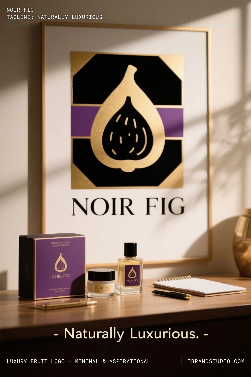
Luxury fruit logos challenge expectations by elevating simple objects into premium marks.
Design Tip:
Whitespace is your best friend—less detail equals more impact.
Best for: Gourmet brands, wine labels, premium skincare
12. Eco-Inspired Fruit Logo – Natural & Sustainable
Concept: A fruit combined with leaves, roots, or circular eco elements.
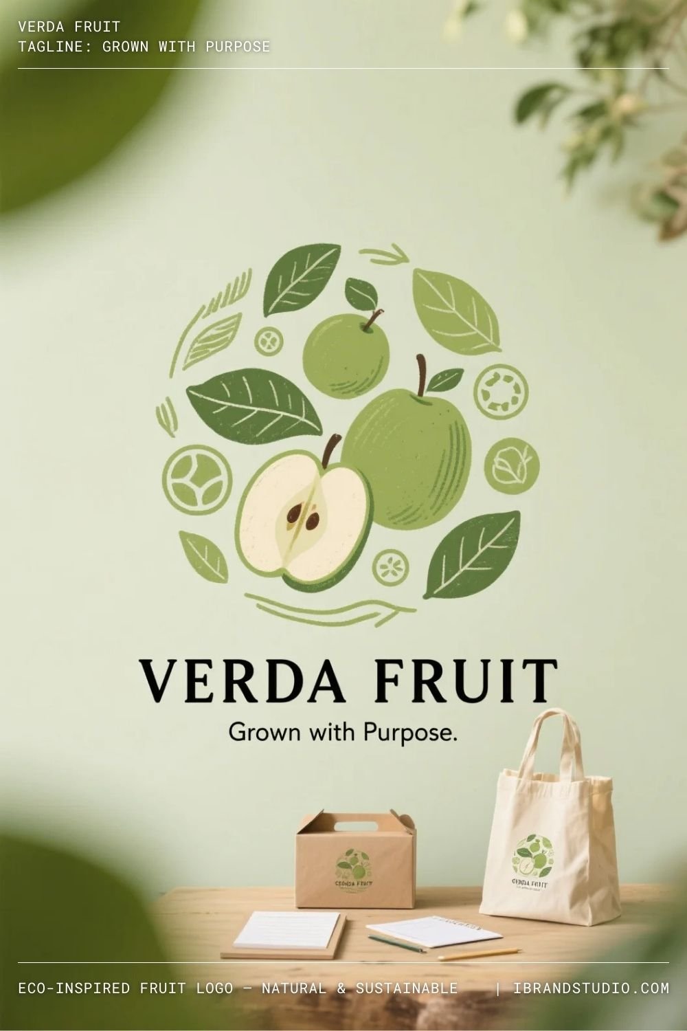
Eco fruit logos communicate sustainability and responsibility when done honestly.
Design Tip:
Avoid overused “green clichés”—aim for subtle, thoughtful design.
Best for: Organic brands, eco startups, plant-based products
Final Thoughts: Designing Fruit Logos That Feel Brand-Ready
Fruit logos are powerful because they feel familiar—but great branding happens when familiarity meets strategy and originality.
As designers, our job is to translate simple symbols into meaningful visual identities.
If you’re building a logo concept for a real client or a personal project, always ask:
- What emotion should this fruit communicate?
- How will it scale across platforms?
- Does it feel unique in its market?
Used thoughtfully, fruit logo design can be fresh, timeless, and incredibly effective.
