Icons That Rule the Internet: 10 Influential Social Media Logos Shaping Digital Culture
Scroll your phone for five seconds and you’ll see them everywhere—small, familiar icons that instantly tell you where you are and what kind of experience to expect.
Social media logos have become modern-day hieroglyphs. They represent communities, behaviors, and emotions long before a single word is read or a post is viewed.
For graphic designers and branding enthusiasts, these logos aren’t just app icons. They’re powerful case studies in scalability, symbolism, and cultural relevance.
In this article, we’ll explore 10 of the most influential social media logos shaping digital culture, look at why they work so well, and pull out practical branding lessons you can actually use in your own design work.
See Also: 20 World-Famous Brands and Their Logos
Why Social Media Logos Are a Big Deal
Designing a social media logo is one of the toughest branding challenges out there. These marks must:
- Be recognizable at tiny sizes
- Work across apps, websites, ads, and merchandise
- Feel emotionally familiar to millions (or billions) of users
- Evolve over time without losing identity
When a logo succeeds at all of this, it doesn’t just represent a brand—it becomes part of everyday life.
Let’s look at the logos that nailed it.
1. Facebook – Consistency That Built Trust
Founded: 2004
Logo style: Blue wordmark + “f” icon
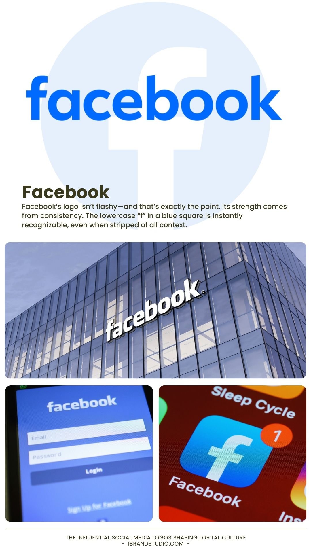
Facebook’s logo isn’t flashy—and that’s exactly the point. Its strength comes from consistency. The lowercase “f” in a blue square is instantly recognizable, even when stripped of all context.
Why it works
- Blue communicates trust, stability, and reliability
- Minimal changes over time protect brand recognition
- The icon performs perfectly in mobile-first environments
Facebook – Consistency That Built Trust
When your audience is massive, familiarity beats novelty.
Small refinements can be more powerful than dramatic redesigns.
Keep Explore: From Inspirations to Icon: 7 Logo Design Ideas that Scream Perfection
2. Instagram – The Gradient That Changed Everything
Founded: 2010
Major redesign: 2016
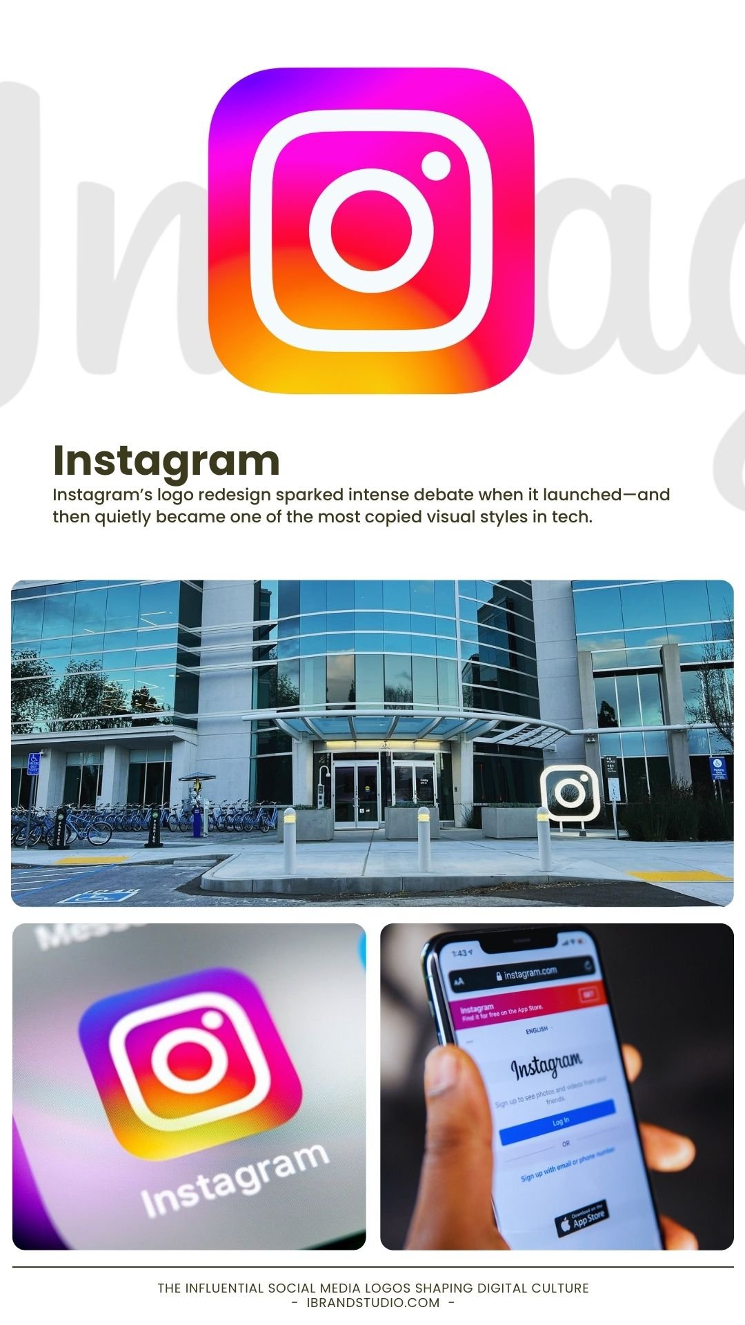
Instagram’s logo redesign sparked intense debate when it launched—and then quietly became one of the most copied visual styles in tech.
Why it works
- The gradient signals creativity, diversity, and emotion
- The simplified camera outline preserves brand memory
- Bold color helps it stand out in crowded app screens
Design lesson
Logos don’t need detail to feel expressive.
Emotion, color, and symbolism can do the heavy lifting.
3. Twitter (X) – Minimalism with Maximum Impact
Founded: 2006
Rebrand: 2023
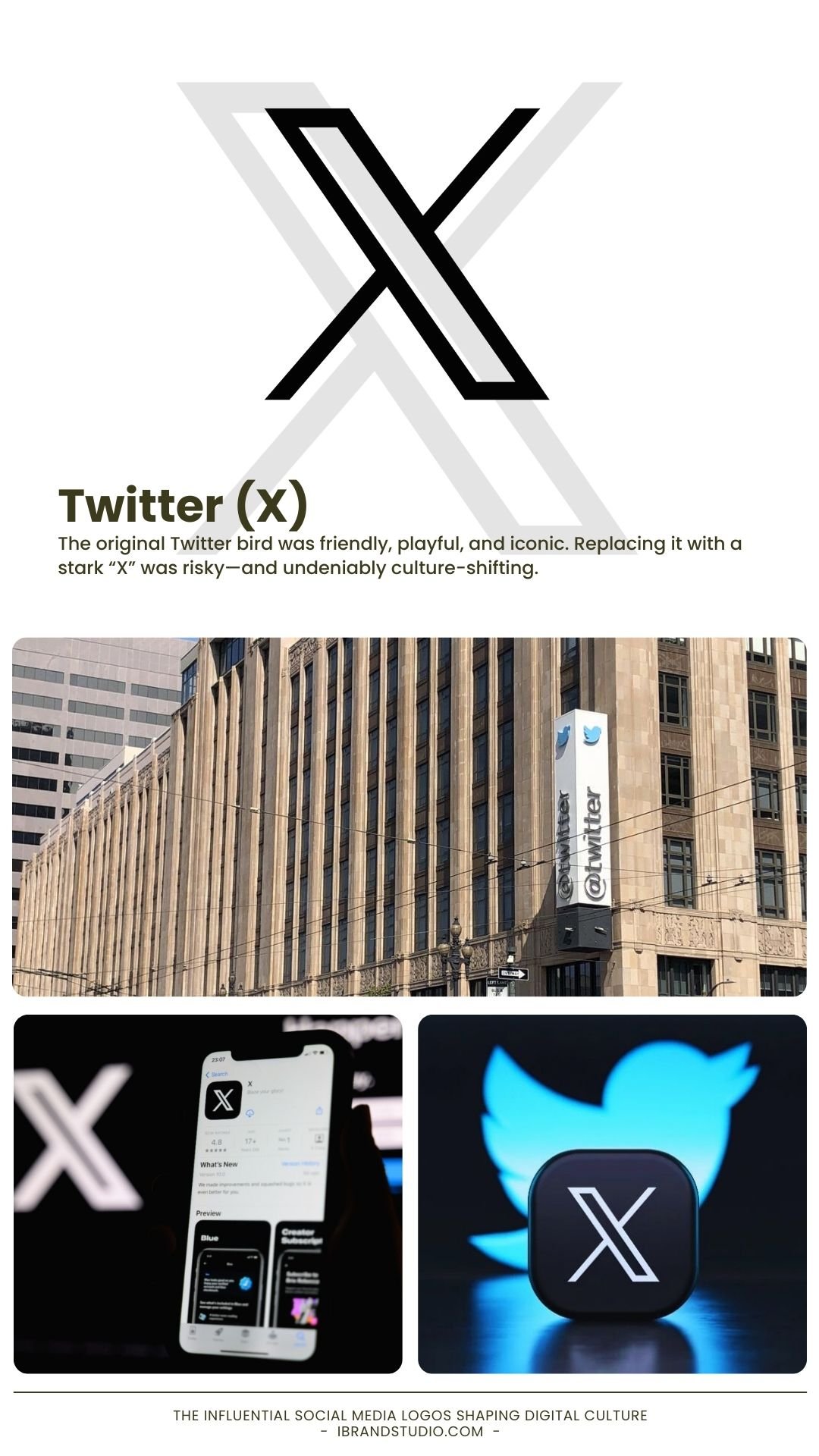
The original Twitter bird was friendly, playful, and iconic. Replacing it with a stark “X” was risky—and undeniably culture-shifting.
Why it works (and why it divides opinion)
- Single-letter logos feel modern and powerful
- Black-and-white branding signals authority and disruption
- The change repositions the platform’s identity entirely
Design lesson
Radical rebrands reshape meaning—but they erase emotional history.
Know exactly what you’re trading before you commit.
4. YouTube – Universal Communication Through Design
Founded: 2005
Key element: Red play button
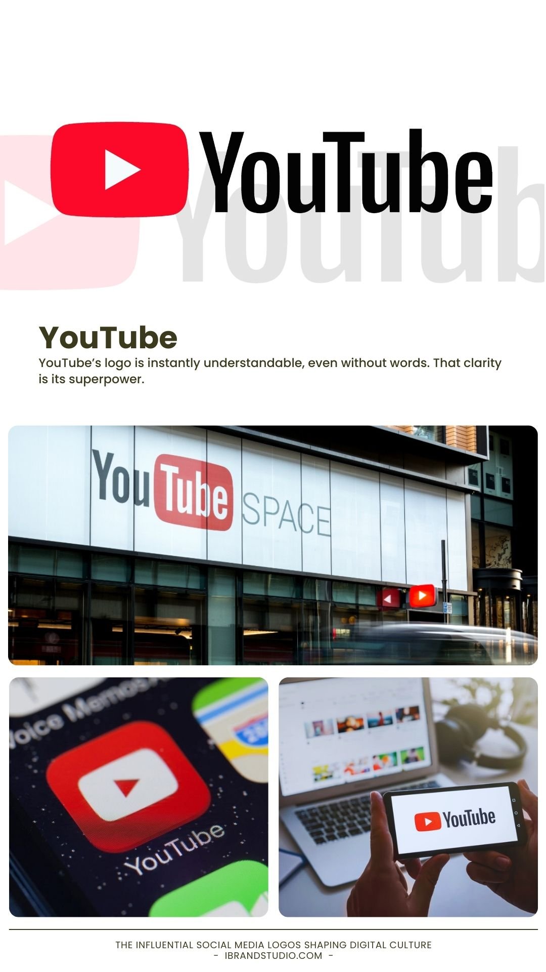
YouTube’s logo is instantly understandable, even without words. That clarity is its superpower.
Why it works
- The play icon is globally recognized
- Red adds urgency, energy, and excitement
- The icon works alone or alongside the wordmark
Design lesson
If your logo explains the action, you’ve already won.
Universal symbols scale across cultures better than clever metaphors.
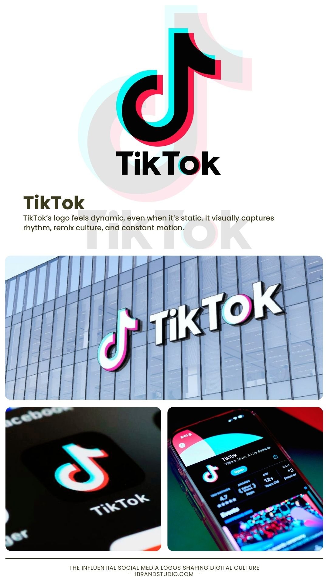
5. TikTok – Designing for Movement and Sound
Founded: 2016
TikTok’s logo feels dynamic, even when it’s static. It visually captures rhythm, remix culture, and constant motion.
Why it works
- Musical note reflects audio-first content
- Neon cyan and pink appeal to younger audiences
- Strong contrast works well in dark mode
Design lesson
A logo can suggest motion without animation.
Visual energy matters, especially for entertainment brands.
6. Snapchat – A Mascot That Made Sense
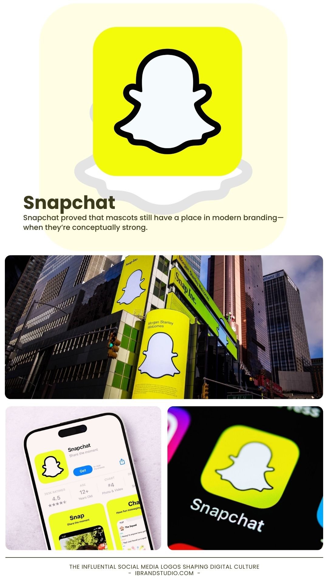
Founded: 2011
Logo: Ghost on yellow background
Snapchat proved that mascots still have a place in modern branding—when they’re conceptually strong.
Why it works
- The ghost symbolizes disappearing content
- Yellow stands out in a sea of blues and blacks
- Simple shape makes it easy to recognize instantly
Design lesson
Strong silhouettes beat detailed illustrations.
If it works in black and white, it works everywhere.
7. LinkedIn – Branding for Professional Confidence
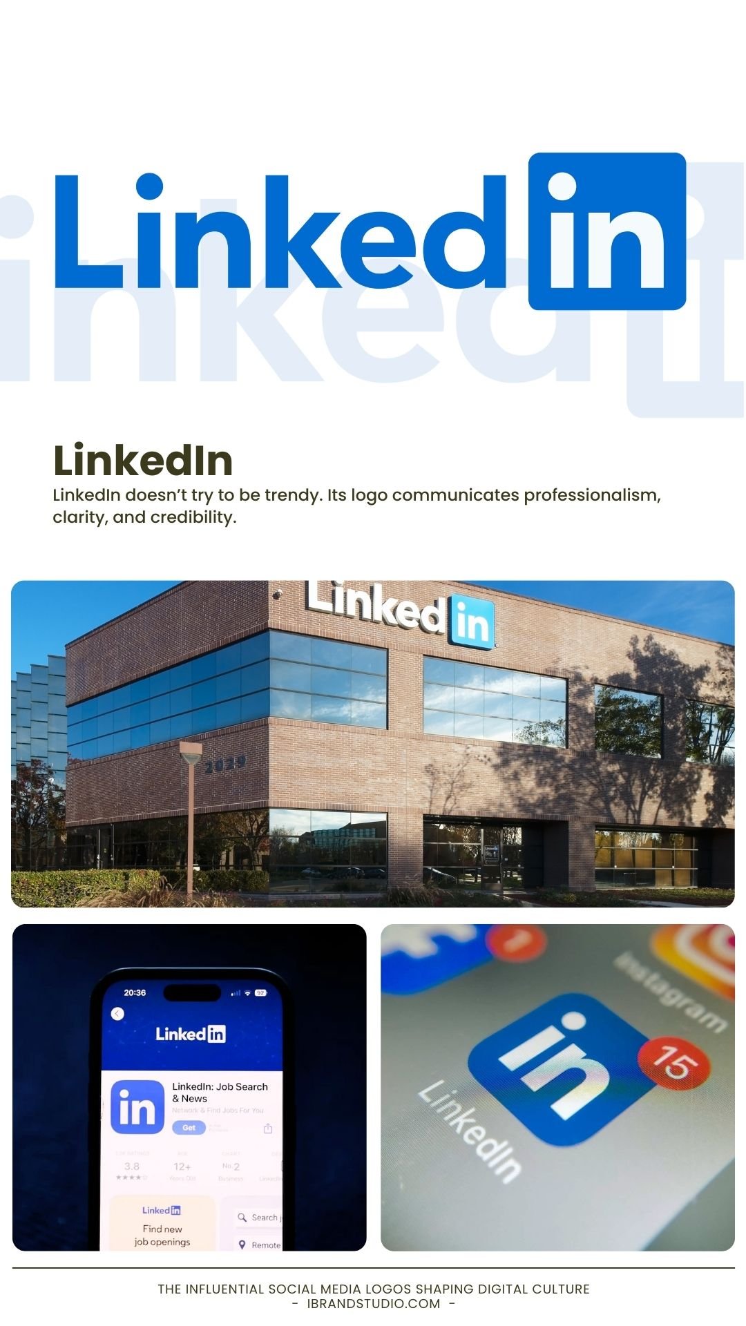
Founded: 2003
Style: Clean wordmark with “in” badge
LinkedIn doesn’t try to be trendy. Its logo communicates professionalism, clarity, and credibility.
Why it works
- Blue reinforces trust and authority
- The “in” badge subtly reinforces networking
- Clean typography suits corporate environments
Design lesson
Your logo should reflect how users want to feel.
Professional platforms need confidence, not flash.
8. Pinterest – Smart Symbolism Done Right
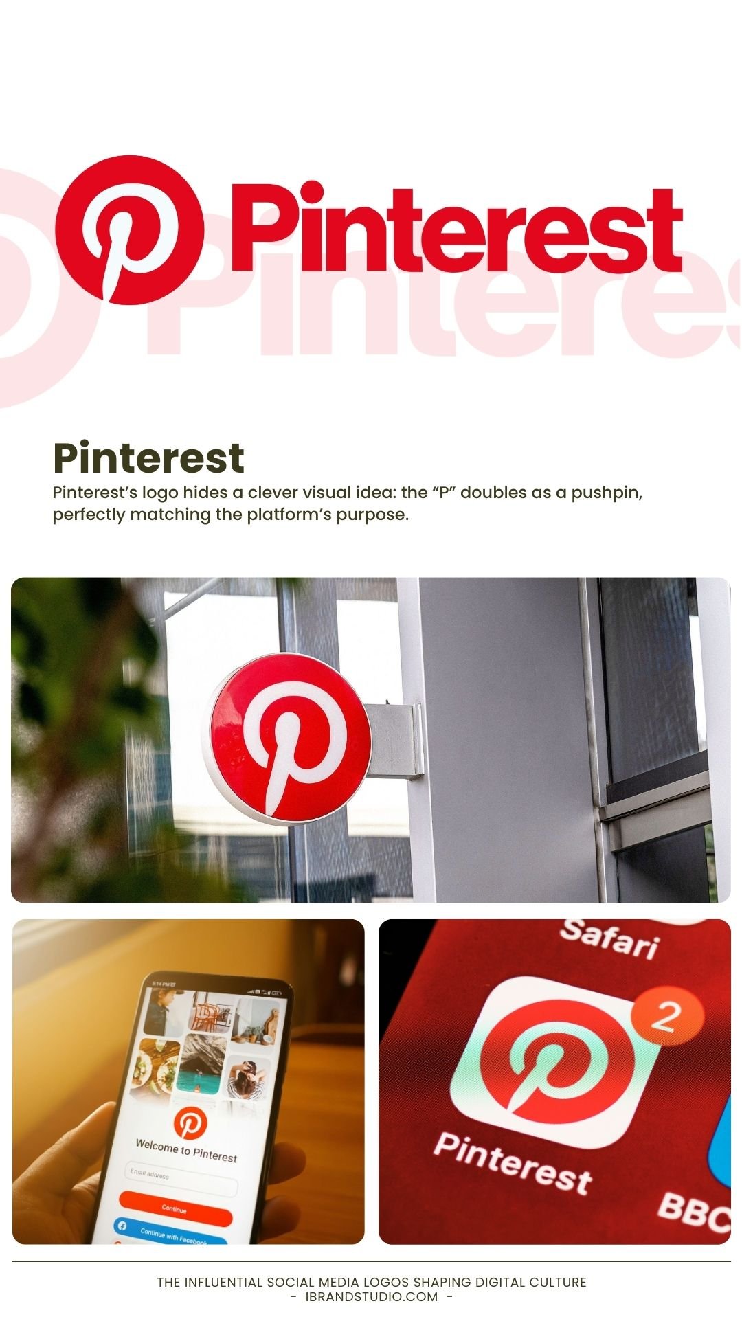
Founded: 2010
Icon: Stylized “P”
Pinterest’s logo hides a clever visual idea: the “P” doubles as a pushpin, perfectly matching the platform’s purpose.
Why it works
- Visual metaphor enhances memorability
- Red suggests inspiration and action
- Simple form adapts easily to digital layouts
Design lesson
Subtle cleverness lasts longer than obvious tricks.
Reward users who notice the details.
9. WhatsApp – Clear, Friendly, and Trustworthy
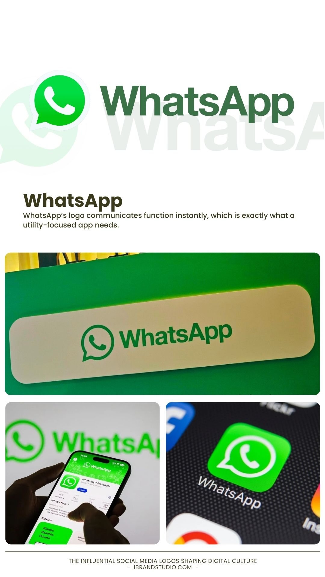
Founded: 2009
Icon: Phone inside a chat bubble
WhatsApp’s logo communicates function instantly, which is exactly what a utility-focused app needs.
Why it works
- Green signals security and positivity
- Combines messaging and calling in one icon
- Friendly design encourages global adoption
Design lesson
Clarity builds trust faster than decoration.
When usability matters, keep the design simple.
10. Reddit – Personality at Scale
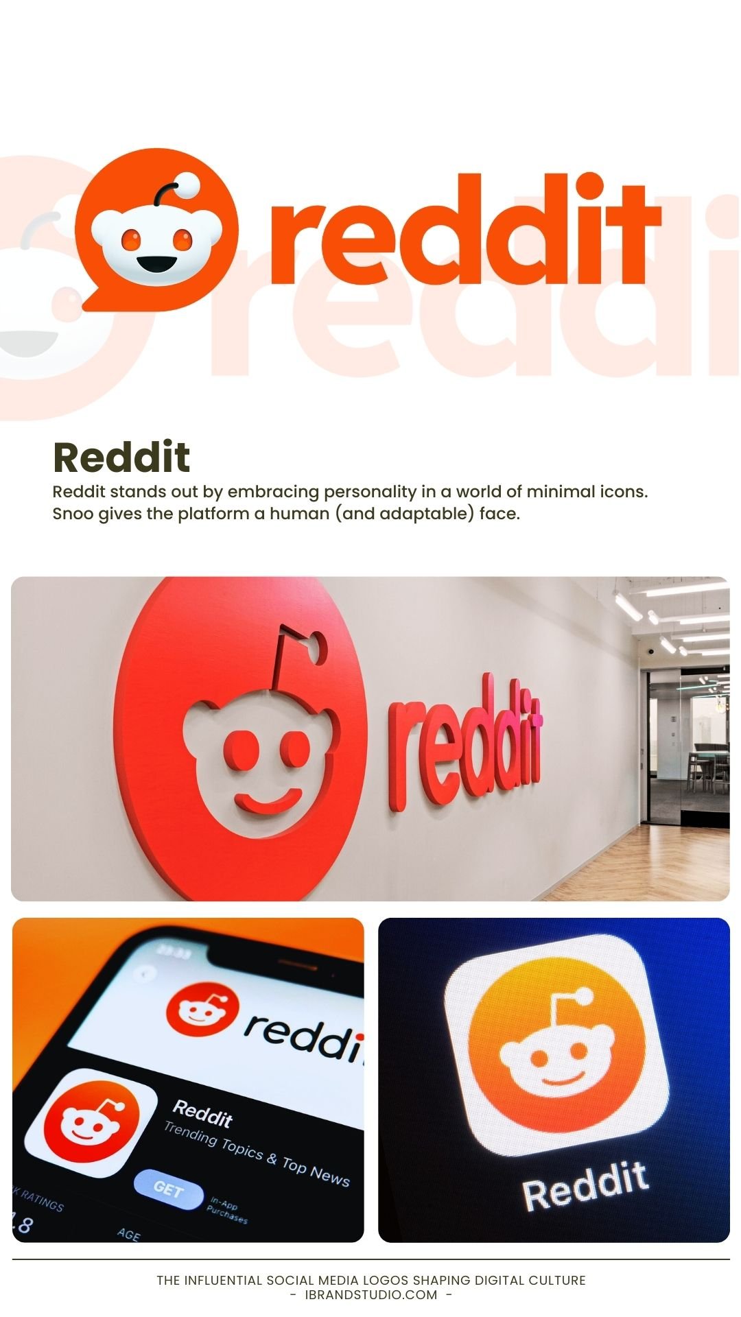
Founded: 2005
Mascot: Snoo
Reddit stands out by embracing personality in a world of minimal icons. Snoo gives the platform a human (and adaptable) face.
Why it works
- Mascot builds emotional connection
- Orange feels energetic and unconventional
- The design system allows endless customization
Design lesson
Personality can scale if the system is flexible.
Give communities room to make the brand their own.
What Designers Can Learn from Social Media Logos
Here are a few practical takeaways you can apply immediately:
1. Start with the App Icon
Design for small sizes first. If it works at 32 pixels, it’ll work anywhere.
2. Shape Matters More Than Detail
Strong outlines and simple geometry improve recognition.
3. Color Carries Emotion
Choose palettes based on feeling, not trends.
4. Build Logos That Can Evolve
The best logos change gradually without losing identity.
5. Culture Comes Before Style
Successful social media logos reflect how people behave—not just how things look.
Final Thoughts: Logos as Cultural Shortcuts
Social media logos are no longer just branding assets—they’re cultural signals. They tell us how to act, what to expect, and where we belong in the digital world.
For designers, these logos remind us that great branding lives at the intersection of strategy, psychology, and simplicity.
If there’s one idea to carry forward, it’s this:
A truly great logo doesn’t shout for attention—it earns recognition. Study these icons, understand their intent, and apply their principles to build brands that last.