Signal & Style: 10 Influential Telecommunications Logos Every Branding Designer Should Study
Telecommunications logos aren’t usually described as “beautiful” or “artsy”—yet they’re some of the most strategically designed logos in the world.
Why?
Because telecom brands sell something you can’t see, touch, or photograph easily: connection.
For branding designers and visual identity enthusiasts, this makes telecom logos incredibly valuable case studies.
They show us how to communicate trust, scale, innovation, and reliability using only shapes, colors, and typography.
In this article, we’ll explore 10 of the most influential telecommunications logos, break down why they work, and extract branding lessons you can apply to logo and identity projects—especially in tech, SaaS, and service-based brands.
Why Telecom Logos Are a Goldmine for Branding Inspiration
Before we dive into the list, let’s set the context.
Telecommunications brands face unique branding challenges:
- Their services are invisible
- They operate at massive scale
- They must feel reliable during both normal use and emergencies
- Their logos must work across apps, SIM cards, towers, websites, ads, and trucks
That’s why most successful telecom logos share these traits:
- Simple shapes
- Strong typography
- Strategic color usage
- Excellent scalability
As designers, that’s exactly the kind of branding problem worth studying.
1. AT&T – Timeless Abstraction Done Right
AT&T is one of the largest telecommunications companies in the world, providing mobile, broadband, and enterprise communication services primarily in the United States.
Founded in 1885, AT&T has evolved alongside the modern communication industry itself.
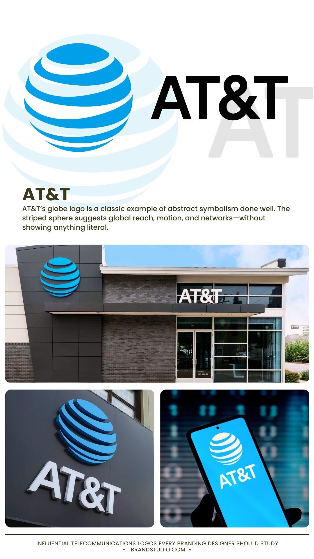
AT&T’s globe logo is a classic example of abstract symbolism done well.
The striped sphere suggests global reach, motion, and networks—without showing anything literal.
Why designers love it:
- Abstract symbols age better than trendy visuals
- Blue reinforces trust and stability
- The logo works even without the wordmark
Branding lesson:
If your brand aims for longevity, abstraction often beats illustration.
2. Verizon – A Wordmark That Feels Powerful
Verizon is a major U.S.-based telecommunications provider offering wireless services, internet, and enterprise solutions.
The brand is strongly associated with network reliability and performance.
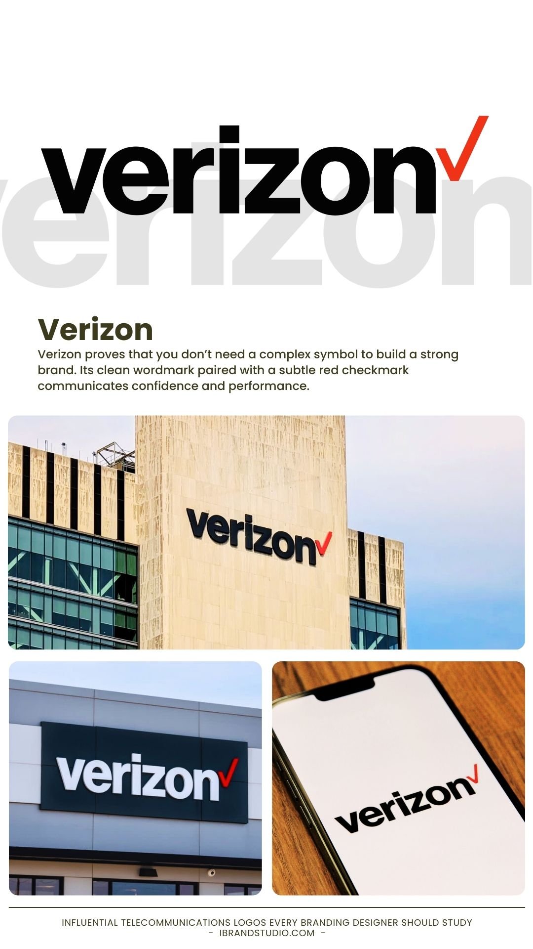
Verizon proves that you don’t need a complex symbol to build a strong brand.
Its clean wordmark paired with a subtle red checkmark communicates confidence and performance.
Why it works:
- Strong, readable typography
- The checkmark implies reliability and verification
- Easy to scale across digital platforms
Branding lesson:
When the name is strong, let typography lead the identity.
3. Vodafone – Human Communication as a Symbol
Vodafone is a global telecommunications company headquartered in the UK, operating across Europe, Africa, Asia, and Oceania. It is one of the most recognizable telecom brands worldwide.
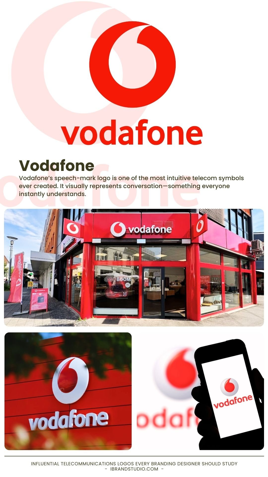
Vodafone’s speech-mark logo is one of the most intuitive telecom symbols ever created.
It visually represents conversation—something everyone instantly understands.
Why it works:
- Direct connection to human interaction
- Red adds energy and memorability
- Simple enough for global recognition
Branding lesson:
The best logos translate complex services into everyday human behavior.
4. T-Mobile – Winning Through Color Ownership
T-Mobile is a global wireless network operator known for its disruptive market strategies and customer-focused positioning, particularly in the U.S. and Europe.
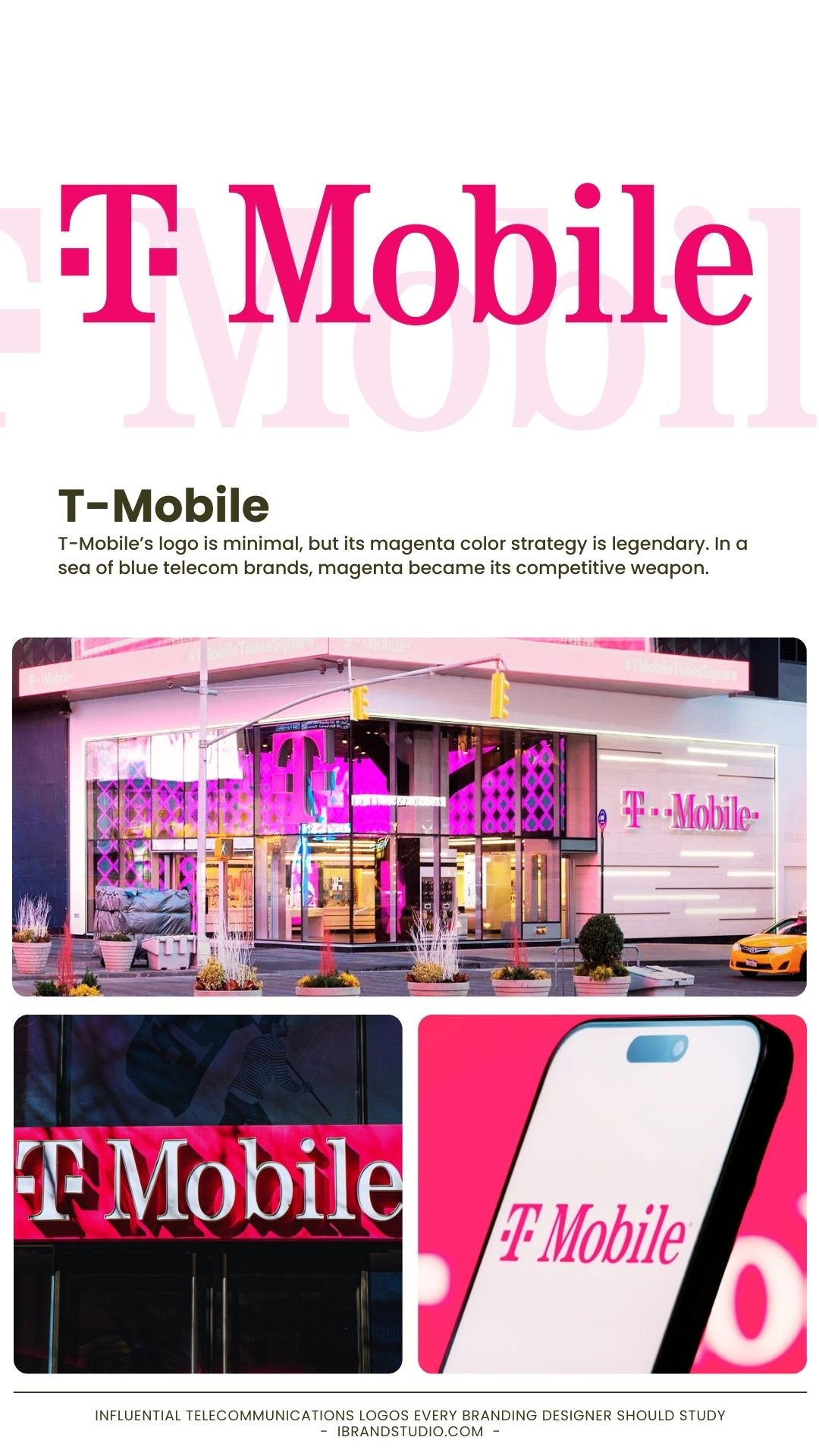
T-Mobile’s logo is minimal, but its magenta color strategy is legendary. In a sea of blue telecom brands, magenta became its competitive weapon.
Why designers admire it:
- Strong differentiation
- Consistent color usage across all touchpoints
- Youthful and disruptive personality
Branding lesson:
Owning a bold, uncommon color can become your strongest brand asset.
5. Orange – Branding Through Extreme Simplicity
Orange is a French multinational telecommunications corporation serving consumers and businesses across Europe, Africa, and the Middle East.
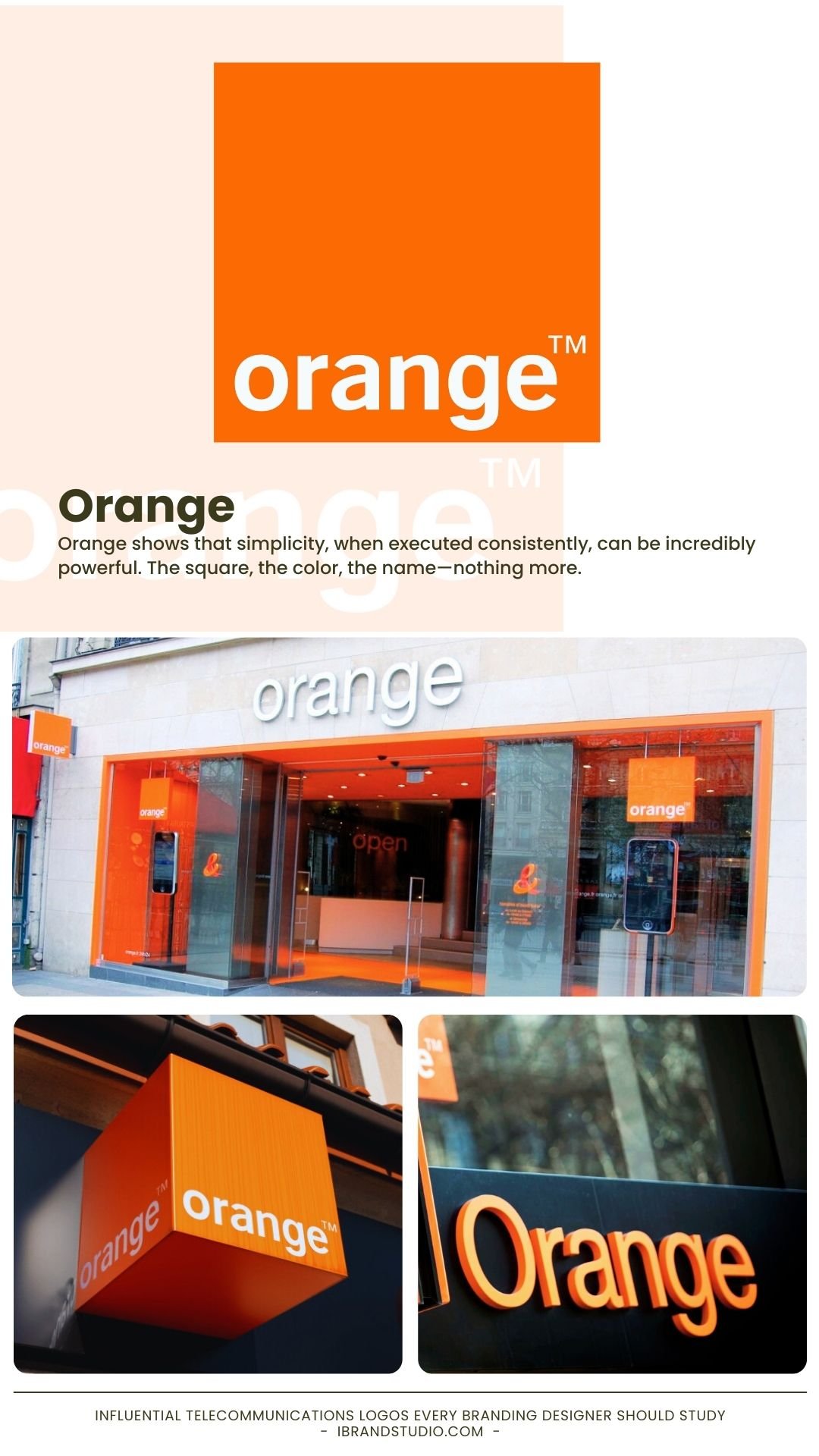
Orange shows that simplicity, when executed consistently, can be incredibly powerful. The square, the color, the name—nothing more.
Why it works:
- Logo doubles as a design system
- Easy to apply across products and campaigns
- Clean, modern, and flexible
Branding lesson:
A logo doesn’t need complexity—clarity and consistency matter more.
6. China Mobile – Structure Equals Trust
China Mobile is the world’s largest mobile network operator by subscriber count, serving hundreds of millions of users across China and beyond.
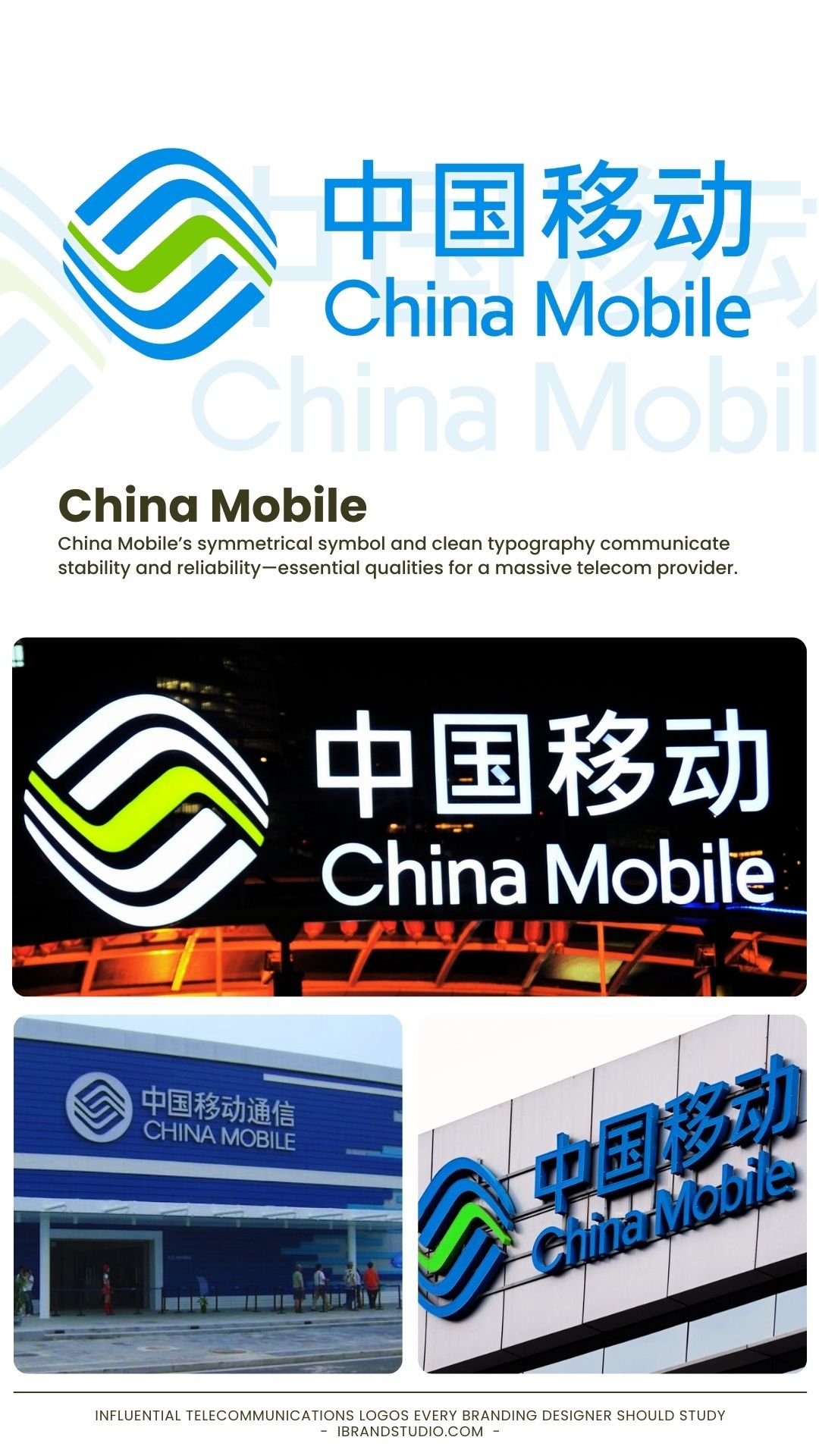
China Mobile’s symmetrical symbol and clean typography communicate stability and reliability—essential qualities for a massive telecom provider.
Why it works:
- Balanced geometry builds trust
- Blue reinforces professionalism
- Works across languages and markets
Branding lesson:
Symmetry and structure are powerful tools for corporate credibility.
7. Telefónica – Modernizing Without Losing Heritage
Telefónica is a Spanish multinational telecom company operating under brands like Movistar, O2, and Vivo across Europe and Latin America.
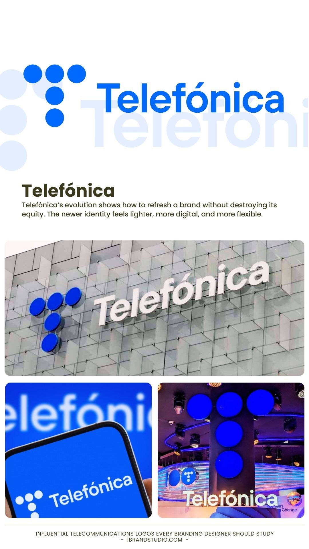
Telefónica’s evolution shows how to refresh a brand without destroying its equity. The newer identity feels lighter, more digital, and more flexible.
Why designers appreciate it:
- Custom typography adds personality
- Simplified forms improve usability
- Respect for brand history
Branding lesson:
Great rebrands evolve the brand story—they don’t reset it.
8. SK Telecom – Emotion in a Tech Brand
SK Telecom is South Korea’s largest wireless telecommunications operator, known for technological leadership in 5G and digital services.
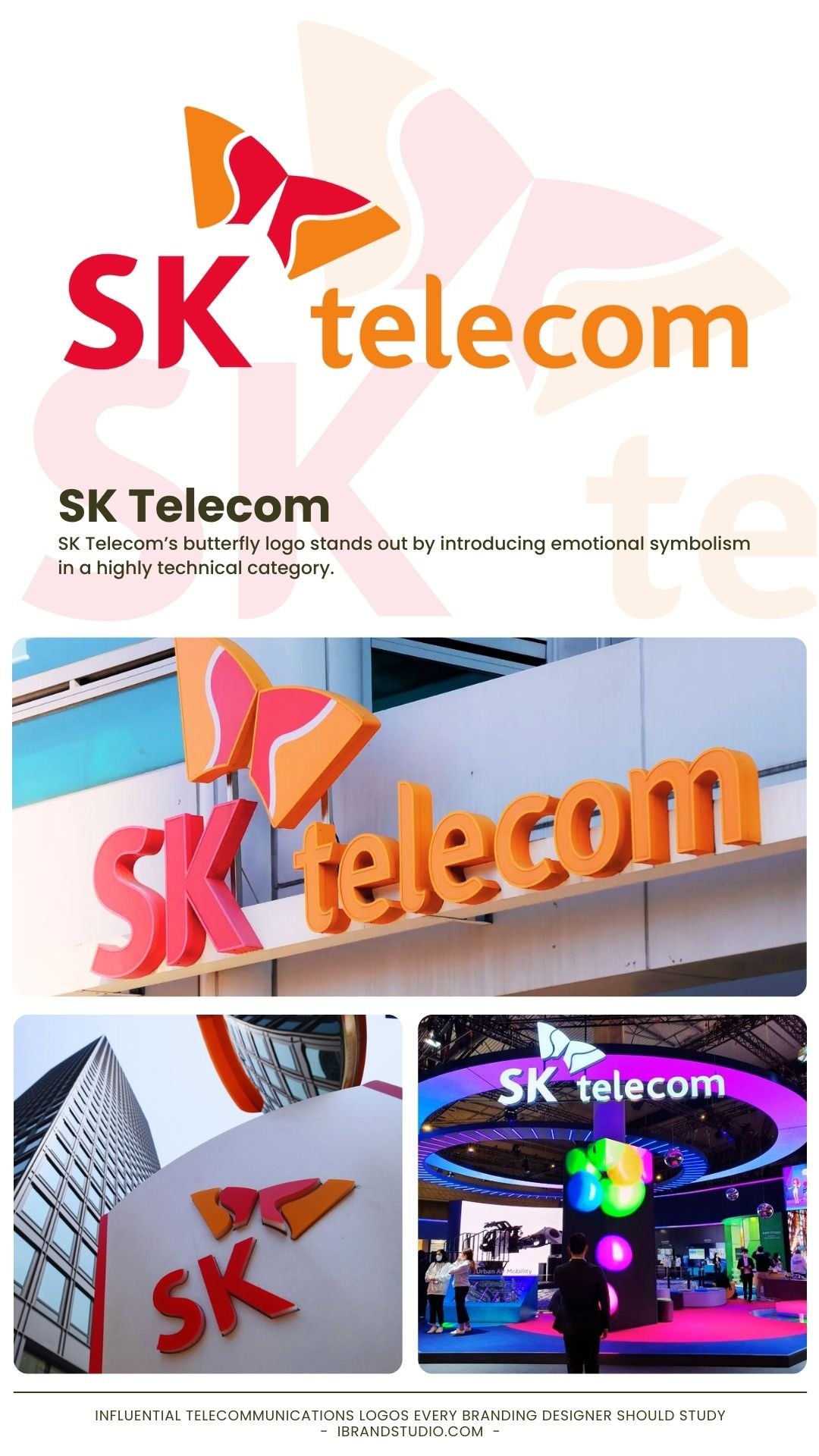
SK Telecom’s butterfly logo stands out by introducing emotional symbolism in a highly technical category.
Why it’s effective:
- Represents transformation and freedom
- Differentiates in crowded markets
- Feels modern and dynamic
Branding lesson:
Emotion is a powerful differentiator—even in tech-driven industries.
9. NTT – Corporate Minimalism That Lasts
NTT (Nippon Telegraph and Telephone) is a Japanese telecommunications giant and parent company to numerous global technology subsidiaries.
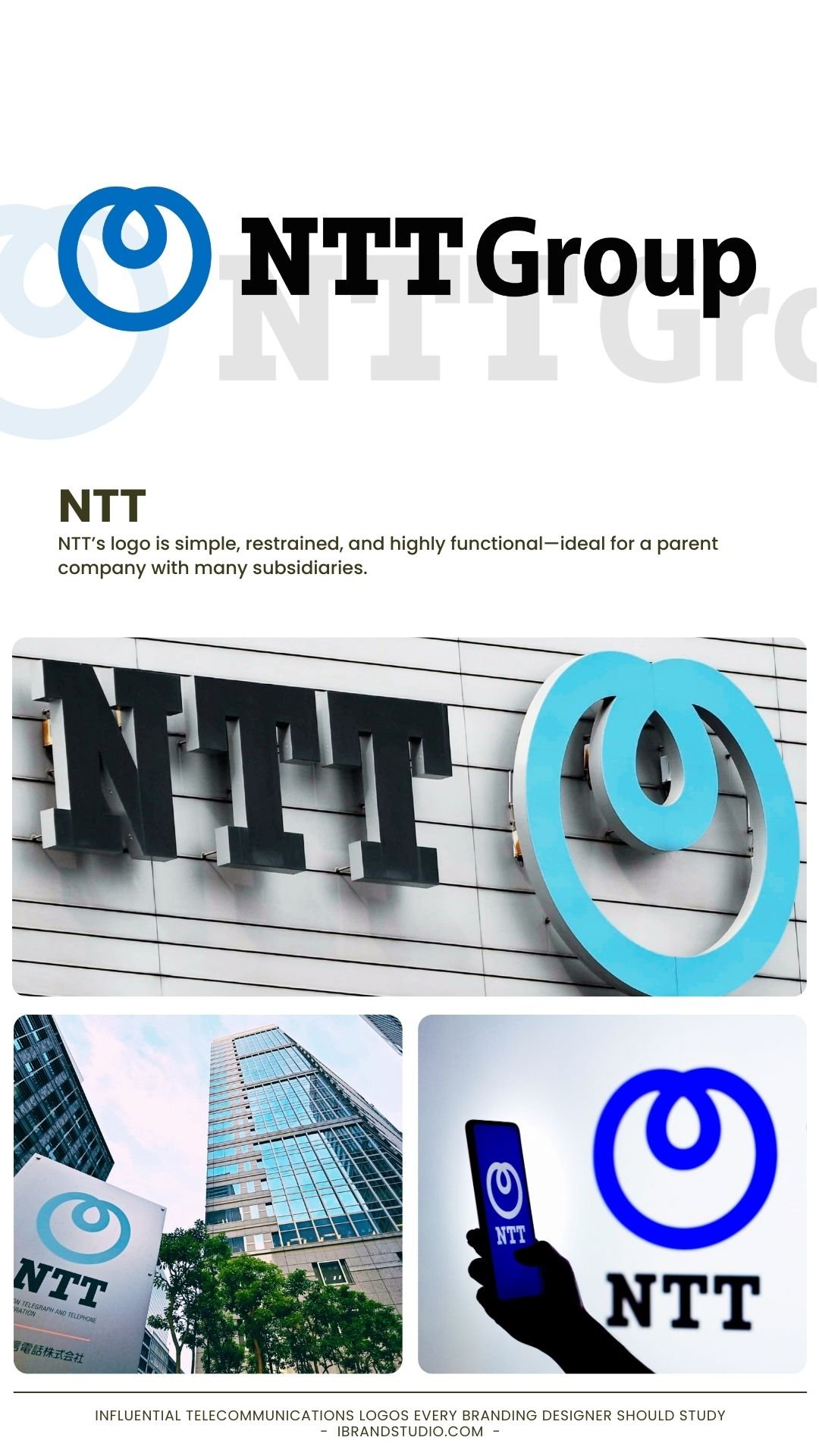
NTT’s logo is simple, restrained, and highly functional—ideal for a parent company with many subsidiaries.
Why it works:
- Clean typography ensures longevity
- Neutral identity supports sub-brands
- Professional and credible
Branding lesson:
Minimalism isn’t boring when it’s purposeful.
10. Telstra – Organic Shapes for Digital Networks
Telstra is Australia’s leading telecommunications company, providing mobile, broadband, and enterprise solutions.
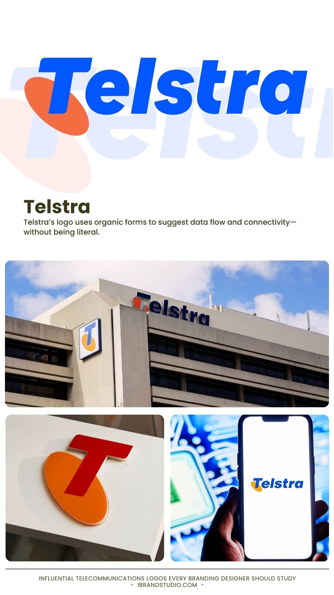
Telstra’s logo uses organic forms to suggest data flow and connectivity—without being literal.
Why designers like it:
- Abstract but meaningful
- Excellent for animation and digital use
- Balances corporate and creative
Branding lesson:
Abstract shapes can express technology in a more human way.
What Designers Can Learn from Telecom Branding
Across all these examples, clear patterns emerge:
- Simplicity scales better than detail
- Color consistency builds recognition
- Typography carries trust
- Logos work best as part of systems
- Abstract ideas age better than trends
These principles apply not just to telecom—but to tech startups, SaaS platforms, digital services, and modern personal brands.
Final Thoughts
Telecommunications logos may not always be flashy, but they are some of the most refined branding solutions in the industry.
They’re built to last decades, scale globally, and perform flawlessly in digital environments.
For branding designers and visual identity enthusiasts, studying telecom logos is an exercise in discipline, clarity, and long-term thinking—skills that separate good designers from great ones.