10 Soft & Elegant Branding Concepts for Female Entrepreneurs Who Want to Stand Out Gracefully
In a world where everyone is competing for attention online, strong branding isn’t about being the loudest—it’s about being intentional.
For many female entrepreneurs, a soft and elegant brand is the perfect balance between professionalism and personality.
Soft branding doesn’t mean weak. Elegant branding doesn’t mean boring.
When designed thoughtfully, this style can feel confident, premium, and deeply personal—especially for coaches, creatives, wellness founders, consultants, and women-led lifestyle brands.
In this article, we’ll explore 10 soft and elegant branding concepts created specifically for female entrepreneurs and branding enthusiasts.
You’ll also find practical, easy-to-apply tips to help translate these ideas into your own brand identity.
Why Soft & Elegant Branding Works So Well for Female Entrepreneurs
Before jumping into the inspirations, it helps to understand why this branding style continues to resonate:
- It builds trust and emotional connection
- It feels timeless, not trend-driven
- It performs beautifully on Instagram, Pinterest, and websites
- It communicates confidence without being aggressive
- It supports premium services and thoughtful businesses
Soft branding focuses on clarity, calmness, and intention—qualities that align naturally with many modern female-led brands.
1. Minimal Blush & Neutral Branding
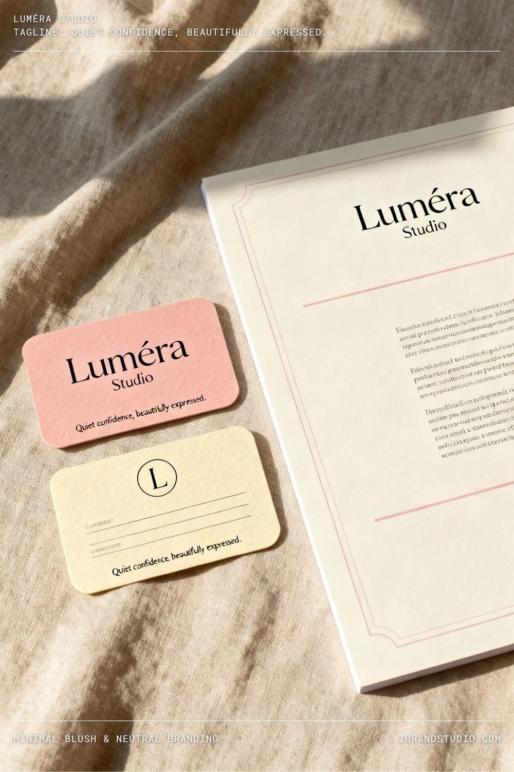
Best for: Coaches, consultants, personal brands
Color palette: Blush pink, cream, warm gray, soft taupe
This branding style relies on gentle neutral colors, generous white space, and clean typography. The result feels warm, polished, and effortless.
Why it works:
Blush and neutral tones create a welcoming atmosphere while still feeling refined and professional.
Tip:
Resist the urge to add too many decorative elements. Let spacing, layout, and typography do the work.
2. Feminine Serif Typography Branding
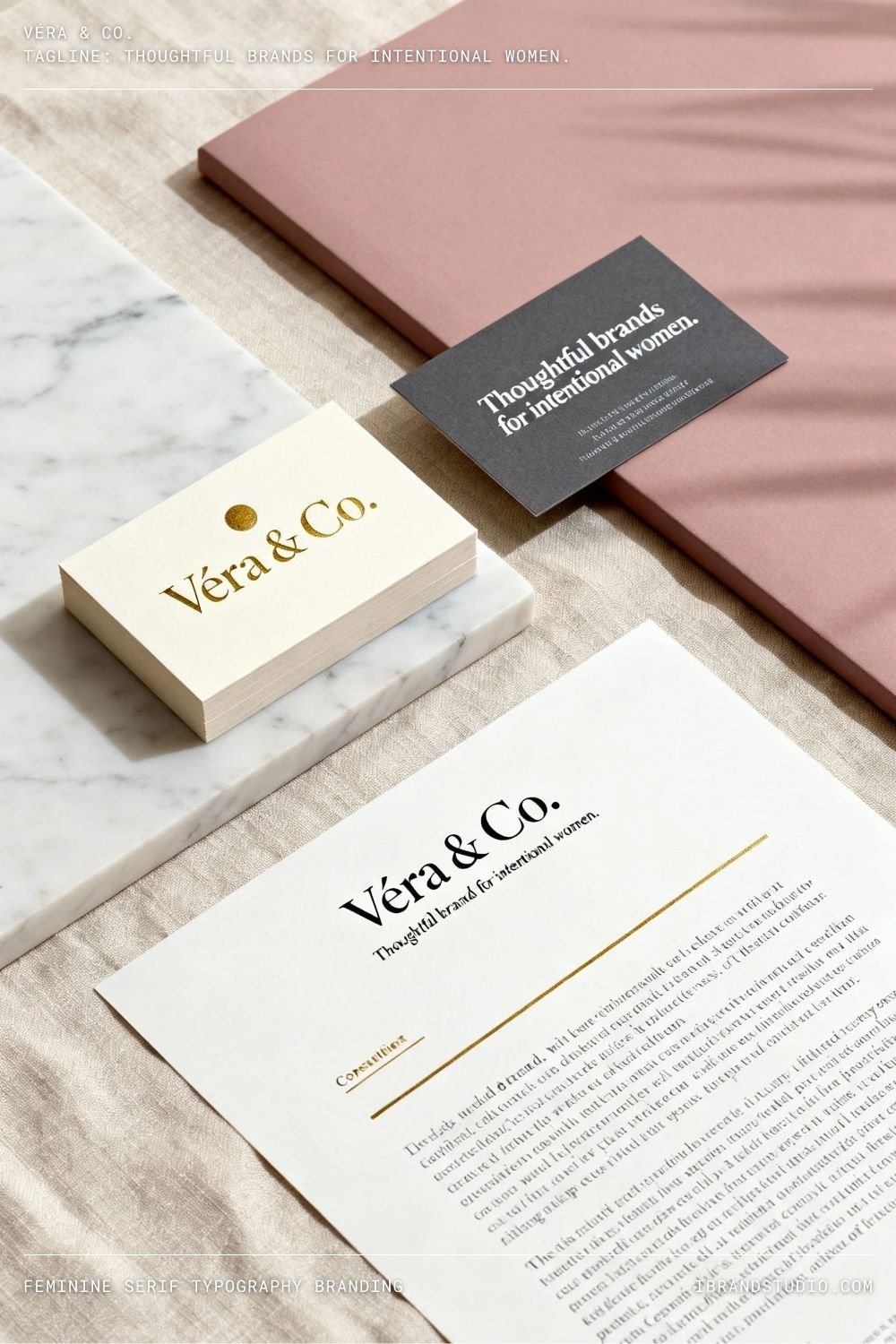
Best for: Writers, strategists, educators
Key element: Elegant serif fonts with light strokes
Serif fonts instantly add credibility and sophistication. When paired with soft colors, they feel modern and feminine rather than traditional or stiff.
Why it works:
Typography-led branding communicates confidence and expertise without needing heavy visuals.
Tip:
Choose one strong serif font as your hero and keep supporting fonts minimal.
3. Botanical & Organic Soft Branding
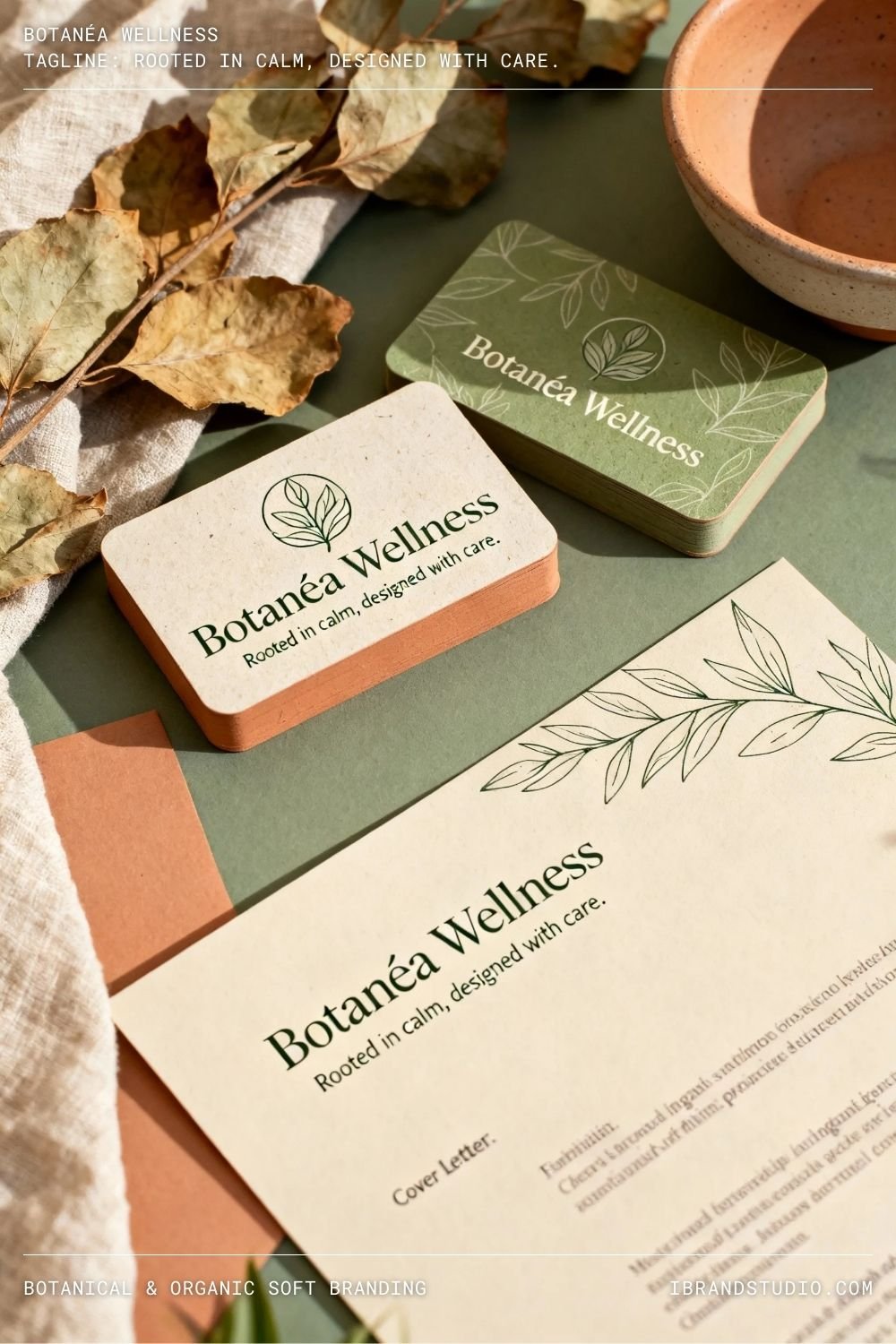
Best for: Wellness brands, herbal products, eco-conscious businesses
Visual elements: Leaves, flowers, hand-drawn botanical details
Inspired by nature, this branding style uses muted greens, beige, sage, and earthy neutrals.
Why it works:
Botanical branding feels nurturing, grounded, and trustworthy—perfect for wellness-focused brands.
Tip:
Use botanical elements sparingly. One well-placed illustration has more impact than many small ones.
4. Luxury Soft Gold Accents Branding
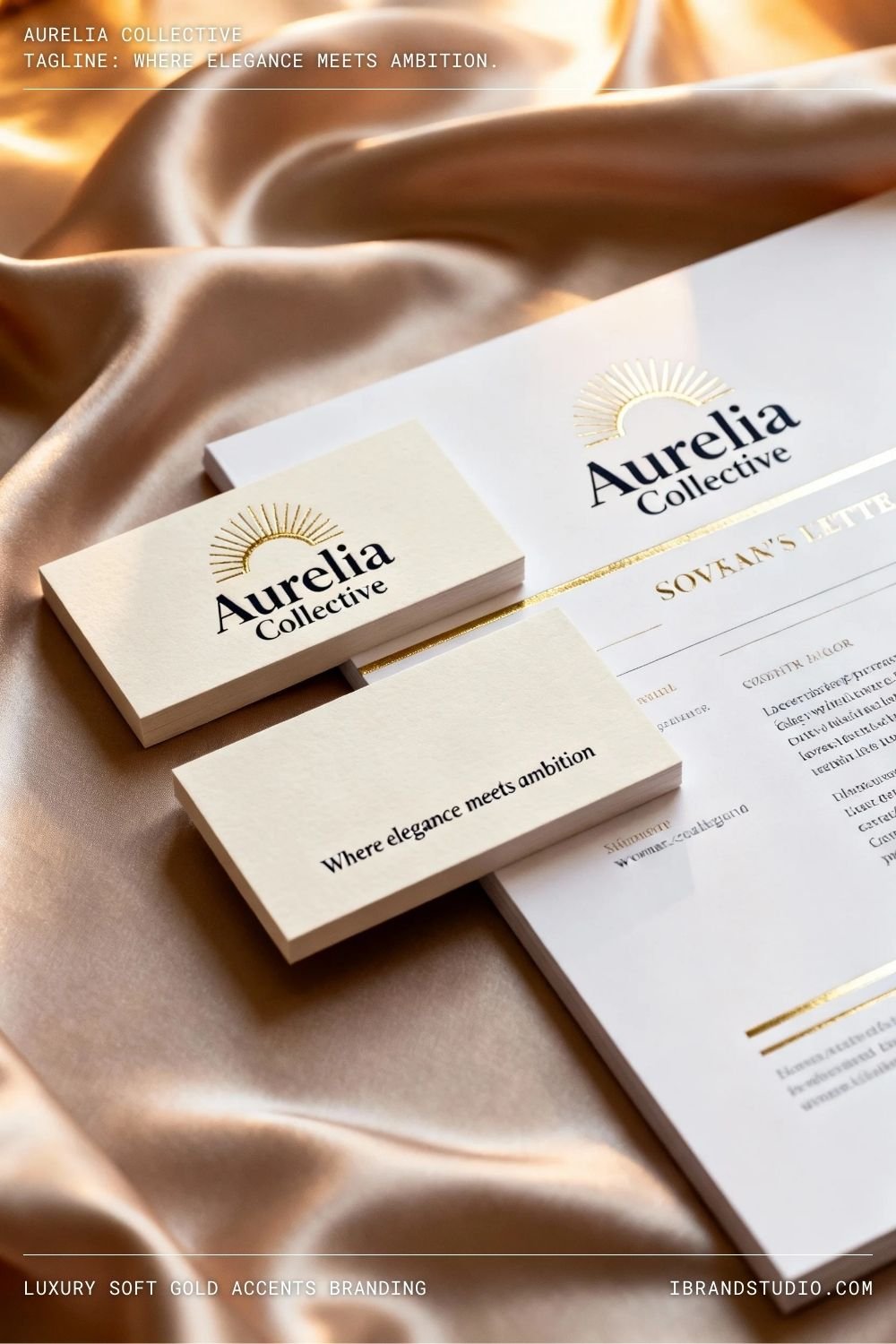
Best for: Premium services, beauty brands, high-end coaching
Color palette: Ivory, champagne, muted gold, charcoal
Gold accents add a subtle sense of luxury when used thoughtfully—thin lines, icons, or understated highlights.
Why it works:
It signals value and exclusivity without feeling flashy or overdone.
Tip:
Stick to matte or muted gold tones. Loud metallics can quickly cheapen an elegant brand.
5. Pastel Gradient Branding
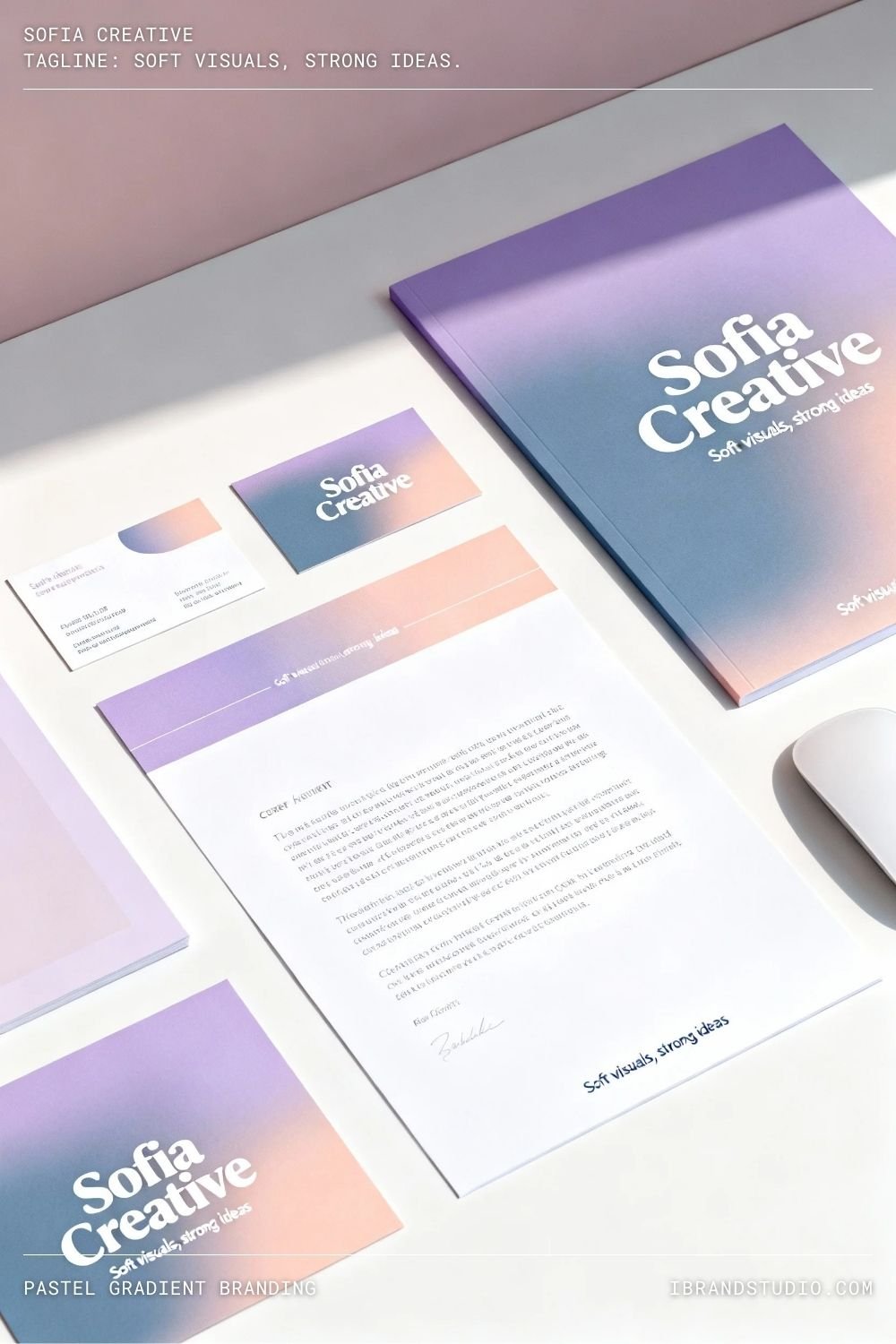
Best for: Creative entrepreneurs, digital product brands
Colors: Lavender, dusty blue, peach, soft coral
Pastel gradients bring softness and visual interest while keeping the brand modern and feminine.
Why it works:
Gradients feel fresh and engaging, especially for online-first brands.
Tip:
Use gradients as accents or backgrounds—balance them with plenty of neutral space.
6. Handwritten Logo & Personal Branding
Best for: Coaches, influencers, service-based businesses
Key feature: Handwritten or script-style logo
A handwritten logo instantly adds personality and emotional warmth to a brand.
Why it works:
It feels personal, human, and approachable—ideal for brands built around trust and connection.
Tip:
Make sure your script logo stays readable at small sizes, especially on social media.
7. Soft Editorial Branding Style
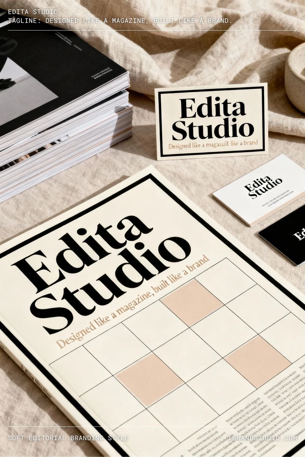
Best for: Fashion, lifestyle, interior, and creative studios
Visual approach: Magazine-inspired layouts and photography
Editorial branding borrows from high-end magazines, combining clean grids, elegant typography, and strong imagery.
Why it works:
It positions the brand as aspirational, confident, and design-savvy.
Tip:
High-quality photography is essential. Editorial branding relies heavily on visuals.
8. Warm Monochrome Branding
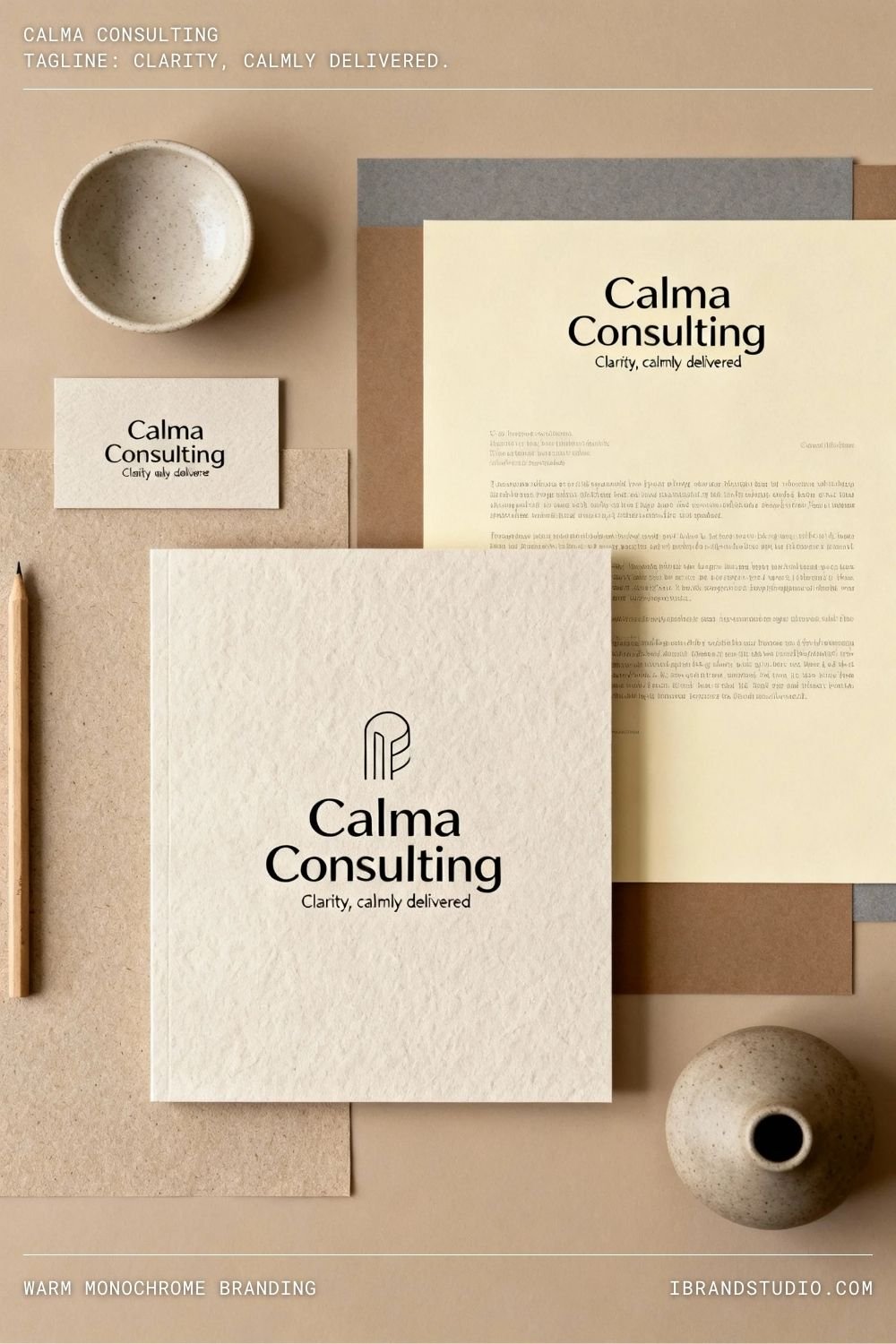
Best for: Consultants, minimalist brands
Colors: Beige, mocha, warm gray, cream
Monochrome branding becomes elegant when warm tones and subtle contrasts are used thoughtfully.
Why it works:
It feels cohesive, calm, and timeless—perfect for long-term brand growth.
Tip:
Add texture through paper grain, shadows, or subtle patterns to avoid a flat look.
9. Soft Feminine Illustration Branding
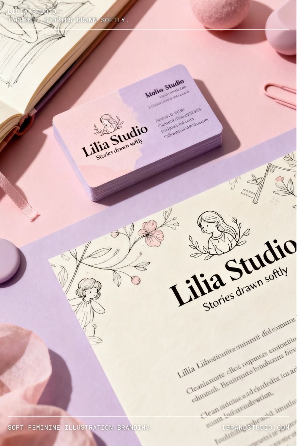
Best for: Creative educators, storytellers, niche brands
Visuals: Line illustrations, abstract shapes, gentle icons
Illustrations add charm and originality while maintaining softness when kept minimal.
Why it works:
Illustrated branding feels unique and emotionally memorable.
Tip:
Stick to one illustration style and a limited color palette to maintain cohesion.
10. Calm Luxury Wellness Branding
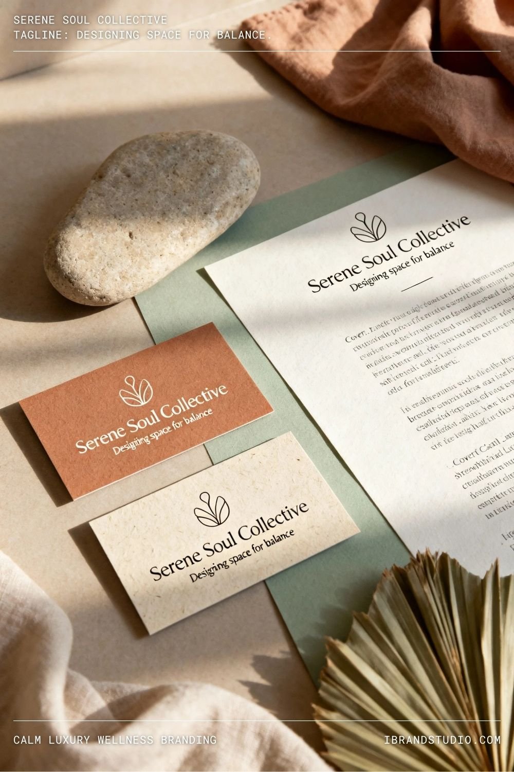
Best for: Yoga studios, therapists, holistic businesses
Colors: Sand, sage, clay, off-white
This branding style focuses on simplicity, softness, and emotional calm.
Why it works:
It communicates peace, trust, and emotional safety—key for wellness brands.
Tip:
Leave breathing room in your layouts. Calm branding feels rushed when overcrowded.
How to Apply Soft & Elegant Branding to Your Own Business
If you want to bring this style into your brand, start here:
1. Define Your Brand Personality
Ask yourself:
- Do I want my brand to feel calm or bold?
- Personal or premium?
- Nurturing or authoritative?
These answers guide every design decision.
2. Keep It Simple
Soft elegance thrives on restraint:
- 1–2 fonts
- 3–5 brand colors
- Minimal decorative elements
3. Design for Real Platforms
Make sure your branding works across:
- Websites
- Mobile screens
4. Think Long-Term
Elegant branding should age well. Avoid trends that feel exciting today but outdated next year.
Final Thoughts
Soft and elegant branding isn’t about being quiet—it’s about being clear.
For female entrepreneurs, it’s a powerful way to communicate confidence, professionalism, and authenticity without forcing a loud identity.
If you’re building or refining your brand, let softness become your strength and elegance become your signature.