Spring into Brand Bloom: 11 Fresh Logo Concepts That Capture the Energy of the Season
Spring isn’t just a season—it’s a mindset. It represents renewal, optimism, growth, and fresh starts.
For brands, especially those launching, rebranding, or refreshing their identity, spring-themed logos can be incredibly powerful.
They tap into emotional cues that feel light, positive, and forward-looking.
This article is written for graphic designers seeking creative inspiration and entrepreneurs who want to understand how seasonal branding can elevate their visual identity.
Below, we’ll explore 11 spring-inspired logo concepts, explain when and why they work, and share practical design tips you can apply immediately.
Let’s dig in
Why Spring-Themed Logos Work (From a Branding Perspective)
Before jumping into concepts, it’s worth understanding why spring aesthetics are so effective in logo design:
- Psychological impact: Spring colors and forms evoke hope, calm, and vitality.
- Market alignment: Spring aligns perfectly with launches, lifestyle brands, wellness, eco-friendly businesses, and startups.
- Visual freshness: Lighter palettes and organic shapes feel modern and approachable.
- Storytelling power: Spring visuals naturally suggest growth, transformation, and new beginnings.
Used correctly, spring themes don’t feel “seasonal only”—they feel timelessly optimistic.
1. Botanical Growth Logos

Concept:
Leaves, stems, branches, vines, or sprouting elements integrated into symbols or typography.
Best for:
Eco-friendly brands, wellness companies, organic products, sustainability-focused startups, beauty brands.
Design approach:
- Use simplified leaf shapes rather than detailed illustrations.
- Integrate growth elements subtly (e.g., a leaf replacing a letter stem).
- Favor symmetry and balance to avoid visual clutter.
Pro tip:
Avoid clichés. A single abstract leaf can feel more premium than a full plant illustration.
2. Bloom & Flower Emblems

Concept:
Flowers representing beauty, renewal, creativity, or care.
Best for:
Fashion, florists, skincare, yoga studios, lifestyle brands.
Design approach:
- Choose flowers with symbolic meaning (lotus = purity, tulip = renewal, daisy = joy).
- Use geometric or line-based flower forms for a modern look.
- Limit color count to maintain scalability.
Pro tip:
Flower logos often perform well in visual search—optimize alt text and image descriptions when publishing online.
3. Sunrise & Dawn Symbols
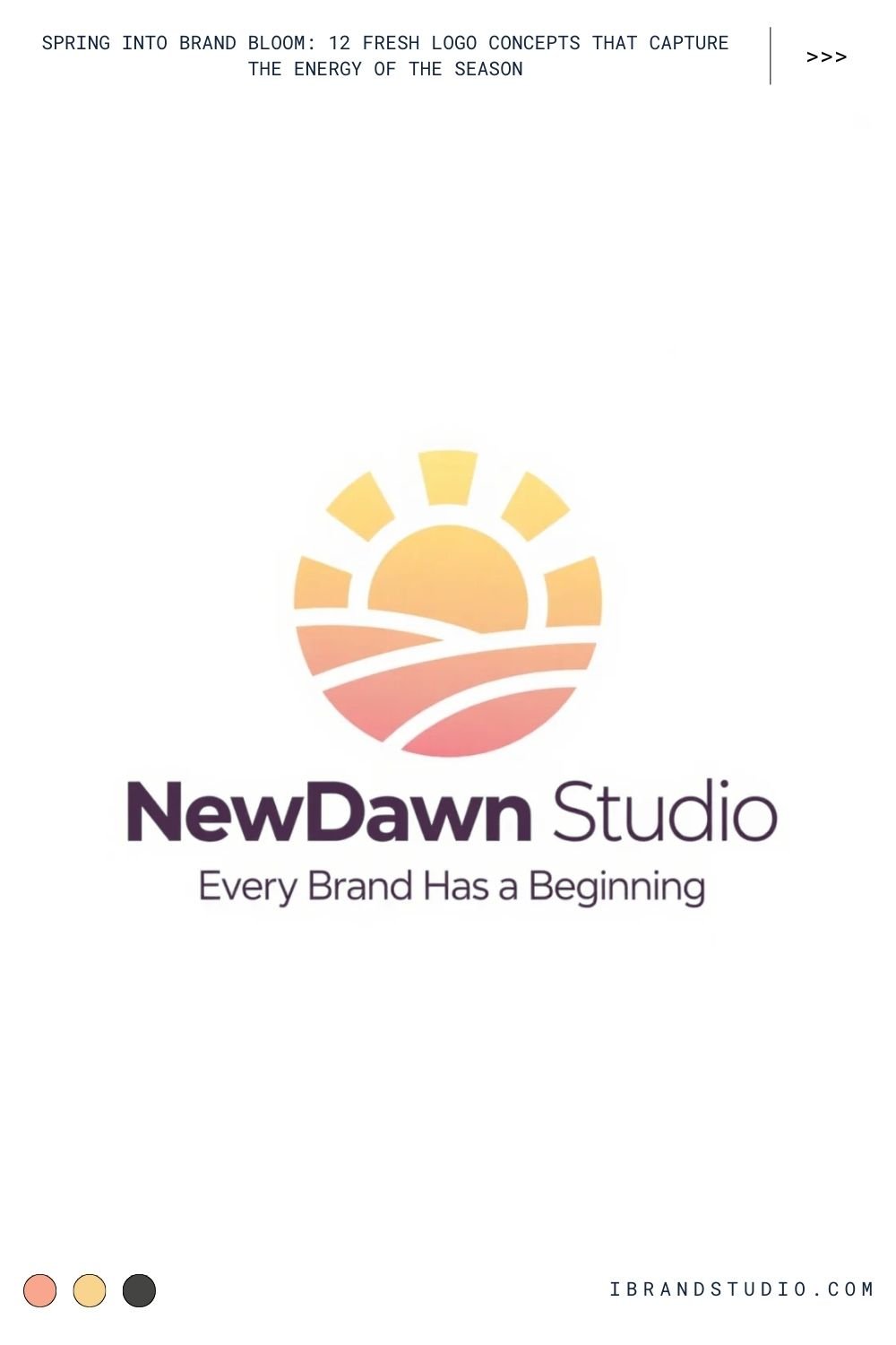
Concept:
Rising suns, light rays, horizons, or circular gradients.
Best for:
Coaching brands, startups, tech companies, education platforms, wellness services.
Design approach:
- Combine circular shapes with upward motion.
- Use warm gradients transitioning from soft yellow to coral or sky blue.
- Keep rays minimal—suggest light rather than drawing it literally.
Brand insight:
Sunrise logos subconsciously communicate new beginnings and reliability.
4. Fresh Typography-Based Logos
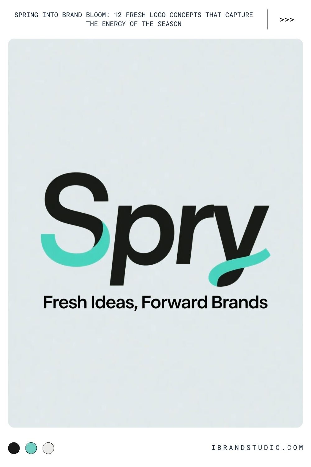
Concept:
Clean, airy typography that carries the spring feeling without symbols.
Best for:
Creative studios, SaaS products, personal brands, minimalist startups.
Design approach:
- Use rounded sans-serif or light serif fonts.
- Increase letter spacing to create breathing room.
- Pair lowercase letters with soft curves for approachability.
Pro tip for designers:
Try custom ligatures or subtle leaf-like terminals on letters for a seasonal twist.
5. Pastel Color Palette Logos
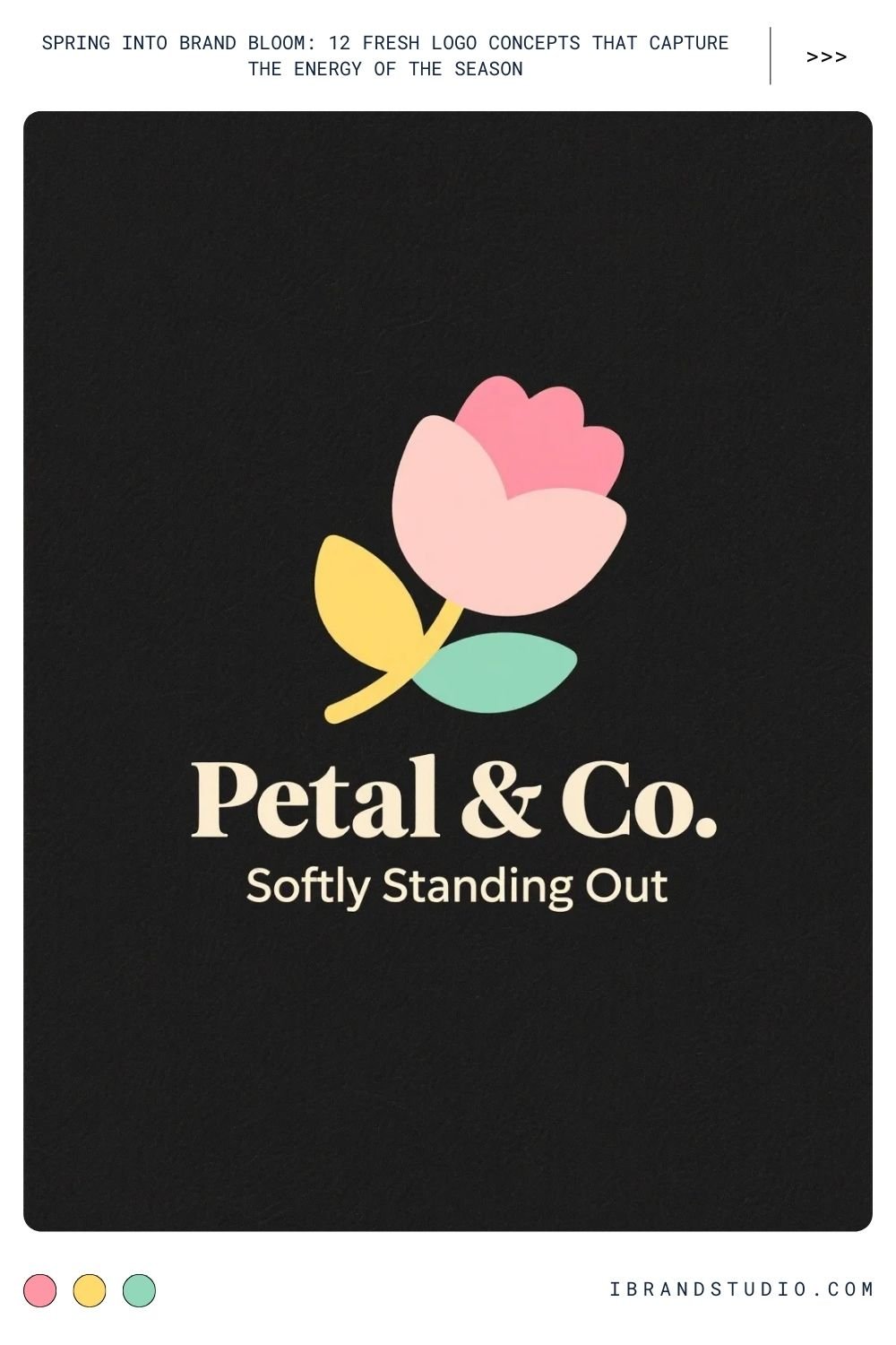
Concept:
Spring-inspired color palettes—pastels, soft gradients, and muted tones.
Best for:
Beauty brands, cafes, lifestyle apps, children’s brands.
Popular spring colors:
- Mint green
- Soft lavender
- Blush pink
- Butter yellow
- Sky blue
Design caution:
Pastels can lose contrast—always test logos on light and dark backgrounds.
6. Nature-Inspired Abstract Marks
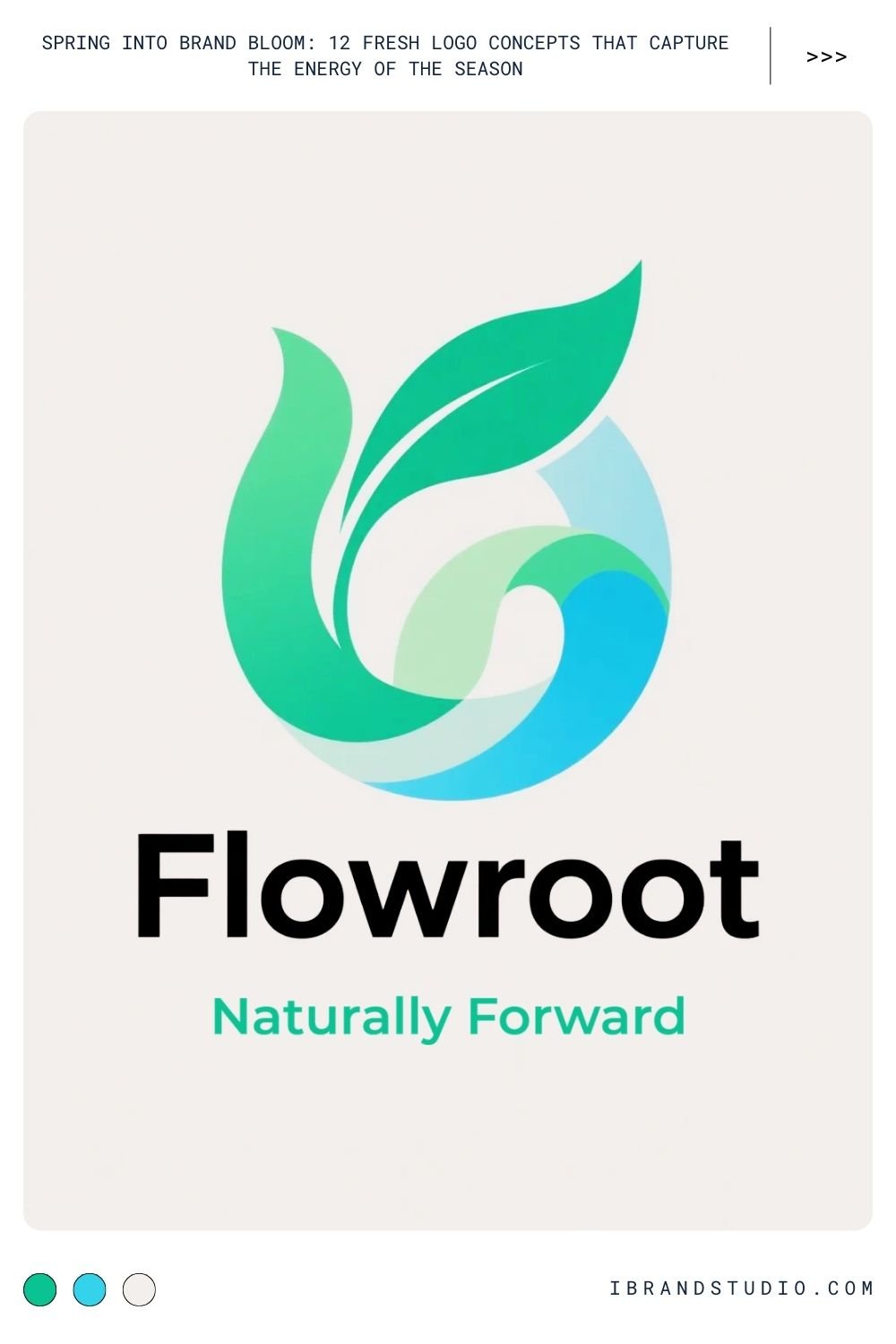
Concept:
Abstract shapes inspired by wind, water, petals, or growth patterns.
Best for:
Tech startups, creative agencies, modern lifestyle brands.
Design approach:
- Use flowing curves instead of rigid geometry.
- Keep shapes ambiguous but organic.
- Let motion guide form—spring is about movement.
Brand advantage:
Abstract logos scale well and feel future-proof while still referencing nature.
7. Animal Symbols of Renewal
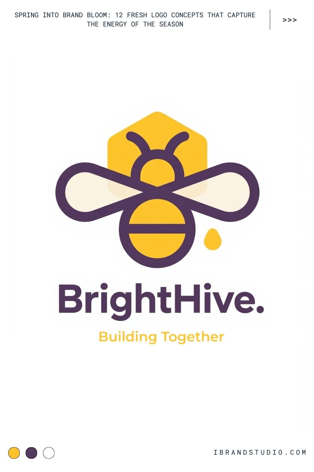
Concept:
Animals associated with spring and life cycles.
Common choices:
- Butterflies (transformation)
- Bees (community, productivity)
- Birds (freedom, optimism)
Best for:
Eco brands, creative businesses, education platforms.
Design approach:
- Use minimal line work or silhouettes.
- Avoid overly realistic animals.
- Pair with soft color accents rather than bold tones.
Expert tip:
Animals carry strong symbolism—make sure it aligns with brand values, not just aesthetics.
8. Circular & Cyclical Logos
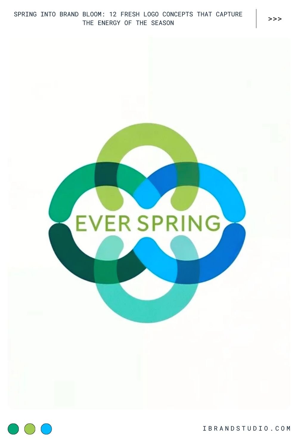
Concept:
Circles, loops, or repeating shapes symbolizing life cycles and renewal.
Best for:
Wellness brands, subscription services, community-driven platforms.
Design approach:
- Combine circles with organic textures or gradients.
- Use negative space to suggest continuity.
- Keep forms balanced and calm.
Why it works:
Circles feel inclusive, calm, and harmonious—perfect for spring messaging.
9. Hand-Drawn & Organic Logos
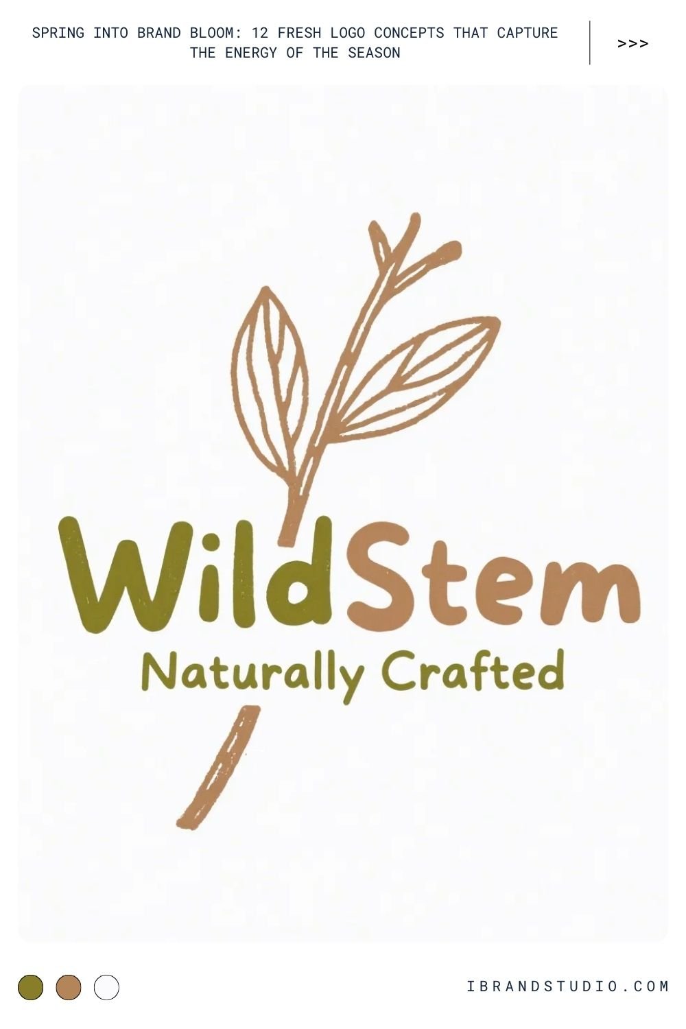
Concept:
Imperfect lines, sketch-style marks, or handcrafted aesthetics.
Best for:
Artisan brands, cafes, local businesses, creative entrepreneurs.
Design approach:
- Digitize hand sketches for authenticity.
- Maintain consistency in stroke width.
- Pair with clean typography for balance.
Brand psychology:
Hand-drawn logos feel human, warm, and personal—qualities strongly associated with spring.
10. Water & Rain-Inspired Logos
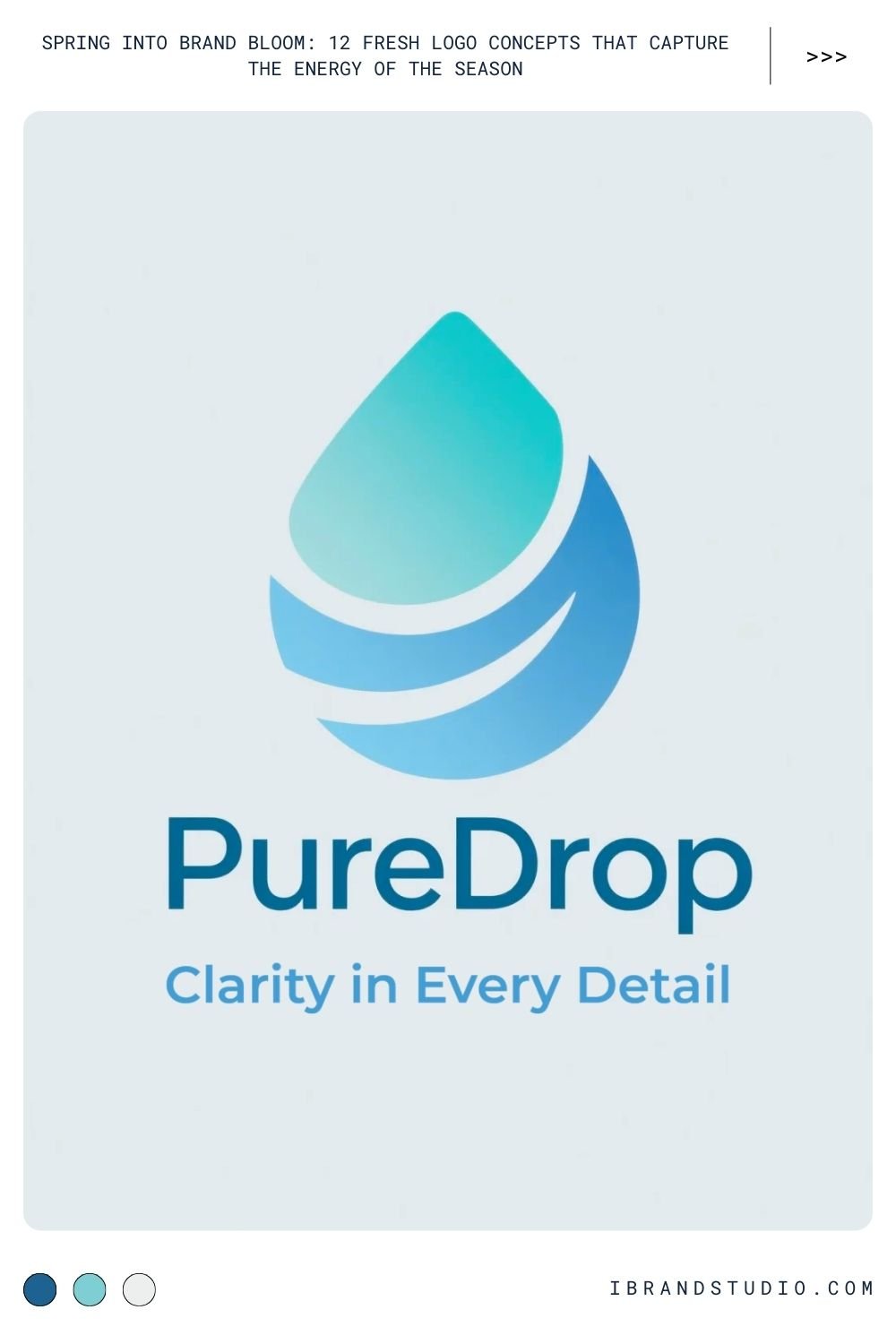
Concept:
Raindrops, ripples, flowing water lines, or dew elements symbolizing nourishment, clarity, and life.
Best for:
Wellness brands, skincare, clean beauty, SaaS platforms, sustainability-focused startups, agriculture or hydration products.
Design approach:
- Use smooth curves and soft gradients to suggest flow.
- Favor droplet or ripple shapes over literal rain illustrations.
- Pair cool spring colors like aqua, teal, and soft blue with neutral typography.
Why it works:
Spring rain is strongly associated with growth and renewal. Water-based logos feel calming, trustworthy, and modern—especially effective for brands emphasizing purity, care, or efficiency.
Expert tip:
Avoid sharp edges. Water-inspired logos should feel fluid and continuous to reinforce their message.
11. Seasonal Pattern-Based Logos
Concept:
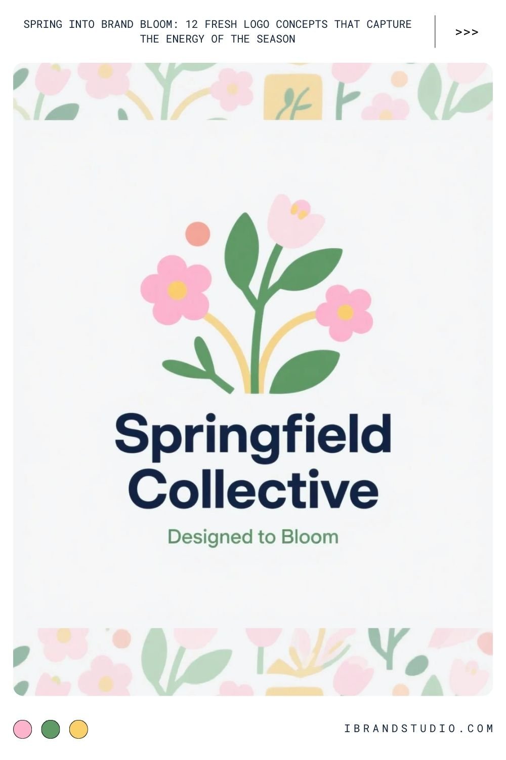
Repeating spring motifs—petals, leaves, dots, or organic shapes—used as part of the logo system.
Best for:
Fashion brands, packaging-heavy businesses, creative studios, lifestyle startups.
Design approach:
- Build a simple core logo, then extend it with patterns.
- Use patterns as secondary elements, not the main mark.
- Keep motifs minimal to avoid visual overload.
Brand advantage:
Pattern-based logos allow brands to expand visually across packaging, social media, and marketing materials while staying consistent. This flexibility is especially valuable for entrepreneurs building a recognizable brand system.
Pro tip for designers:
Test patterns in monochrome first to ensure they don’t rely solely on color for impact.
Practical Tips for Designing Spring Logos That Last
To wrap up, here are some actionable tips you can apply whether you’re designing or commissioning a logo:
- Design beyond the season – Spring themes should feel evergreen, not dated after three months.
- Prioritize scalability – Test your logo at favicon size.
- Balance emotion with clarity – A beautiful logo still needs to communicate the brand clearly.
- Avoid over-decoration – Spring is light, not busy.
- Document your color system – Pastels and gradients need clear brand guidelines.
- Think in systems, not symbols – A logo is just one part of a visual identity.
Final Thoughts: Let Your Brand Bloom
Spring-themed logo concepts are about more than flowers and colors—they’re about energy, optimism, and growth.
When thoughtfully designed, they help brands feel alive, relevant, and emotionally resonant.
For designers, spring offers endless creative inspiration. For entrepreneurs, it’s a chance to align your visual identity with a message of renewal and possibility.
Design with intention, keep it simple, and let your brand bloom 🌸
