The Visual Power of Industry: The Top 10 Most Recognizable Logos in Oil and Mining
When you think of global powerhouses like Saudi Aramco, Shell, or TotalEnergies, you might picture vast fields and massive machines.
But behind every barrel and mine lies something equally powerful — their brand identity.
These logos do more than decorate; they define legacy, communicate energy, and make industrial giants instantly recognizable around the world.
Here are 10 of the famous oil and mining companies and their logos:
1. Saudi Aramco (Saudi Arabia)
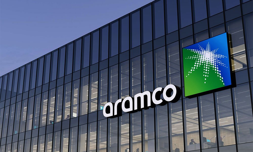
A majority state-owned oil and gas giant that is the world’s largest crude producer and among the most profitable companies globally.
Founded in 1933 when Saudi Arabia granted exploration rights to the U.S. company Standard Oil Company of California (SoCal) via its subsidiary.
A commercial oil discovery was made in 1938. The Saudi government gradually took full ownership by 1980, and the company became known as Saudi Arabian Oil Company (Saudi Aramco) in 1988.
The Saudi Aramco logo uses a word-mark “Aramco” next to a simplified star/flower type emblem in green as a symbol of earth and blue as a symbol of the sky.
The emblem is often interpreted as representing energy, growth, and sustainable transformation, aligning with the company’s vision of evolving into an integrated energy & chemicals company.
2. ExxonMobil (USA)
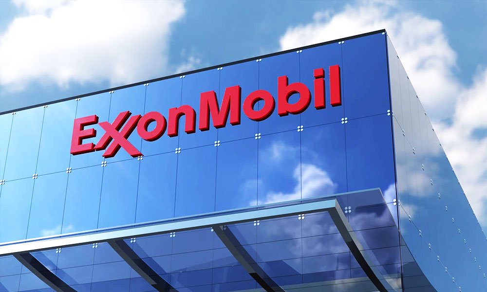
One of the major publicly-traded “supermajors” in oil & gas, active in exploration, production, refining, distribution, and chemicals with a presence in dozens of countries.
Tracing its roots to the late 1800s oil boom and the breakup of Standard Oil in 1911, the company that became ExxonMobil involved multiple predecessor companies (Standard Oil of New Jersey, Mobil Oil, etc.).
In 1972, Exxon became the unified brand name. In 1999, Exxon merged with Mobil to form ExxonMobil.
The ExxonMobil logo is a bold red word-mark on white background, featuring two interlocking “X”s in “Exxon” which were designed to emphasize strength and unity.
The red colour conveys energy and determination; the simplicity and strong typography underscore reliability and clarity of the brand.
3. Shell (UK/Netherlands)
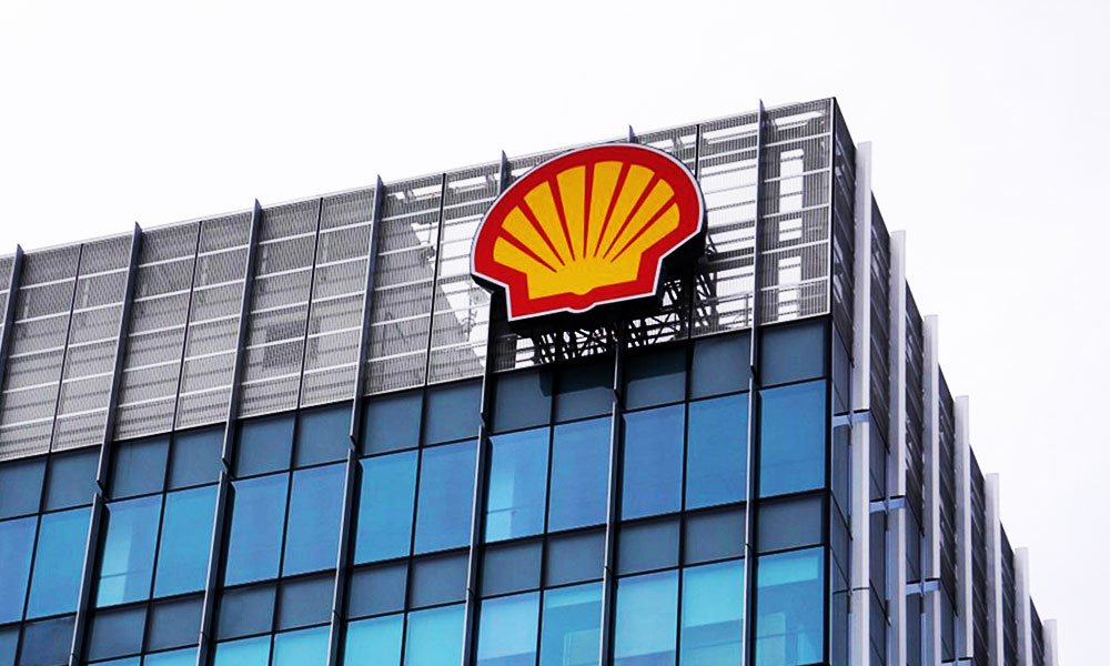
A large integrated energy company operating globally in oil & gas, LNG, petrochemicals, refining and retail, known for its expansive downstream and upstream operations.
Shell can trace its heritage to companies such as the British “Shell” Transport & Trading Company (founded 1897) and Royal Dutch Petroleum Company.
In 1907 they merged to become Royal Dutch Shell, expanding globally. The company has evolved over decades into one of the world’s largest integrated oil & gas companies.
The iconic Shell “pecten” logo—a stylised yellow and red scallop shell—is one of the world’s most recognized brand marks.
It began as a black‐and‐white shell illustration in the early 1900s, then adopted the red & yellow colours (possibly from maritime signalling or Spanish influence) around 1904-1908.
The simple shell mark evokes heritage, reliability, and global reach.
4. Chevron Corporation (USA)
Another major U.S. oil company with global reach, covering all parts of the oil value chain — exploration, production, refining, and marketing of petroleum products.
Chevron’s roots date back to 1879 as the Pacific Coast Oil Company, which later became part of Standard Oil.
After multiple mergers and evolutions, it emerged as Chevron Corporation in 1984. Today, it’s one of the world’s largest integrated energy companies, operating across oil, gas, and renewable sectors.
Chevron’s logo features two stacked, angular “chevrons” — blue above red — forming a sleek, forward-pointing shape.
The minimalist design symbolizes movement, innovation, and energy flow, while the color contrast reflects trust (blue) and strength (red).
5. Petrobras (Brazil)
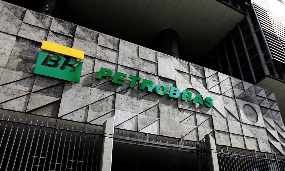
Brazil’s national oil company (majority state-owned), involved in upstream oil & gas production, refining and petrochemicals, with a global operational footprint.
Founded in 1953, Petrobras (Petróleo Brasileiro S.A.) was established as Brazil’s national oil company to lead the country toward energy independence.
It became a global player through deep-water exploration and innovation in offshore drilling.
The Petrobras logo combines green, yellow, and white — echoing Brazil’s national colors — with the bold initials “BR” in the center.
The horizontal bands suggest stability and progress, while the palette represents energy, optimism, and sustainability.
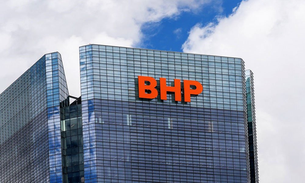
6. BHP Group (Australia)
A leading mining and metals company, regarded as one of the world’s largest miners — with operations in iron ore, coal, copper, nickel and other commodities.
Originally founded in 1885 as Broken Hill Proprietary Company in Australia, BHP has grown into a global mining and metals company.
It merged with Billiton in 2001 (becoming BHP Billiton) and later simplified to BHP Group. It is a major producer of iron ore, copper, coal and other commodities.
The current BHP logo is a simple word-mark in Orange uppercase letters (“BHP”).
The design is minimalist, representing strength in simplicity and global scale, appropriate for a resource-heavy business.
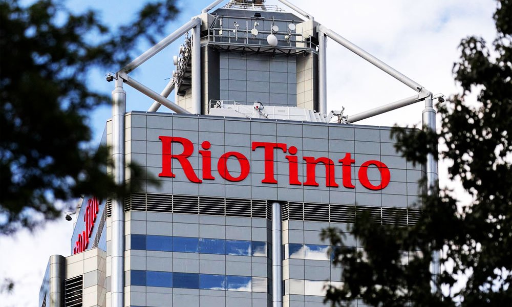
7. Rio Tinto Group (UK/Australia)
A major global mining company engaged in mining and refining of minerals, including iron ore, aluminium, copper, gold, and diamonds — highly diversified.
The company’s origin began in 1873 when a British syndicate purchased the Spanish Río Tinto copper mines.
Over time it became Rio Tinto Company, expanding worldwide. Today, it is one of the largest mining groups operating globally across iron ore, aluminium, copper, gold, and other minerals.
The Rio Tinto logo consists of the words “Rio Tinto” in a custom serif word-mark, often paired with a simple red rectangle or bar.
The design emphasises heritage (serif type, red colour), solidity and the vast scale of the mineral-resources business; red also connotes strength and the earth/mining connection.
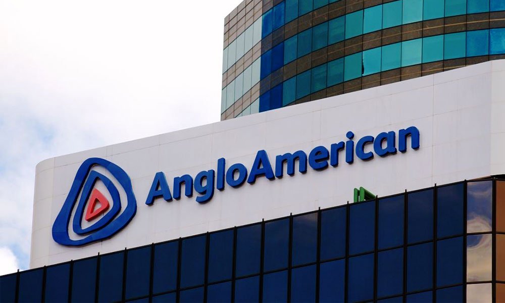
8. AngloAmerican (UK/South Africa)
A long-established mining company that produces a variety of materials including platinum, diamonds, iron ore, copper and coal — with operations worldwide.
Founded in 1917 in South Africa by Sir Ernest Oppenheimer, Anglo American began as a gold mining company.
Over time, it evolved into a multinational mining powerhouse with interests in diamonds, copper, and platinum, headquartered in London.
Anglo American’s logo features a dynamic triangular swirl with a gradient blue and red palette.
The spiral form conveys transformation and forward motion — a nod to both geological layers and the company’s modern, progressive outlook.
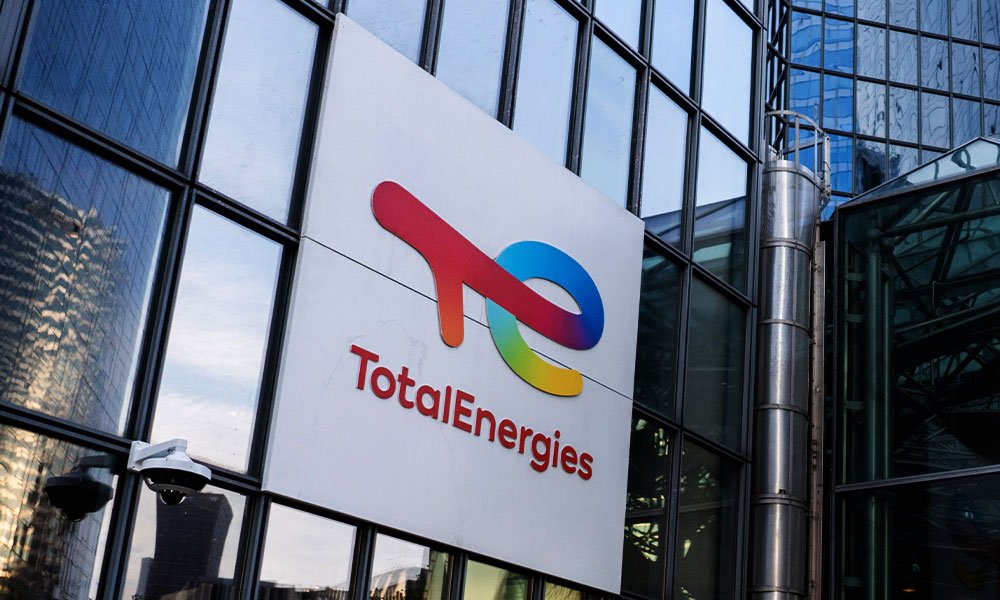
9. TotalEnergies (France)
Formerly Total, this French energy major has operations in oil & gas production, refining, petrochemicals, and increasingly in renewables and low-carbon initiatives.
Founded in 1924 as Compagnie Française des Pétroles (CFP), Total has evolved into a global energy company, rebranding to TotalEnergies in 2021 to reflect its transition toward renewables and sustainable energy.
The logo uses a fluid, colorful “T” & ”e” symbol in gradient hues of blue, green, yellow, orange, and red — symbolizing diverse energy sources and global unity.
The name “TotalEnergies” conveys a modern, inclusive identity.
10. Glencore (Switzerland/UK)

A major diversified commodities company, active in mining, metals and also commodity trading — one of the largest mining firms by asset size and revenue.
Glencore began in 1974 as a trading company founded by Marc Rich, specializing in commodities like metals, energy, and agriculture.
It grew through mergers and acquisitions — notably with mining company Xstrata in 2013 — becoming one of the world’s largest diversified natural resource firms.
Glencore’s logo is elegantly minimal — a simple black serif wordmark in all caps.
The refined typography suggests sophistication and authority, reflecting its identity as a global powerhouse in resources and trading.
Final Words
From bold colors symbolizing innovation to geometric shapes expressing balance and progress, the design language of these industry leaders proves one thing: branding isn’t just for tech or fashion — it’s a universal storytelling tool.
Even in industries built on stone and steel, creativity remains the spark that shapes perception and legacy.