Unlocking Science: 15 Striking DNA Logo Concepts You Can Steal
Alright, let’s be real—DNA logos are everywhere right now. From biotech startups and science podcasts to nutrition brands and even tattoo designs (yes, really), everyone’s trying to decode that double helix magic.
But here’s the catch: most DNA logos look the same. Two twirling lines, a few dots, maybe some blue gradients—and boom, “science.”
So, if you’re here because you want a DNA logo that actually stands out, buckle up. I’ve rounded up 15 striking DNA logo ideas you can totally borrow (or, you know, “draw inspiration” from).
Let’s give your brand some molecular-level style!
Why DNA Logos Are So Addictive (And Effective)
Before we geek out on designs, let’s talk about why DNA logos just hit differently.
DNA’s not just a molecule—it’s a symbol. It screams innovation, life, evolution, precision, and discovery. Basically, everything you want people to associate with your brand if you’re in anything remotely science-related.
Plus, that double helix shape? It’s instantly recognizable—even to people who failed biology in high school. (Hey, no judgment. I still can’t remember which base pairs with guanine.)
1. The Minimalist Double Helix
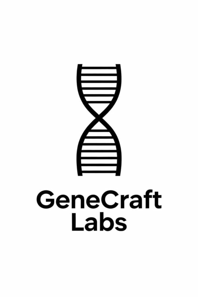
Sometimes less is definitely more. A minimalist DNA logo strips away all the extra stuff—just clean lines, simple geometry, and solid contrast.
Why it works:
- It’s timeless and scalable. Looks great on a lab coat and a smartphone app.
- The clean aesthetic gives off serious “precision and trust” vibes.
If you’re running a research startup or a health tech company, this one’s a safe bet. Simple, elegant, and hard to mess up.
2. The Gradient Twist
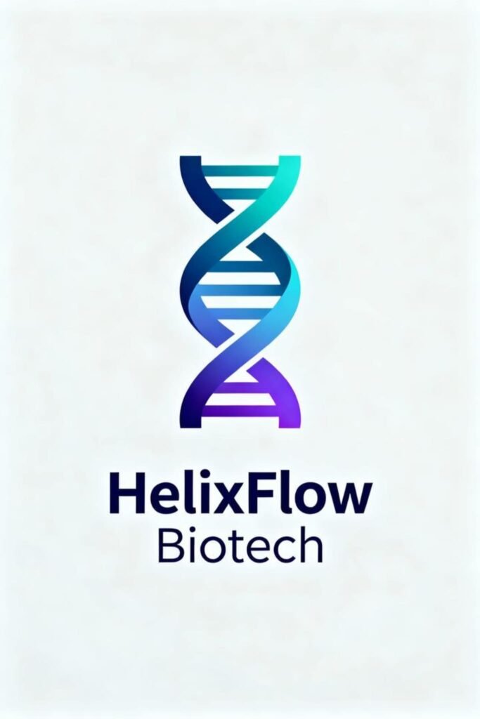
Ah, gradients—the “I’m modern and techy” badge of honor.
Imagine a sleek double helix transitioning from deep blue to neon green, or maybe from purple to teal. It’s dynamic, eye-catching, and very now.
Pro tip: Use this for brands focused on biotech innovation or genetic data platforms. The subtle color shift can symbolize transformation and growth. Ever seen a logo that literally glows with meaning? This is it.
3. The Geometric DNA
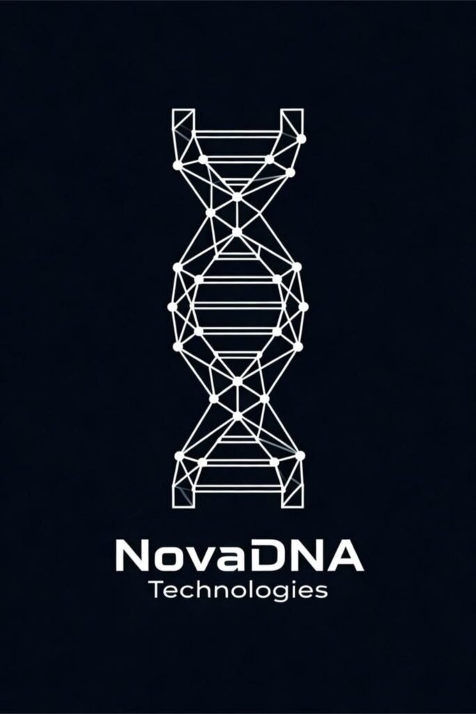
If you love the symmetry of science (and who doesn’t?), a geometric DNA design is pure eye candy.
Think polygonal shapes forming the helix strands—kind of like if a mathematician decided to do art therapy.
Why it stands out:
- It gives your brand a futuristic, tech-savvy personality.
- Works perfectly for blockchain + biotech crossover projects (yes, those exist).
Honestly, it’s like a logo that says, “We do serious science, but we also know how to use Adobe Illustrator.”
4. The Nature-Infused DNA
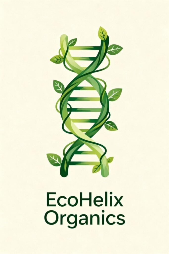
Ever seen a helix made of leaves or tree roots? Yep, that’s the eco-bio hybrid look—and it’s trending fast. 🌿
This concept merges biology with sustainability, perfect for brands focused on eco-friendly biotech, organic health supplements, or regenerative farming.
Pro tip: Use earthy tones—greens, browns, and soft neutrals—to make the concept feel alive, not corporate.
5. The Digital Pixel Helix
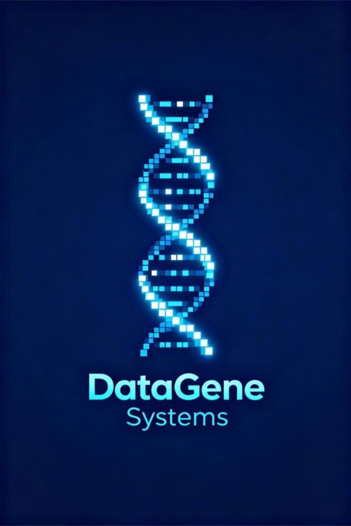
Now here’s one for the tech nerds (I say that lovingly because, same). A pixelated DNA logo uses squares or dots to form the helix shape, symbolizing digital transformation and data-driven genetics.
Ideal for: genetic data apps, genome analytics companies, or AI-based healthcare brands.
It basically says, “We don’t just study DNA—we compute it.” 🔬💻
6. The Circular DNA Loop
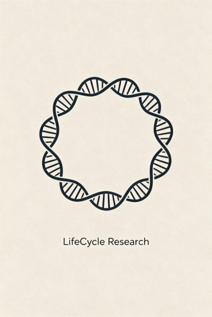
Break away from the classic helix and go circular! A looped DNA design creates a visual metaphor for continuity, unity, and evolution.
This style often uses a circular strand with intertwining lines, symbolizing endless discovery.
Perfect for nonprofits, educational initiatives, or community health projects that promote life as a continuous cycle.
7. The Letterform Helix
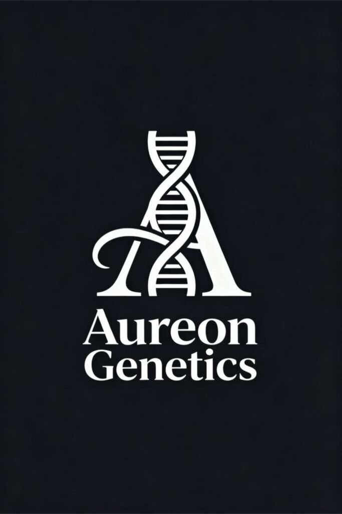
This one’s clever—blend your brand initials into the helix shape. Imagine the letter “D” wrapping around a twisting strand or “A” forming the bridge of the helix.
Why it’s genius:
- It’s unique and personal.
- It instantly connects your logo to your brand name.
Plus, when you pull this off, it looks insanely smart. You know, like “we thought about this for months” smart.
8. The Neon Sci-Fi Vibe
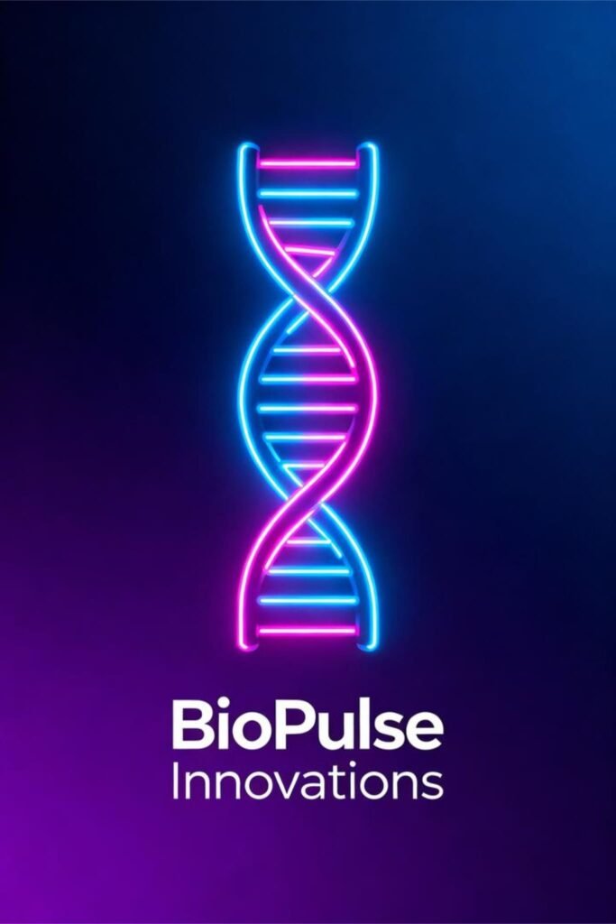
If your brand’s aesthetic leans more “futuristic startup” than “traditional science lab,” go neon. Think glowing helix lines against a dark background, maybe with electric blue or magenta hues.
It’s bold, edgy, and totally screams next-gen innovation.
I’ve seen this style dominate in AI-genetics crossover brands and sci-fi-inspired creative agencies. Because honestly, who doesn’t want their logo to look like it belongs in a Marvel lab?
9. The Monogram Helix
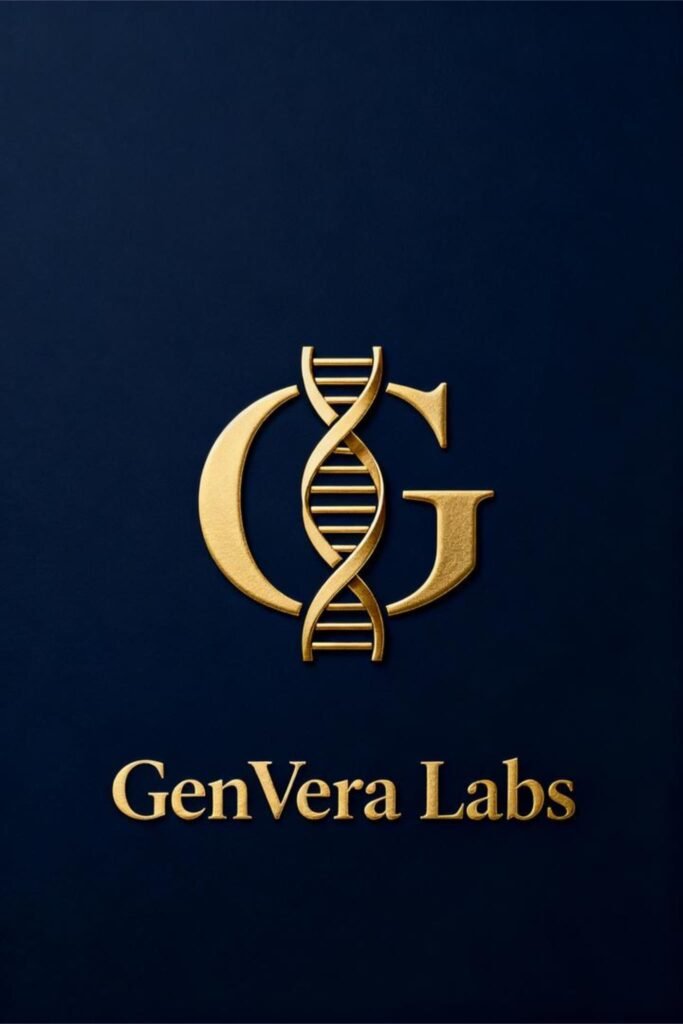
Combine elegance with science by creating a DNA monogram—a lettermark logo intertwined with helix elements.
Best for: luxury wellness brands, DNA-based skincare, or high-end research consultancies.
A monogram helix says, “Yes, we’re scientific—but also stylish.” And if your logo can pull off classy science, you’re officially winning branding.
10. The Hand-Drawn DNA Sketch
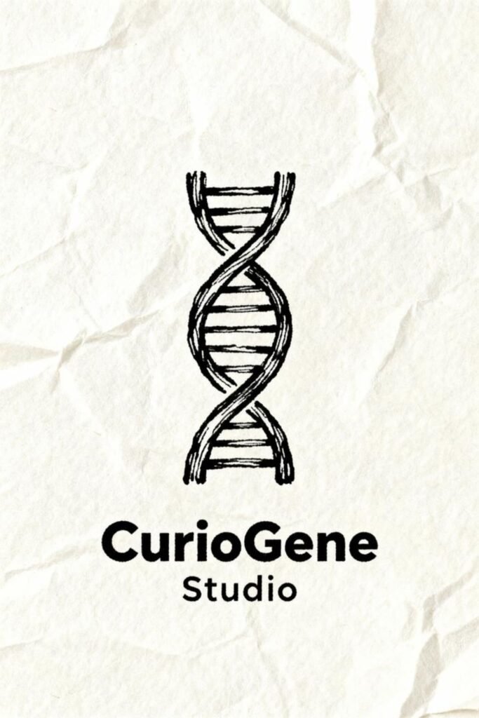
Sometimes imperfection makes perfection. A hand-drawn DNA logo feels organic, creative, and warm—perfect for brands that want to humanize science.
Think science educators, YouTube channels, or small research collectives. The slightly sketchy style adds a human touch to what’s often seen as a cold, technical field.
Bonus points if you pair it with a handwritten font. It’s like saying, “Hey, we do serious work—but we’re still approachable.”
11. The 3D Metallic DNA
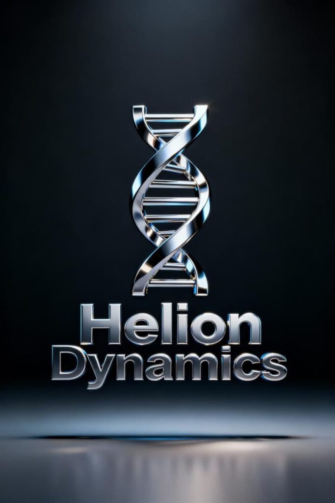
If you’re going for the big-budget, sci-fi movie intro look—here’s your shot.
A 3D metallic DNA logo shines (literally) with depth, texture, and realism. Perfect for brands that want to scream “innovation powerhouse”.
Just be careful: this style needs top-tier execution, or it risks looking like clip art from 2008.
12. The Human Touch Helix
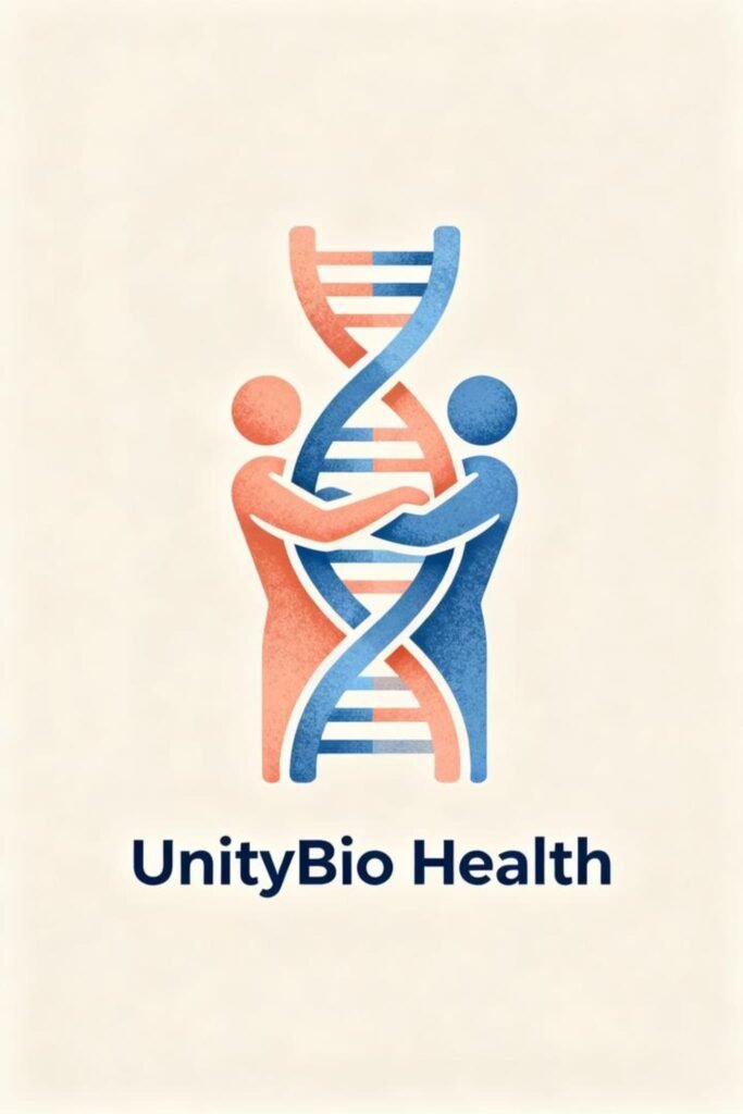
What if you turned the DNA strands into human figures, arms outstretched, connecting to form the helix? It’s a beautiful metaphor for connection, humanity, and shared evolution.
Ideal for: medical institutions, genetic counseling services, and non-profits centered around human health.
I’ve seen this design bring literal tears to people’s eyes (no exaggeration). It’s science with soul.
13. The Color Splash DNA
Want to ditch the blue-and-white cliché? Add a burst of vibrant color to your helix.
Go wild—turquoise, coral, electric yellow, even pastel gradients. Colors evoke emotion, and in branding, emotion equals memorability.
Pro tip: Use your brand colors inside the DNA lines for a consistent identity. Nothing says “we thought this through” like cohesive color branding.
14. The Infinity Helix
Combine two symbols—the infinity loop and the DNA strand—and you get the ultimate design for brands that emphasize longevity, innovation, or eternal growth.
Why it’s powerful:
- It represents endless possibilities and unbreakable cycles.
- It looks elegant on everything from stationery to app icons.
If your company’s motto sounds anything like “Shaping the future of life,” this logo basically designs itself.
15. The Negative Space DNA
Ready for the secret weapon of pro designers? Negative space.
A DNA shape subtly carved out between shapes, letters, or patterns creates a logo that rewards a second look. And trust me, those double-take moments stick in people’s minds.
Example: The helix shape formed between two mirrored triangles or the white space in your brand initials. Genius, right?
Bonus Tip: Mix, Don’t Copy
Okay, I know I said “you can steal these,” but let’s be clear—I mean steal the idea, not the actual design (because copyright lawyers exist). 😉
The real trick? Combine concepts.
Take the minimalist form (Idea #1), blend it with a splash of color (Idea #13), and boom—you’ve got something fresh and truly yours.
Because at the end of the day, DNA logos are about identity, both literally and figuratively. Your design should reflect what makes your brand you.
How to Choose the Right DNA Logo for Your Brand
Feeling overwhelmed by all the options? Fair. Here’s a quick cheat sheet to make the decision easier:
If your brand is about innovation:
→ Go with geometric, digital pixel, or 3D metallic styles.
If you’re eco or human-focused:
→ Try nature-infused, human touch, or infinity helix.
If you want something artsy and approachable:
→ Check out hand-drawn, color splash, or negative space logos.
And whatever you do, test your logo in black and white first. If it still looks good without the color, congrats—you’ve got a winner.
Common Mistakes to Avoid (Seriously, Don’t Do These)
You’d be shocked how many DNA logos fail because of simple design sins. Here are the biggest offenders:
- Overcrowding the helix. Don’t add too many lines or dots—it gets messy fast.
- Ignoring scalability. It might look great on your laptop but unreadable on a business card.
- Generic color choices. Blue + white = every other DNA logo ever.
- Too literal. You don’t need to recreate a textbook illustration of DNA. We get it—you’re scientific. Move on.
Final Thoughts: Your Brand’s Genetic Code
At the end of the day, a great DNA logo does more than look cool—it tells your brand’s origin story in one elegant shape.
Whether you go minimalist, colorful, futuristic, or organic, your logo should feel alive, just like the DNA it represents.
And if anyone accuses you of “stealing ideas,” just tell them it’s evolution—you’re improving on what already exists.
Now go create your perfect helix masterpiece. Because in design, just like in genetics, the strongest ideas always survive.
