12 Calendar Logo Concepts You Can Use for Productivity Tools
If you’re designing logos for productivity apps or building a tool of your own, you already know how important it is to make that first visual impression count.
A great calendar logo instantly communicates structure, planning, and reliability — all qualities users expect from productivity software.
Below, you’ll find 12 logo ideas you can draw inspiration from, plus practical design tips that will help your logo look sharp at any size and stand out in a crowded market.
Why Your Calendar Logo Really Matters
Calendar-based tools are everywhere — planners, scheduling apps, habit trackers, project managers — which means your visual identity needs to work a little harder to capture attention.
A strong logo can:
- Instantly signal what your product does
- Make users feel organized before they even open the app
- Build trust and credibility
- Help your brand stand out in search results and app stores
Let’s get into the concepts.
1. The Classic Page-Flip Calendar
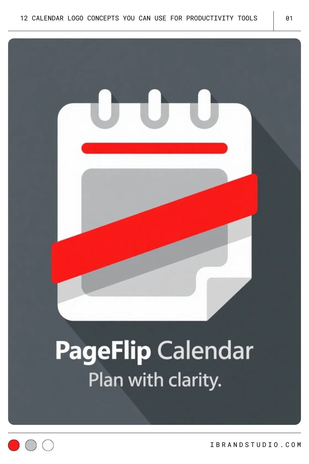
This one’s timeless for a reason: a simple calendar page with a folded corner or tear line communicates “date” at a glance.
Pro tip: Keep details minimal. A few clean lines are all you need.
You Might Also Like: 36 Best Looking Logos from Project Management Tools
2. Minimalist Grid with a Checkmark
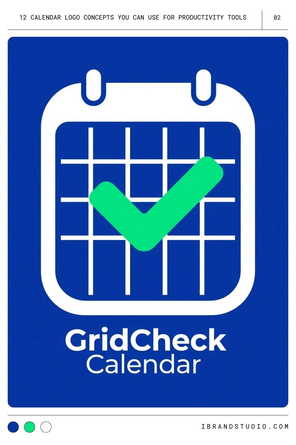
A simple grid plus a bold checkmark reads like a calendar and a to-do list in one icon.
Pro tip: Use negative space to your advantage — let the checkmark break a line or two for movement and energy.
3. Clock + Calendar Hybrid
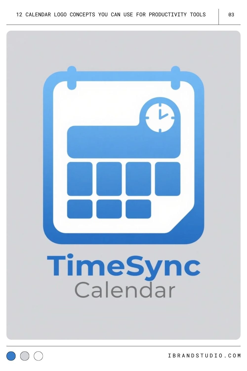
Great for tools that handle appointments and deadlines. The combination instantly tells users: “This app manages both time and dates.”
Pro tip: Keep the clock elements subtle so the logo stays clean when scaled down.
4. Calendar with an Upward Arrow
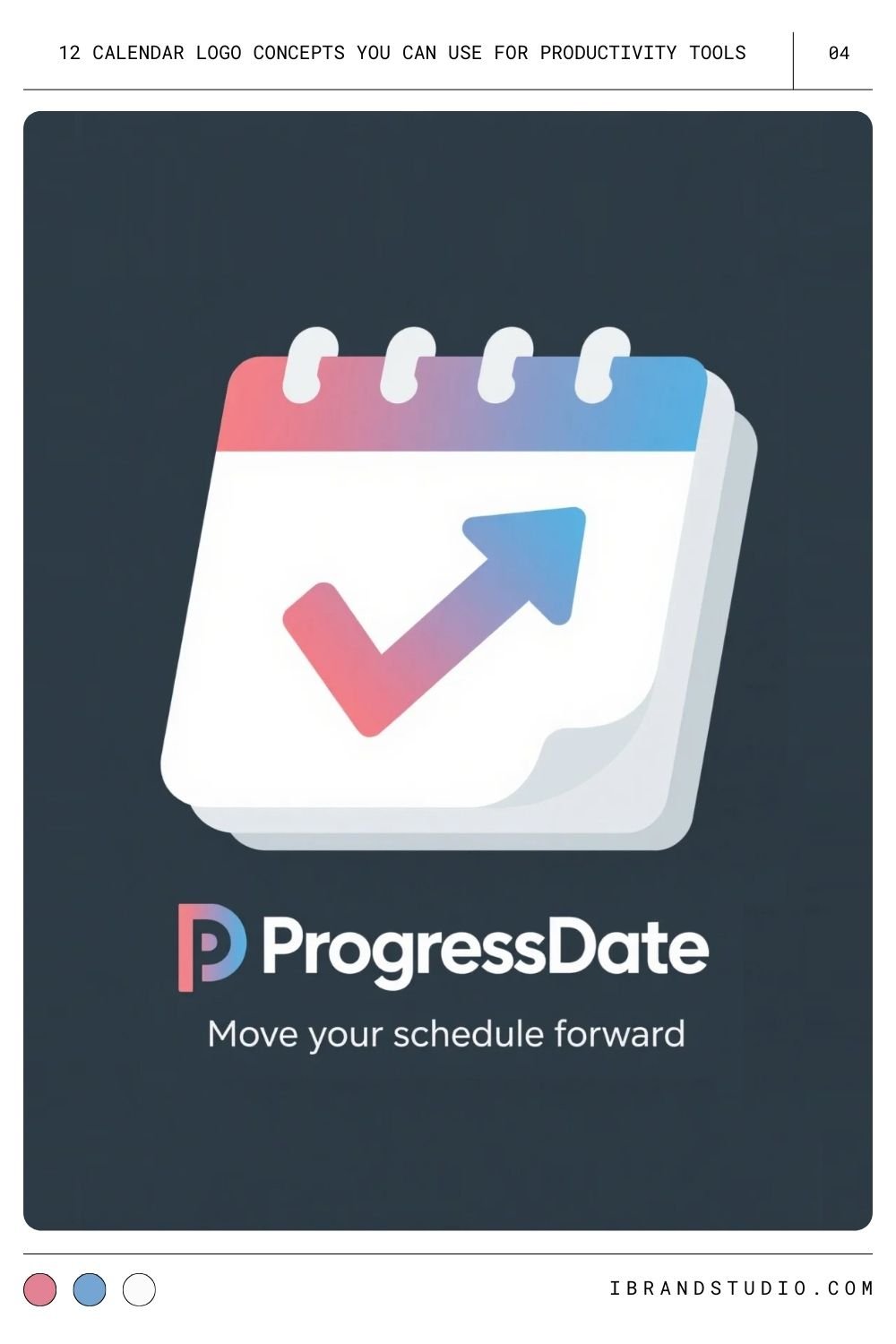
Perfect for brands focused on productivity, progress, and momentum.
Pro tip: Match the arrow’s style to your calendar outline so the whole logo feels cohesive.
5. Overlapping Calendar Pages
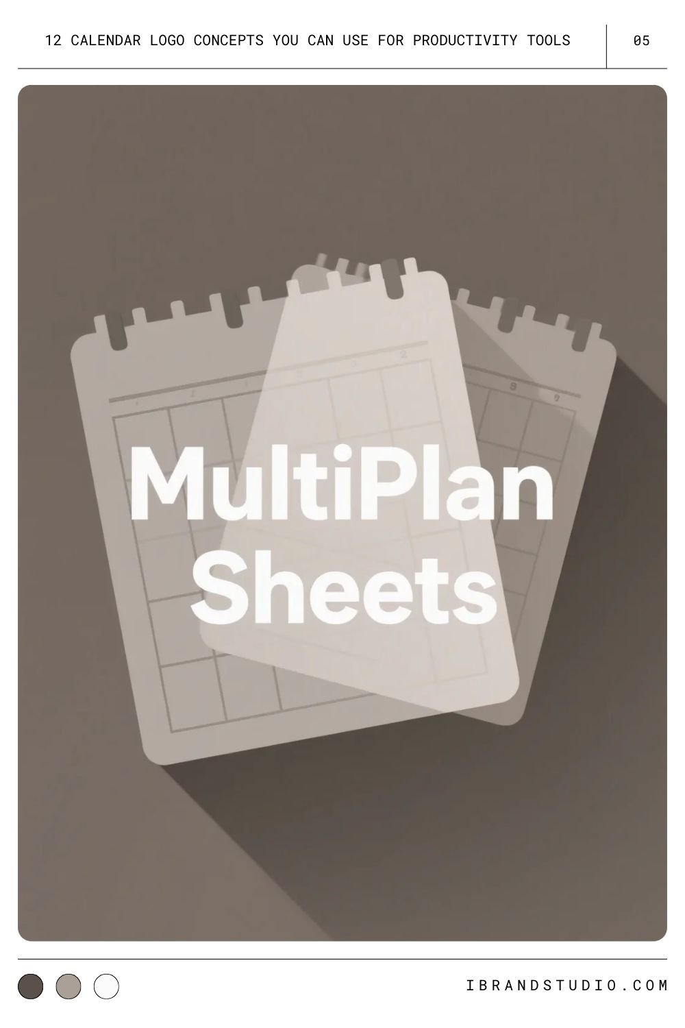
Stacking two or three pages suggests multiple projects or shared scheduling.
Pro tip: Soft shadows or slight transparency help keep the overlaps clear without clutter.
6. Calendar with To-Do Markers
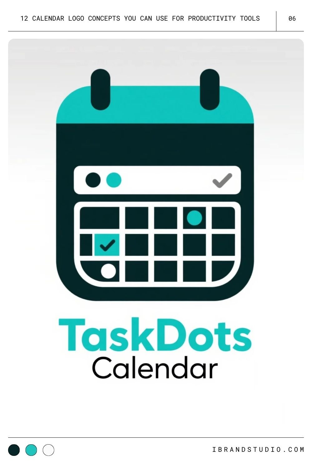
Tiny dots or checkboxes inside a few “days” hint at task management or habit-tracking functionality.
Pro tip: Skip full icons inside each square — they clutter quickly.
Also Read: A Showcase of The Best Time Tracking Tool Logos
7. Calendar + Pencil or Pen
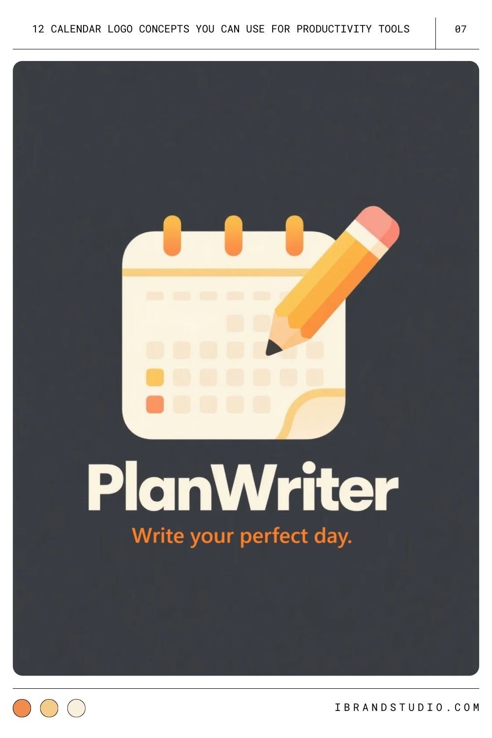
This combo emphasizes planning, editing, or customization — great for flexible, user-driven apps.
Pro tip: Use a simplified pencil shape so it doesn’t overpower the calendar.
8. Circular or Ring-Style Calendar
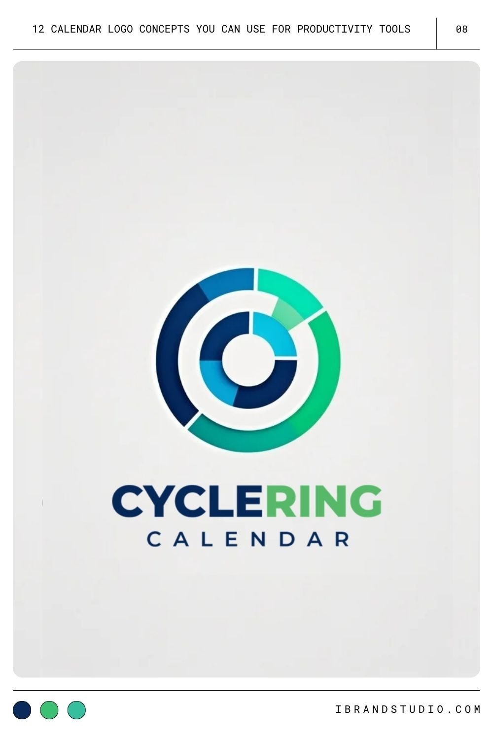
A segmented ring is ideal for representing cycles, routines, and habits.
Pro tip: Use a limited number of segments to keep the design clean.
9. Calendar with a Lightning Bolt
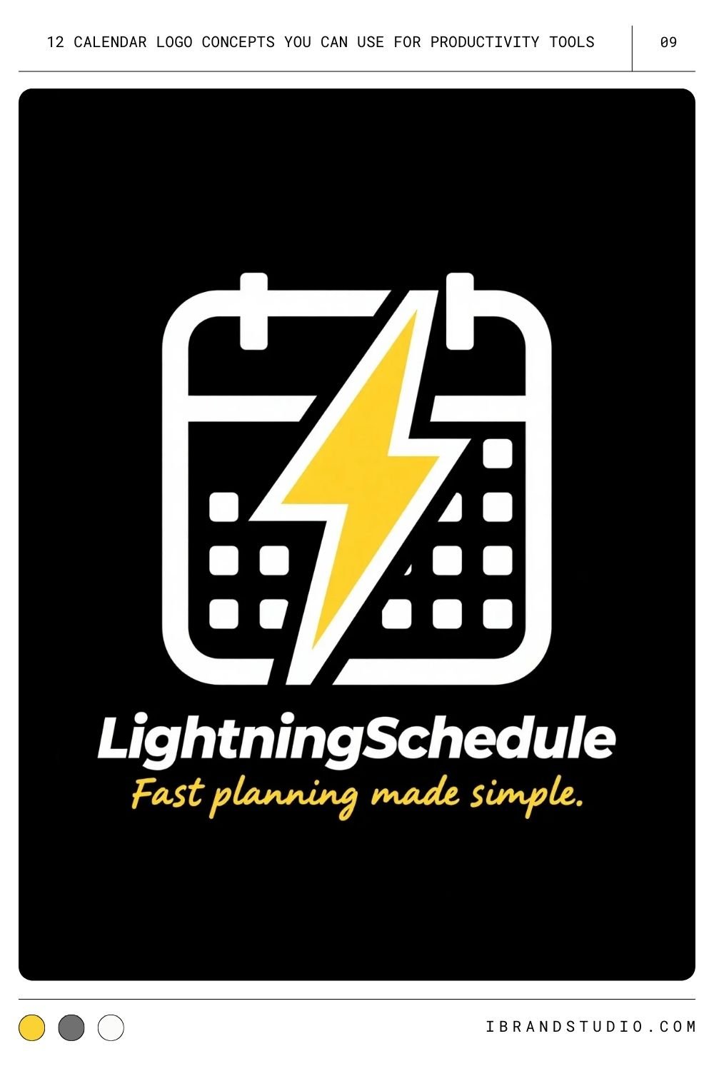
A bold, energetic option for tools that promise speed, timeboxing, or fast workflows.
Pro tip: Keep the bolt stylized — sharp angles, minimal fuss.
10. Calendar + Lock (Privacy-Focused)
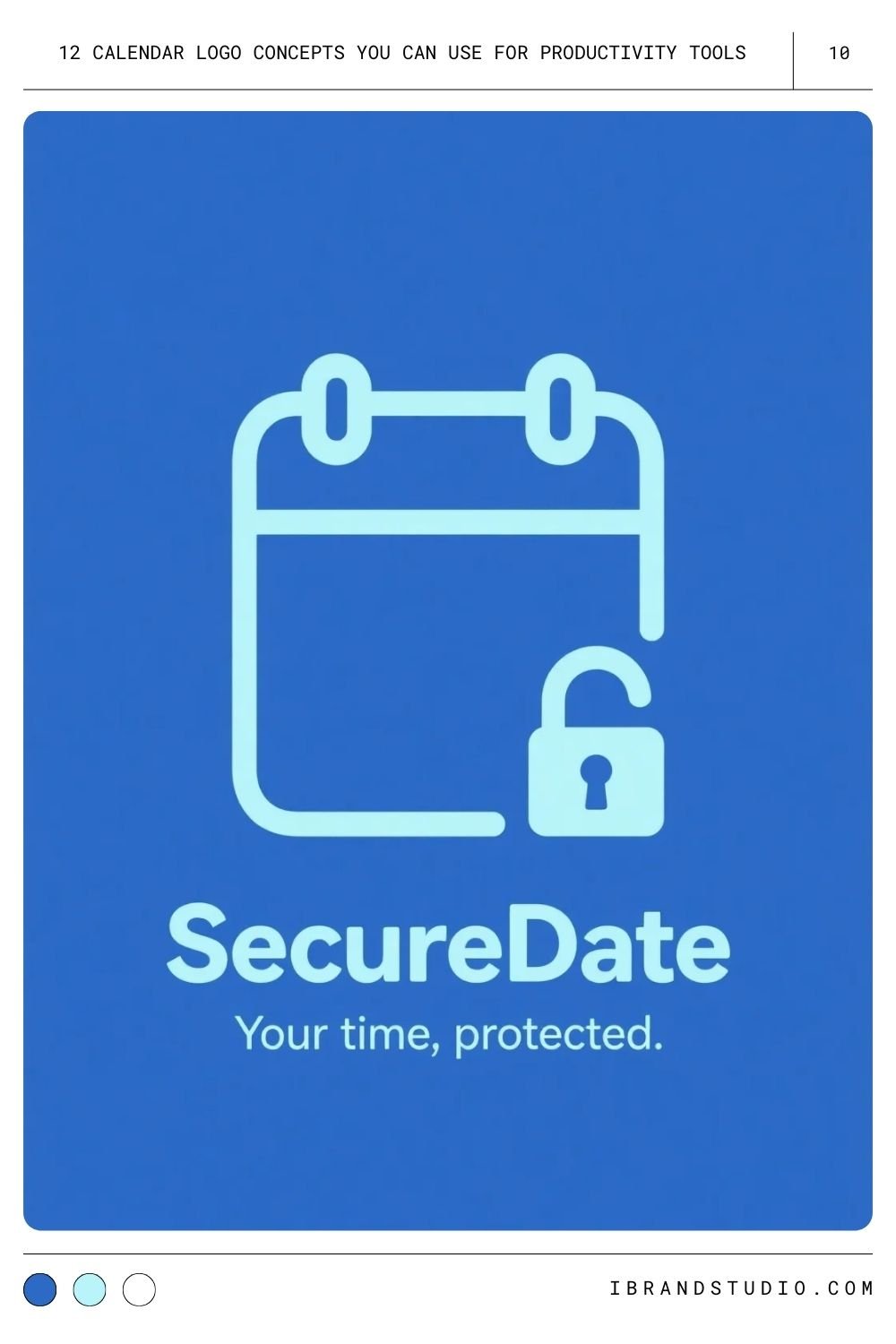
If security is a big part of your brand, this is a natural fit. It signals trust, encryption, and safe scheduling.
Pro tip: Make the lock small and subtle; heavy security imagery can feel intimidating.
11. Calendar + Person Silhouette
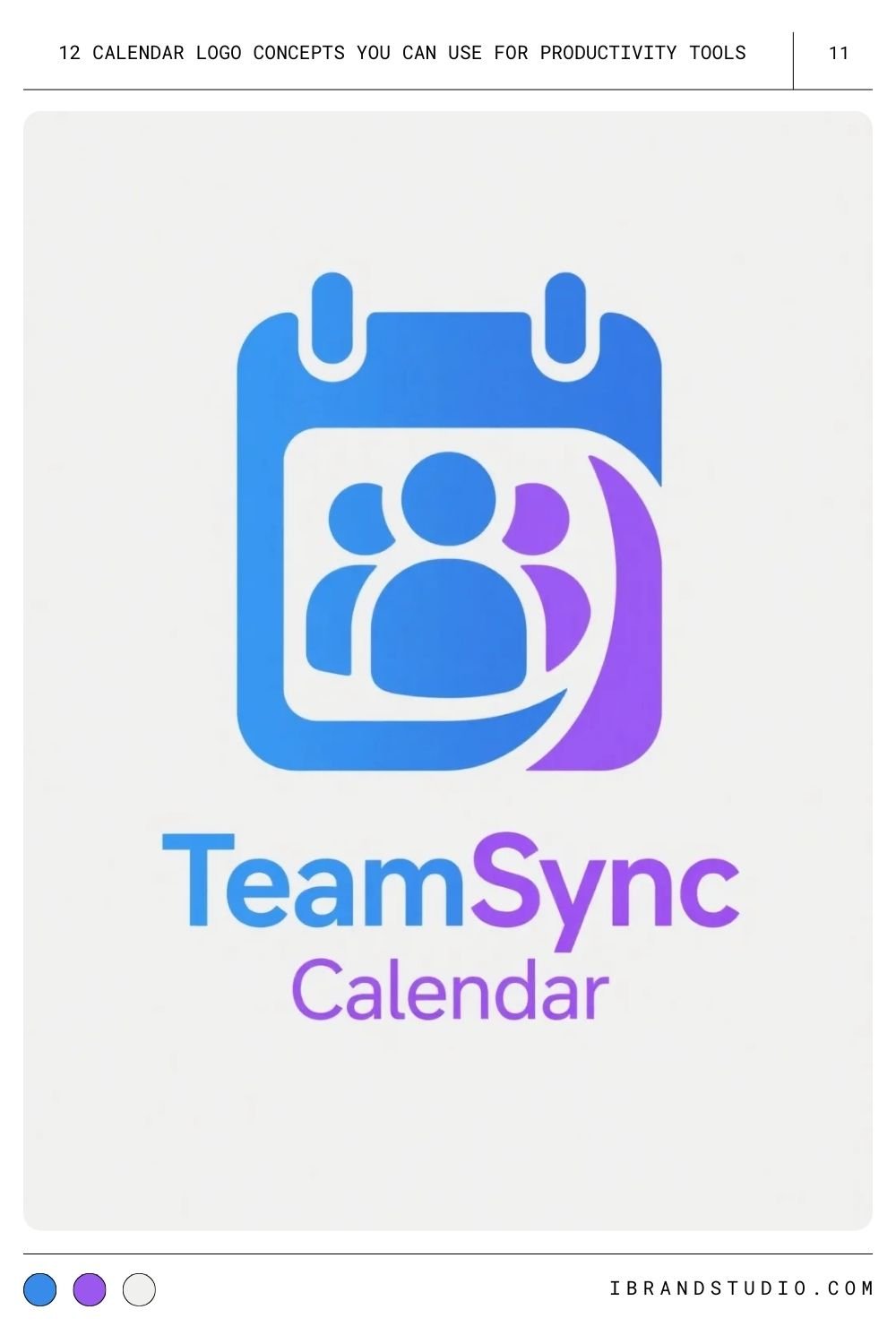
Great for apps built around teams, meetings, or collaborative planning.
Pro tip: Use an abstract human figure rather than detailed illustrations for a modern, professional feel.
12. Calendar + Chat Bubble
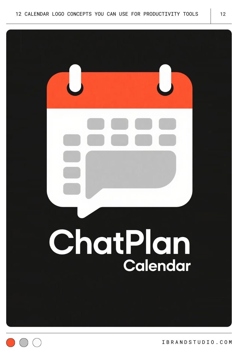
Perfect for apps where scheduling and communication go hand in hand.
Pro tip: Blend the chat tail into the calendar outline so the two shapes feel unified.
Design Tips for Logo Designers & Startup Founders
Tip 1. Design for Small Sizes First
Your calendar logo will likely appear as a tiny app icon. Start small, then scale up — not the other way around.
Tip 2. Choose Colors Intentionally
Blues and greens feel trustworthy, while brighter accents can draw the eye. Always design variations for light and dark mode.
Tip 3. Stick to Vector Formats
SVG, AI, and Figma files keep your lines crisp at any size — especially important for grid-based icons.
Tip 4. Keep It Simple
Productivity tools are about clarity. If your logo looks busy, it conflicts with the brand promise.
Tip 5. Think About Your Brand Personality
A corporate scheduling app needs a different tone than a playful habit tracker. Let your brand personality guide shape, color, and line style.
See Also: 17 Logo Concepts for Tech Startups: Inspiring Ideas for Modern Branding
Final Thoughts
A strong calendar logo does more than mark dates — it tells users your app will help them stay organized and productive.
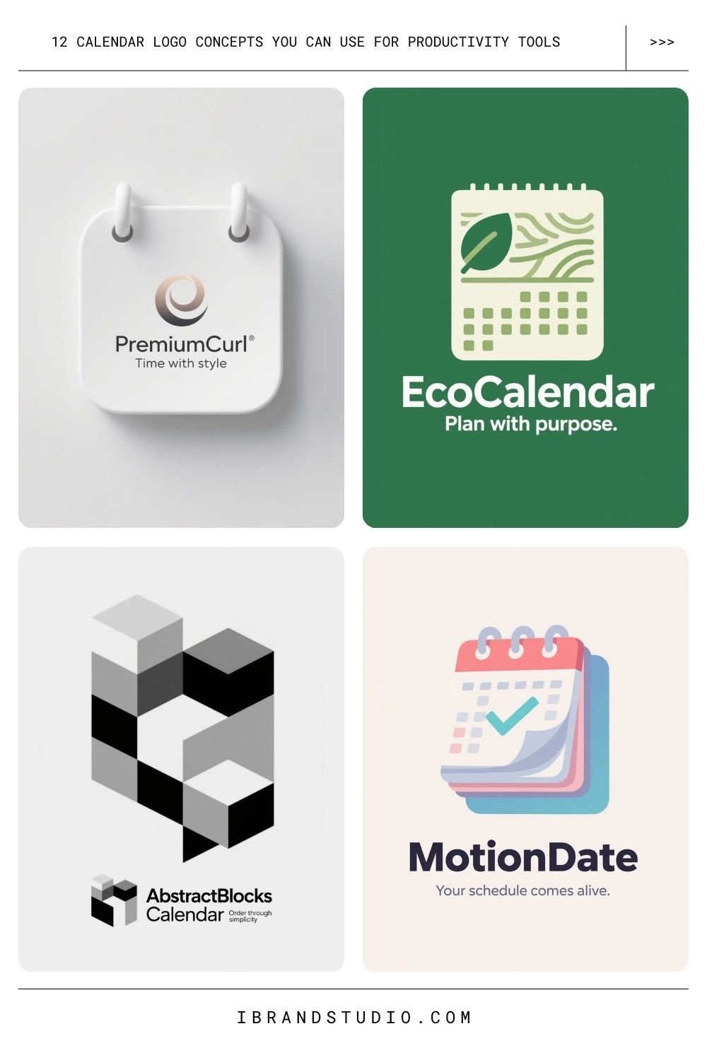
Whether you pick a classic grid, a bold abstract concept, or a hybrid icon that blends multiple ideas, aim for clarity and personality.
Sketch broadly, test often, and choose a design that fits how you want your users to feel the moment they open your tool.
If you want feedback on your logo concepts or want help brainstorming variations, just let me know — I’m happy to help.
