8 Brilliant Ways to Make Your Pricing Page Stand Out
The pricing page is probably one of the most important parts of a business website — but it can be hard to make one stand out from the competition.
Often, your pricing page is one of the last places customers visit before moving on to a purchase or subscription. Listing out the details of your pricing packages and tiers in a way that is creative, engaging and easy to understand can help you secure these conversions.
These are eight strategies for making a pricing page more unique without sacrificing effective communication.
#1. Make Comparison Easy
Deciding between different plans, packages or tiers can be hard. You can help customers by making it easy to compare the various plans that you offer.
Businesses use different strategies to help customers compare different plans or tiers. A comparison table is one common approach. This table lists out features available in different plans and helps customers know exactly what they will get with each package or tier.
Plan descriptions and names can also make it easier for customers compare plans. Providing as much info as you can on each plan while keeping descriptions brief will ensure that customers can find the right package or tier for their needs.
Including price information is also important. At a glance, customers should be able to tell how much each plan will cost and which will be the most or least expensive.
Not every business will be able to provide specific or detailed price information — when possible, however, putting prices front and center is a great way to offer some extra clarity and appear more trustworthy.
#2. Use Descriptive Names
Ideally, your price packages are as distinct as possible. At a glance, customers can get an idea of why they exist and what makes them different from one another. With the right design, your page will help direct customers towards the tier or package that best meets their needs as quickly as possible.
Price package names are a great way to make individual packages or tiers stand out. For example, see this pricing page from Baltimore-based wedding videography Shutter & Sound:

The four packages all have unique names that quickly differentiate them from one another and give customers an idea of what each package contains. These names make the page more scannable and can direct customers to investigate packages that meet their needs first.
The page’s design also shows off how package names can be a great branding opportunity.
While many businesses may choose to use more plain and straightforward names — like Free, Basic, Pro or Enterprise — using unique names like Preview, Short and Feature can intrigue customers and encourage them to investigate your packages or tiers.
Finding descriptive names for your pricing packages will make your pricing page more scannable and easier for customers to understand.
#3. Minimize Clutter
Removing clutter, unnecessary details or hard-to-understand features can make your pricing page much easier to navigate and scan. A more scannable pricing page will encourage customers to investigate — potentially moving them closer to a conversion.
While you don’t need to fully commit to minimalism on your pricing page, keeping the page’s design as simple as possible will make it easier to secure conversions.
For an example of how you can minimize clutter, see this pricing page from Scratchpad, the provider of a suite of productivity tools for Salesforce.
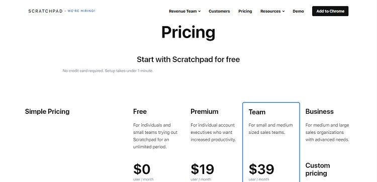
High-contrast text, simple copy and a limited color palette make this page as easy to understand as possible. By keeping it simple, Scratchpad ensures that customers will be able to find the pricing package they need.
Reducing clutter on your own pricing page can assist your customers in the same way. Clearing out unnecessary elements and simplifying your design can streamline your business’s average customer journey.
You don’t have to commit to a minimalist aesthetic, but reviewing your page for clutter or complexity can allow you create a more effective pricing page.
#4. Limit the Number of Plans
Choice is great, but providing too many options at the same time can overwhelm a customer. Offering too many plans or tiers may make a customer more likely to click away from your pricing page.
In the same way the page simplicity can drive conversions, a simple pricing structure will allow you to reduce friction for customers.
For example, see this pricing page from Loom, a provider of video messaging solutions:

Three plans — that’s it. Each of the plans offers something unique and likely targets a different buyer persona.
While there’s no magic number for plan quantity, it’s always a good idea to review your pricing structure and consider if each plan is necessary.
Considering diverging audience segments, different buyer personas and current sales data will help you identify plans that you need and plans that could be cut out.
#5. Highlight a Recommended Plan
You know your plans better than anyone else. As a result, you probably also know which plan is most likely to best fit your customers’ needs.
Many businesses highlight a recommended or best-value plan on their pricing page. This recommendation draws the eye of each visitors and makes the pricing page easier to scan.
A recommendation also possibly reduces the chance that your visitors suffer from analysis paralysis when they are deciding which plan to choose.
Highlighting a plan can be done with extremely simple changes to your pricing page layout. For an example of recommendations in action, see this page from email marketing solution provider Mailchimp:
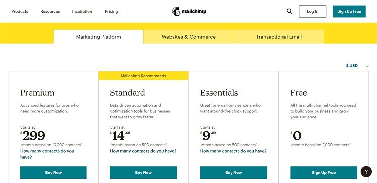
Using a bright yellow that stands out from the neutral colors of the rest of the page, the designers have highlighted one of the mid-price plans. It’s a subtle design change, and the recommendation isn’t so bold as to be distracting.
On your pricing page, you can use one of the accent colors in your site palette to highlight a recommended plan. Highlighting this plan will guide your visitors towards a purchase and steer them towards a plan they’re likely to find valuable.
#6. Eliminate Friction
Difficult-to-use features, inconvenient page design and confusing package descriptions can all make a pricing page hard to understand.
Web design friction — elements that a visitor must overcome to use a site — can easily convince a potential customer to click away from your pricing page.
Eliminating friction will minimize the risk that customers click away before committing to a purchase.
To identify where users are getting tripped up or stuck, you can take advantage of site analytics and user behavior data. Usability testing can also give you an idea of where your site may be unclear or confusing.
#7. Indicate Credibility
Trust plays a major role in most consumer’s purchase decisions. Pricing pages that build trust often convert more as a result.
Businesses use different strategies to make their pricing pages seem more trustworthy. Placing the right trust signals on your page will assuage customer FUDs — fears, uncertainties and doubts — while moving them towards a purchase.
Money-back guarantees and free trials show that you’re confident in your business’s offerings, and willing to go the extra mile to ensure customers are satisfied. Trust badges can allow you to demonstrate the steps you’re taking to keep customer financial info safe.
While you build trust with page design, you’ll also want to avoid some common pricing page missteps that can make your business seem less trustworthy. Generic language, confusing naming schemes and limited pricing information can all push customers away from a sale.
A well-placed FAQs section can also reduce uncertainty. Answering some common questions about your services or products beneath the main pricing package descriptions can benefit customers who want to know more before committing to a purchase.
#8. Test and Incorporate User Feedback
Once you start developing your new pricing page, you should start testing. With data, you’ll be able to make more informed decisions and avoid relying solely on gut feelings. Both A/B tests and usability testing will let you know if your pricing page works well.
You can also use information from site analytics to understand how people are looking at your pricing page. Top site metrics like bounce rate, new vs. returning user percentage and average visit length can tell you if your pricing page works well, or if there is room for improvement.
So long as your pricing page is live, you should be testing and reviewing analytics. There’s always going to be room for improvement and your business’s audience and goals are likely to shift over time, as well. Taking time to reevaluate your pricing page and how well it works will
Best Practices for Creating a Pricing Page That Stands Out
With the right design strategy, you can create pricing pages that are engaging, interesting and good at driving conversions.
Simple adjustments to existing pricing pages, like the addition of comparison tables, descriptive names, trust signals and a highlighted plan, can all help make a page better at drawing in visitors.
Knowing what to leave out will also be important. Clutter, friction and elements that cause analysis paralysis can make a pricing page much less effective.
About the Author!
Eleanor Hecks is editor-in-chief at Designerly Magazine. Eleanor was the creative director and occasional blog writer at a prominent digital marketing agency before becoming her own boss in 2018. She lives in Philadelphia with her husband and dog, Bear.