Design Theory Principles That Work When Building a Website
When it comes to converting visitors online, your website design is one of the most important conversion tools at your disposal.
While you can use every strategy and tactic for conversion in the world, none of it is going to do you much good if your website looks terrible.
Design isn’t just art; it is also marketing. It shows the world your product and how it works.
Whether you’re designing a new website or improving an existing one, these design principles will work for getting the results you want.
Visual Hierarchy
Use design theory in the same way as the world’s top brands by applying a visual hierarchy to your website.
This is one of the most important principles behind good web design and refers to the more prominent visuals getting the most attention.
Certain parts of your website are going to be more important than others, such as your calls to action, value propositions, forms, and more – and you want to make sure that these get more attention compared to other, less important parts of the site.
Visual hierarchy can be utilized in website design in several different ways. Obviously, the easiest way to do it is with the use of colors. However, you cannot use several colors in a single page and expect a good result.
This is why you might want to create some other design modifications that would promote visual hierarchy, like using fonts or arranging elements in a way that those that are very important are seen first.
A very good example of the use of visual hierarchy in modern web design is the presentation of contact details right at the top of the header, usually in the upper right corner.
We see this with business websites that have a contact phone number but it can be the case with any site that has use of contact details. The visitor can quickly see the phone number and knows they can use it when needed.
Fitt’s Law

You can use Fitt’s Law to make sure that it’s easy for users to find and use the functional parts of your website that are more important.
This law refers to the theory that the time required to move to a target area, such as clicking on a button, is a function of the target’s size and the distance needed to get to it.
Simply put, the bigger and closer an object is on your website, the easier it will be to use.
This is why we often see larger CTA buttons close to a piece of text that dictates why the button should be clicked. And we see forms close to navigation menus on contact pages.
We can highlight several examples but what is particularly important to understand is that perfect design theory practically means arranging elements in a way that they are very easy to get to when the visitor decides to interact with them.
Hick’s Law
Hick’s Law states that each additional choice increases the time that is needed to make a decision.
You might have already experienced this at a restaurant, where a huge menu with lots of options makes it harder rather than easier to choose what you want to eat.
On the other hand, if you only have two or three options, picking what you’d like to eat will usually take much less time.
This can be applied to web design by only including the necessary options. The more options a user has on your website, the more difficult it will be to use.
As a result, the best designs always limit how many choices the visitor has. We can see this on eCommerce product pages. When there are way too many buttons present, the visitor starts to doubt their choices.
When we only see the Add to Cart button and not much else, if the visitor wants to buy, they will do it much faster.
This drastically increases the possibility of making a sale, which is why eCommerce sites are created.
Rule of Thirds
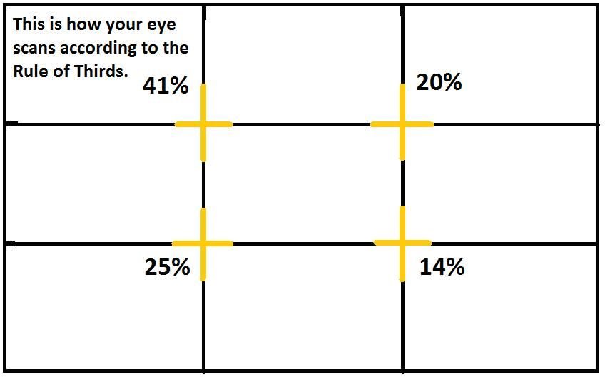
Another design theory principle to apply to web design is the rule of thirds. Using images and graphics is good web design practice as this can communicate ideas a lot faster compared to text.
However, the best images for your website should follow the rule of thirds. The image should be divided into nine equal parts by two horizontal lines and two vertical lines that are spaced equally.
This is one rule that you do not instantly realize when you look at a website. However, the highly experienced web designers will always use it.
And in time, the use of the rule of thirds becomes second nature. Many designers end up not even knowing why they implement it and that they do it.
White Space
Finally, white or negative space is another important principle to apply to web design.
This refers to the part of the website or webpage that is ‘empty’.
It’s the space in between the graphics, menus, columns and more – and it’s not just empty, as it’s an important element of the web design that allows the items and objects within it to exist.
More white space means a more minimalistic and less cluttered website.
A huge advantage of actively using white space is that you can easily put focus only on those things that matter the most.
When you clutter the design, it is a very bad idea since the attention of the visitor will start to move from one place to another on the page. What you want the visitor to do might be lost and frustration can even appear.
Final Thoughts
No matter what kind of website you are building or improving, applying these design principles can make it easier to get the professional and sleek results that you want.
However, this does not mean you have to use the design rules every single time and on every single page. There are situations in which some might not be warranted.
Try to create several versions of the pages you design so that you can see what works best for your brand.