The main criterion for the quality of any interface is user experience. If the audience spends a lot of time on the site or in the application, comes back every day and actively interacts with the content, then the design and usability contribute to this.
In this article, we will figure out how strongly psychology affects the user interface, and how to design interfaces that will drag users in from the first seconds.
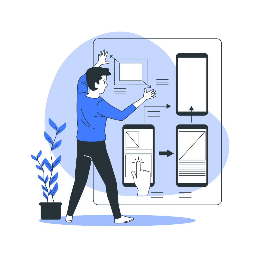
The Influence Of Psychology On Design
Fonts, animations, media content and usability are important, but its psychological techniques that have the most impact on the user experience. The designer not only creates a graphic “shell” of the product but also determines what it will look like in the eyes of the target audience.
If a specialist does not just study the needs of people but understands how they will interact with the interface, the effectiveness of a digital product increases many times over. It is not necessary for a designer to obtain a master’s degree in psychology or take specialised courses. It is enough to determine the points of contact of the audience with the interface and figure out how to evoke certain emotions in people using the menu, slider or text blocks.
6 Psychological Principles For Ux
Let’s deal with several effective psychological techniques that fit into the plane of graphic design. Australian business people will be able to understand how to build relationships with audiences in the digital world, and designers will receive some useful insights.

#1. Effect Of Isolation
The Restorff effect describes the property of human memory to remember objects that stand out from the crowd. Imagine that there are 20 green apples and one red on the table. In most cases, we will choose red, even if it is not as pretty as green.
It is human nature to highlight unusual objects. We mentally isolate the same elements and highlight the one that is different from the others. This principle works everywhere: from the selection of products on the shelf to controls in the interface.
In interface design, the isolation effect manifests itself in its own way. It is usually used to highlight a call to action. If you place 3-4 identical buttons in several columns, users will not understand which one opens the popup. In this case, the conversion will be much lower than when the CTA is different from other objects.
#2. The Law Of Proximity
The next important principle says that objects located at a small distance from each other are perceived as a whole. Buttons placed in the form of columns horizontally turn into a group. The brain connects objects to maintain visuals and to group elements as important. It is easier for us to connect objects into groups in order to remember them and, if necessary, restore images from memory.
The problem with many interfaces is that meaningless objects are often in proximity. The error prevents users from learning how the product works and affects the user experience.
It is very important to approach the grouping with the utmost responsibility. Placing items side by side without a clear purpose can create dissonance for users and ruin the product experience.
#3. Hick’s Law
The Hick’s law says that the amount of information entering the brain determines the time that a person spends on making a decision. If there are 30 types of dessert in a café, the client will look at the menu and spend a lot of time choosing.
A designer who develops a landing page or an application interface with many screens needs to be as careful as possible. Ideally, there should be nothing superfluous next to the CTA elements, otherwise, instead of a steady stream of conversions, customers will only receive bad behavioural factors.
Try to reduce the number of options so that the user accurately chooses at least one. If a person needs to choose a service from a long list of 40 objects, the conversion will be minimal. The interest or need should be so great that you spend time looking for a suitable option.
#4. Cognitive Load
In the process of studying a new product, the human brain uses a certain amount of resources. The more elements, the more time and effort will have to be spent in order to master the capabilities of the application or site.
Internal load reflects the difficulties people face in the process of exploring new objects. Psychologists advise making it easy for the user to grasp the essence of the product. If the system seems intuitive, it is more likely to become an everyday tool. The useful properties do not end with a logical structure. Depending on the complexity of the project, you can add explanatory texts, interactive tips or a virtual training system.
Relevant cognitive load is the resources that a person spends on processing new data and creating connections between objects. Psychological research proves once again that it is easier for people to learn new technologies and products if they are created according to familiar patterns.
Let’s say a user who has never logged into Photoshop opens it for the first time and wants to create a new project. At this stage, there will be no problems – he sees a welcome message and a button to create a file. The main tasks can be solved using a menu that works according to familiar patterns. But with the internal tools, you will have to deal with longer, if you did not have experience in other editors before.
Digital products need to be created so that the target audience spends as little time as possible on learning. It is clear that it will take some time to get to know the application or website, but this process should be shortened to the minimum.
#5. Edge Effect
The principle partially correlates with the first three techniques. When a user sees a group of elements in front of him, he better remembers the first and the last. If there are 4-5 slides in the slider, people will remember the ones with which they interact longer. The first slide is shown before switching items. And the latter is imprinted in memory since the user usually finishes viewing the content on it.
Professional designers use the edge effect correctly – they place buttons or widgets on the sides with high priority. If we are talking about a floating menu with several elements, then on the left and right it is better to place the items with which users will interact most often.
#6. The Law Of Completeness
Psychologists agree that users study new objects as a whole. They see each piece of the puzzle as a piece of the puzzle, but do not separate it from the system. When people encounter an unfinished object, they fill in the empty space on their own based on previous experience.
The problem with many interfaces is that the first screen appears to be visually complete. He should only bring the audience up to date. It’s like the first meal in a restaurant. It awakens the appetite and stimulates the client to order 3-4 more plates of goodies.
If you divide the interface into semantic blocks, link them in meaning and create the effect of incompleteness, users will try to find the missing elements. They will explore the site beyond the first screen and be able to find answers to questions.
What Properties The Interface Should Have
Let’s take a quick look at how to use the information correctly to create a good UX.
Authority
Even a company that has just entered the market can make an interface authoritative. The most important thing is to win the trust of customers and shows that a commercial project is not trying to make more money, but cares about users.
Social proof
Testimonials, reviews, and other formats of user experience stories are great as social proof.
Deficit
A deficit can boost conversions when used correctly. It is very important not to overdo it with pressure and not create a need artificially.
Openness
People share personal information only if they are confident that they will receive something in return. Honesty and welcome bonuses help make the first contact.
Gamification
People love the emotions that games can give. They temporarily forget about everyday worries and immerse themselves in virtual reality. A good interface should have similar properties.
Emotionality
Emotions play a big role in shaping the user experience. The result of the project depends on how responsibly the designer approached the creation of the digital product layout, and what emotions he put into it.
Consistency
A good digital product reveals its features gradually. Users follow sequential steps and understand what tasks they can solve. The structure must be precise and light so that one gets the feeling that he has a very interesting book before himself, which must be read to the end.
Conclusion
Knowledge in the field of psychology helps to make digital projects that are centred around people, not products. Companies understand how to motivate people to use a product and are successfully using effective engagement tools.
About the Author!
Nick Brown is a blogger and a marketing expert currently engaged in projects for Orion Creative. He is an aspiring street artist and does Audio/Video editing as a hobby.