A logo is the recognition of a company that makes it unique and different from the others. In today’s competitive business world, the importance and usefulness of a logo cannot be underestimated. A logo is a graphical symbol that represents a company’s identity, which can increase its reputation. However, the wrong Logo can destroy the image of the company.
All the professional designers are aware of the significance of a business logo design for any small or large organization. Developing a unique and professional logo is challenging for professional designers as well. You have to go through a tiresome process that needs a lot of research, brainstorming, skill, and patience. Committing mistakes while designing a logo is very common, whether you are starting a new design or working on an old logo.
This article focuses on highlighting the common mistakes committed by designers and the way to overcome them.
Common Mistakes Made by the Logo Designers:
#1 – Lack of Doing Enough Research
Designing a logo requires thorough and deep research to generate creative ideas. Most of the designers do not conduct enough research while starting a logo design task and thus fail to create a professional logo. You know there are badly designed websites out there, but there are also badly designed logos. And this is why.
Designing a logo is a challenge of how a designer catches and apprehends the essence of the brand and reflects it through the graphical symbol.
To be successful in this process, you need to acquire a deep knowledge of the brands’ mission, vision, values, business strategies, and the message it is trying to convey to the stakeholders. You need to make a brand audit survey to understand and acquire a deep knowledge of these topics and brief the findings to the team so that everyone is clear about the objectives of the business and Logo.
#2 – Focusing on your Own Portfolio without Realizing Customer’s Requirement
Most often, designers focus on designing their portfolio instead of understanding what the client requires, which fails in the logo design project and thus causes the business to suffer too.
Often designers design something from the existing portfolio, while the client might require a different logo that conveys a message and represents the brand value. Committing such mistakes can ruin your career as a designer. If you’d be working in an agency, then you would most likely be verified by a project manager and such mistakes wouldn’t appear.
However, when working alone, you are prone to mistakes since there’s nobody to offer you quick feedback.
So, you should sit with the client and talk about what is the actual requirement and what are their objectives and values. Does the client have any specific instruction or messages or symbol that needs to resemble in the Logo? Communicate clearly, get a clear idea, and design it professionally.
#3 – Unattractive Font Selection
It might seem silly, but some designers struggle to select the appropriate and suitable fonts for a logo. Choosing the wrong font might result in a disaster that can directly influence the reputation of the brand.
Before selecting a font for the logo, talk in detail with the client to understand their values, personalities, what message they want to convey, or if they have any specific font selection. Once you have enough knowledge about the brand you are working for, you can create your font to make the Logo most professional.
#4 – Using Multiple Fonts
It’s a common trend to use multiple fonts in a logo. That should be avoided while designing a professional brand logo. The experts in the graphic design sector suggest following one or a maximum of two fonts to avoid unwanted competition and dispute among brands. A font with a sharp contrast may convey a wrong message that can create conflict. Famous brands like Barclays or Adidas selected a single font logo.
#5 – Designing a too Generic or too Complicated Logo
Often rookie designers develop too generic logos, which cannot be used for multipurpose and fails to clinch the attention of target audiences. A professional designer always focuses on making the Logo flexible enough to use for multipurpose such as in print media, in online platforms, in different sizes.
#6 – Following Trends Blindly

Graphic design is one of the most mentionable industries that largely influenced by various trends at a regular interval.
Most often than not, the designers follow or rely too much upon the most recent design trend while designing the logo, which backfires most of the time, and the designer fails to create a professional logo. It is good to keep in touch with the trend, but use your ideas, own innovation to make the logo professional.
Pro Tip: Check out this What’s Coming Up in Logo Design Trends 2020.
#7 – Choosing the Wrong Colors
One of the most common mistakes conducted by the designers is a wrong or poor color selection, which makes the Logo unattractive and fails to reflect professionalism. Some designers select color randomly and few do not think about the color at all which makes them fail to create a professional, unique, and lucrative logo.
As a professional designer, you need to choose the color wisely that reflects the brand’s core message and the value it stands for. So brainstorm your ideas while selecting the colors for the Logo to make it impressive.
#8 – Using The Dot Matrix Image format
Using a dot matrix image format or raster image in logo design is one of the most common mistakes made by most designers. Though it’s more popular than the use of vector, experts prefer to use vector images for professional logo design.
There are many problems of using a dot matrix image like getting blurred white zooming, loses quality if resized, or pixelated. While using a vector image format helps you to get rid of such issues. Most of the experts and new generation designers now prefer using vector imaging like adobe illustrator to make an impressive logo without facing any quality issues.
#9 – Plagiarism
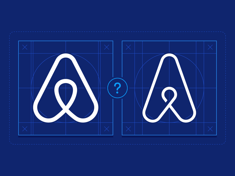
The most common mistake conducted by the designers is to copy others’ work, which is known as plagiarism. To design unique, professional, and attractive logos, designers must use their creativity instead of copying other’s designs.
#10 – Creating a Monogram from A Business Name
This is also a common mistake made by the young rookie designers to find out a monogram from the business name. This process can be followed to enrich your idea just to create a unique and impressive brand logo.
Designers should also avoid making acronyms of the business name while creating a logo. Although there are famous brands like IBM, HP, and GM who made the Logo with acronyms, it comes after years of hard work and devotion of the organizations.
#11 – Using Unnecessary Symbols
Using unnecessary symbols, characters, or components in a logo can make the Logo unattractive and fail to grab the attraction of respective stakeholders. For illustration, inclusion of ‘Ltd.’, ‘Pvt.’ Or ‘Inc.’ should be avoided. Though the symbol of {TM) or (®) can be included if it’s requested by the clients.
#12 – Not providing a Neat and Clean Logo File
Sometimes, designers overlook the importance of providing a neat and clean logo file to the clients. Especially reducing the number of node points as minimum as possible, making smooth curves avoiding any overlapping is very important when you handover a logo file to the clients.
Conclusion
By avoiding the mistakes mention in these articles and following the suggestion made, designers can create a unique, impressive, and professional logo easily.