How To Create a Beautiful E-commerce Store Your Customers Will Marvel At
E-commerce stores are plentiful, with more popping up every day. Figuring out ways for your store to stand out from the crowd requires careful attention to detail and an understanding of your target audience. You must know what your buyers expect and how to deliver it to them if you wish to find success in the online retail marketplace.
In their most recent State of Ecommerce report, eMarketer points to the fact that consumers are ready to spend after a tumultuous period brought on by the pandemic. Experts predict pent-up consumer demand will result in a 17.9% growth in digital sales and 6.3% growth in-store. With more people shopping online, now is the time to perfect your store’s appearance.
If you already own an online retail website, now is the time to revamp your overall look and function. If you’re just getting into the e-commerce game, you have a fresh slate and can implement good practices from the beginning. Either way, you can never go wrong by improving your online real estate.
Is It a Good Time to Sell Online?
More people shop online now, preferring the convenience of armchair browsing. Why is electronic shopping so popular today? Experts point to the many benefits of online shopping, such as the ability to see if a store has something in stock without calling or driving all the way to a brick-and-mortar location.
How can you make your store stand out from the tens of thousands of others? Here are some of the best ideas for creating a beautiful e-commerce store your customers will love and return to. We’ve also included a few examples of our favorite designs.
#1. Keep Structure Simple
Different styles come and go, including asymmetrical or symmetrical. People add in things such as augmented reality, animation and neon colors. Some things stand the test of time and some do not.
However, if you keep things fairly uncomplicated, you’ll have a site that always meets current trends. A grid layout looks good for most e-commerce sites and keeps products separate for viewing. You can also add in some of the trendier design methods here and there and replace them as styles change.
One advantage of a grid layout is that it converts easily for mobile devices. You can add or remove white spaces as needed to make the site aesthetically pleasing. It will afford a more symmetrical layout, but it will also adapt better to varied screen sizes than curves and triangles.

Rvinyl uses a grid layout to showcase beautiful images of their products. Note how the categories are in equally spaced boxes, while the hero image stretches across the screen. Even the shopping options are laid out on the grid. There is a symmetry to the design that is visually pleasing and reassuring to the user.
#2. Make Navigation Intuitive
Some parts of what make a website beautiful are whether it is easy to use. Your navigational structure can be intuitive or confusing. Start by limiting your navigation categories to five or so. Any more and the user may feel uncertain where to click first.
You can always expand your menu with subcategories and even sub-subcategories. Use drop-downs or mega menus to showcase additional options. Start simple and expand from there.
#3. Show Off Products
An e-commerce site’s biggest asset is the photos showcasing products. You’ll want to include beautiful thumbnails with a look at the product, but also have additional images to show it from varied angles.
Allow zoom options or upload closeups of some of the features of the product. If it comes in different styles or colors, offer an image for each variety.

Space Posters offers a simple layout showing a front-facing shot of each poster. However, if you click on the link for “more photos,” you find lots of images of close-ups and even an image like the one above of what the poster looks like in a room.
#4. Keep It Simple
Stay away from too many heavy elements competing for attention. Have a single focal point for each page of your site, so the user knows what the goal of the page is and what action they should take next. Don’t allow them to stop and question what they should do next, or you risk losing them to a competitor’s site as they bounce away.
For example, if your goal is to get them to click on the call to action (CTA) button, you shouldn’t add a bunch of animation unless it points toward the button. Know the purpose of your page and cut anything unrelated. All elements must move the user to the next stage of the buyer’s journey.
#5. Create a Text Hierarchy
A beautifully designed page has a hierarchy to elements, including your fonts. Make sure users know what is a heading, subheading and body text. They should know at a glance what the most important words on the page are.
Your text hierarchy should include what appears in what font, size and weight. So your headings might be in a different font and bold. Your subheadings could be italicized and slightly smaller. Your body text would be normal and 12 to 14 points.
Stand back from your screen and look at the way the text works together without actually seeing the words. Is the layout pleasing? Is it clear what is a headline and what isn’t?
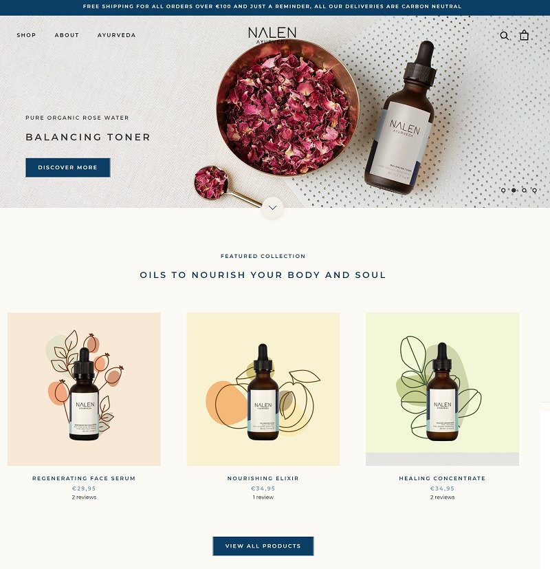
Nalen Ayurveda does an excellent job with their typography. Note the different size, weight and color between the headline, subheadings (product titles), price and other text. The user can skim over what is there and gather the pertinent details quickly.
Adding the CTA on a blue background in white text sets it off as something different from the other elements on the page. The user knows clicking on the button takes them to something important. However, there are other links on the page, taking the user directly to separate product pages.
#6. Embrace Mobile Responsiveness
Statista reports there are currently 6.4 billion smartphone users with an estimate of 7.5 billion by 2026. The number of people using their mobile devices to access the internet grows monthly. If your site doesn’t look aesthetically pleasing on small screens, you may miss out on a huge number of potential buyers.
Test your pages on both desktop and mobile devices to see how it appears. If someone is on a phone, can they easily access the features of your page? How hard is it to share information via a form? Look at both the style and the functionality of your pages.
#7. Choose Colors Wisely
Color trends change seasonally. One year, bolds will take the awards. The next year, people seek muted pastels. Your choice doesn’t have to match trends, but it should accomplish a few things for your brand.
First, people should associate the hues with your company image. Seek out colors you’re already using on packaging and other communication. You also need contrast. If you choose a light background, you need dark text on top.
Even a beautiful design isn’t very functional if the reader can’t make out what the words say.
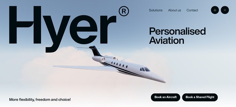
Hyer uses a beautiful sky blue background to give the impression of flight. By combining the soft, cloudy sky with a pitch black font and CTA buttons, they create contrast that makes the entire design pop.
The design is simple, but elegant. The user’s eye is drawn first to the headline and then moves down the page in a Z-pattern.
#8. Add Icons
Users want to know at a glance if they can use the payment gateway of their choice. Utilize icons to show if you take credit cards, Stripe, PayPal or other options. You should also add icons for social media as many customers appreciate interaction.
Sometimes the impact of an icon is subtle. For example, add a Better Business Bureau logo or professional associations you belong to ramp up the trust factors on your site. Highlight the opportunity to add a review with a CTA button.
Look for ways to point the user where you want them to go with small images that don’t overwhelm or take away from the impact of the product images on your site.
#9. Highlight Support
People expect to get in touch with you should they have a problem with their order. Make it clear how they can contact you by adding a toll-free number and even a live chat option.
Put your contact information in easy-to-find places, such as your navigation bar and in the footer of your site. People are used to looking for details in these two places and will head there first. Show them you’re trustworthy by making the information easy to find.
Finishing Touches
Spend time looking at your design and seeking ways to improve it over time. Ask for feedback from your customers, check out what things people click on and what they ignore and make small improvements each week.
Conduct split tests to see what changes your users respond to and which ones they don’t. With time and practice, you’ll have a beautiful e-commerce store your customers flock to.
About the Author!
Eleanor Hecks is editor-in-chief at Designerly Magazine. Eleanor was the creative director and occasional blog writer at a prominent digital marketing agency before becoming her own boss in 2018. She lives in Philadelphia with her husband and dog, Bear.