Tim Ash, an expert in landing page optimization says the following:
‘’A landing page is any webpage on which an Internet visitor first arrives on their way to an important action that you want them to take on your site.’’
For the landing page to have this effect on people, it has to be optimized and fit their interests and needs. Those who strive to achieve this and essentially convert leads seek ways to leverage the power of UI.
But, before we go into how you can use UI to create a higher converting landing page, let’s see what these terms encompass.
What is a Landing Page?
Landing pages can be described as standalone pages because of their nature – to entice visitors to take some action. Generally speaking, a landing page is any page on the Web that users ‘’land on’’. This can be a website’s homepage, an individual page for a product or service, etc. However, unlike regular pages on the Web with more generalized information or purpose, landing pages have a single focus or goal – to push users toward the CTA.
The primary goal behind the creation of landing pages is to generate leads and conversions. This is why most landing pages are linked with social media and email campaigns that reach potential subscribers and buyers.
What makes a good landing page?
For a landing page to be considered effective, it needs to increase leads and sales, successfully promote products, and grow the list of subscribers. When we talk about a high-converting page, that means that the landing page has a large number of users that not only arrive on it but also take the intended action.
On top of this, a quality landing page provides the designer with insight for improving the strategies and product itself. How? With a high number of visits and action, designers can collect valuable data to analyze and use to improve their moves.
Before you jump toward optimizing a landing page, you need to be prepared to store and use the data for the good of your business. All the data needs to be collected, but also stored and analyzed for future actions. This is precisely why you need a good knowledge base software like Slite, the ”solution that all your team will love”. With a good knowledge base software, you can put an effective landing page into use that goes beyond conversion.
But, first things first. In this article, you’ll learn how to use UI to create a high conversion landing page.
Understanding UI: how to use it for your landing pages
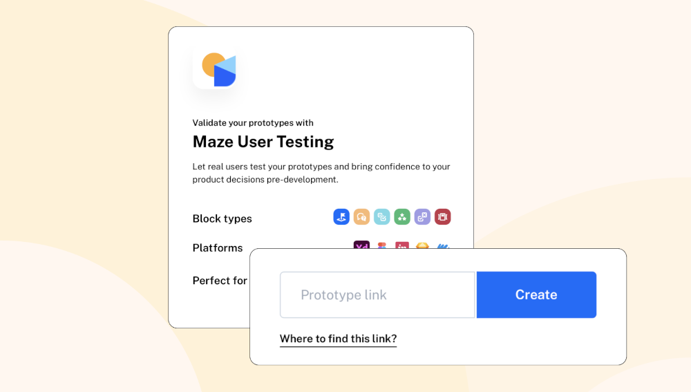
To utilize various User Interface strategies for landing pages, you need to first understand what UI means. According to Jonathan Widawski, the CEO of Maze, a famous brand for remote testing products, the difference between UX vs UI is described as follows:
‘’UX design is about understanding the overall journey of your users and turning it into a product… UI design is about using typography, images, and other visual design elements to turn a basic interface into something digestible and usable.’’
Knowing this, an effective landing page is highly reliant on the UI strategies that designers use. Plus, you can use Maze to test your users and decide on the best UI and UX strategies for the landing page.
Here are some great tips on designing or updating a landing page to look the part, as well as maximize leads.
#1. Go for simplicity
A visually crowded website can take away the visitor’s focus. Because of this, landing pages have the best effects when they are visually simple. If you want to push the visitors to see the CTA, you need minimalistic design and a lot of whitespaces.
Ideally, your calls to action should be isolated from the remaining elements on the page. This makes it stand out and provides a contrast. While the rest of the pages can provide all sorts of data and include various elements, landing pages need to be simple.
#2. Color is a very important element
Springer research data shows that colors are a big influence on human psychology. They affect how we feel and more importantly, how we act. What does this mean for your landing page?
It means that the use of colors can have a huge impact on visitors’ decision to take any action – or not. It can guide their behaviors in the right direction, therefore improving the landing page conversions.
Here are some tips for best color use in landing pages:
- Use a palette of compatible combinations of colors. Make the right combinations of high and low colors for contrast and copy readability.
- Choose colors that fit your product or service, as well as the message you’re sending. For example, green is known as a color that yields trust, security, and calmness. Red is the color of extremes.
- Color symbolism can be very effective when used properly. Depending on your target audience’s culture, you should decide on your use of colors. Different cultures have different interpretations.
#3. Quality media is key to a great landing page
Since you have little room for elements, you should make sure that they are of top quality. A quality picture can say a hundred words, which is why images are an essential part of great landing pages. In the little space you have, you should use quality media to demonstrate the product, tell the story, and create a connection with visitors.
People will be more willing to click on the CTA button if they are not overwhelmed with action. But, they still need some presentation of the product or service offered. Media is a great way to build trust with visitors and prompt them to take action.
This includes both images and videos. Research on landing pages suggests that videos are more effective than still images. According to this same research, 71% of participants believe that video converts better than all other content types.
#4. Create a responsive design
Responsive design is no longer a choice, but a prerequisite for the industry. Landing pages make no exception in this matter. They need to provide the same level of quality in terms of UI and UX on mobile and desktop devices. In the last 6 months alone, 79% of smartphone users have made a purchase online. With the increasing use of mobile phones for searches and purchases, optimizing your landing page for mobile use is vital.
Yes, your website template might already have integrated responsiveness, but you should keep working toward this continuously. Responsive landing pages significantly increase the amount of traffic because they welcome both mobile and desktop users.
#5. Make your CTA buttons strong
Strong CTA is vital for the success of a landing page. Think of this as the gateway between the user and your product or service. With that in mind, here are some ways to keep it above the fold:
- Emphasize the key CTA, the primary call to action that leads to the desired action.
- Make use of bright and strong colors for your CTA to stand out
- Use visual elements and cues to point users toward your CTA.
- Place it in the middle of the white space to make it easily noticeable.
- Use actionable phrases that clear up the purpose of the button.
#6. Spot-on headlines
The landing page headline is the first thing a visitor sees when they get there. This is your first, and often even only chance to engage them. Many visitors see a dull headline and move on to look at other sites without giving the rest a chance.
In landing pages, first impressions matter – A LOT.
If you want your landing page to bring more conversions, you need to consider the headline as your most important hook. You have only seconds to engage people who land on the page. Your headline should convey the most important message and be eye-catching.
According to Neil Patel’s guide for powerful headlines, it must convey a sense of urgency, call-for-attention, and a unique rationale.
#7. Leverage psychology to convince users
People are often subject to psychological rules and principles. Their desires, motivations, and beliefs lead them toward making a specific choice. Choices made by people are heavily affected by unconscious and conscious factors.
To leverage psychology for your benefit, do the following:
- Promote a sense of urgency and value by using contrasting colors and appropriate copy in the headlines and CTAs.
- Use empathetic images relevant to the user’s context. Appeal to the emotions, feelings, and empathy of users.
- Display the ratings, awards, and trust badges at the top to convey feelings of trust.
- Proudly showcase social proof such as brands and influencers involved with your product, as well as relevant testimonials to build trust.
Final thoughts
UI tools and strategies can make all the difference for your landing page. Getting people to land on a page is only the starting point. As a designer, your next goal is to make the page engaging enough to convince them to take action. By utilizing UI tips like the ones in this article, you’re one step closer to turning people into leads.