Why Your Business’s Landing Page Could Use More Simplicity
Your company’s landing page is the first impression you make on your customers. You can either earn their trust or lose their interest in the span of a few seconds. You already know you have to hit the high points as far as aesthetics, colors the audience will respond to and excellent information.
In the middle of trying to hit all the factors you need to in order to convince someone to do business with you, it’s easy to add too much to a landing page. Remember, landing pages should have a singular focus whenever possible. The goal of the page should be at the forefront of any design. Things unrelated to the objective must go.
How do you get back to simplicity? What does a simple design look like? How much information is too much, and how much is enough?
How Do I Make My Landing Page More Effective?
According to the Conversion Benchmark Report, the average conversion rate for landing pages is 9.7% but the figures vary by industry.
If your figures fall far below what’s typical, it’s time to ramp up your efforts at perfecting your pages. Even if you’re at the industry standard, you can improve your revenue with a little extra effort.
Start by conducting tests on your landing pages and fixing any errors you see. Use heat maps to identify what people actually click on. If any areas are cool, it may be time to cut them from the page.
Make sure there is plenty of white space surrounding things such as clickable buttons. You want users to realize they need to take action and move forward.
Fortunately, simplifying your pages is a fairly easy process. Follow these landing page standards to get a handle on the focus of your page and improve your conversion rate.
1. Know Your Audience
The better you know your audience, the easier it is to focus on their specific needs and utilize only the information they need to make key decisions. Understanding them helps you understand the right language to use, what supporting evidence you can skip and how to answer the most common questions.
You can even survey them and find out what they need answered before they make a decision to buy from you. Anything you can do to set their mind at ease and show you already understand their needs will improve your landing pages and thus your conversion rates.

Wantable nails the purpose of their landing page. They know that most people visiting their site are trying to decide if the service is right for them or not. They use a call to action (CTA) for a style quiz and place it above the fold. They also use a relevant image showing the possibilities.
2. Cut Headlines Down
Is your headline too wordy? Remember that your headings serve several purposes. An H1 header might serve as the first words someone sees when doing a search engine dive. What appears in the heading on the search engine results page (SERP) is determined by your headings.
Anything over seven words may get cut off and not make sense, for example. Your headline is also the thing people see first when they land on your page. Use action verbs and concrete language to paint a clear picture.
Keep refining your headline and testing response from your audience. Ideally, your headline will describe the purpose of the page in a few short words.
3. Answer Questions Before They Arise
One of the advantages to knowing your customers is you can answer they’re probable questions up front and move them to the next phase of the buyer’s journey. For example, if first-time customers often ask your hours, place them on your landing page.
You’ll also save your sales reps time and effort by answering frequently asked questions upfront. What are their objections to buying from you? If you want to more easily close the sale, answer those objections before your salesperson has to.
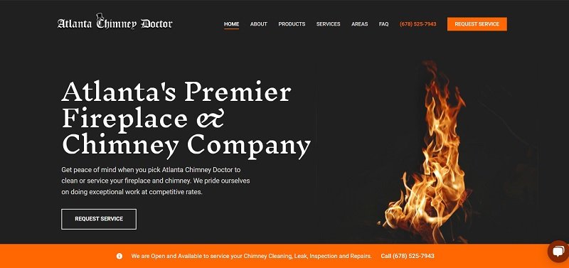
The Atlanta Chimney Doctor is another example of an excellent landing page that gets to the heart of what the user wants. In addition to a clear “Request Service” CTA button, they answer a common question across the bottom of the fold.
They explain they have openings and offer services such as chimney cleaning, leaks, inspections and repairs. They also include their phone number. Their CTA is still the main focus of the page, but the supporting material helps overcome any reluctance to click on the button.
4. Establish a Single Goal
The primary purpose of any landing page is to drive conversions and generate leads. What is the main reason you created a landing page? Stick to one thing. You can always create additional landing pages to achieve secondary goals.
Sticking to a single objective also makes it easier to track results. You can make a small change and do some A/B split testing to see if it generates the conversions you wish.
5. Reduce or Remove the Menu
You’ll read two schools of thought when it comes to menus on landing pages. Some people believe a portion of traffic may accidentally land on the page, so there should be a way to navigate elsewhere.
On the other hand, a menu can distract the user from the goal of the page. It’s much more focused to use a CTA and no other links.
The best practice is likely somewhere in the middle. For example, you could include a logo and make it clickable to the homepage of your site. You could also use a hamburger icon to indicate where a menu is for those who wish to navigate off the landing page.
Try different variations until you find the one that works best for your audience and brings the results you want.

Grubhub is an excellent example of a focused landing page. They offer a search feature with the invitation to search near you or order in the app. When the user looks at the information above the fold, nothing detracts from the CTA. There is no menu or other elements. Even the logo isn’t clickable.
However, the user can scroll down and link to other sections on the site. Placing the most pertinent and focused information at the top of the page is an effective way to lead conversions.
6. Limit Form Length
Do you want site visitors to convert to leads? Throw out the lengthy forms and stick to one as simple as possible. For example, you might ask for a first name and phone number or email. Make mobile forms autofillable to avoid too much trouble on the user’s part. If they can click and fill, they are much more likely to share their personal info.
While you may need some details to come up with a custom quote or fully address the needs of potential customers, you can gather that information after the initial contact. Keep things simple.
7. Add Social Proof
If your goal is to get users to convert into leads, you’ll want to gain their trust. One way of doing so is by adding proof that others think you’re awesome. People are much more likely to listen to their peers and what they think than believe anything a company has to say about itself.
Social proof can include things such as reviews, testimonials, social media posts and video reviews. Get your top customers on board and ask them to share what you do with others and then put their comments and user generated content (UGC) on your site and on social media.
UGC can save you a ton of money on creating promotional posts and be much more effective than anything you can come up with on your own. Look to your customers as mini influencers to help spread the word about your brand and drive traffic to your landing pages.
When people get to your landing pages, they should see the same UGC repeated.
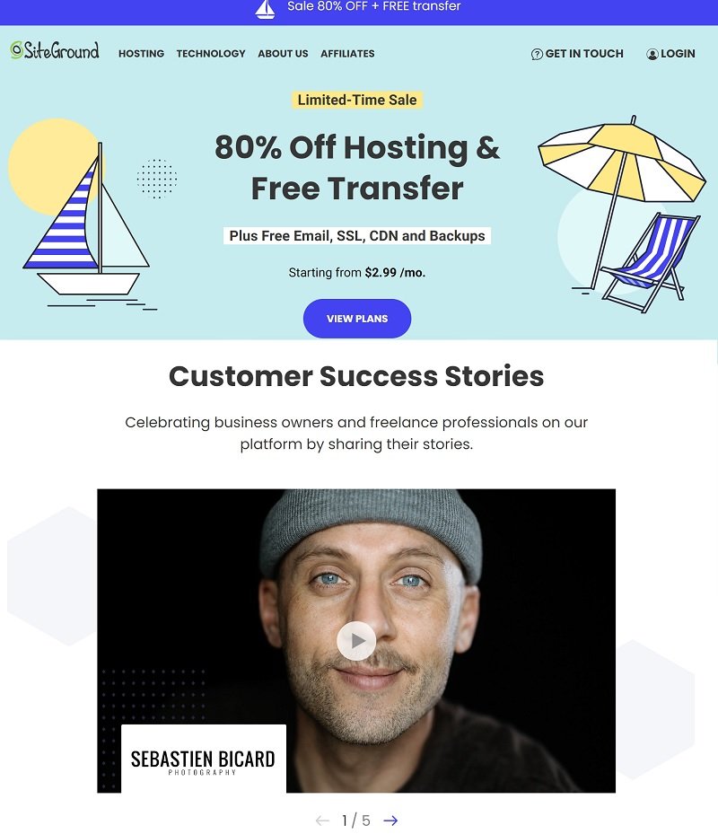
SiteGround shares customer success story videos on their landing page. Understanding how they’ve helped other entrepreneurs build successful websites might make other site visitors understand what they bring to the table. Customer reviews help highlight that they offer what they say they do.
8. Add Relevant Images and Icons
An image can say far more in less space than words alone. You can even use icons and symbols to guide the user to the CTA button. Videos make your site more interactive and tell a story in a few short minutes.
The key is finding relevant and unique visuals that enhance your message. Don’t just add photos for the sake of adding them. You should have a purpose for every element on your page.
Simplify, Test and Simplify More
Cutting clutter from your landing pages shouldn’t be a one-time endeavor. Ideally, you will constantly tweak and change your pages so they can be as effective as possible for your customers.
Over time, your user base may also change a bit. Revamp your pages frequently to account for a shifting demographic or new products in your lineup. With a little work, your landing pages will have high conversion rates and you’ll see a significant increase in revenue.
About the Author!
Eleanor Hecks is editor-in-chief at Designerly Magazine. Eleanor was the creative director and occasional blog writer at a prominent digital marketing agency before becoming her own boss in 2018. She lives in Philadelphia with her husband and dog, Bear.