Checkout abandonment is one of the biggest challenges for online businesses. A piece of research by the Baymard Institute compared 44 cart abandonment studies and calculated an average checkout abandonment rate of around 70%.
That’s more than two-thirds of all customers deciding not to buy at the final stage! While that’s a scary figure, it also shows that there is still a huge opportunity to optimize your checkout pages to lower that number and get more customers over the final hurdle.
The dominance of Amazon and the rise of beginner-friendly website builders like Shopify means that the competition for online customers has risen, driving the cost of customer acquisition to all-time highs. So, converting the leads you do manage to get hold of is critical to ensuring a profitable eCommerce business.
This article is going to outline top checkout page UX design tips to improve your conversion rates and create a better overall online shopping experience for your customers.
Why do people abandon their carts at checkout?
Before we get into the UX design tips, please check this UI/UX design agency San Francisco. We first need to take a look at some of the reasons why people abandoned their shopping carts. It’s a natural behavior of online shoppers who are window shopping, comparing prices, saving items for later, searching for gifts, or simply just playing around.
So, don’t be scared if you have a high abandonment rate. However, understanding why the leads who are not just window-shopping are leaving you will help you to reduce that number and drive more sales.

The same study that found a 70% average cart abandonment rate also looked into why shoppers ditched their orders. They found that the top five reasons for cart abandonment were:
- Hidden fees and extra costs were too high – 49% of respondents
- The site required shoppers to create an account to checkout – 24% of respondents
- Slow delivery times – 19% of respondents
- Long & complicated checkout process – 18% of respondents
- The site felt untrustworthy – 17% of respondents
So, what can you do to your checkout page to resolve some of these issues?
Don’t hide costs – be honest and upfront
There’s a school of thought that if you can just get your customers to the checkout page, more often than not they complete the purchase. This has resulted in some online store owners withholding information like shipping and tax fees until the last possible moment.
This might work for getting your visitors to the checkout page, and a small number of them might complete the purchase. However, it’s more likely to increase your abandonment rate because the majority of people will soon run when they get the shock of the extra fees. Not to mention they’ll probably feel like they’ve been lied to.
Think about it, if you were told a product will cost $50 but by the time you’ve completed the checkout, it’s now $73.50. No thanks!
If you really want to improve your conversions, then I recommend that you offer free shipping. That way you have nothing to hide. A recent study from the Nation Retail Foundation found that 75% of shoppers expect free delivery, even on orders under $50.
Whether you charge for shipping or not, you should make sure that the total costs involved are visible as early as possible during the buyer’s journey. This will help you to build trust with your customers and prevent you from annoying them with last-minute fees.
Have an option to checkout as a guest
The second biggest turn-off at a checkout page is being forced to create an account to complete a purchase. This mistake is made because online store owners want to collect as much customer data as possible. However, research shows that forcing your customers to sign up for an account will send nearly a quarter of them somewhere else.
An alternative is to offer a way for the customer to checkout as a guest and to make creating an account optional. Collecting additional customer data can be beneficial to your business so you can incentivize shoppers to sign up with discounts on their next order and explicitly describe the benefits of having an account. The benefits could be things like faster checkouts, access to order history, and quicker customer service response times.
However, not everyone is interested in anything more than making the purchase. So, to make sure they don’t abandon their order, provide an option that lets them skip creating an account.
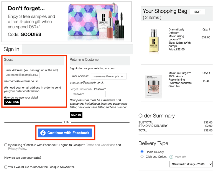
This example shows that Clinique is offering two alternatives to complete the checkout process instead of creating an account. The first is a guest checkout which only requires an email address. The second is a ‘Continue with Facebook’ button. Both are quick options that should please the speedy shoppers out there.
Reduce the number of form fields to create clearer and faster checkouts
The next problem we’re going to address is a long and complicated checkout process. It’s the fourth most popular reason for abandoning a shopping cart and one that is easily solved.
Research has found that the average checkout contains 14.88 form fields. This is twice as many as necessary. So, most eCommerce businesses are requiring their customers to work twice as hard as they need to in order to complete purchases.
A lot of what comes as standard with checkout page designs is non-essential. Therefore, the first thing you can do is reduce the number of form fields. Try to remove everything that’s not essential and hide anything that only a small minority of customers will need behind a text link. Here’s what you can do:
- Merge ‘First Name’ and ‘Last Name’ fields into a ‘Full Name’ field
- Hide ‘Address Line 2’ and ‘Company Name’ behind a text link so that customers that need to use them can, but so they are hidden from the shoppers that don’t
- Create a tick box to let customers say that the billing and shipping address is the same
- Remove the title field – you don’t need Mr, Mrs, or Miss to complete the transaction
- Unless you offer international shipping, you can remove the ‘State’ and ‘Country’ fields, the Zip Code will give you the information you need.
An optimized checkout page should have between five to eight form fields. If you optimize your checkout page with the tips above, you could remove up to 10 fields. If you were an online store with the average number of fields (14.88) this would bring you down to just five fields. Even, if you can’t get down to five, every field that you can remove will go a long way in reducing your abandonment rate.
Finally, enabling autofill can allow customers to automatically populate the form fields from data stored from a previous session or stored on their browsers and mobile devices. This will dramatically reduce the time it takes to enter the necessary details. It’s a simple hack that can get your customers moving through the most time-consuming part of the checkout process quickly.
Use a checkout progress bar
A checkout progress bar can help to solve the same issue as reducing the number of form fields. By breaking up your checkout process into smaller chunks and highlighting each stage, you can simplify the process for your customers.

In the example above from GymShark, you can see that they have a five-step checkout process:
- Cart
- Customer info
- Shipping details
- Payment information
- Confirm & pay
A progress bar like this will help to reduce abandonment rates because they motivate customers. Completing each step gives a sense of progress and knowing that there is only one or two more steps to go will increase the chances that they will complete the purchase. Also, the fact that they let you know what’s coming up reduces the fear of accidentally clicking next and ordering an item, making it a less daunting process.
Progress bars allow you to break things down for a simpler checkout process. They also allow you to address the psychological barriers of tedium and fear by providing a clear process that motivates customers to get to the end.
Make your customers feel more comfortable with security-focused copy and credibility symbols
Feeling insecure at the checkout stage of the buyer’s journey is the fifth most common reason for shoppers abandoning their orders. A lot of the hard work to make your customers feel more secure can be addressed before the checkout stage.
A Stanford University study found that nearly half of web visitors assessed the credibility of a site based on the overall visual design of the site. This includes things like the color scheme, font types, and the layout of visual elements. So, don’t underestimate the influence of your web design on building consumer confidence.
However, this article is about checkout page optimization so what can be done on the checkout page?
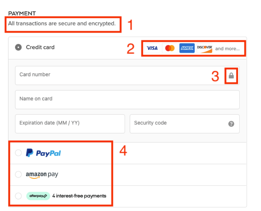
Research shows that nearly two-thirds of online shoppers fear having their details stolen online and not trusting a site with card details causes 17% of shoppers to abandon their carts. Therefore, the payment details section is the best place to optimize to make your customer feel more at ease.
The above example from Alo Yoga shows how you can optimize the payment details section of your checkout process using security-focused copy and credibility symbols.
- ‘Secure’ and ‘Encrypted’ are two words that everybody wants to hear just before they hand over their card details.
- elling your customers it’s secure, is the first step to making them feel comfortable
- Using the symbols of the most trusted and well-known credit and debit cards leverages the trust that those brands have built. It shows that you use trusted payment methods
- The padlock symbol next to the card number creates a visual security cue that will calm the customer’s mind
- Offering alternative payment methods for people that don’t want to use their regular bank details online will make sure that you don’t exclude these types of customers.
Final thoughts
There are lots of ways to optimize your checkout page for better conversions. However, the five UX design tips listed in this article help to address the most common reasons why people abandon their shopping carts. For every UX design practice that you adopt, the lower your abandonment rate will fall.
About the Author!
Jake is a digital marketing specialist, head of content marketing at Website Builder Ninja, and a contributing writer for a variety of marketing-focused online publications. Website Builder Ninja reviews the world’s leading DIY website builders to help you to find the right platform to grow your online business.