One thing the pandemic taught everyone on the planet–things can change on a dime. People are ready to get out of their houses and back to attending events and spending time with family and friends. With that new verve for life, they also love bold colors and bright designs. Many websites are turning to colors such as electric-blue and lime-green to shine a hue on things.
Bold colors have always been a part of the design world. If you follow the fashion or interior design industry, you’ve likely seen the way trends shift from neutrals back to vivid colors over the decades. We are now in a phase where people are using the vivid shades again, even in web design.
The colors you choose and how you combine them can help you design stand apart from your competitors’. While some industries gravitate toward a specific color, such as financial institutions often using a deep blue, others are open to anything you might imagine. Even if your industry has some standard hues in place, you can pull in accents or choose to design outside the norm.
Are Colorful Web Designs Right for You?
The United States Bureau of Labor Statistics estimates the web developer and digital designer industry will grow 13% annually through 2030. It probably isn’t surprising with designers from all over the globe that people’s ideas of what color combinations work best vary. People’s culture impacts how they relate to color, so studying a variety of designers and their work helps bring fresh ideas.
Design trends change frequently. They’re influenced by interior design, fashion and world events. The youth often drive certain popular choices of the moment. Your best bet as you venture into colorful web designs for your next project is to be aware of some of the rules and what others are doing, so you can either follow a similar trend or throw the rules out the window.
One of the best ways to find inspiration for your next web design project is by studying what other designers are doing. We’ve scoured the internet for some of the top designs with colors outside the norm. We’ll talk about how colorful web design impacts your return on investment and share our favorite examples of stellar design with bold color.
1. Let the Photos Speak for You
One way to incorporate bold color choices into your web design is by choosing images with bright hues. You have a lot of options when you turn to visuals. You can use a hero image, make them part of the background or utilize them for accents. Think about the placement of the photos. Which ones should you put first? What is going to have the most impact on users?

Van Gogh The Immersive Experience uses the artists’ paintings to bring bold color to their design. The features on the paintings work perfectly for a darker background and then a pop of color for attention. Note the text and accents are kept fairly simple. The white text pops on the darker parts of the art and the swirl of blue and yellow engages the viewer.
Takeaway: Finding just the right images for your design can take your website to the next level. The best visuals have a natural balance of positive and negative space, allowing you to add text and other elements without distracting from the purpose of the photo.
2. Try Unique Color Combinations
Don’t be afraid to go with contrast colors or combinations you might not typically consider for a color palette. The shock of two bold colors against one another can grab the user. You have but a few seconds to make an impression once someone lands on your page. The shock of something unexpected may grab them enough to keep them on your site for a bit.

Jellyfish Lighting takes color standards and turns them upside down. They start by adding a transparent gradient over the image of a home with lights. The gradient goes from blue to purple to rose. You’d expect to see a pop of yellow or neutral colors with the design.
Instead, they choose turquoise for the accent color. The bold choice draws the eye and encourages the user to take action. The transparency allows the designer to get buy with some options that otherwise might not work.
Takeaway: Be brave in your color combinations. Try different hues you might not normally combine. You can always change colors if something isn’t working but you won’t know until you try. The more attention you can grab, the lower your bounce rate will be.
3. Consider Emotional Impact of Colors
There is an entire psychology surrounding the color choices you select. Users respond based on their personal history and how the hue makes them feel. For example, black might seem elegant to one person and remind another of funerals.
To choose the best colors for your users, you have to understand who they are. Study their demographics, survey them and pay attention to what they tell customer service and sales staff.

Perfy goes with a vivid yellow for their background and uses only accents in other spots. The text is a neutral black. The burst of yellow reminds the user of sunny days and being thirsty. It sets the perfect mood for the beverage.
If you want to grab user attention with a solid, bold background, make sure the shade you choose has an emotional impact on your users. Red can bring excitement. Blue is often calming. Purple seems regal. Lime green is fun and may bring to mind tropical destinations. Think about the tone you want to set and which shade works best.
Takeaway: Approximately 80% of shoppers say color impacts whether or not they buy an item, and another 70% won’t buy an appliance that isn’t in their favorite color. What shades you choose matter. Conduct split testing and keep trying different options until you hit on the one that brings results.
4. Use Bold Colors in the Accents
Sometimes your brand identity involves using more muted tones. Fortunately you can add some boldness in the accents on your site and still come up with a design that grabs users and pulls them in.
The majority of business owners find it challenging to stand out from the competition. Using your signature color helps with brand recognition. However, you may want to utilize bold hues to pull your site visitors into the sales funnel.

The Authentic Brief has a pale, buttercup-yellow background. They add pops of color with a vivid blue-green. You’ll also see some geometric lines and squiggles in varied hues to add a bit more interest.
The effect is fresh and unusual in the industry. People will instantly recognize the site when they visit the landing page.
Takeaway: Any design can take on a fresh, modern look if you add in some accents. Think about what colors work well with the design you already have and try different combinations until you hit on the one that grabs attention and keeps it on your page.
5. Combine Monochrome with Color
When you think about colorful web designs, you might imagine a site that is a bit jarring on the nerves. However, you can add some brightness without overwhelming the user’s senses. One option is to choose a monochromatic design and add bold color to some elements.

Yukon 1000 uses shades of gray for the majority of their site. The text is in white, which contacts nicely with the darker charcoal-gray tones. However, they also add in color with boxes to highlight content.
Note how the orange box is the first thing you look at when you land on the page. The text and button are in white and black but the bold color stands out and makes one want to learn more.
Takeaway: You can add color without overwhelming the user. A box to highlight content is another way to pull in boldness without changing your design.
6. Let Your Product Speak for You
Some designs fall into place because of the way your product looks. If you already have colorful designs on your packaging, you may not need a vivid color palette for your website. You can go with something a bit more neutral and use product images to add the shades that draw user attention.
Accents can match one of the colors on the product to tie everything together and create a seamless appearance. Another advantage to a simple design is you can swap product images in and out as new inventory arrives.
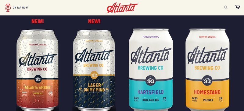
Atlanta Brewing lets the product speak for them. The colorful design on the cans look fabulous set against a simple, dark background.
Find Something Outside the Norm
It’s okay to choose something slightly different than what other businesses do in the same industry. Add that pop of sunny-yellow or choose neon pink when every other brand uses a dusty-rose pink.
Look for ways to stand out. With color, you can easily swap things around and redo your palette when something doesn’t work. Experiment and see how your audience responds.
About the Author!
Eleanor Hecks is editor-in-chief at Designerly Magazine. Eleanor was the creative director and occasional blog writer at a prominent digital marketing agency before becoming her own boss in 2018. She lives in Philadelphia with her husband and dog, Bear.