
Beverage logos do a lot more than look good on a bottle or can. They help people make split-second decisions, trigger memories, and build trust over time.
In a category where products are often chosen in seconds, a strong logo can be the difference between being noticed or ignored.
For branding enthusiasts and entrepreneurs, beverage brands offer some of the clearest, real-world lessons in visual identity.
These companies have spent decades refining logos that feel familiar, emotional, and instantly recognizable.
Below, we’ll break down 10 of the most recognizable beverage brand logos ever created, explain why they work so well, and share practical branding lessons you can apply to your own business.
You Might Also Like: Top 12 Most Famous Fast-Food Brand Logos Worldwide

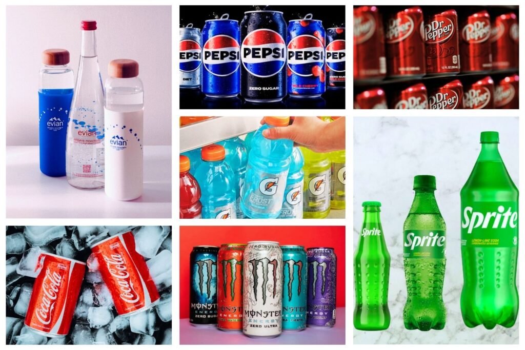
Why Beverage Logos Set the Standard for Branding
The beverage industry is brutally competitive. Shelves are crowded, products are often similar, and price differences are small.
That puts enormous pressure on branding—especially the logo—to do heavy lifting.
The most successful beverage logos tend to share three things:
- Simplicity – They’re easy to recognize at a glance
- Consistency – They evolve slowly, not radically
- Emotional connection – They make people feel something
Let’s look at the brands that have mastered this balance.
Also See: 20 World-Famous Brands and Their Logos
1. Coca-Cola
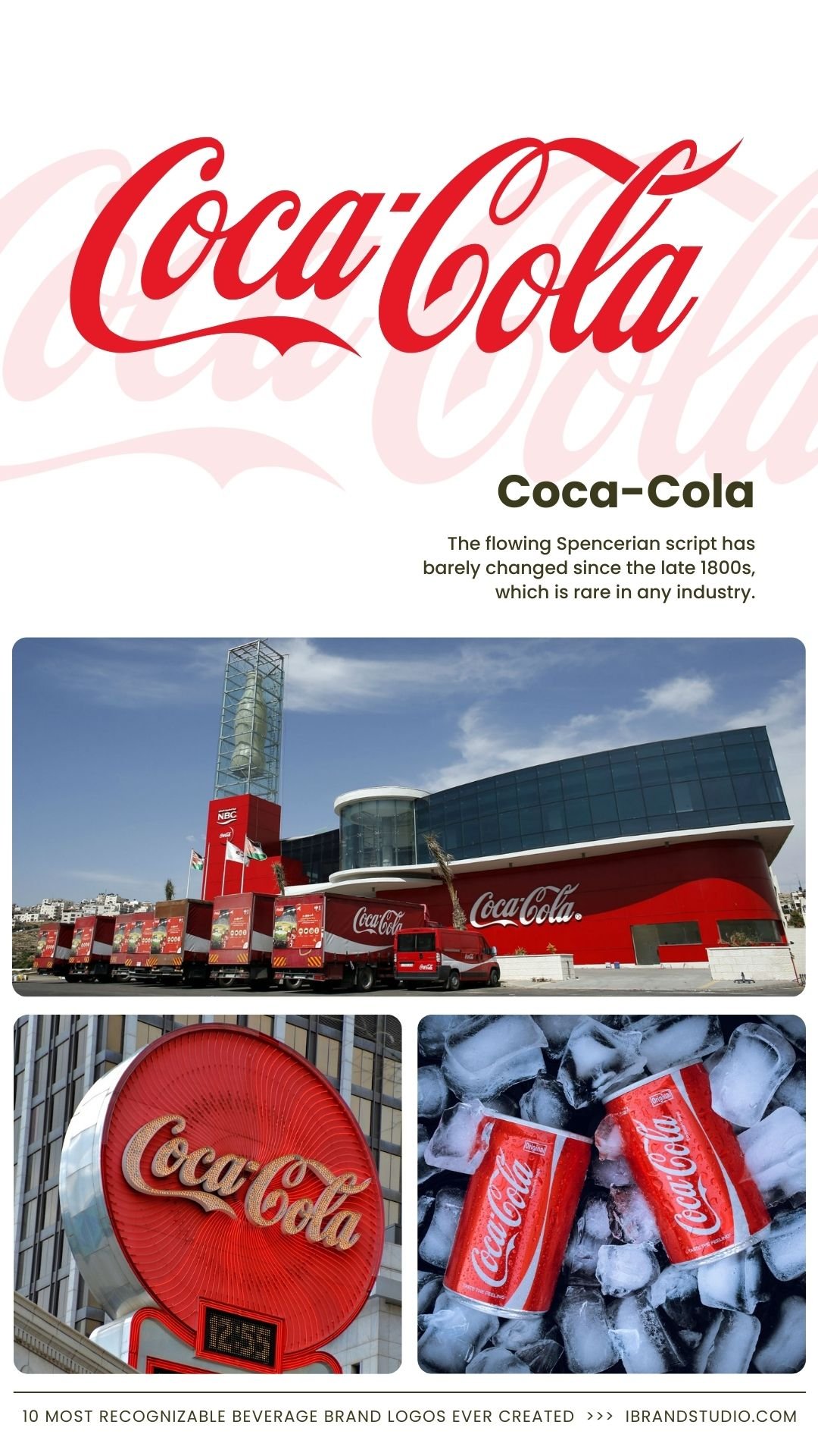
Coca-Cola’s logo is one of the most iconic visual identities in the world.
The flowing Spencerian script has barely changed since the late 1800s, which is rare in any industry.
Why it works:
- Handwritten typography feels personal and timeless
- Red and white create strong contrast and visibility
- Deep emotional associations with happiness and nostalgia
Branding tip: If your logo has history, protect it. Small refinements beat major redesigns.
2. Pepsi
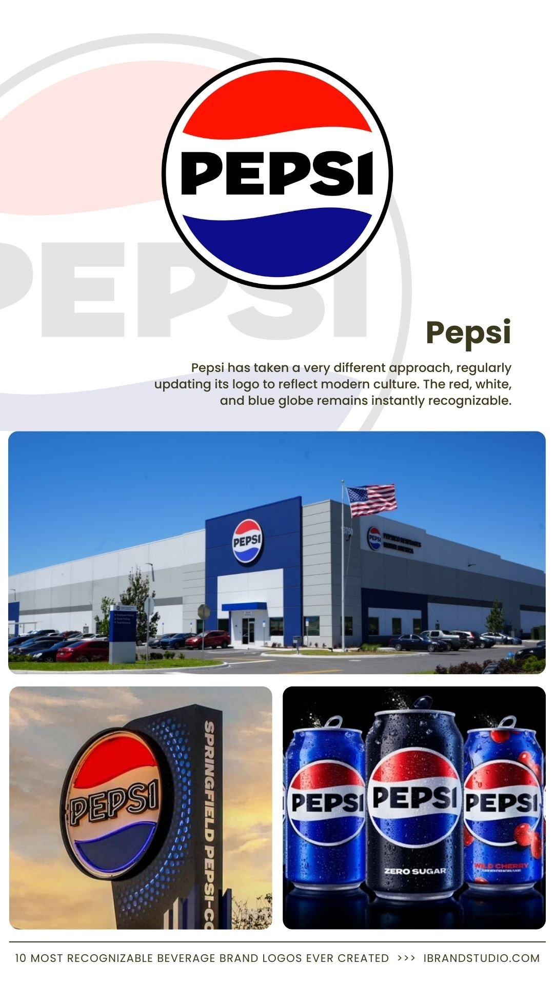
Pepsi has taken a very different approach, regularly updating its logo to reflect modern culture.
Despite those changes, the red, white, and blue globe remains instantly recognizable.
Why it works:
- Circular shape is flexible across packaging and digital use
- Familiar colors signal energy and trust
- Strategic reinvention keeps the brand feeling current
Branding tip: Rebranding works best when core elements stay intact.
Recommended Reading: Best 11 Famous Logos in the World – Why do They Work?
3. Red Bull
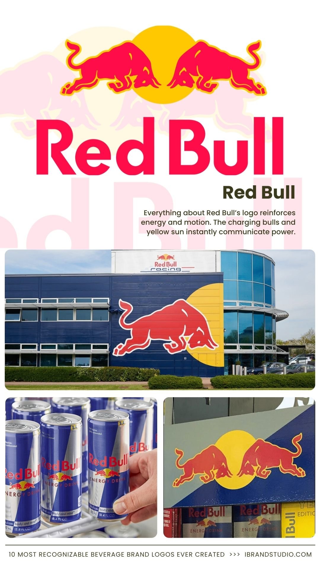
Everything about Red Bull’s logo reinforces energy and motion. The charging bulls and yellow sun instantly communicate power.
Why it works:
- Visual metaphor aligns perfectly with the product benefit
- High-contrast colors stand out on shelves
- Strong tie to extreme sports and performance
Branding tip: A great logo visually explains what your product delivers.
4. Dr Pepper
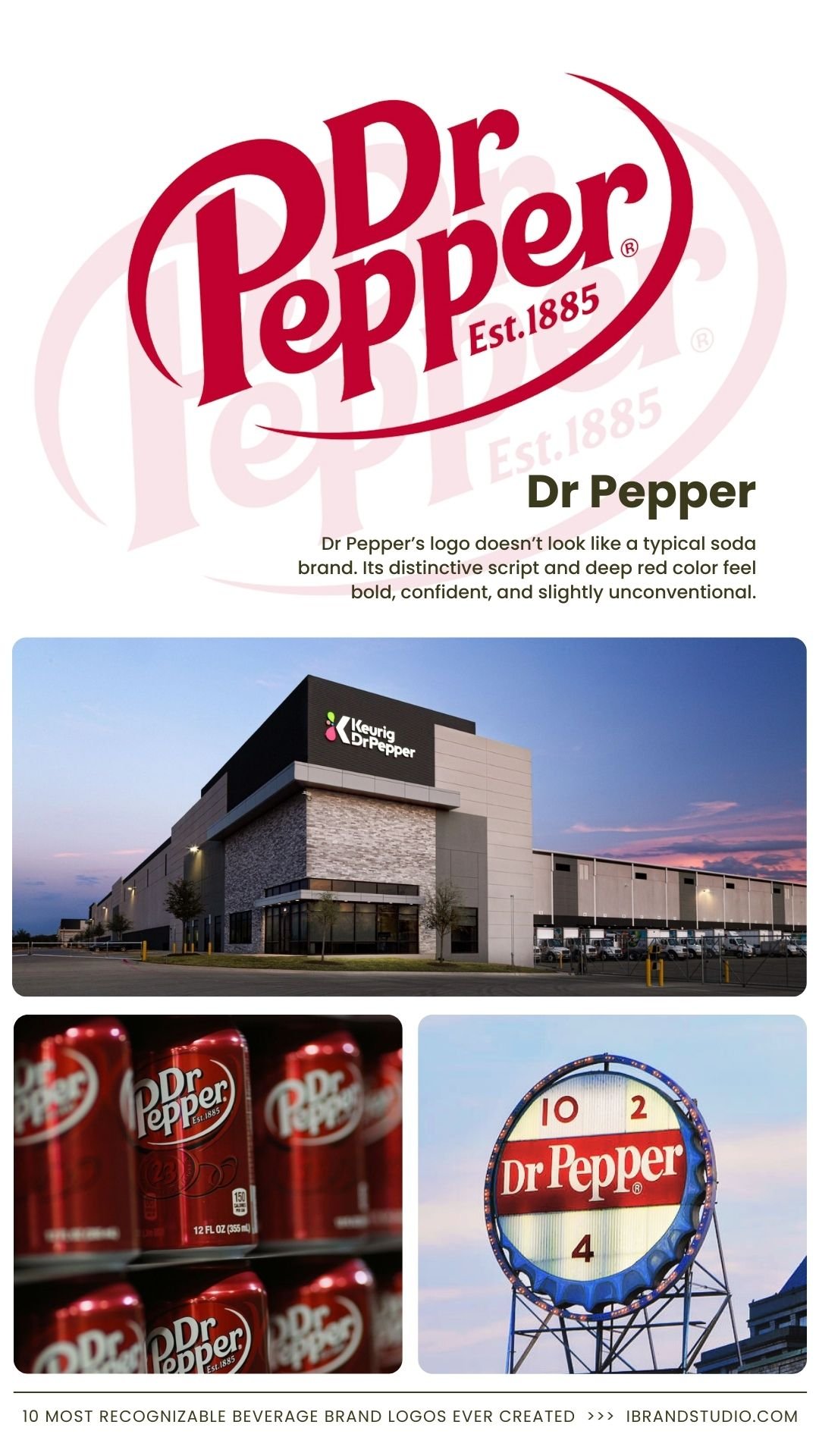
Dr Pepper’s logo stands out because it doesn’t look like a typical soda brand.
Its distinctive script and deep red color feel bold, confident, and slightly unconventional, much like the brand itself.
Why it works:
- Unique typography that’s instantly recognizable
- Deep red conveys richness and heritage
- Consistent visual identity despite minor refinements
Branding tip: Standing apart visually can reinforce a brand’s personality, especially in crowded categories.
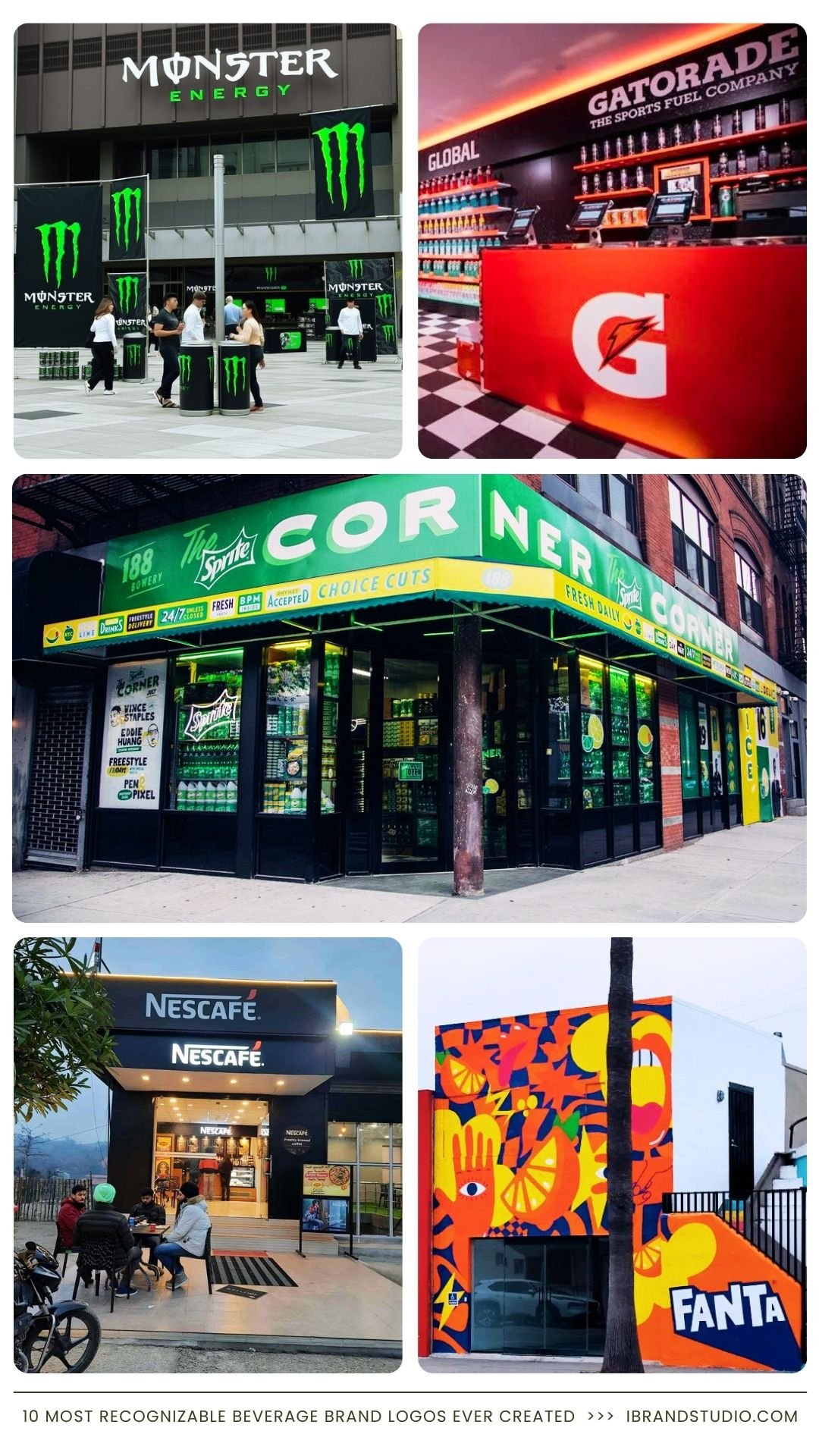
5. Sprite
Sprite’s logo feels sharp, cold, and refreshing—exactly what the drink promises. Its bold angles and green color reinforce that message.
Why it works:
- Angular typography feels crisp and energetic
- Green reinforces citrus flavors
- Strong appeal to younger audiences
Branding tip: Let typography reflect the physical experience of your product.
6. Fanta
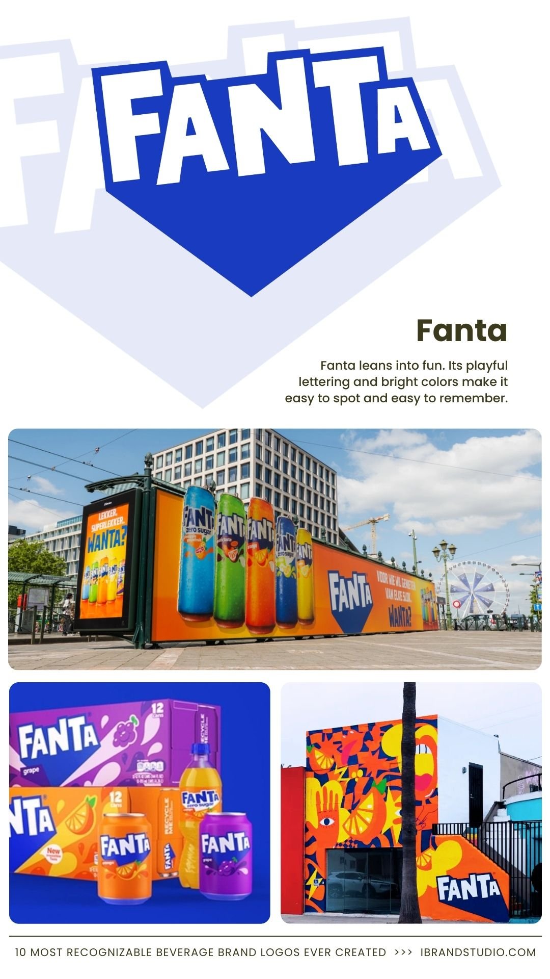
Fanta leans into fun. Its playful lettering and bright colors make it easy to spot and easy to remember.
Why it works:
- Friendly, informal design
- Bright palette separates it from competitors
- Clear appeal to families and teens
Branding tip: Playfulness can be a strategic choice, not a weakness.
7. Monster Energy
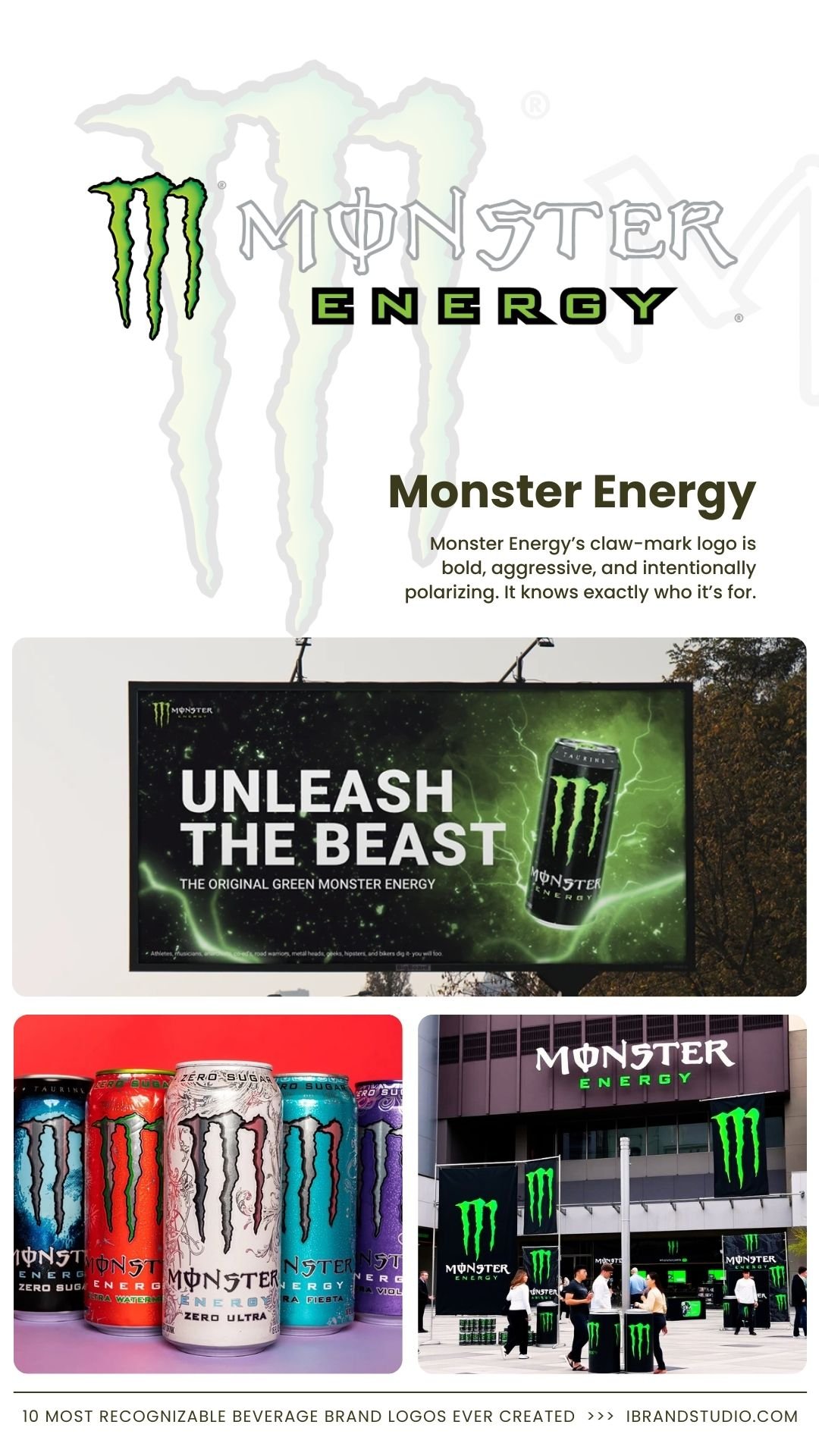
Monster Energy’s claw-mark logo is bold, aggressive, and intentionally polarizing. It knows exactly who it’s for.
Why it works:
- Highly distinctive symbol
- Dark color palette reinforces intensity
- Strong alignment with gaming and action sports culture
Branding tip: Strong brands don’t chase everyone—they build loyalty with a specific audience.
Also Read: 12 Inspiring Restaurant Branding Designs for Your Next Project
8. Gatorade
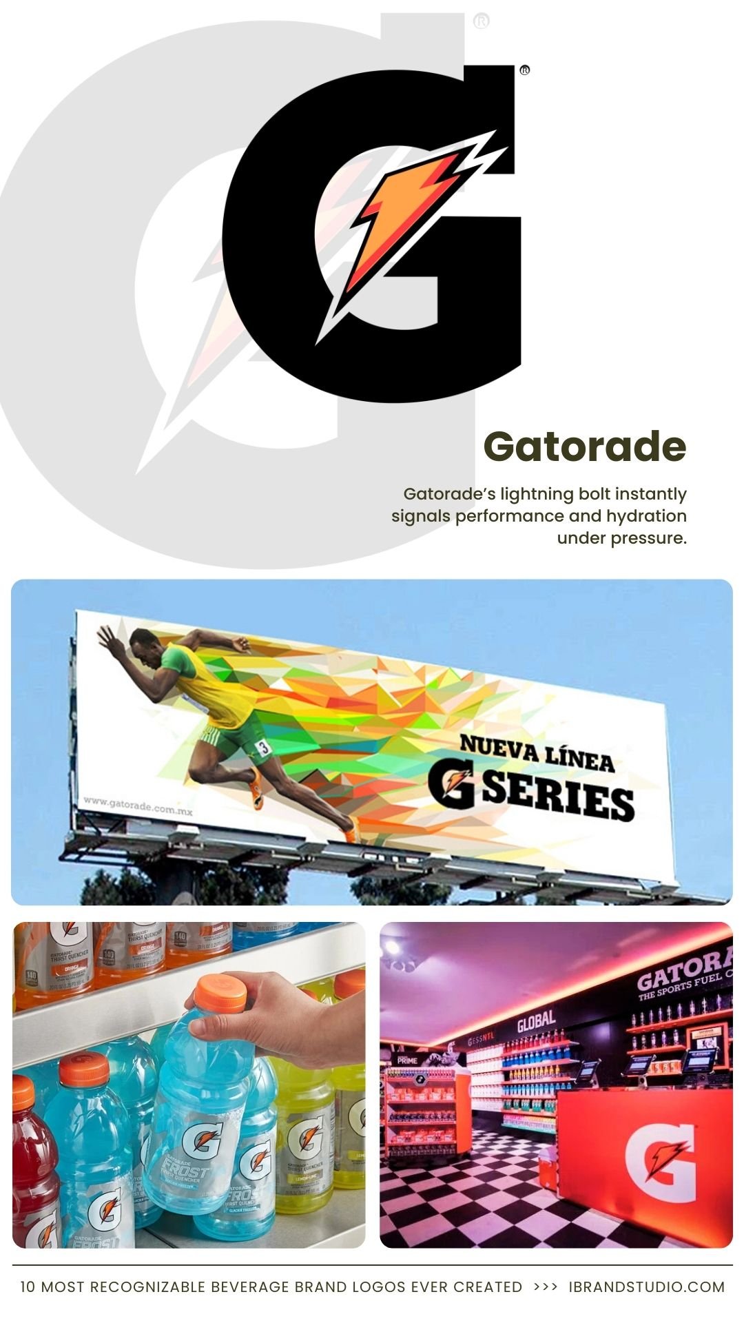
Gatorade’s lightning bolt instantly signals performance and hydration under pressure.
Why it works:
- Clear association with speed and energy
- Easy to adapt across flavors and sub-brands
- Backed by professional sports credibility
Branding tip: Authority and function should be visible in performance-focused brands.
9. Nescafé
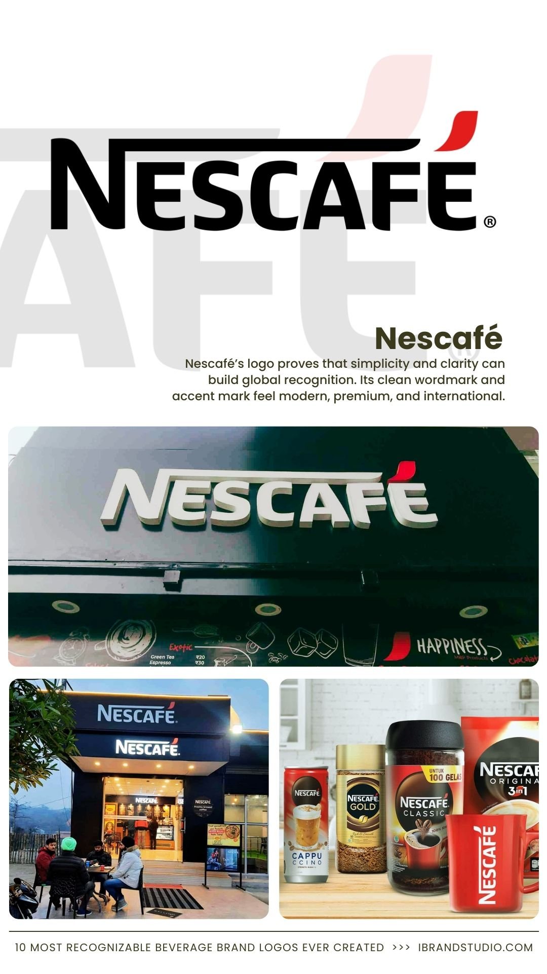
Nescafé’s logo proves that simplicity and clarity can build global recognition. Its clean wordmark and accent mark feel modern, premium, and international.
Why it works:
- Strong, legible typography across languages
- Minimal design adapts easily across products and regions
- Clear association with energy and daily routine
Branding tip: If you’re building a global brand, prioritize legibility and cultural neutrality.
Also Read: 10 Coffee Shop Brand Identity Concepts That Go Beyond the Logo
10. Evian
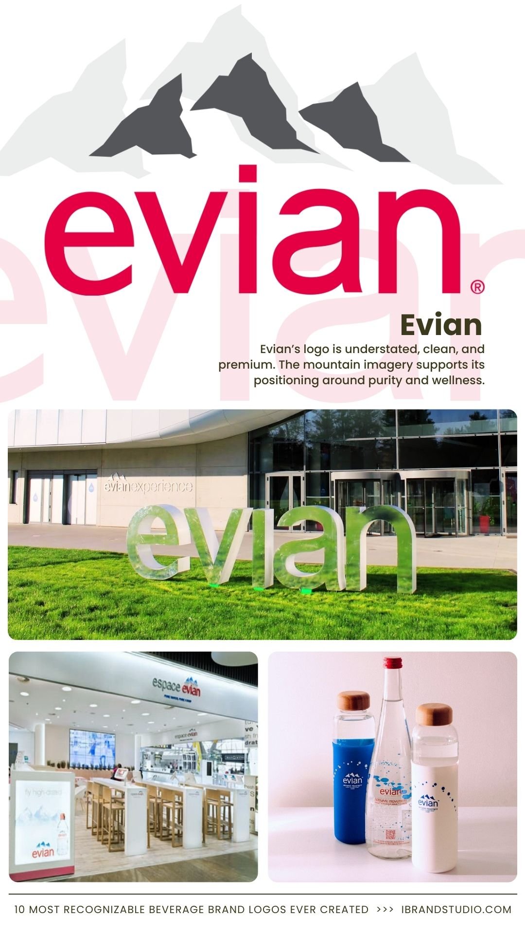
Evian’s logo is understated, clean, and premium. The mountain imagery supports its positioning around purity and wellness.
Why it works:
- Natural visuals reinforce product benefits
- Minimal design feels high-end
- Strong alignment with health-conscious consumers
Branding tip: In premium branding, less often says more.
What Entrepreneurs Can Learn From These Beverage Logos
When you step back, the lessons are clear:
- Simple logos scale better across packaging, retail, and digital platforms
- Consistency builds brand equity over time
- Emotion drives recognition and loyalty
- Audience focus matters more than trends
Before finalizing a logo, ask yourself one question: What should someone feel the moment they see this?
Final Thoughts
The most recognizable beverage brand logos weren’t created by accident.
They’re the result of long-term thinking, disciplined design choices, and a deep understanding of the customer.
Whether you’re launching a new beverage brand or refining an existing one, these examples prove that great logos don’t need to shout.
They need to be clear, consistent, and emotionally resonant. In a crowded market, that kind of recognition is priceless.