Typography Tricks You Should Know as A Designer
In this article, we share some typography tricks you can use to spruce up your designs. We’ll help you create that clean, professional look using simple and effective techniques.
Web designers use typography in various ways in order to make content pleasing and easy to read. This means that they can use bold fonts in headlines, choose the proper font, or some of these tips and tricks that you’ll find below.
The designer will then bring these points together in order to create a pleasing and aesthetic impact.
As a typographer, knowing your craft will enable you to create impressive results. As with all other skills, hints and tips make a big difference to the end result. This will enable you to build your reputation as a designer.
Trick #1: Kerning and tracking
Before we begin, let’s introduce you to two terms in typography known as kerning and tracking.
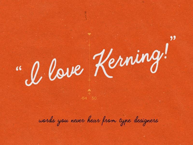
Kerning is the space which occurs between pairs of letters. Tracking works across paragraphs, pages, documents or other wide ranges of letters.
Trick #2: Kern upside down
When your brain sees words it immediately takes the whole into account and produces meaning. As a result, you won’t notice the spaces between the words or the ways that these spaces impact on layout.
By kerning upside down, you’ll see shape and space. If you struggle with kerning, doing it upside down will enable you to work more effectively.
Trick #3: Blur it
If you’re unfamiliar with kerning upside down, another tried and tested technique is to blur the letters.
Some designers use Photoshop to do this. This will prevent your brain seeing the full message and you’ll be able to kern more easily.
Trick #4: Forget small caps
If you’re reducing your letters to create small caps, take into account the difference between true small caps and fake ones.
With true small caps, the letters are in perfect proportion to the rest of the font. With fake small caps, vertical strokes are often out of proportion and the letters are at the wrong height.
Don’t just shrink your letters down and call them small caps. You’ll need to space and adjust them properly. Correct spacing is a little looser than lowercase.
Trick #5: Make use of the ‘o’

When you are spacing your words, use the letter ‘o’ as your guide. This will give your letters great visual spacing.
When laying out your words, imagine the letter ‘o’ between each and every one. This will make your site easy to read for visitors.
Trick #6: Keep your font count low
When you’re working with fonts, use a maximum of three. Anything more and your page will become too cluttered. When working with different fonts look at your page as a whole.
How would you like to lay it out? Which fonts will help you to create interest or give a striking visual effect? Which would be most legible for your readers?

When selecting your fonts, look at weight. Very often it’s helpful to select one font of different weight so that you can create a simple, stunning impact without cluttering your page or confusing your readers.
Trick #7: Stay in proportion
Unless you think it is crucial to do so, try not to alter your font proportions. Rather select a different font that meets your purposes.
Fonts have often been designed with a specific proportion in mind. Altering these can have the same impact as warping a photo or stretching an image.
If you do choose to edit a font, make sure you do this with a purpose in mind (for example creating a distorted look). This will keep your work looking professional. Otherwise, you might simply have a font which looks out of proportion.

Trick #8: Correct your Alignment
When your text is properly aligned, you’ll create a balanced effect on your site. You can align your text from the left, right, center or justify it. However, sticking to a single option is most helpful. Without this, your copy will look messy.
Aligning the text from the left makes it easy on the eyes and is the most traditional way of working. Aligning text from the right can work well if done carefully.
However, both of these options might produce a ragged line on one side of the page. As a designer, you can adjust ragged lines by changing the length. This is the most helpful choice for spacing your copy.
If you use center alignment, this could result in uneven sections within your page if not used effectively. Justified alignment can be very difficult for developers as it can create unusual spaces within the text and make your page feel out of balance.
When aligning your text, work in a way which will create a friendly and balanced layout. This will give visual appeal to your site.
Trick #9: Use a grid
Working within a grid helps you to balance the different design elements on your page. When you’re working within a grid, you’ll be able to keep track of your composition. This will also help you to see how the various aspects of your design interact with each other.
Trick #10: Select your fonts carefully
When you are working with fonts, select your choices carefully. This might mean looking beyond the surface until you find the unique look you require.
A careful selection means that you won’t have to work at adjusting an incorrect font. Stretching or distorting fonts can give your site an unprofessional look.
Instead, pick your fonts carefully. Keep looking until you find the choice which is right for you.
If you rent out your font (as mentioned in the point above) you won’t have to worry about adjusting the font if it doesn’t work for you. Simply pick a different option until you achieve the look you would like most.
Trick #11: Whitespace
White space is such an important aspect when it comes to achieving balance. Remember that your empty spaces are not simply unfilled areas.
They can help you to create focus and create a clean look to your design. Using white space carefully will add a sophisticated aesthetic to your design.
Trick #12: Focus on headlines
When kerning and tracking pay special attention to your headlines. These are aspects of your design that it is important to get right. If you are using cleanly lined fonts, inaccurate spacing might seem exaggerated.
When your working with sans-serifs, work on getting a rough tracking before kerning. Tracking means creating a standard space between all of the letters in your headline.
Decide how you’d like the headline to look (you could choose for your kerning to be either looser or slightly tighter). Next, you could use rough tracking to gain an overview of the final result.
You could use rough tracking to space out your numbers too. Very often numbers benefit from tighter kerning. Rough tracking will give you an overview of your end result.
Summary
Learning new tips and techniques in typography will enable you to create an aesthetic which will please your work’s viewers. Like anything else, typography benefits from regular practice.
Try to spot fonts which appeal to you and find out how they have been used. Remember to always focus on legibility. Your design should always combine great aesthetics with a practical element.
About the Author!
Bogdan is a designer and editor at DesignYourWay. He’s reading design books the same way a hamster eats carrots, and talks all the time about trends, best practices and design principles.