How to Choose the Right Typeface
Typography is still overlooked by many creative workers, although it is a very important element of design. In fact, choosing the right typeface can make a real difference to the effectiveness of the entire project.
Your task is to find a typeface that will connect the text with the graphics to achieve the corporate objective. This way you will affect the audience’s perception of the message.
Among multiple fonts available on the market, it’s getting harder and harder to find a suitable option. Luckily, we can cover you on that! By following our guidance, you will manage to find the correct typeface and successfully integrate it into your project.
Think about personality
When you get involved in a project, you should have a clear understanding of what stands behind it. You should check its business strategy, goals, approach, reputation, and many other aspects. This knowledge will guide you through the creative process.
If you are dealing with an IT start-up, you may use some simple, funny, and bright fonts to attract the audience’s attention to the new product. If you are dealing with an educational project, you need to find something more reserved yet elegant.
Once you know the project traits, you will start moving in the right direction. You will have better chances of finding a typeface or typefaces that reflect the project personality.
Consider visual and tonal direction
The visual idea of the project must be reflected through typography. When you are about to choose a font, you should pay attention to how its size, color, and overall attractiveness. Is it relevant to the project mission? Does it look harmonious with other elements of design? Can it be paired with other fonts? These are only some of the questions to be answered.

As long as you are familiar with the project values, you should use this knowledge while deciding on the tone of your font. The tone of typography can’t be ignored. You can’t use an aggressive color palette while designing a kid’s project. At the same time, a simple and pale color palette will be inappropriate for an entertainment project.
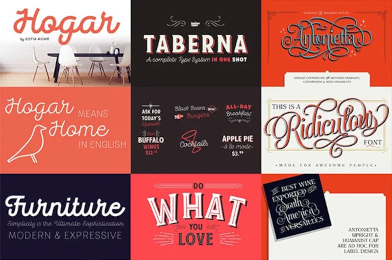
As you can see, the visual characteristics of a font are crucial for making the design work. Whether you use serif, sans-serif, script, or some hand-drawn styles, make sure that they can be associated with the project concept.
Think function
Not every typeface works at every weight and size. Display fonts that look nice at larger sizes turn out to be totally illegible at smaller sizes. Meanwhile, body fonts that look nice at small sizes happen to be boring and even tiring at display sizes. Of course, you can find universal fonts that work at any weight and size.
Readability is probably the most significant feature of a typeface. As a designer, you should test more than several typefaces to make sure they are readable in any format. Since you want to communicate a message, you should make your message is clear to the audience.
Consider performance
When it comes to web design, safety is one of the major criteria for consideration. To find a safe typeface, you should refer to the online catalogs. Take a look at Google Fonts or Adobe Typekit. These online libraries have proved their reliability among users. Thus, you won’t have to worry about infecting your computer with a virus after the download from their sites.
Online libraries are incredibly overwhelmed with traditional and modern fonts. So, make sure that you download an item that you are actually interested in. While dealing with high-quality typefaces, you will enjoy a smooth performance.
Notice typography around you
If you look around, you will notice so many amazing designs that demonstrate how the right typeface creates a masterpiece. You can use them for inspiration.
You can use such resources as Dalton Maag, Monotype, Hoefler & Co, Font Bureau on Type Network, and Commercial Type to check the most recent trends in typography. This is where you can develop your creative taste. For your next project, you will have a bunch of ideas to offer in terms of typography.
Test rigorously
When you seem to find a nice font, you shouldn’t rush to integrate it into your design. Instead, give yourself a benefit of the doubt. You need to test the font by checking its relevance and compatibility with the project. You don’t know if it will work until you try it out.
Feel free to adjust the selected typeface to the project design. It’s fine to make it larger or smaller, thinner or thicker, and so on. But it shouldn’t be manipulated in any way that changes with its initial proportions. If you stretch the font, you will see the blurred line or some other mess after the integration into the final design.
Pair up properly
To add more levels of visual hierarchy to the text, you will need to combine several fonts. Well, it’s not as easy as one may assume. Not all fonts play well with each other. Some of them are neutral enough to be paired with hundreds of other fonts. Meanwhile, others are more unique having a limited number of suitable combinations.
Choosing font combinations is a kind of art that takes a lot of time and effort to master. While there are no matching rules, the process requires a fair amount of experimentation. You can play with colours, size, contrast, and many other features. The main point is not to go overboard.
A visual concept of any project can hardly be successful without an appropriate typeface. This element of design dictates what message you send across. Some fonts may look casual, while others may seem formal and professional. If you don’t want to leave your audience confused, make sure to do everything right.
Keeping the above guidance in mind will help you make the right decision. So when your client asks “why did you choose this typeface?”, you will answer this question easily.