A Short Diving into Typography: How to Classify the Fonts
It’s worldwide accepted that the small details make the big difference and no one seems to have another valid approach. In the world of web design, this idea is capital: each apparently insignificant aspect may have a special value into a specific context. The consequence is simple: if you ignore a single item from your layout, it will definitely ignore you at a moment. The care for details is a great sign of quality and everyone should apply this principle in his work.
The letter is quite probable the smallest item from a webpage and it’s true- it is the most neglected…or was it neglected until Metro came back? Anyway, the general opinion of the web design community is that typography is vital in any project, but paradoxically, the designers neglect the choosing and the display of a font.
Therefore, you as a designer, should know how to handle the types in your advantage. The realm of typography is immense but at the same time magic; the true designer can feel this magic and select only the best solutions. It’s obvious, you should conquer the typography and the best approach is “divide et impera”. It’s simple, before conquering all the fonts it is highly recommended to classify them according to some common features. This job is very time consuming and the issues are enough difficult to overcome. The good news is that in this article you have a clear and concise classification of fonts- nothing too complicated but in the same time very well-explained. Don’t worry if you have another classification or you find another article that delimitates the fonts into different categories. Unfortunately, there is no standard classification- each designer comes with his own system. You should consider the classification of fonts as a tool or a guideline, it is not a rule!
However, there is a common accepted classification of fonts: sans serif and serif fonts.
- Sans serifs are the types that don’t have any “extra lines” in the extension of the types strokes. Somehow, these give the impression of rigidity and may be used for better readability in bigger size (there is a hot debate, but the most of designers considers that sans serif are better for headlines while serif fonts for paragraph texts). Sans serifs are grouped into two big categories: Humanist and Geometric.
- Serif fonts are distinguished by the lines added to the types strokes; the image bellow is self-explicatory. Serif fonts are classified into four groups: Old Style, Transitional, Modern and Slab Serif.

There are other two types of fonts that aren’t quite useful but in some projects these may be a real help: Handwritten and Dingbats.
Sans serifs fonts
#Humanist
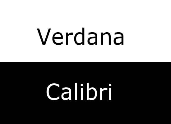
Distinguishable features: appeared in twentieth century and it is considered the descendent of the handwriting. These are very calligraphic and legible even if the Humanist fonts have many details.
Where to use: a Humanist font manages to express human warm but it gives a sense of modernism (in fact, it is a new category of fonts!). On the other hand, the level of the details may harm the eyes of the viewer, so pay close attention to these fonts.
Examples: Verdana, Gill Sans, Myriad, Calibri.
#Geometric

Distinguishable features: it’s opposite to the Humanist. The letters are simple and elegant cut, any details being removed. It’s enough to study the letter “a”- in the majority of cases it is just a circle and a small line in the lower right part. It might be considered as a minimalist font.
Where to use: geometric fonts aren’t recommended to use in the body of the text, but are perfect to use in headlines. If you need to realize a modern or minimalist project then consider these fonts!
Examples: Futura, Helvetica, Gotham, Century Gothic.
Serif fonts
#Old Style
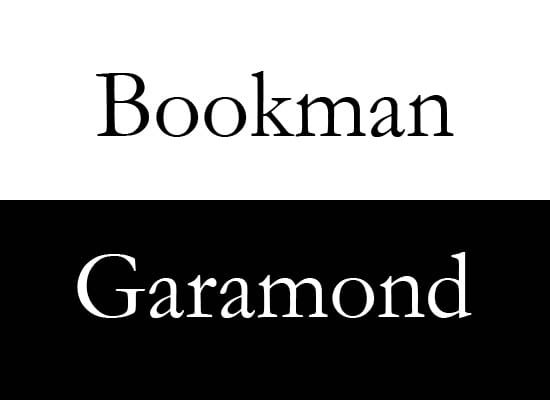
Distinguishable features: the serifs are rounded, the contrast between strokes is low, usually the letters being rounded and all these features assure a very good readability. It’s no wonder because, as the name itself is saying, these fonts are old and across time were constantly perfected.
Where to use: everywhere where is needed a good readability (well, everywhere!!!). Yep, it is a general valid solution but avoid not being too boring.
Examples: Garamond, Bembo, Palatino, Bookman.
#Transitional

Distinguishable features: Transitional evolved from Old Style and maintain many common element. A Transitional font has more elegant serifs than the Old Style and the contrast between strokes is more obvious. Even if it sounds as an intermediate step between Old Style and Modern, these fonts are very common and numerous.
Where to use: it is another font family that is suitable for almost everything. In these cases is very important the combination with other font; two wonderful fonts don’t mean that they should make a “good family”.
Examples: Times New Roman, Baskerville, Caslon, Georgia.
#Modern
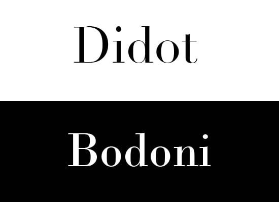
Distinguishable features: a Modern font has a powerful contrast between strokes, in the majority of cases, the horizontal ones being thin while the vertical ones are thick.
Where to use: if you want to transmit a powerful message then a Modern font may be the best solution. Also, a website that needs to have a modern look should have such a font.
Examples: Bodoni, Didot.
#Slab Serif

Distinguishable features: the Slab Serif fonts have square strokes, being easy to identity due to the boldness and strong influence.
Where to use: usually, these fonts give the impression of authority and strength.
Examples: Clarendon, Rockwell.
#Handwritten and Dingbats
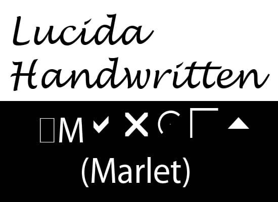
Even if we are living in a world were handwriting is quickly losing its importance, it will never disappear. One of the best evidence is the multitude of fonts that imitate the “old writing.” Each Handwritten font is another trying to imitate the handwriting; it is interesting to add such a font but you should be very careful to the readability. Handwritten are recognized as being the less readable solution. Dingbats fonts are nothing more than substitutes of the alphanumeric items; instead of letters and digits are used various symbols.
In the end, I hope that this classification to be very useful and I repeat: don’t take it as a precise rule. In fact, it doesn’t matter how the fonts are grouped, the most important is the satisfaction of the user. Please add in the comment form your opinion about font classification and let us know if you are interested in more subjects related to typography.
– Written by Daniel –