The call to action (CTA) on a website page may be the most important element to drive site visitors toward conversion. Without a strong CTA, visitors won’t understand the path they should take for the buyer’s journey.
Most web designers and small business owners understand the basics of excellent CTAs, such as finding the right wording. However, making even small mistakes can drive down conversions and result in lackluster sales.
What Is a Bad CTA?
Before one can create an excellent CTA, it’s crucial to know what a bad CTA is. Pushing too hard for the sale or not putting enough effort into the development winds up reducing conversions and potentially driving site visitors away.
Out of 93,000 CTAs, those that used buyer personas to target users gained 42% more views than generic wording. Stick with specific, strong words and CTAs will shine. Here are the biggest mistakes business owners might be making and what they should do instead.
Mistake #1: Not Using a CTA on All Pages
Some pages don’t naturally flow into a CTA and require a bit more thought into how to place and word the call. Leaving it out, though, leaves potential leads on the table. They may just bounce away and go to a competitor’s site instead.
Ideally, add a CTA on every single page on a website. Even an About page could have a CTA button about a free trial or estimate at the top of the page or in the footer. “Learn More” buttons also add a nice touch to draw users in and help them get to know the company better.
Think about the purpose of the page. What might users’ next natural step be in the website journey? If they want to know more about the team, would they also like to learn more about the history of the company or perhaps customer policies?

AdEspresso adds a short CTA at the bottom of even their “About” page, encouraging users to “Start Free Trial.” In the header on each page on the site is a bright green button to “Signup.” The single word fits within the navigation bar but still features a CTA for site visitors to refer back to when they’re ready to get started.
Ask if a smaller button might serve the navigation bar well to attract clicks and encourage visitors to take action. A CTA in the header should fit in with size and shape but pop with a vivid color.
Mistake #2: Ignoring the Area Above the Fold
Web developers know the area above the fold is prime real estate. People often spend just a few seconds on a page after landing there. One of the first things they should see is the CTA.
Yes, there’s something to be said for setting up the information to entice a user to take action. However, people are highly impatient these days. They have a million little things that need done.
Perhaps they have to get ready, drop their child at daycare, drive to work, meet with clients, go out with a friend after work and pick up groceries and their child on the way home.
Once they get home, the nighttime routine is just as hectic. A consumer might find just a few minutes in their day to visit a few websites and gather information.
The easier and more accessible details are on a site, the higher the chances they’ll convert into a lead. Make the process easy for users so they don’t bounce away in frustration.
Mistake #3: Limiting CTAs to One Per Page
There’s no rule of thumb that says sites can’t have as many CTAs as they’d like. While it’s crucial not to dilute the sales funnel, one can certainly move users into the next phase of the buyer’s journey in several places on a page.
One can even use different wording as long as it is similar and ties into user intent. For example, one CTA button might read, “Get Free Trial” and another “Try for Free.”
At the same time, there must be a balance. Nonstop CTAs might be as distracting as too few. Create a nice visual balance. Perhaps one in the header, one above the fold and one at the bottom of the page could be a good rule of thumb for most websites.

Renewal by Andersen uses a CTA button encouraging users to “Request a Free Consultation,” placing it above the fold over the hero image. Later down the page, they have a “Claim Offer” CTA button and “Learn More” buttons. All the CTAs are meant to move the user on to the learning or decision stage of the buying process.
Consider the best placement for CTAs to move the user smoothly through a website. Where should the first one be? Is it larger than some of the others? Is there a common position on all pages on the site?
Mistake #4: Choosing Style Over Function
A website must load quickly to engage the user and keep them on the page. Beautiful designs might appeal to people, but if they can’t get to the CTA and click on it in a second or two, they may bounce away.
Do designers have to keep buttons simple so they load at lightning speed? Finding the perfect juxtaposition between fast loading times and aesthetically pleasing designs requires a bit more effort but is worth the extra input to get there.
Mistake #5: Taking Too Long to Get to the Point
In the effort to stand out from other businesses in the industry, some websites overshare information. After all, if a brand can convince leads they’re the best, why wouldn’t they click through.
However, taking too much of their time with details can just overwhelm the customer and make them walk away instead of converting. Instead, get to the point quickly. Cut out as much clutter as possible.

Progressive doesn’t waste a lot of time on specifics. They add a CTA button that reads, “Get a Quote.” They have drop downs so users can hop right to an auto quote or add property and for their specific location as rates vary by town.
Businesses should review the process on their sites. What could be removed without losing meaning? Get to the point as quickly as possible.
Mistake #6: Choosing a Matching Color
When it comes to CTAs, sites should choose a color that contrasts with the rest of the page. It should stand out from everything else to signify it is something special. Around 80% of consumers say they bought a product based on color.
One thing each example of excellent CTAs shares is the pop of bright color for the CTA buttons. The rest of the page might be black and white, but a strong pop of vivid orange pulls the user in and makes them notice the button before anything else.
Mistake #7: Failing to Test CTAs
Some designers get so caught up in the look of the CTA or the wording that they forget to actually test the button and make sure it goes where it’s intended. When the user clicks on the button, is it clear what will happen? Do they go to the right page or a confirmation of some sort?
CTAs must do what they say or users will distrust a site. Carefully click on every single CTA and ensure they match user expectations.
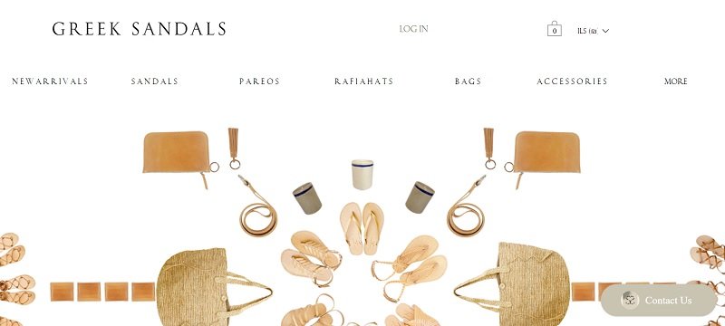
Greek Sandals has a simple minimalistic design that grabs user attention and highlights the newest arrivals. Every product has a “Shop” button. The site seems to have been tested as every link works and takes the user to the expected page.
Even if it seems time-consuming, spend time going through every link on a site and making sure they all go somewhere and to where the user expects. Sites set up on a content management system such as WordPress may utilize plugins to check for broken links and dead ends.
Mistake #8: Choosing Weak Words
“Click Here” or “Sign Up” may not hold the power of more unique phrases. People visit thousands of websites. The words seem to run together after a while. Spend time thinking about the audience the site is aimed at.
What words are powerful to the buyer persona? What might they respond best to? Can anything be shortened or stated more clearly? Some words offer powerful, concrete visuals of actions. Some studies have even shown that using “I” or “You” statements has a stronger impact on site visitors.
Play around with different versions, conducting A/B split tests to see what works best. Don’t be afraid to swap wording around and try different things until hitting on the one that works best for each site.
Do Most Things Right
No matter how hard a company tries, a few mistakes appear on nearly every website and in CTAs. Stick to the effort required to create the best CTA possible.
Even if the site has a mistake or two, users can be quite forgiving. Best effort is what matters to drive conversions and help business owners come up with excellent CTAs to match user expectations.
About the Author!
Eleanor Hecks is editor-in-chief at Designerly Magazine. Eleanor was the creative director and occasional blog writer at a prominent digital marketing agency before becoming her own boss in 2018. She lives in Philadelphia with her husband and dog, Bear.