Most people retain information better when they see graphics of a concept rather than text alone. Data visualization helps your web design stand out from your competitors. You can say more with fewer words and site visitors will have a better recall of your presentation.
When you want people to have a clear idea of what a particular data set means, visualization breaks down complex topics.
Those who aren’t as familiar with your industry or business will grasp what you’re trying to convey. Even if they have a working knowledge of your industry, an image is easier to understand and enhances information.
Data visualization can also make it easier to see trends and patterns over time. For example, your leads may want to know how your service helped other businesses and a graph can show growth from multiple clients. You could even tie some testimonials into statistics on improved performance.
What Are the Key Benefits of Data Visualization?
The global data visualization market is expected to reach $7.76 billion by 2023, with an annual growth rate of around 9.47% between 2017 and 2023.
Brands see the benefits of utilizing images to drive home a point. One of the best ways to get ahead of your competitors is by adding some detail to your website they don’t yet have on theirs.
Some of the key benefits of data visualization include:
- Breaking down complex topics
- Notice patterns and trends
- Illustrate relationships
- Easier to remember than text alone
Images also break up the lines of text on a website. A page with only words is pretty boring and people may bounce away pretty quickly.
You only have a few seconds to make a good first impression on people who land on your page. If the page is visually appealing, you have a better shot of grabbing their interest.
How can you best make use of your infographics and visuals?
1. Choose the Right Charts and Graphics
How do you know what types of data visualization make an impact? Think about facts you’re sharing and if putting them into an image makes them easier to understand or quicker to absorb.
Perhaps you just need a graphic to enhance what you’re claiming. Will an image add some additional credibility to your claims?
A good place to use data visualization is when you’re sharing company facts. Perhaps you want to impress potential clients but you know they won’t remember the specifics of percentages and such. In such cases, you can share the number but add an image to drive the data home.
Business people sometimes use relational image techniques to recall names and details. For example, if you meet someone named Bob, you might picture him on a boat bobbing out in the ocean.
You can apply this same technique to the facts you share on your website. Adding images helps your readers remember the little details they might otherwise forget.

FedEx lays out details such as how many visitors come to their site and how many service centers they have. They use icon images to help the user relate to the numbers. Icons add interest to the look of your site. They also can serve as a memory trick to help users remember details.
The icons next to each point also help serve as separation for different details. The simple graphics break up the text on the page and add some interest that helps the information flow smoothly.
2. Tell a Story
You likely spend a lot of time, effort and some of your budget driving traffic to your site. Once people land on your page, you want them to stay there a bit and at least make it through the first stages of the buyer’s journey.
One of the best ways to engage your audience is by telling a story. You can use data visualization to tell a tale. Like any good story, you’ll want to narrow your focus. Don’t try to tell visitors about your entire company history at one time, for example.
Use relevant graphics to help tell your story along the way, but don’t be scared to use headlines and words to add to the effect. Stick with graphics that enhance the text and vice versa. Don’t have orphaned pieces that don’t relate to anything else.
Ideally, your visualizations should have a beginning, middle and end. You’re telling a story in the image phase, so you want to hit all the high points as though you were orally describing the information to a listener.
3. Animate Your Pages
Data visualization doesn’t have to be flat. You can add some animation to your visualizations to drive the reader in the direction you want them to go. You can use moving images to draw attention to the most important facts. Animation adds a bit of extra oomph to anything you do.
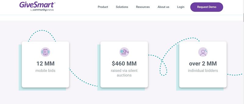
GiveSmart shows some statistics on those who use their fundraising software. As you look at the facts, the numbers count upward, showing that the figures are ever-changing. We also like the addition of the dashed line to draw the eye from the left to the right.
4. Allow Plenty of Whitespace
Negative space can be your friend. Don’t feel as though you have to use up every part of the page. It’s okay for the eye to have a break at times. Make sure every bit of visual data has a purpose.
For example, if you’re sharing details on how long it takes to implement a program you sell, you don’t also need to include what year you started or the various versions the product went through.
Focus on the topic at hand. Narrow your focus so you don’t have to cram too much information on one page.
5. Use Color Ques
The colors in your data visualization should have a hierarchy. Keep in mind that there is an entire psychology to color choices. You can evoke emotions simply by using red, black or yellow. However, who your audience is makes a difference in the feelings each hue evokes.
If you’re using graphs, you can use a particular color to show different ranges. The same with pie charts or any other data visualization. The color of text should match the visual it represents. You can also use gradients to show rising and falling statistics.

The Economist talks about the current graphics chip shortage and points to how crypto minors may be responsible. To better explain this complicated topic, they use a graphic to show the rise and fall of GPUs versus Ethereum prices.
Note how they use a separate color to track each result and then scatter some blues in the background to add intensity and highlight the rise on the graph.
6. Optimize Images
Excellent web design includes fast-loading pages so users don’t have to wait for a site to load. The problem with infographics and visuals is that they can sometimes result in bulky visuals that load a bit more slowly or drag down a website’s speed.
One way to counteract bigger files is to optimize them so they load more quickly and take up less of your bandwidth and storage space. You can also break huge images into smaller snippers.
7. Create Interactive Opportunities
If you can get the user involved, they are much more likely to stick around and check out your facts. Make a data visualization users can click on and move things around to try different scenarios.
Think about interior design sites where the user can try different room layouts or plop various types of furniture in place.

CNN uses an interactive graphic to show how difficult it is to steer a ship through the Suez Canal.
Using keyboard controls, you can speed the ship up, try to counteract wind shear and wind your way through the canal. Unfortunately, you’ll likely have a collision and not make it very far at first.
The interactive visual turns the topic into a game and helps the user experience the data rather than just reading it.
8. Be Authentic
The last thing you want to do is skew your numbers to make something seem true that isn’t. You can choose any data you want and alter the facts by leaving out details or only sharing certain facts.
Instead, find a web designer who is adept at working with visualization and will help you bring facts to life without misleading your readers.
You want those just learning about your business to trust you. You may have to share both pros and cons to get your point across and maintain transparency.
When In Doubt, Add Images
If you aren’t sure if your facts make sense, add a visualization to enhance the meaning. If you wonder if you’ve made a strong enough argument to convince leads to convert, go ahead and add another infographic.
You can’t go wrong by adding detail and beautiful images filled with detail and information are the perfect way to enhance your web design.
About the Author!
Eleanor Hecks is editor-in-chief at Designerly Magazine. Eleanor was the creative director and occasional blog writer at a prominent digital marketing agency before becoming her own boss in 2018. She lives in Philadelphia with her husband and dog, Bear.