Improve your Typography Skills with These Tips Articles
As a designers we should know that typography is really important in a design and should pay more attention to it. And making the right typographic choices for your brand identity design is absolutely critical to successfully capturing the image you want to project.
Today I’ll be going over some of useful typography tips and tutorial articles, that can improve your typography skills and you can apply to your current design projects.
Useful Web Typography Tips
10 Principles For Readable Web Typography

by Matt Cronin
In this post, we’ll explain some Web typography terms and how they play into readability; we’ll present numerous tips to help improve the readability of your content; and we’ll showcase very readable websites, layouts and articles.
Use Contrasting Fonts for Maximum Impact
by Jennifer Farley
There’s a lot more to typography that just picking a font. It is the ability to choose an arrangement of type that is legible and attractive. There are four fundamentals that can help you maximize the readability and improve the look of your website:
How To Create Great Web Typography in 10 Minutes

by Kayla Knight
In this article we’ll go over how to adjust typography from a more official and mathematical standpoint – and we can get the typography of any website perfected in 10 minutes or less.
Top 10 Dos and Don’ts of Web Typography

by Simon Pascal Klein
As a designer setting type well is a common and important task. While honoring the text we’re setting we need to ensure its legibility and readability. This is my list, used as a set of general guiding principles:
Top Ten Web Typography Sins

by Smashing Magazine
While many designers have been quick to embrace web standards, it’s surprising how often the basic standards of typography are neglected. Here are ten deadly sins to avoid in your web typography:
General Typography Tips
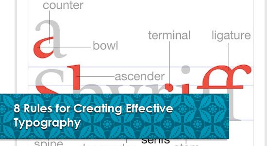
8 Rules for Creating Effective Typography
by Joshua Johnson
Today we’re going to discuss something that is both a hot trend and timeless art: typography. The basic rules outlined below will help you become more aware of how you structure and use typography in your designs. Being conscious of these rules can improve nearly everything you create that contains a headline or major typographic element.
Five Tips for Better Typography

by David Appleyard
If you follow our five simple steps below, you will see a dramatic improvement in the look and feel of your designs. You’ll benefit from readers spending a little more time browsing through your pages.
An Insider’s Guide to Type and Symbol Logos
by Jennifer Farley
When using both type and symbols, designers must carefully consider how their choice of typeface will work with the symbol.
Improving typography through space

by Brian Hoff
Instead of focusing this article on choosing a typeface or what makes a quality font, I thought it would be better to focus on something indirectly related, yet thought about, but never enough: Space. Whitespace, negative space, however you deam it, makes for good typography.
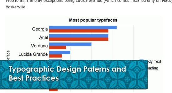
Typographic Design Patterns and Best Practices
by Michael Martin
To find typographic design patterns that are common in modern Web design and to resolve some common typographic issues, we conducted extensive research on 50 popular websites on which typography matters more than usual (or at least should matter more than usual). We’ve chosen popular newspapers, magazines and blogs as well as various typography-related websites.
A Typographic Anatomy Lesson

by Yves Peters
Do you know what all the parts of the characters in an alphabet are called? To be honest, although I examine, discuss and write about type on an almost daily basis there still are blind spots in my typographic vocabulary.
Focus on Typography: Size
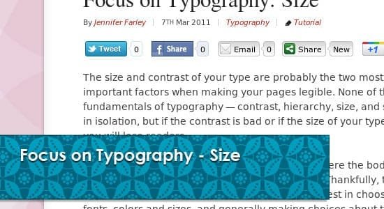
by Jennifer Farley
The size and contrast of your type are probably the two most important factors when making your pages legible. None of the fundamentals of typography — contrast, hierarchy, size, and space — work in isolation, but if the contrast is bad or if the size of your type is too small, you will lose readers.
Styles, Weights, Widths — It’s All in the (Type) Family

by Yves Peters
In a previous Type Basics piece we examined the difference between a typeface and a font. Both terms refer to a single manifestation of type. In this episode we look at how individual typefaces/fonts relate to each other.
Best Practices of Combining Typefaces
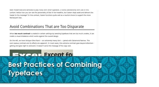
by Douglas Bonneville
Today we will take a close look at some the best practices for combining typefaces — as well as some blunders to avoid.
Considerations When Mixing Typefaces

by Simon Pascal Klein
A common technique in typesetting and design is to mix typefaces. This needs to be done with a bit of grace to ensure the addition of the second (or third) typeface doesn’t clash with the primary face of the work, and the design as a whole.
How to Make Your Typefaces Play Nicely Together

by Jennifer Farley
Well there are relationships that exist in typography that can help us reign in a design and subdue it when required, or to produce something very eye-catching and bold. There are also relationships that we want to avoid. Let’s take a look at these three.
Illustrator & Type Tips Worth Knowing

by Jacob Cass
Improve your skills and workflow by exploring these five oft-overlooked aspects of Illustrator and typography; the differences between optical and metric kerning, how to use the Glyphs panel, the use of Roman hanging punctuation, the correct use of dashes and how to edit the preferences to display large font previews… all tips worth knowing about.
“What Font Should I Use?”: Five Principles for Choosing and Using Typefaces

by Dan Mayer
Here are five guidelines for picking and using fonts that I’ve developed in the course of using and teaching typography.
How To Make Your Own Fonts

by Sonia Mansfield
Creating your own font has never been easier, so set forth and learn how to make your own font.
What Makes a Quality Font

by Brian Hoff
Since thousands of varied quality fonts readily available for download from free font sites, it’s important to be able to spot andunderstand the difference between a ‘professional quality’ font and those of ‘lower grade’ and less quality.
Typography Design Tutorials
Create Light Painted Typography in Photoshop

by PsdPremium
If you’ve ever attempted to write words using traditional light painting photography techniques you probably know how challenging it can be to create words that are easy to read. In this tutorial, author Alex Beltechi will demonstrate how you can create a similar look without a camera and tripod.
Create a Geometric Wordmark and Ambigram
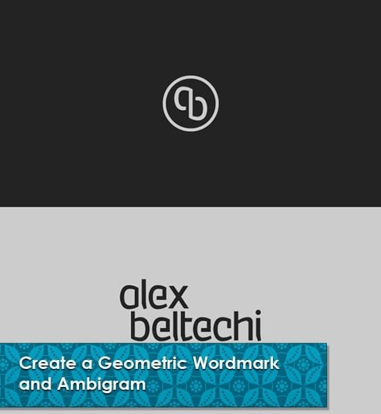
by AlexBeltechi
If you want to learn how to create your own graphic identity, through the creation of your own geometric letters, ambigram mark, then this detailed tutorial is for you. The process involves using curves that are created by aligning a series of proportionately scaled circles. Their radii are determined by precisely angled lines and font weights are metrically specified. Simply put, nothing is left to chance!
Create a Majestic Script in Photoshop

by PsdPremium
Custom typography can be a lot of fun to create. In this tutorial, author Alex Beltechi will demonstrate how to create a custom script in Photoshop in three different styles based on the same lettering layout. The result will be a clean, grungy, and distressed text effect.
Video Game Cover Light Effect in Photoshop
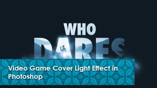
by abduzeedo
A few months ago I was checking some video-game sites, as I’m sort of addicted to video-games, and I saw this image with a really cool light effect. So I decided to try that in Photoshop. In this tutorial I will show you how to create a super cool dramatic light effect using simple filters and blend modes, but with an awesome outcome.
Recommended Book
Smashing eBook #6: Web Typography

by smashingmagazine
We have put together Smashing Magazine?s best articles on web typography with one additional article series and glossary in e-book form for you as reference work and inspiration. Have fun creating even better Web sites with beautiful and readable rich web typography!
Conclussion
Do you have another great typography tips articles? Did these article really useful to improve your typography skills? Please share your thoughts in the comment below. Thanks. 🙂
